AGF Coffee Stick Box View
Topics
Details
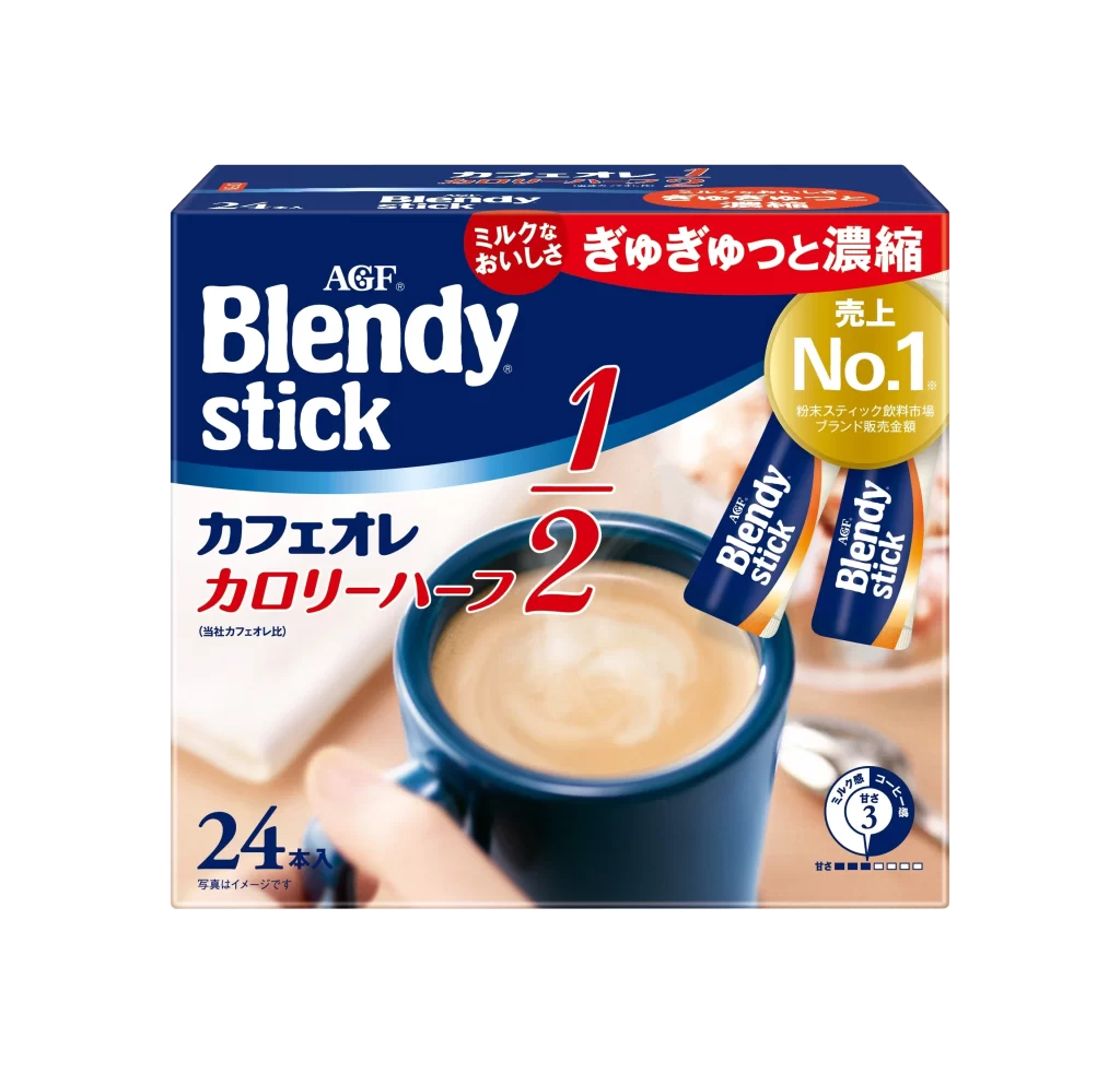
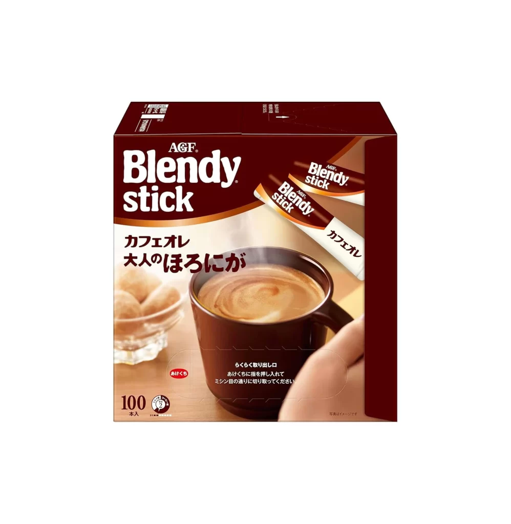
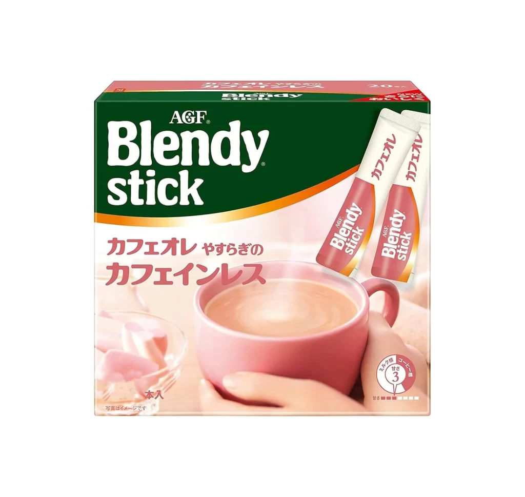
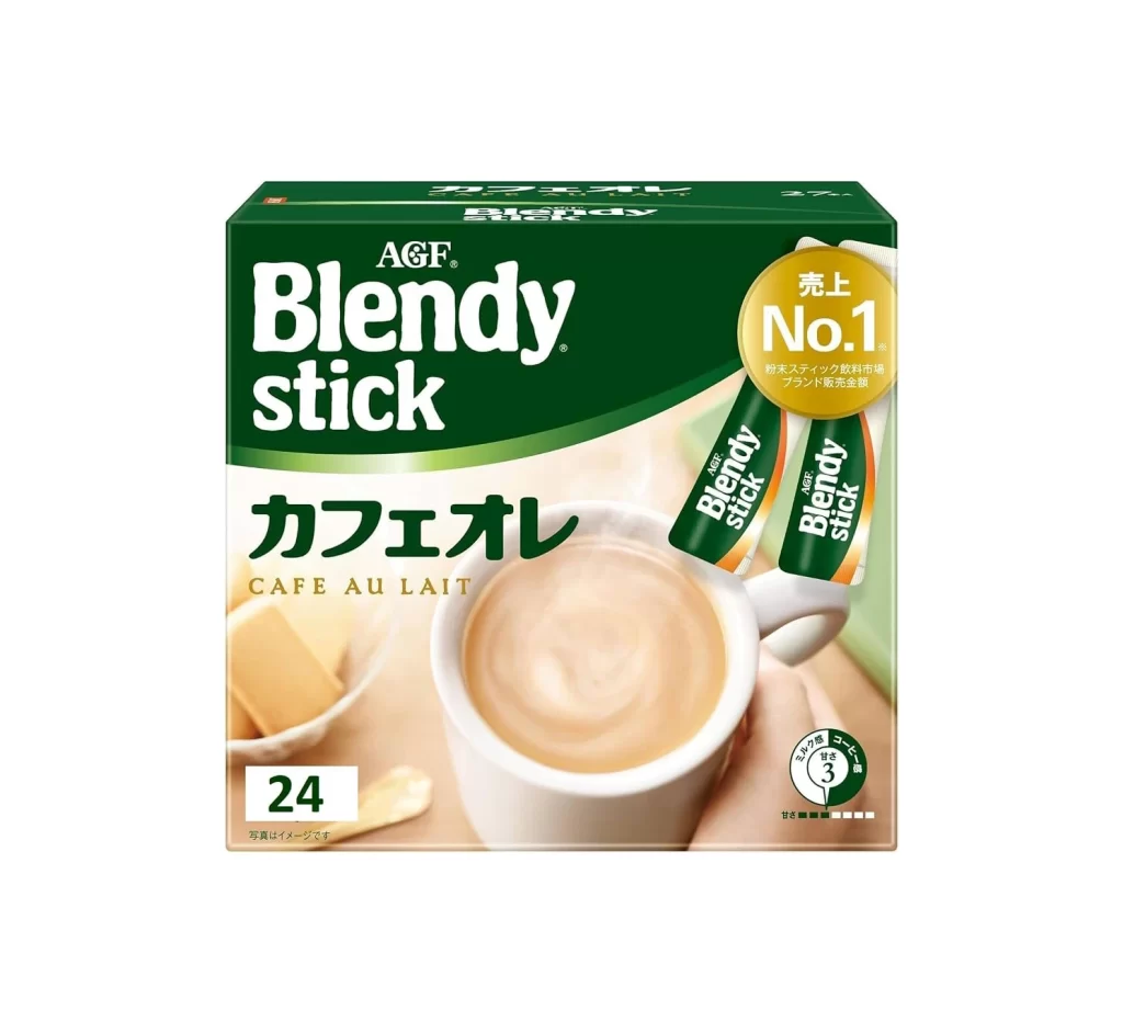
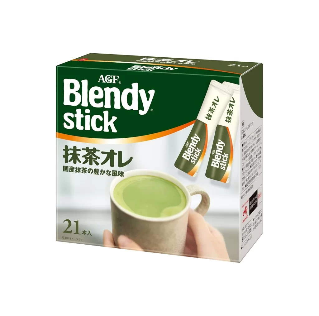
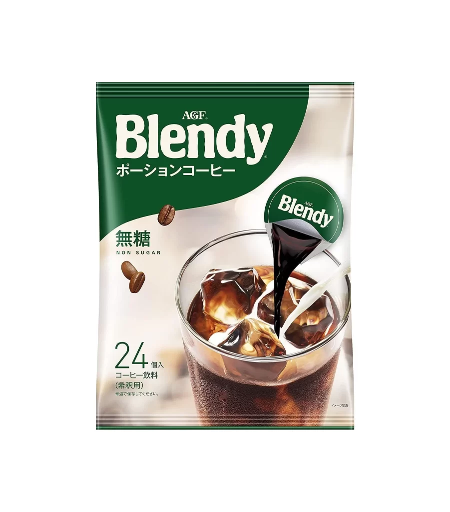
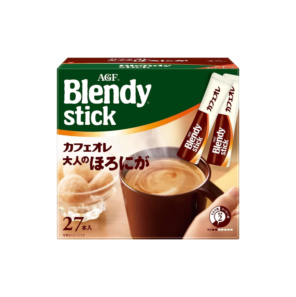
Rich emerald green dominates the upper half of this rectangular cardboard package, transitioning into a warm cream-colored lower section via a curved orange-gold band. Bold white sans-serif lettering spells 'Blendy stick' beneath the smaller 'AGF' brand name, while Japanese characters for 'Café au lait' appear in dark brown below. The front panel features a photographic image of a steaming brown ceramic mug filled with light tan coffee, accompanied by two individual stick packets angled toward the upper right and a glass bowl of sugar cubes to the left.
Visual hierarchy is established through the striking contrast between the saturated green header and the photographic realism of the coffee scene below. The packaging leverages appetite appeal by showing the actual texture of the foam and the inviting warmth suggested by the steam rising from the cup. Typography plays a crucial role here, mixing English branding with descriptive Japanese text to signal both product identity and flavor profile to a bilingual consumer base.
Product photographers studying food and beverage packaging will find the lighting setup on the mug particularly useful for understanding how to highlight liquid textures. Graphic designers working on international retail goods can analyze how the layout balances multiple languages without cluttering the visual field. Illustrators needing reference for everyday objects like ceramic mugs or sugar bowls can extract accurate material details and proportions from this composition.