Title

Baked Goods Blue Gold Packaging Design


Topics

No Topics

Details

Uploaded user: Leo

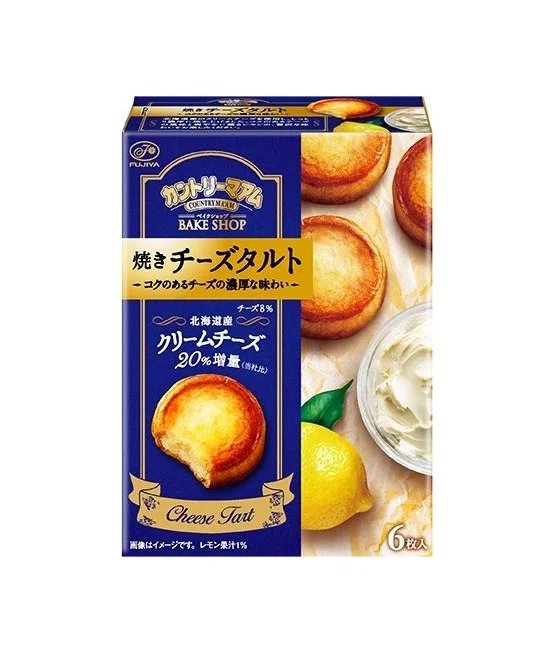
Deep royal blue dominates the rectangular cardboard box, accented by metallic gold typography and decorative borders that frame the central product photography. The front face displays Japanese characters for "Baked Cheese Tart" and "Cream Cheese" alongside the English words "BAKE SHOP" and "Cheese Tart," while a realistic image of a golden-brown, flaky pastry with a bite taken out sits in the lower left quadrant. To the right, additional whole tarts appear atop a marble-like surface next to a halved lemon and a glass bowl of white cream, all captured from a straight-on perspective under even studio lighting.

Visual hierarchy relies on the striking contrast between the saturated navy background and the warm gold foil elements, which guide the eye from the brand logo at the top down to the appetizing food imagery. The combination of elegant serif fonts for the English text and bold, stylized Japanese lettering creates a sophisticated yet accessible aesthetic typical of premium confectionery packaging. Realistic texture details in the pastry's caramelized surface and the creamy filling provide tactile visual cues that emphasize the product's freshly baked quality.

Packaging designers studying color theory applications for luxury snack brands would find this composition particularly useful for understanding how metallic accents enhance perceived value. Marketing teams developing visual identity systems for bakery chains could reference the typographic balance between local and international language elements. Food photographers might examine the lighting setup used to highlight the glossy, toasted edges of the tarts without creating harsh shadows on the reflective gold text.