Casswell Massey Leather Good Box
Topics
Details
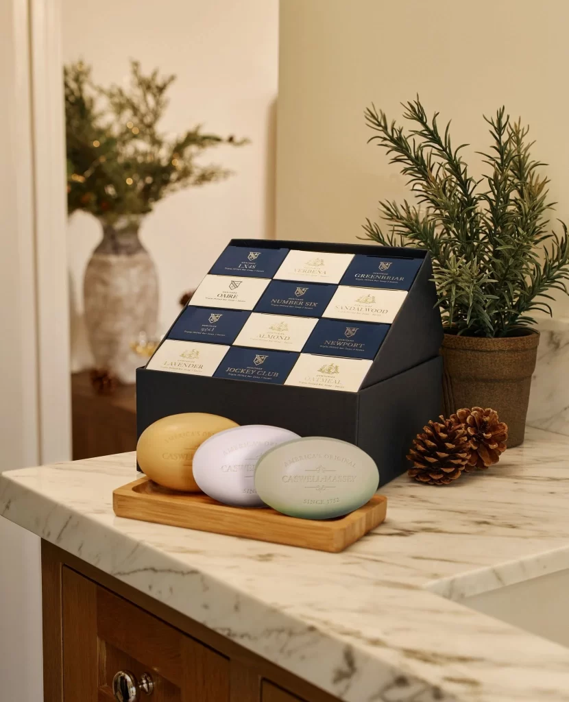
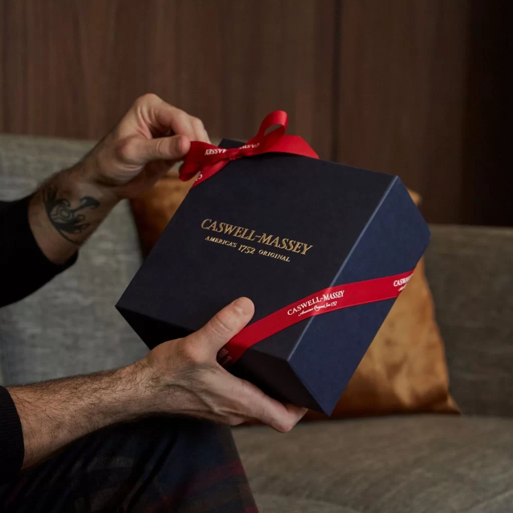
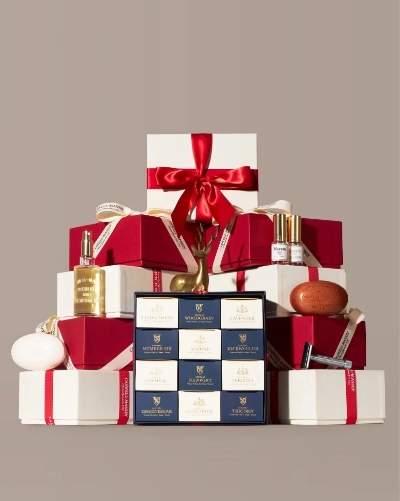
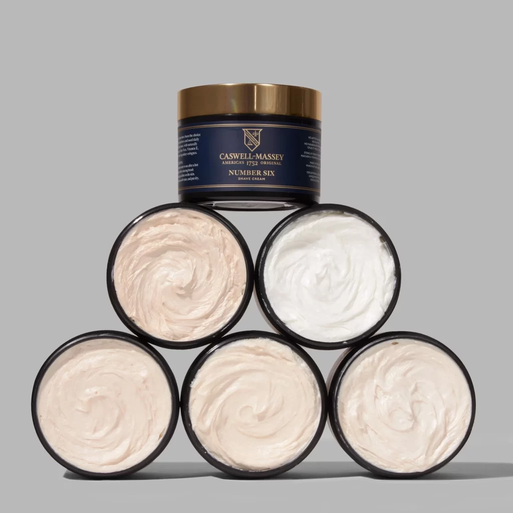
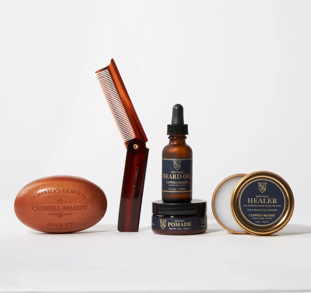
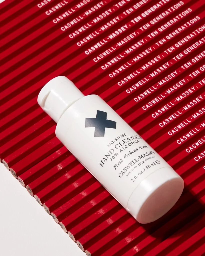
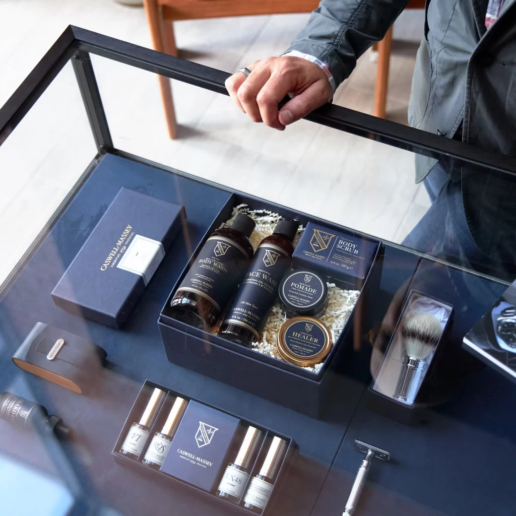
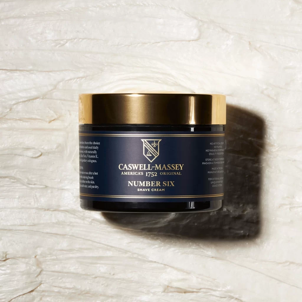
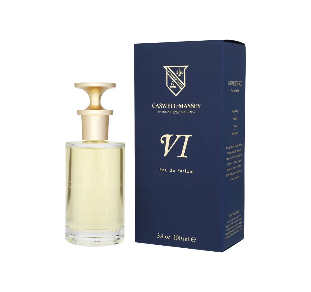
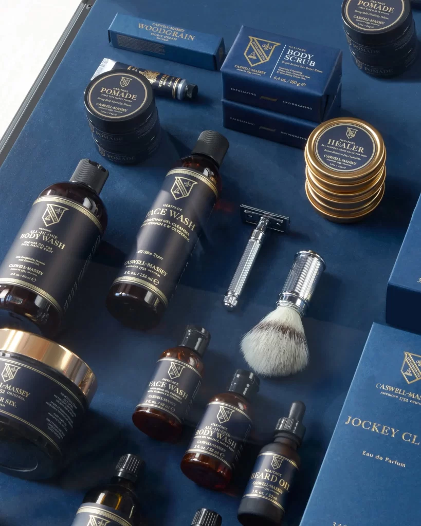
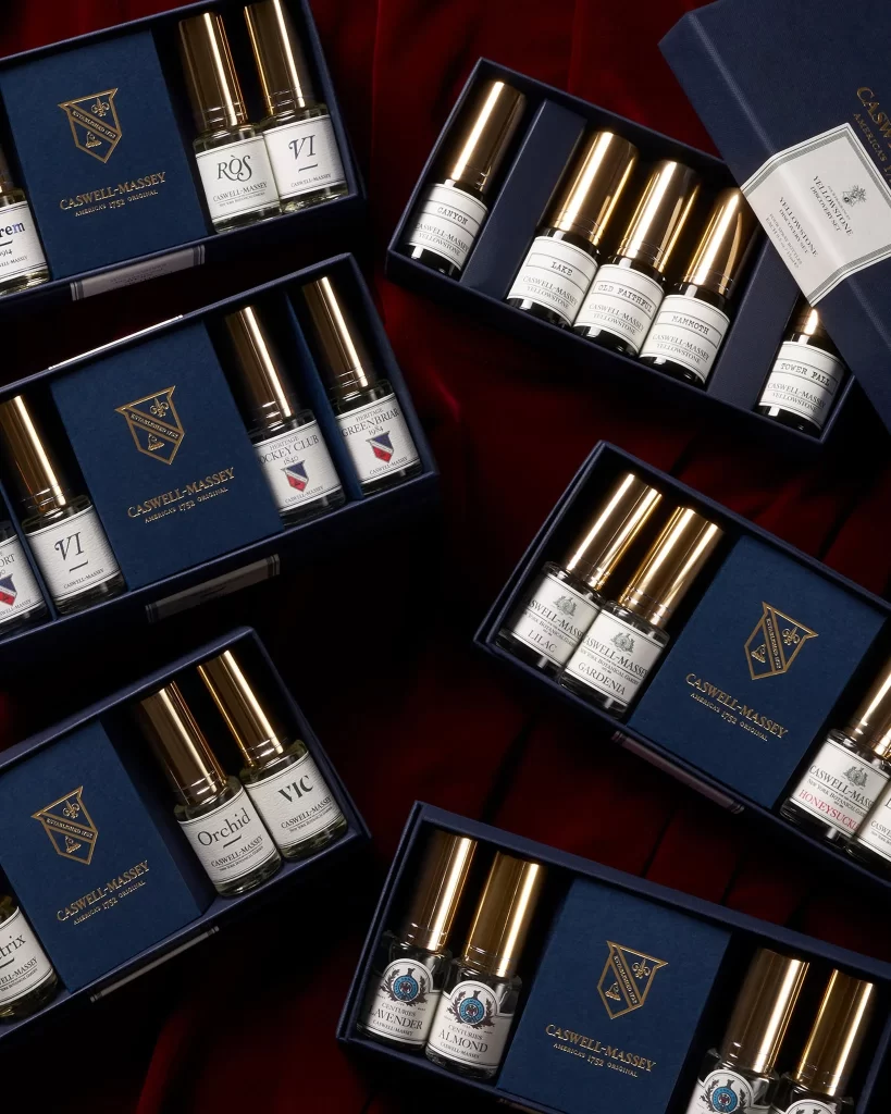
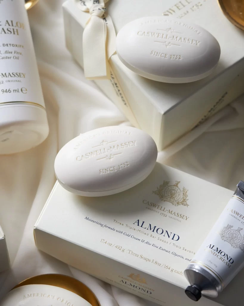
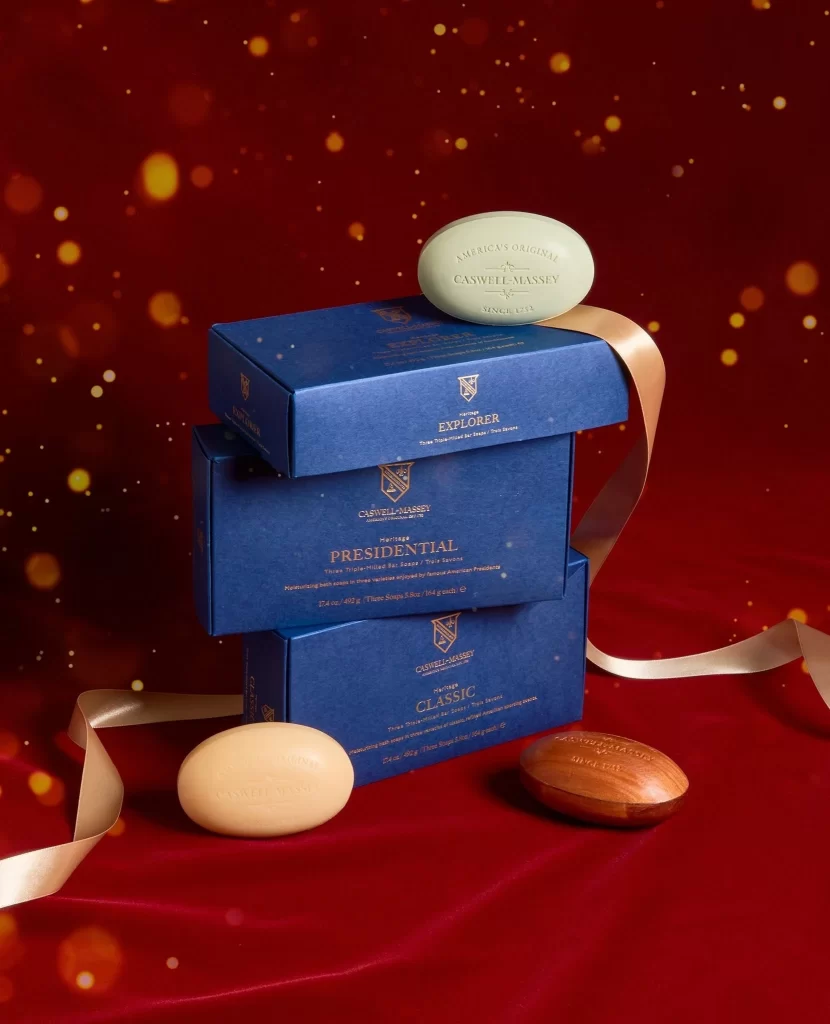
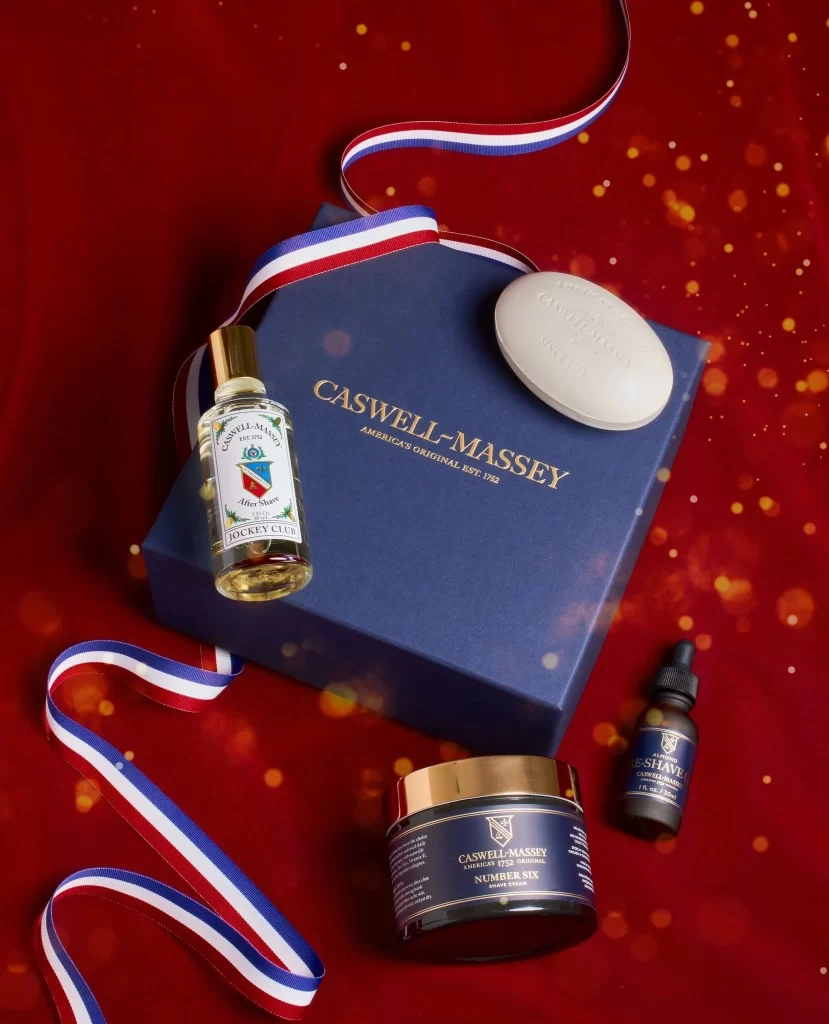
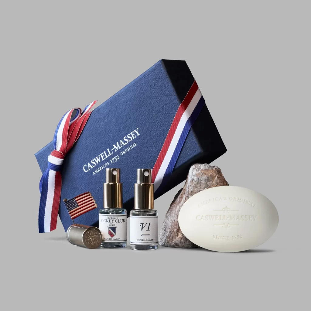
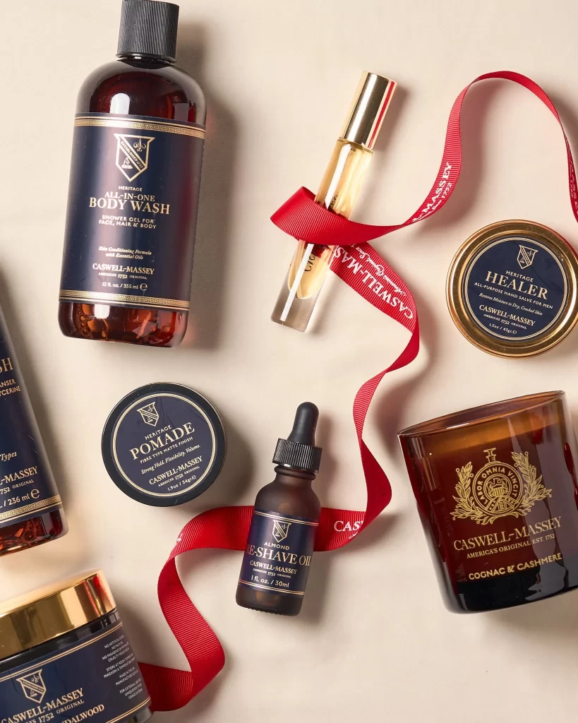
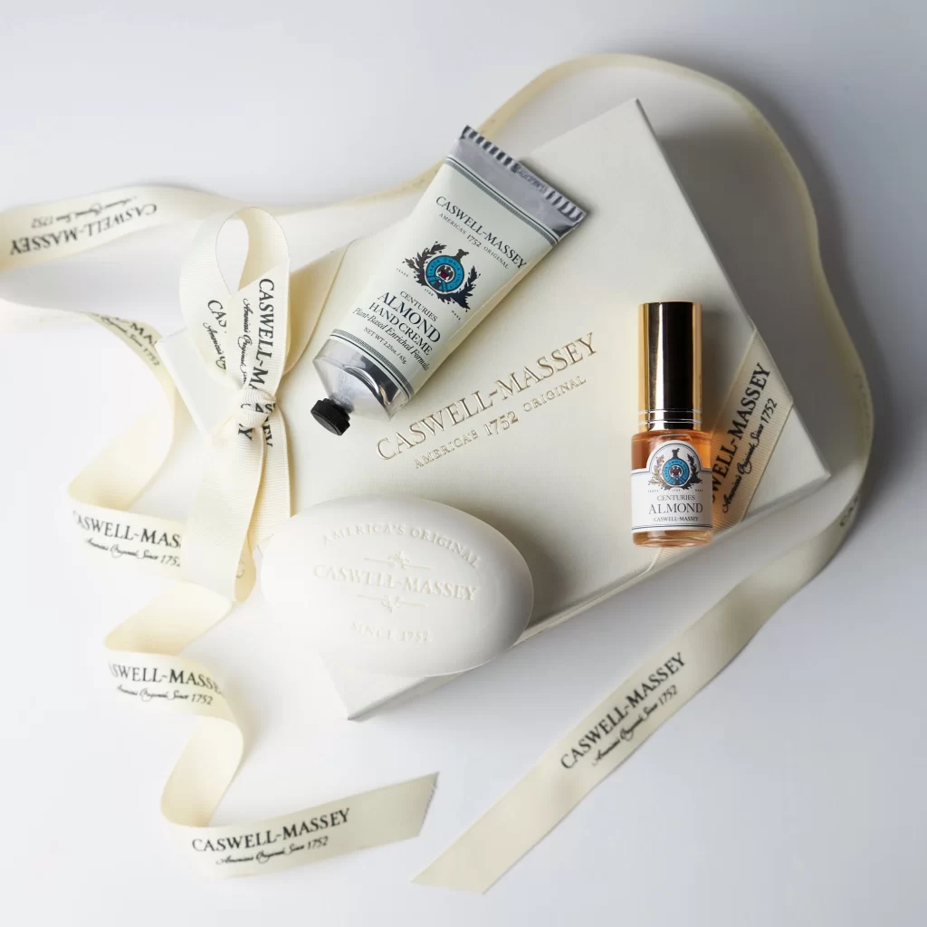
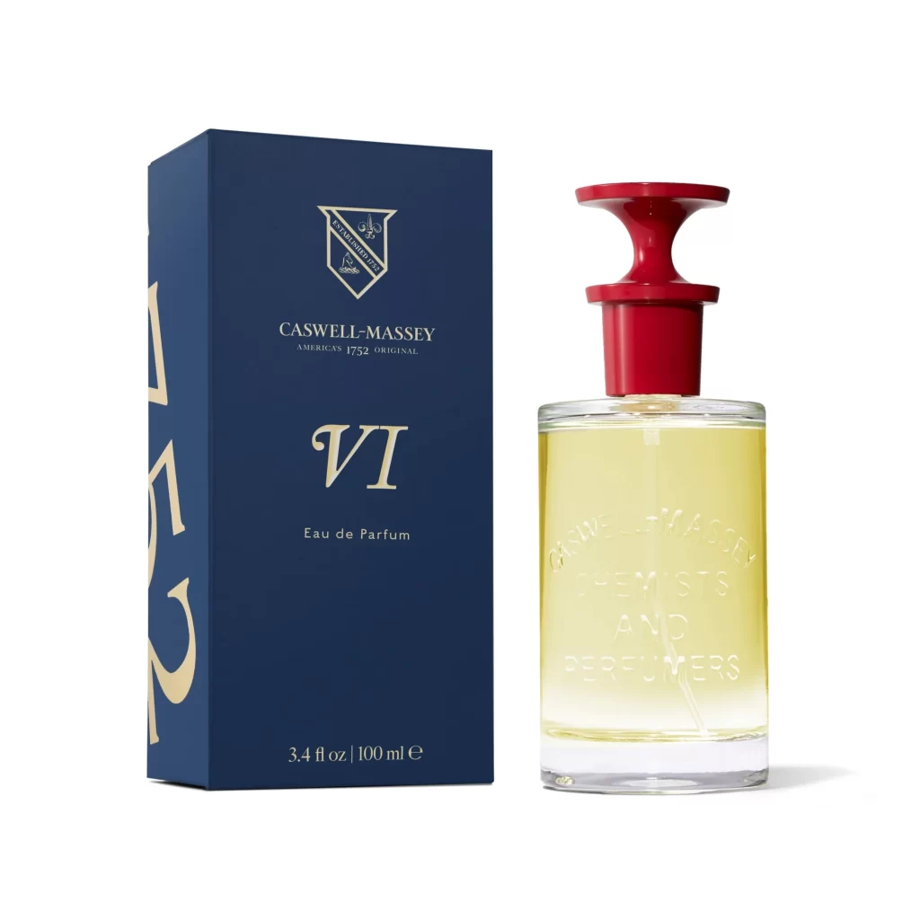
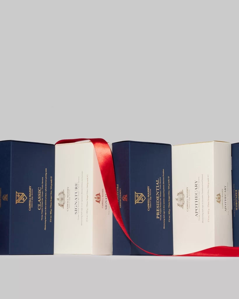
Against a seamless light gray backdrop, five rectangular boxes stand in a tight row, alternating between deep navy blue and crisp white. A vibrant crimson satin ribbon drapes diagonally across the center of the arrangement, catching the light with a subtle sheen. Each box features elegant gold serif typography, displaying brand names like 'Casswell-Massey' alongside product titles such as 'Classic', 'Signature', 'Presidential', and 'Apothecary'. The camera maintains a straight-on eye-level perspective, ensuring every detail of the embossed crests and fine print remains perfectly legible under soft, even studio lighting.
Visual distinction emerges from the sophisticated interplay between the matte paper textures and the glossy ribbon accent. The strict color alternation creates a rhythmic pattern that guides the eye across the composition, while the consistent use of gold foil stamping unifies the diverse product line. Such deliberate material contrasts and typographic hierarchy demonstrate how luxury packaging balances minimalism with ornate detailing to convey heritage and quality.
Brand strategists might study this layout to understand how color blocking can organize a product portfolio while maintaining visual cohesion. Packaging designers could reference the specific weight of the serif fonts and the placement of heraldic crests when developing their own premium identity systems. Photographers working on e-commerce shoots will find value in analyzing how the ribbon adds a dynamic diagonal element to an otherwise static grid of objects.