Caswell Massey Pomade Jar
Topics
Details
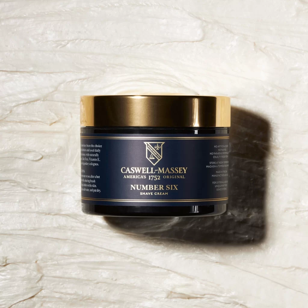
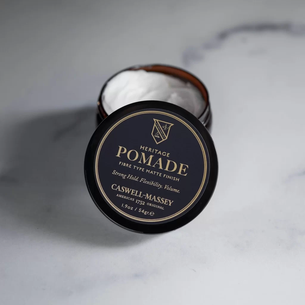
Against a cool-toned marble surface with subtle grey veining, an open black tin of Caswell-Massey Heritage Pomade sits at a slight three-quarter angle, its circular lid propped forward to reveal the white, matte-finish product within. The lid features a deep navy label bordered by thin gold lines, displaying serif typography that identifies the item as a fibre-type pomade promising strong hold, flexibility, and volume. Soft directional lighting from the upper left casts gentle shadows beneath the container, emphasizing the metallic rim and the creamy texture of the pomade visible inside the dark cylindrical vessel.
Visual distinction emerges from the stark contrast between the obsidian packaging and the luminous gold foil lettering, which creates a vintage apothecary aesthetic rooted in the brand's 1752 heritage. The shield-shaped crest positioned above the product name adds heraldic weight to the composition, while the off-center placement of the lid introduces dynamic asymmetry to an otherwise symmetrical object. Such deliberate use of classical typography against modern minimalist backgrounds suggests a design language that bridges historical authenticity with contemporary grooming standards.
Product photographers studying luxury cosmetic packaging will find value in how this shot balances text legibility with atmospheric depth through selective focus and controlled contrast. Industrial designers analyzing container ergonomics can reference the relationship between the lid's diameter and the jar's opening for user-experience considerations in similar beauty applications. Art directors developing brand identity systems might examine the hierarchy established by varying font weights and the strategic deployment of metallic accents to convey premium positioning without overwhelming the visual field.