Caswell Massey Soap and Cream
Topics
Details
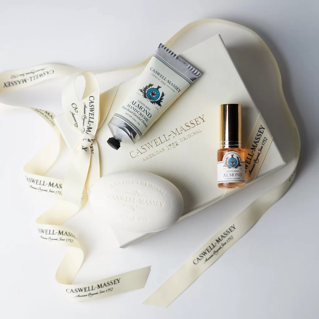
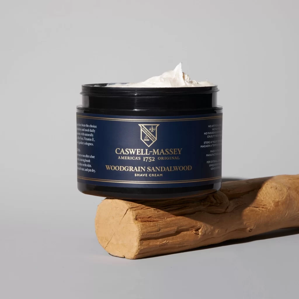
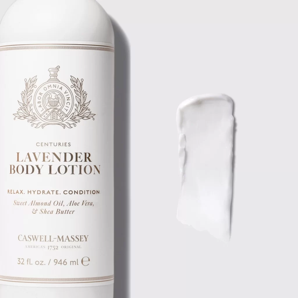
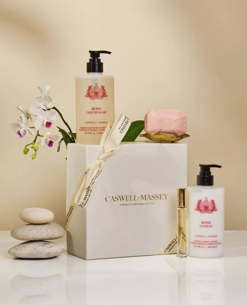
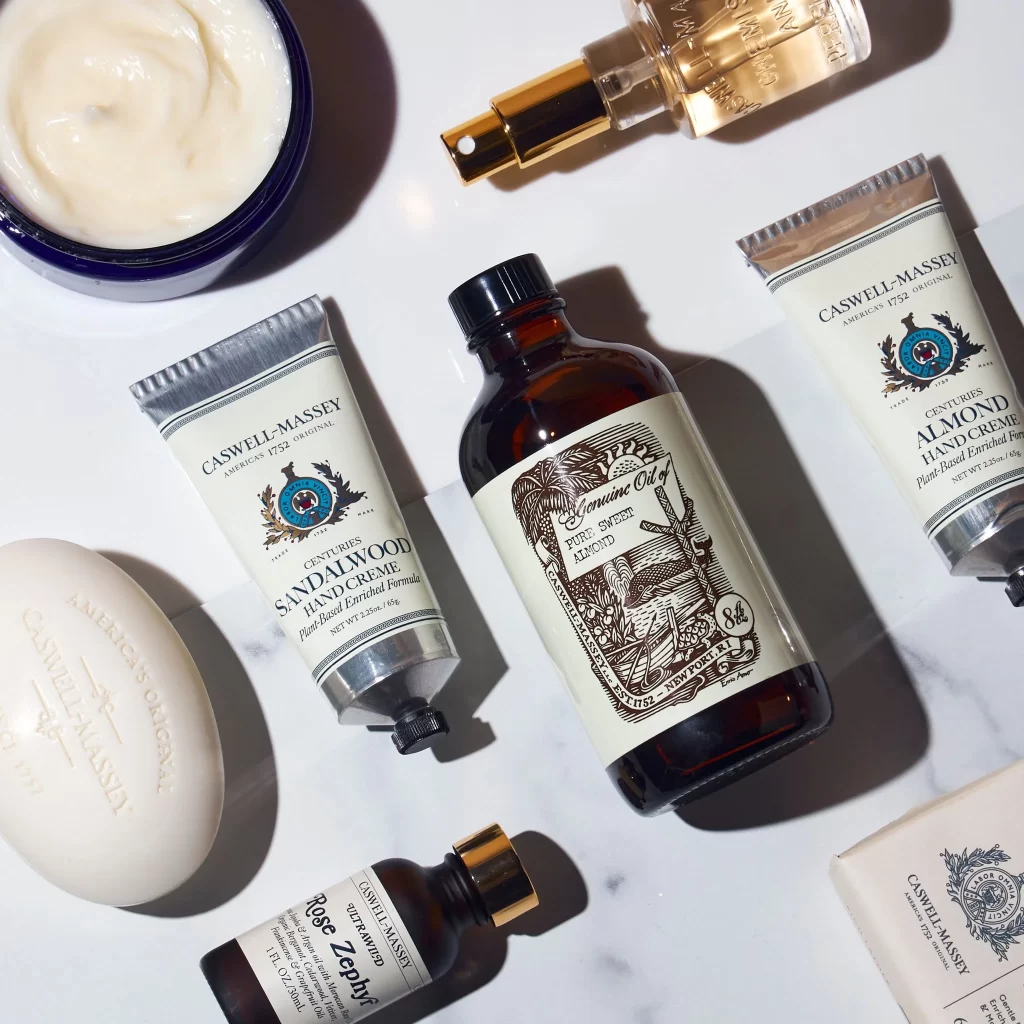
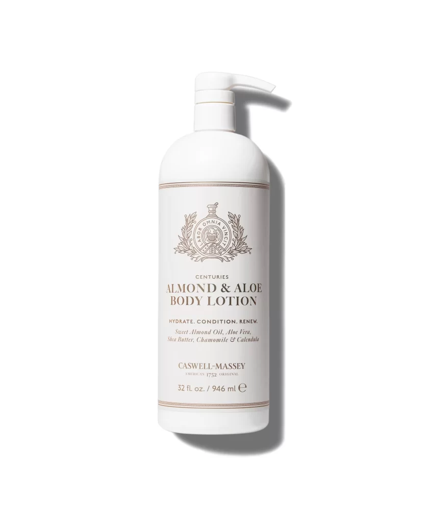
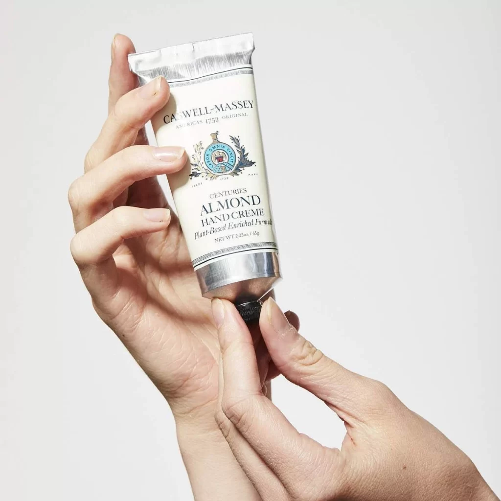
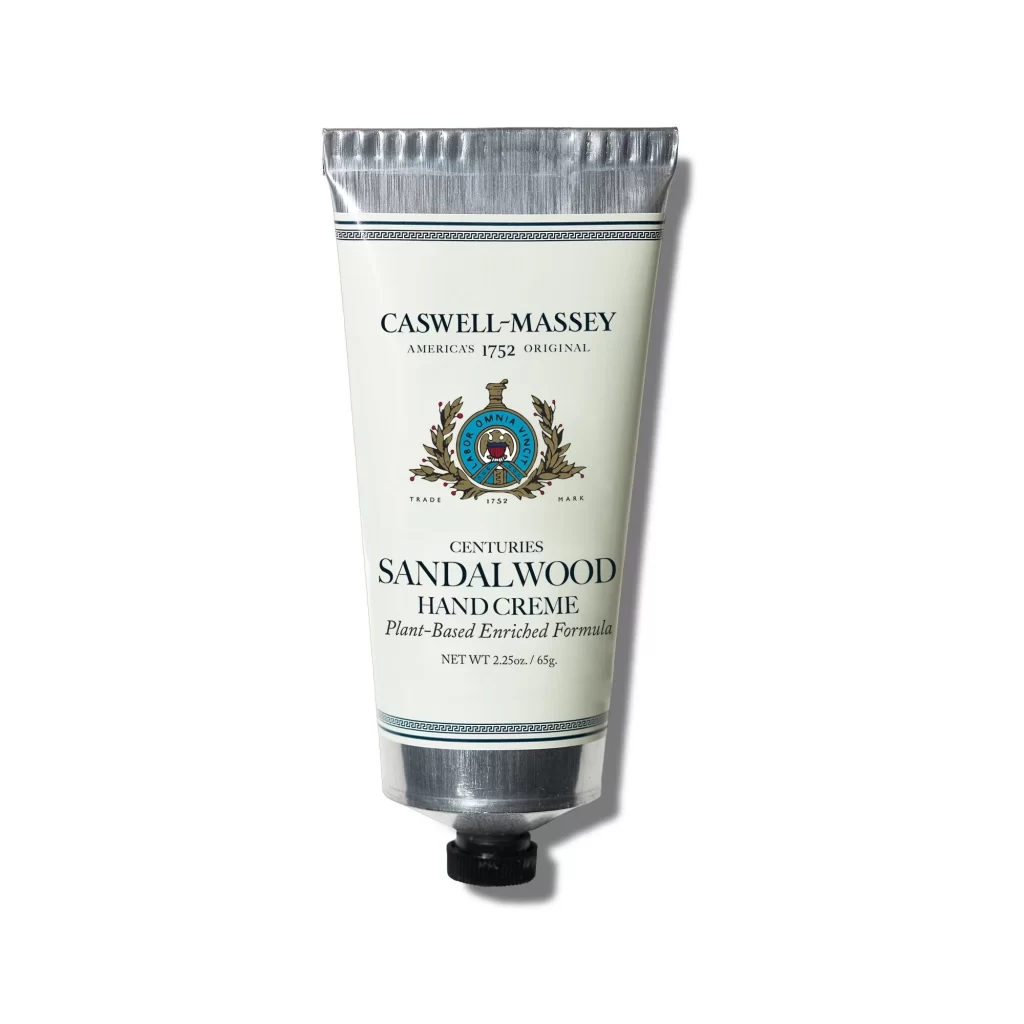
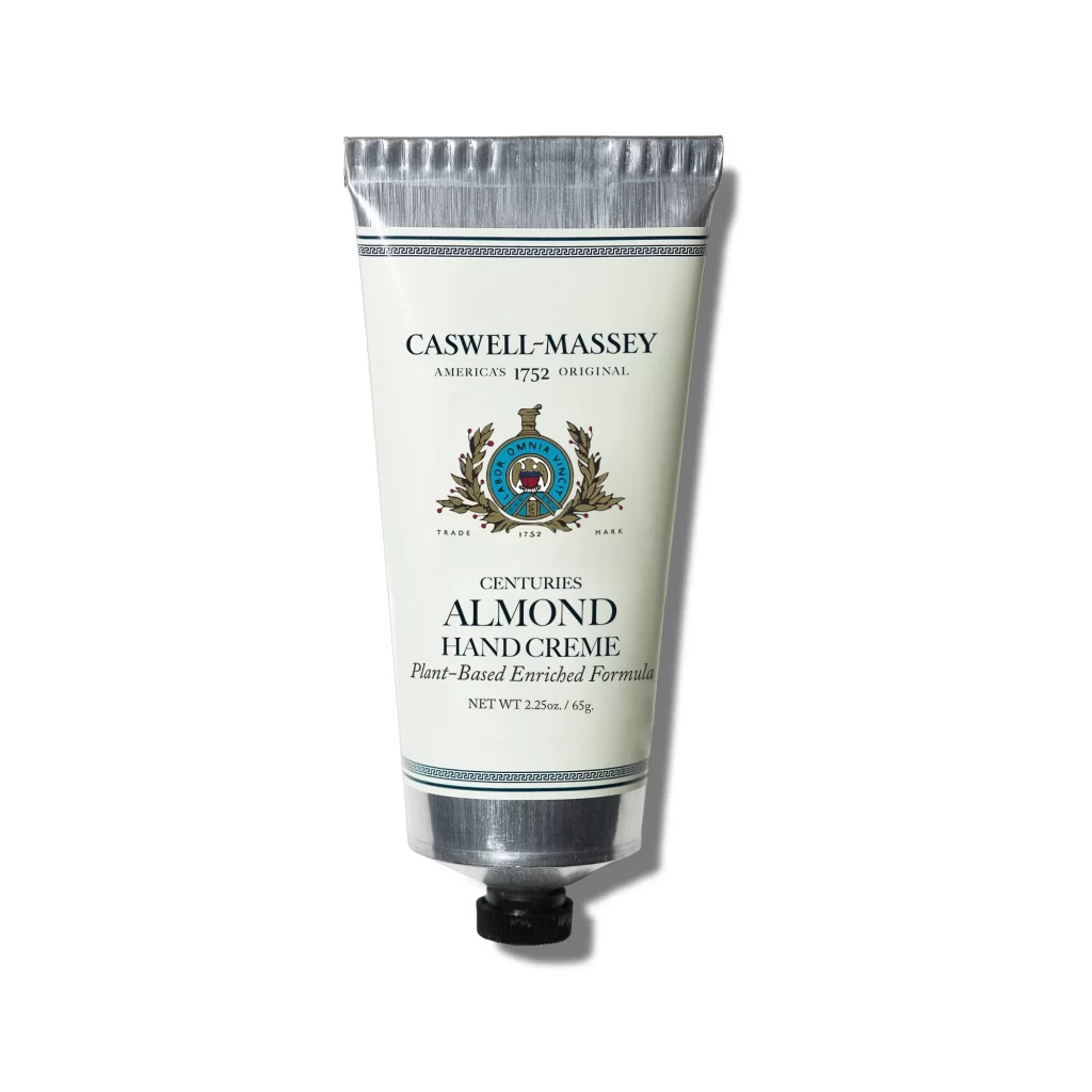
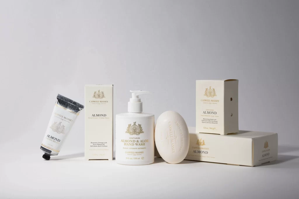
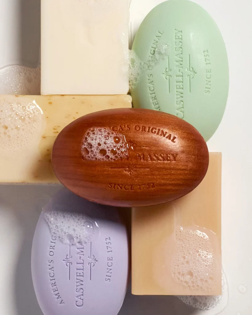
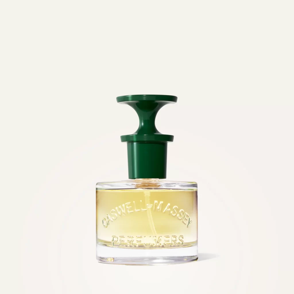
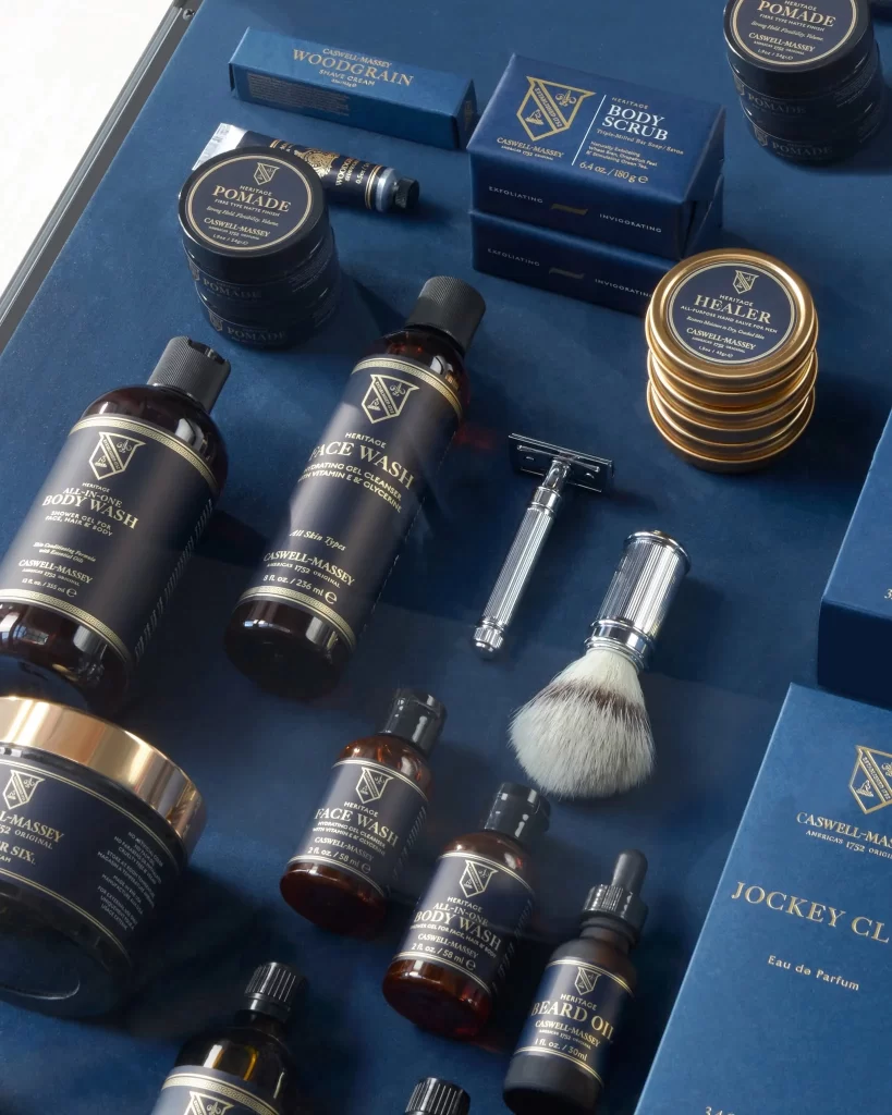
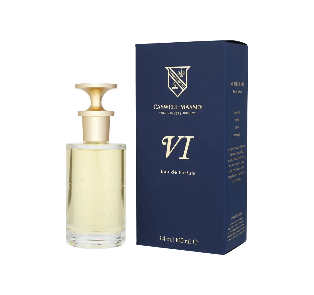
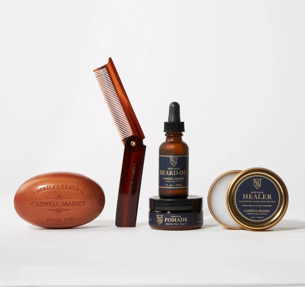
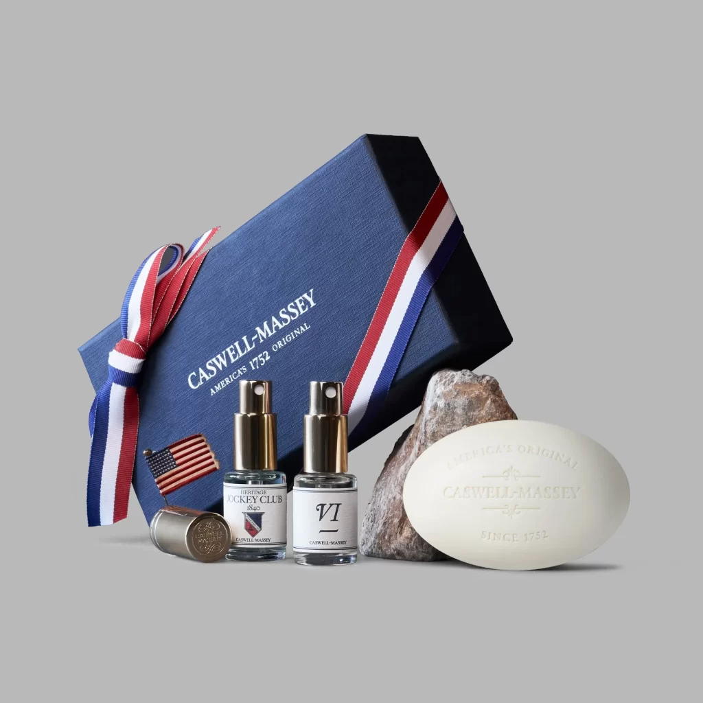
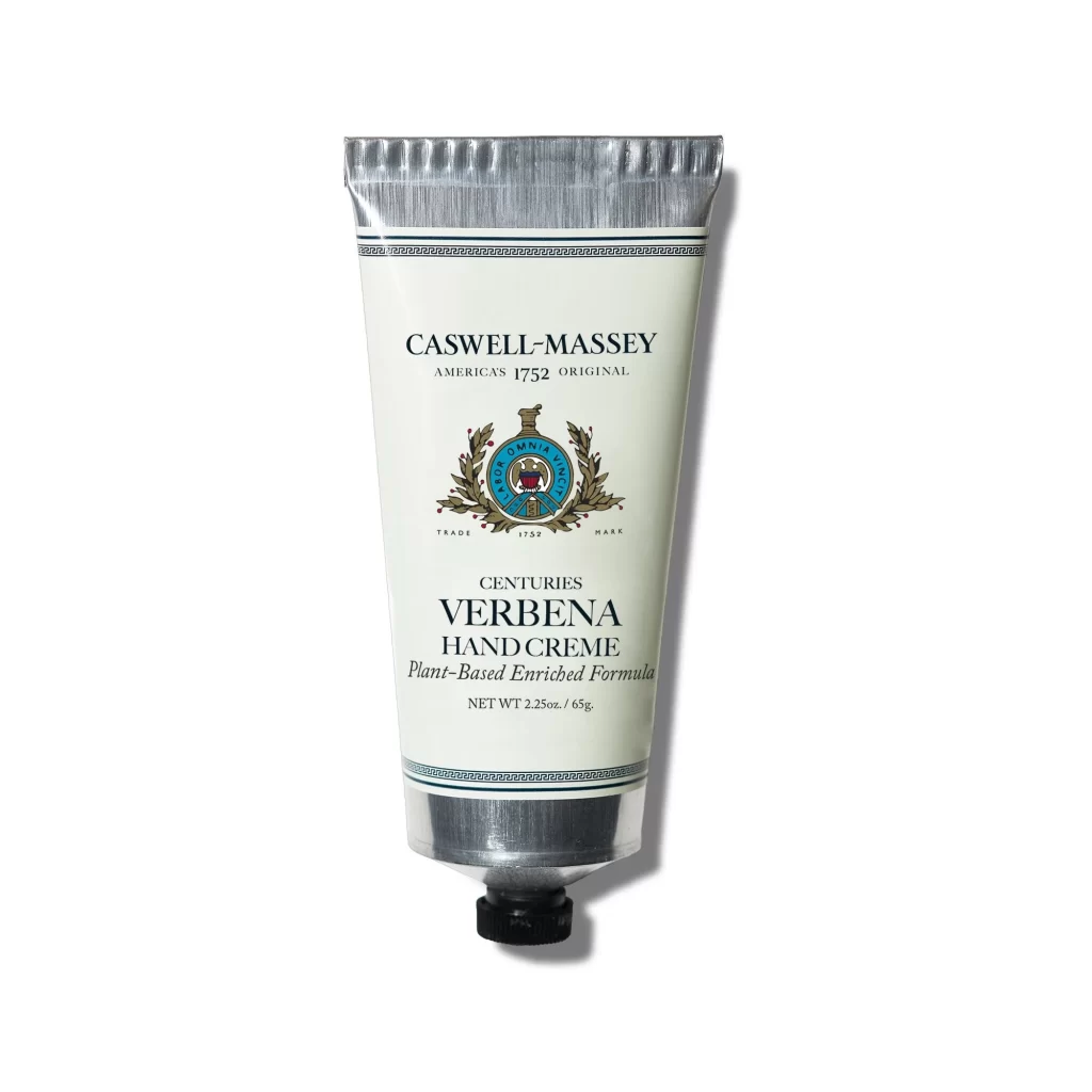
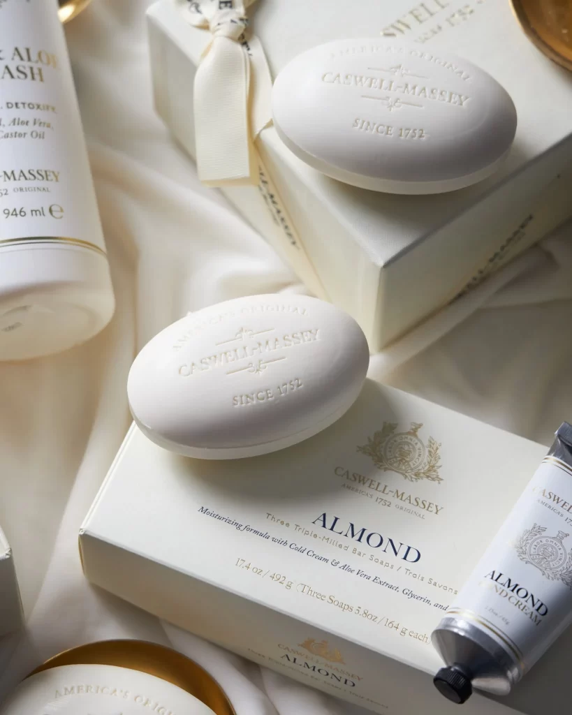
Soft ivory tones dominate the composition, where oval bars of white soap rest atop crisp packaging embossed with gold and navy lettering. The camera hovers at a slight angle, revealing the raised serif text 'CASWELL-MASSEY SINCE 1752' pressed into the soap's surface alongside boxes labeled 'ALMOND' and 'HAND CREAM'. Gentle light spills across the arrangement, highlighting the matte texture of the paper, the metallic sheen of a tube's cap, and the delicate cream ribbon tied around a gift box in the background.
Visual distinction emerges from the disciplined palette of whites, creams, and subtle metallic accents that evoke heritage apothecary traditions. The interplay between tactile elements—smooth soap curves, rigid box corners, and glossy tube surfaces—creates a sophisticated material contrast. Typography serves as both information and ornament, with the embossed brand name on the soap adding dimensional depth while the printed packaging maintains elegant legibility through restrained color choices.
Art directors developing luxury beauty campaigns might study this layout to understand how neutral backgrounds amplify product prestige without visual clutter. Packaging designers could analyze the hierarchy of embossed versus flat printing techniques to inform their own premium branding projects. Photographers specializing in still life would find value in observing how diffused lighting eliminates harsh shadows while preserving textural details across varied materials.