Chocolate Bar With Cacao Fruit Experience Box
Topics
Details
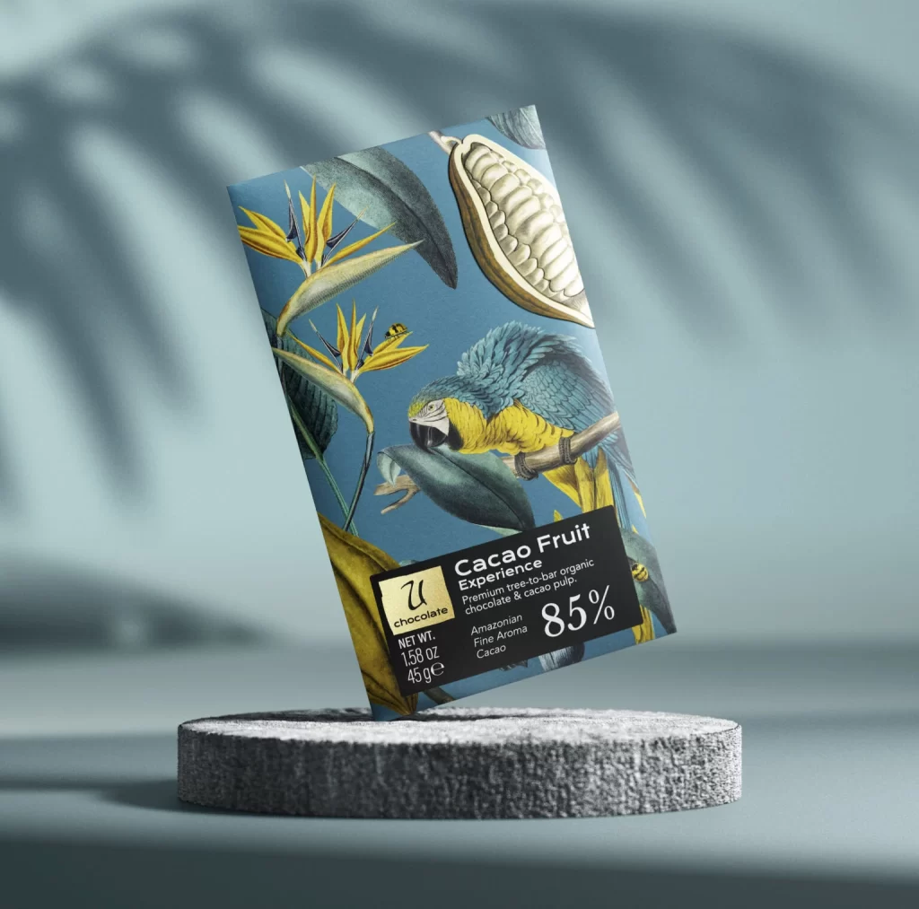
Resting on a textured gray stone pedestal, the chocolate bar package leans at a slight angle against a soft teal background where blurred palm frond shadows dance across the surface. The box itself features a rich botanical illustration with a vibrant blue and yellow macaw perched among tropical bird-of-paradise flowers and an open cacao pod revealing its pale beans, all set against a deep cerulean backdrop. A black rectangular label anchors the lower portion displaying 'Cacao Fruit Experience' in bold white typography alongside '85%', while smaller text indicates Amazonian fine aroma cacao and a net weight of 1.59 oz or 45g next to a gold square logo.
What sets this packaging apart is its sophisticated blend of scientific illustration aesthetics with modern luxury branding, creating a visual narrative that feels both educational and indulgent. The color palette deliberately contrasts cool blues and greens against warm yellows to draw immediate attention to the parrot and cacao elements, establishing a clear exotic origin story before the consumer even reads the product details. Typography choices balance elegance with readability, using weight variations to guide the eye from the experiential product name down to specific sourcing information without overwhelming the intricate artwork.
Packaging designers studying premium food branding could analyze how this layout balances dense illustrative content with essential regulatory information while maintaining visual hierarchy. Art directors developing tropical or botanical product lines might reference the specific way natural elements are arranged to frame the central product identity rather than merely decorate empty space. Marketing teams launching single-origin or high-cocoa-percentage products could examine how the 85% figure is integrated as a design element rather than an afterthought, suggesting quality through typographic scale and placement.