Do Man Wine Bottle Design
Topics
Details
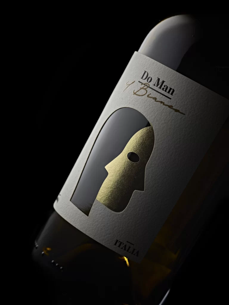
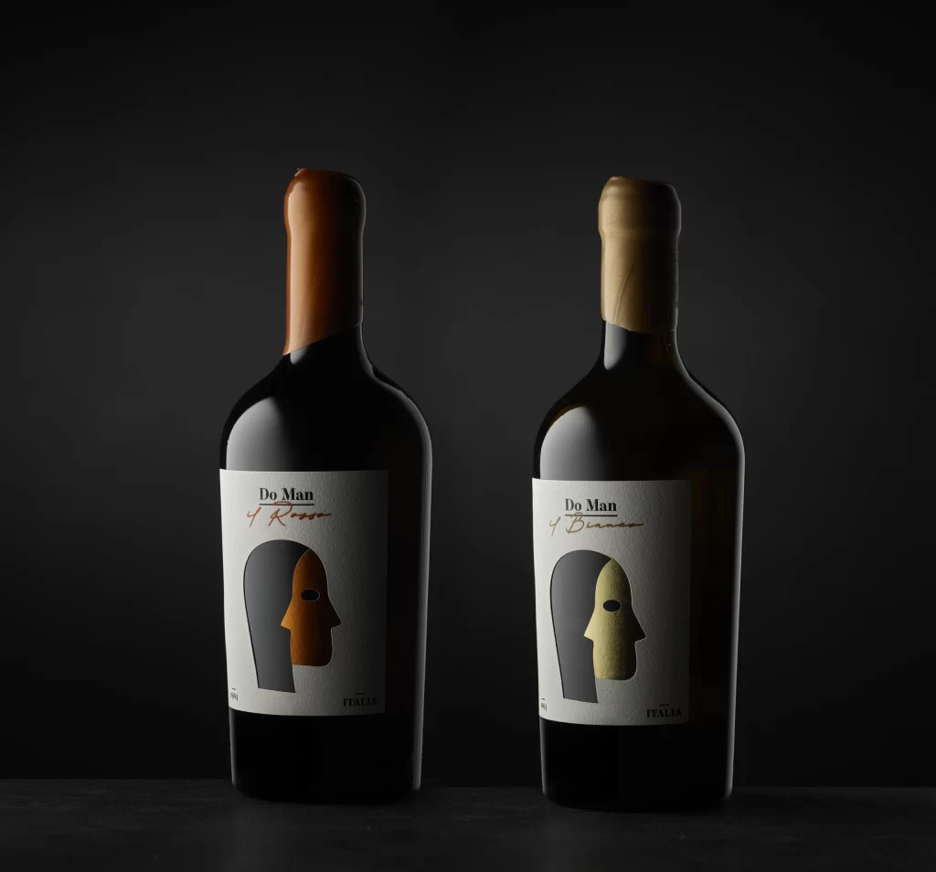
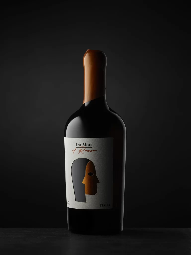
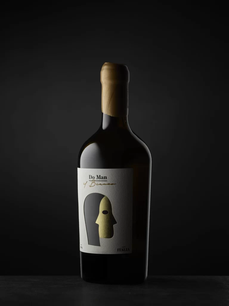
Against a seamless black gradient background, a dark glass wine bottle stands centered in the frame, illuminated by soft directional lighting that creates subtle highlights along its curved shoulder and neck. The vessel is sealed with a textured, tan-colored foil capsule that catches the light with a matte, organic finish. A rectangular white label dominates the lower half of the bottle, featuring the brand name 'Do Man' in bold black serif typeface above the cursive script 'di Bianco', while a stylized graphic of a face split between solid black and metallic gold occupies the central space, with 'ITALIA' printed in small capitals at the bottom right corner.
Visual interest derives from the striking dual-tone mask illustration, which employs a flat, minimalist aesthetic that contrasts sharply with the traditional typography above it. The interplay between the matte black silhouette and the shimmering gold facial section creates a sense of theatrical mystery and luxury without relying on ornate detailing. Furthermore, the restrained color palette of white, black, and gold ensures the packaging maintains an elegant, contemporary presence that feels both artistic and commercially viable.
Packaging designers studying premium beverage branding would find this composition particularly useful for analyzing how abstract iconography can convey sophistication and narrative depth. Art directors working on luxury goods campaigns might reference the lighting setup to understand how to photograph dark glass surfaces without losing label legibility. Additionally, typographers could examine the hierarchy between the formal serif logo and the flowing script to see how contrasting font styles establish brand personality within a confined label space.