Do Man Wine Bottle View
Topics
Details
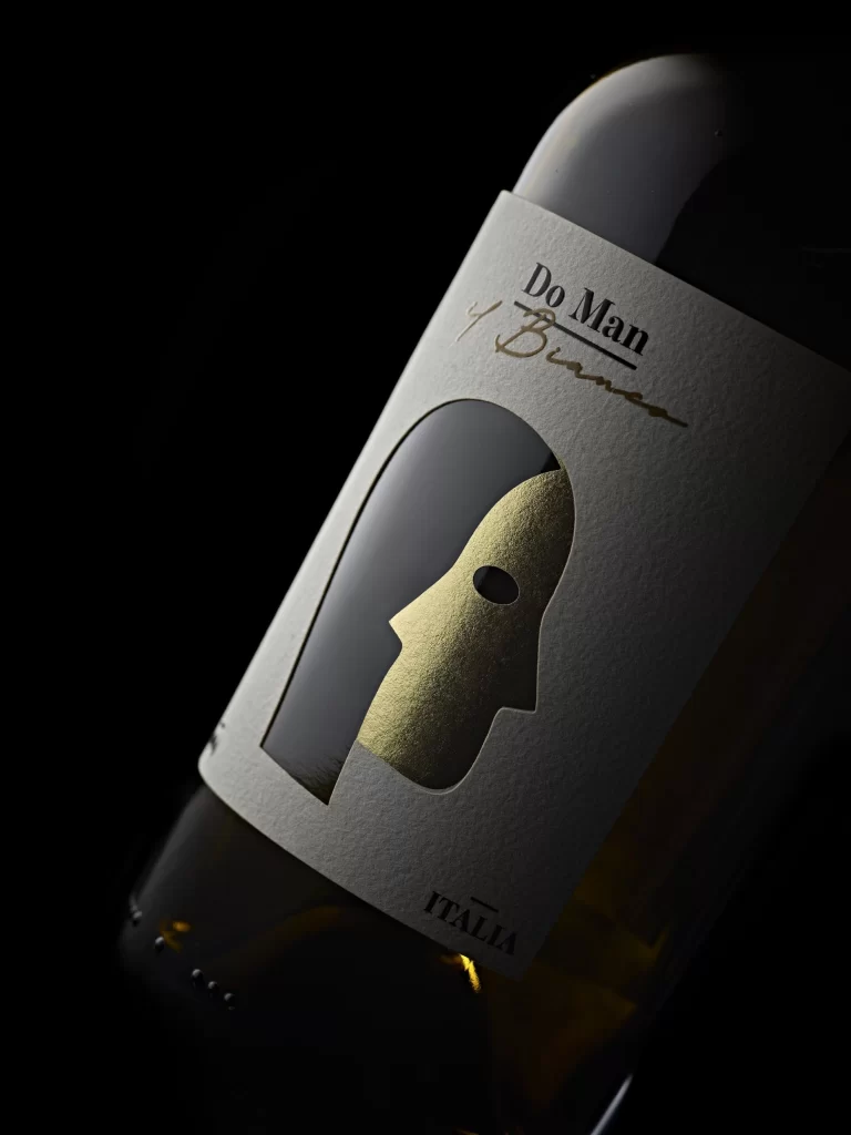
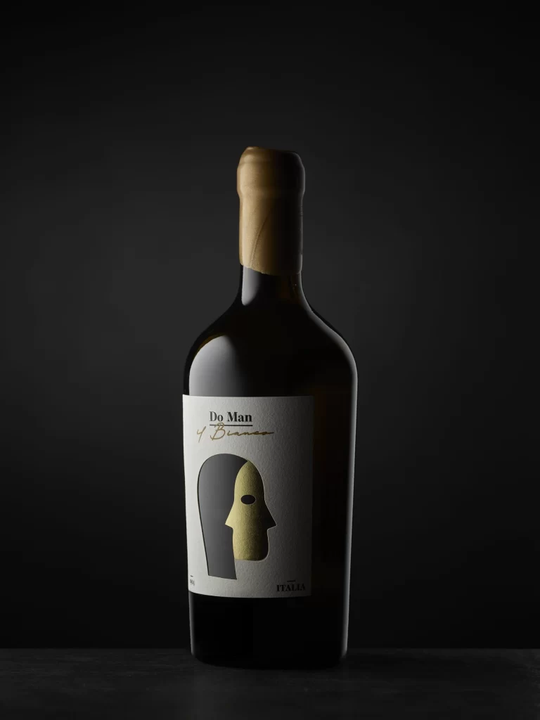
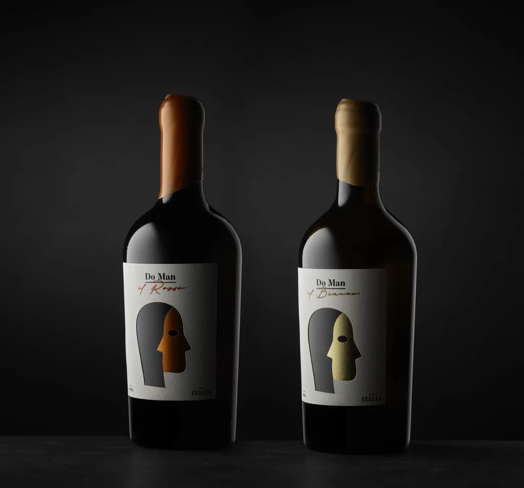
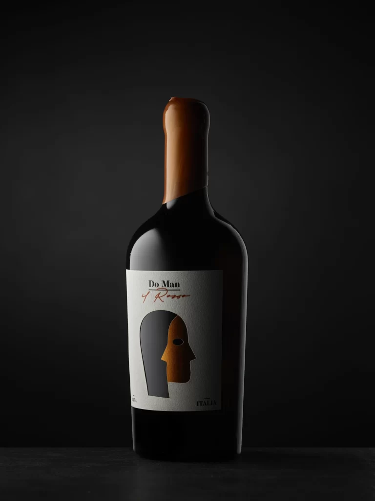
Do Man 4 Rosso appears on a minimalist white label featuring a stylized, two-toned face graphic split between charcoal black and burnt orange. The dark glass bottle is sealed with a warm copper capsule, standing in dramatic low-key lighting that fades into deep shadow.
Visual tension arises from the minimalist label design, where the abstract dual-face illustration creates an immediate sense of mystery and duality without relying on traditional viticultural imagery. The restrained color palette of black, white, and burnt orange lends the packaging a contemporary art-gallery aesthetic that feels both premium and intellectually provocative. Subtle texture on the paper label contrasts with the glossy glass surface, adding tactile depth to the overall presentation.
Brand strategists might examine this composition to understand how abstract symbolism can convey luxury and narrative depth within confined packaging real estate. Packaging engineers could study the interplay between the matte label finish and reflective glass to optimize their own product photography setups. Art directors working on boutique beverage campaigns would find the lighting ratios particularly useful for planning moody, high-contrast studio shoots.