Do Man Wine Bottle
Topics
Details
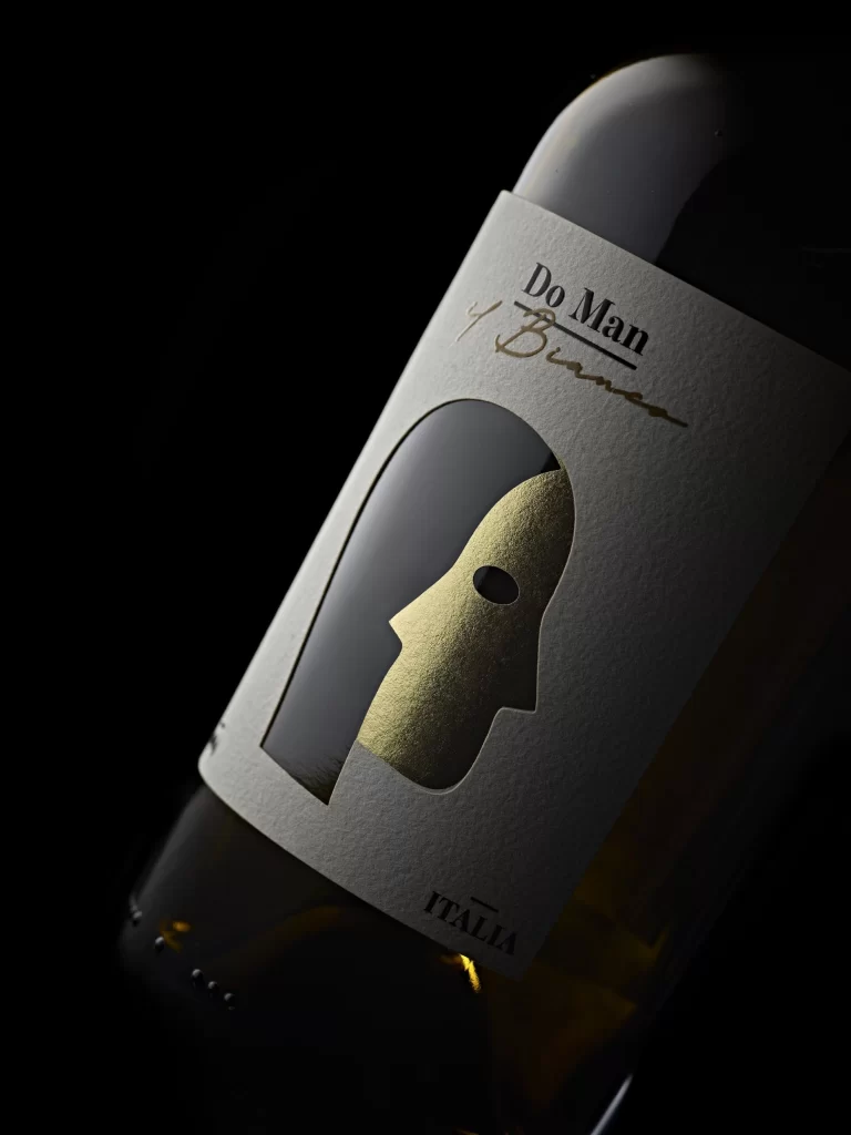
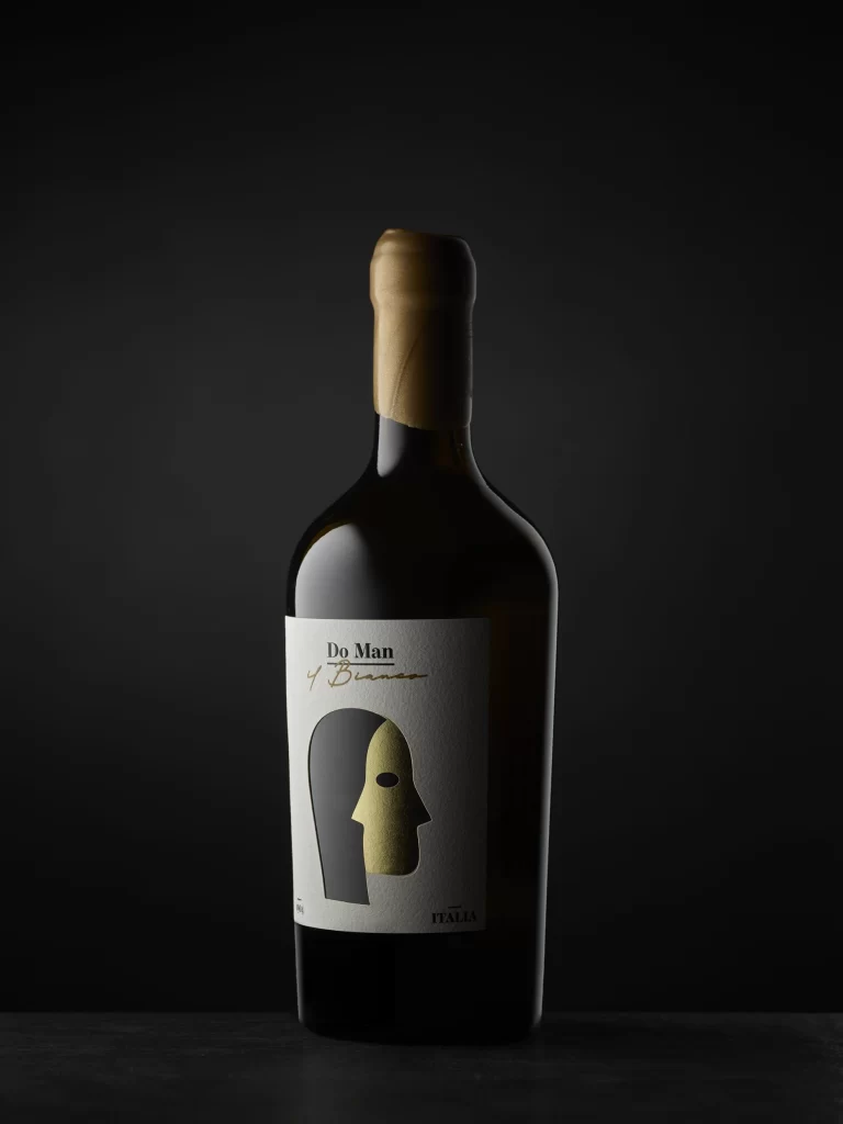
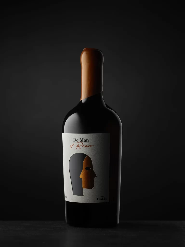
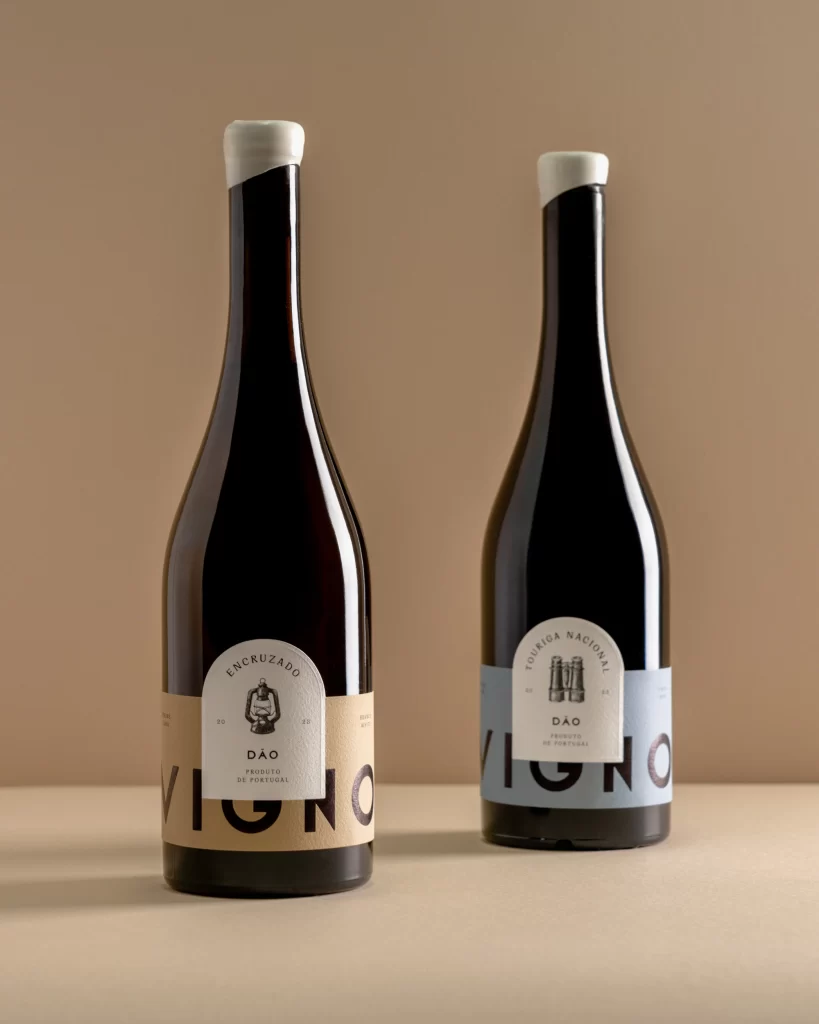
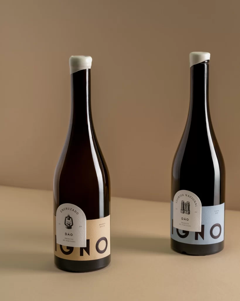
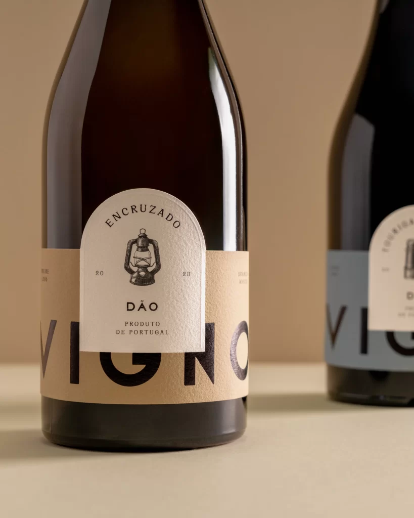
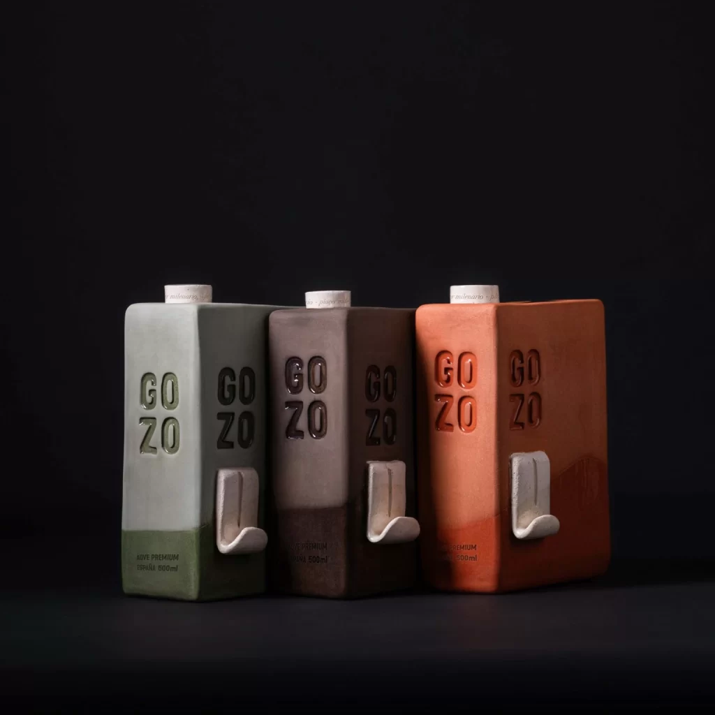
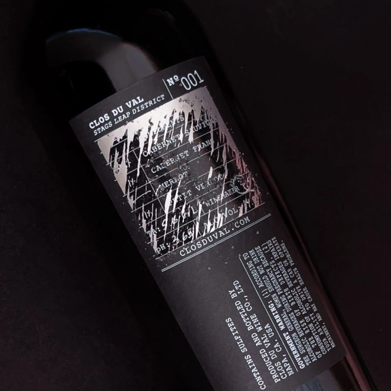
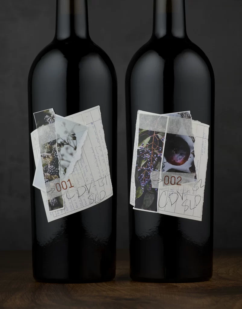
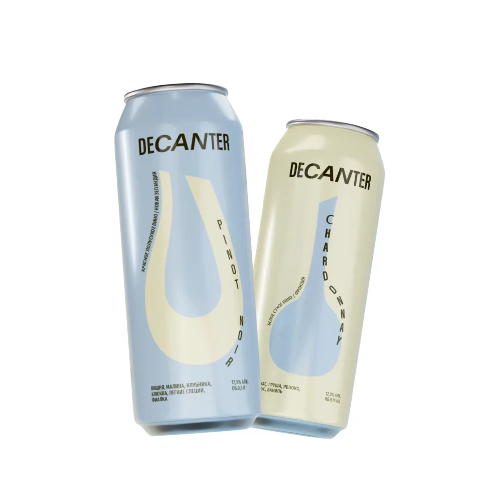
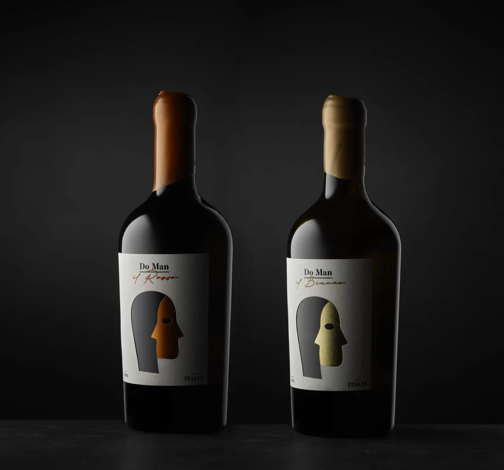
Two wine bottles stand side by side on a dark surface, illuminated by focused lighting that creates subtle highlights on their curved glass shoulders. Each bottle features a white rectangular label bearing the brand name 'Do Man' in bold black type, with 'Rosso' or 'Bianco' written in cursive script beneath it depending on the variant. The left bottle displays a stylized face graphic split between charcoal gray and burnt orange, while its counterpart shows the same motif in gray and metallic gold, both capped with wax-sealed necks in matching copper and champagne tones.
Visual distinction emerges from the minimalist mask illustration that dominates each label, using a two-tone color scheme to suggest duality or transformation within a single identity. The choice of textured paper stock for the labels combined with the hand-drawn quality of the script typography creates an artisanal aesthetic that balances modern graphic simplicity with traditional winemaking cues. Color coordination between the capsule wax, the face fill, and the varietal name reinforces product differentiation while maintaining cohesive brand identity across the line.
Packaging designers studying premium beverage branding will find value in analyzing how limited color palettes communicate product variants without cluttering the visual field. Art directors developing luxury goods campaigns can reference the lighting setup and composition techniques used to emphasize material textures like glass reflectivity and paper grain. Brand identity specialists might examine the typographic hierarchy and iconographic consistency as a case study in scalable visual systems for product families.