Do Man Wine Bottle Detail
Topics
Details
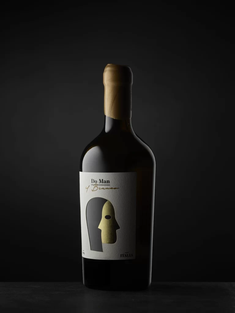
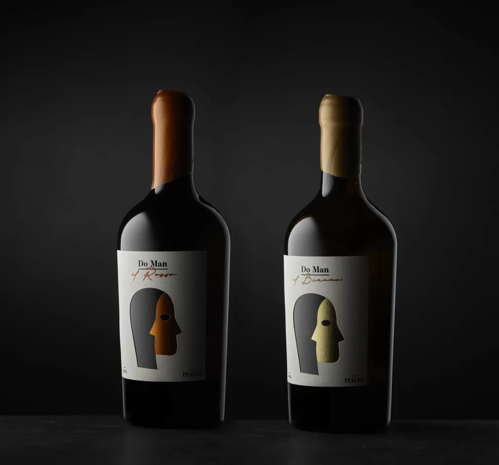
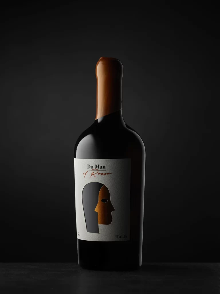
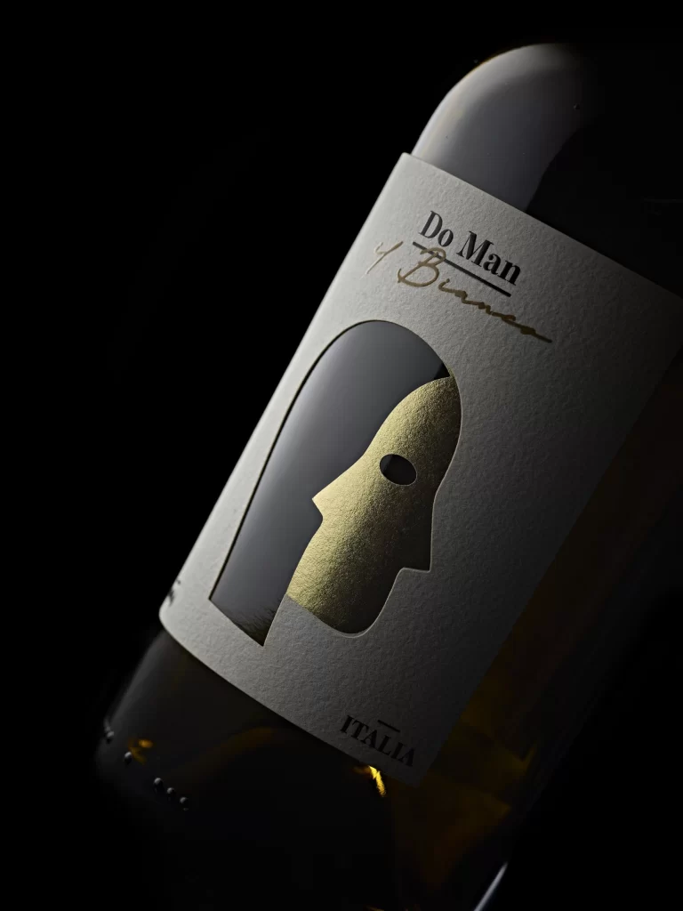
A textured white label wraps the bottle's shoulder, featuring a die-cut silhouette that reveals a metallic gold profile with a single dark eye cutout. The typography displays 'Do Man' in bold black serif above a flowing gold script signature, while 'ITALIA' anchors the bottom in understated capitals. Dramatic side lighting carves deep shadows across the glass surface, emphasizing the contrast between matte paper, reflective foil, and the dark liquid within.
Visual intrigue arises from the sophisticated interplay between matte textures and shimmering metallic finishes on this label. The abstract face icon creates immediate brand recognition through its minimalist geometry, while the contrast between the rigid typography and the handwritten cursive adds a layer of artisanal personality. Such a design successfully balances modern graphic sensibilities with traditional winemaking cues, making it stand out in a crowded market.
Packaging designers studying premium beverage branding will find the foil stamping techniques and die-cut elements particularly instructive for their own projects. Art directors looking to pitch concepts for boutique liquor brands can analyze how limited color palettes and high-contrast imagery convey value without clutter. Additionally, 3D artists rendering product visualizations might use the specific way light wraps around the bottle’s shoulder and reflects off the golden mask as a benchmark for material realism.