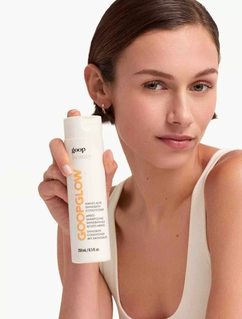
Goop Beauty Amino Acid Shinebath Conditioner Packaging
Topics
Details
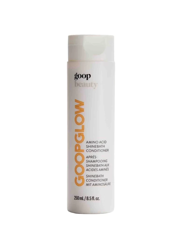
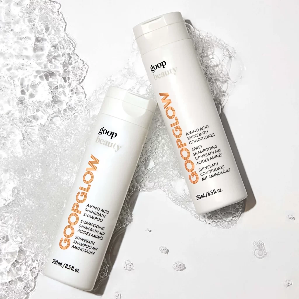
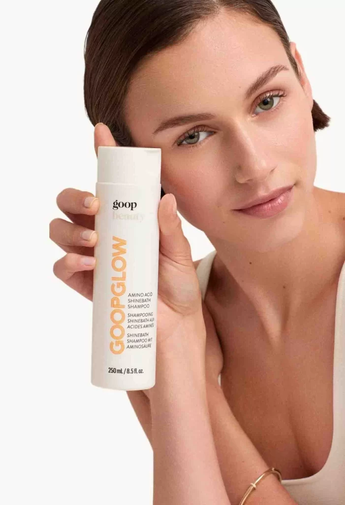
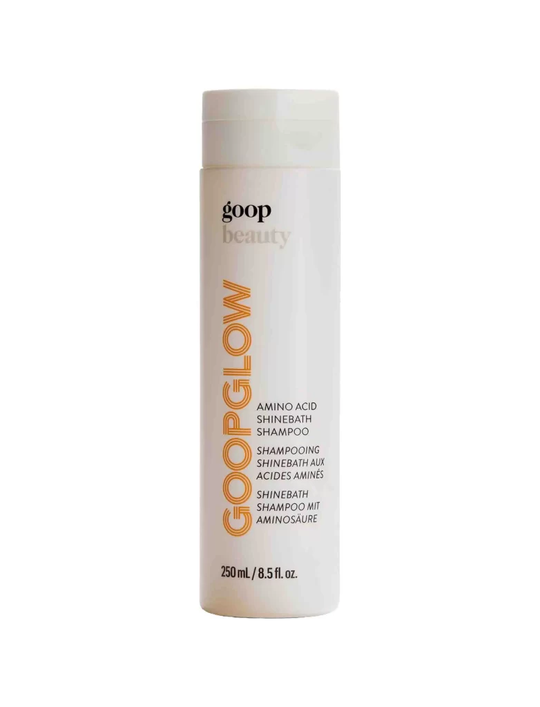
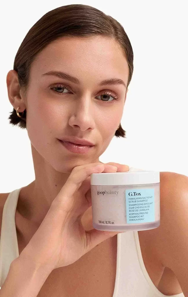
A cylindrical white bottle held at chest level displays the brand name 'goop' in black lowercase letters above a bold, vertical orange gradient reading 'GOOPGLOW', with smaller black text identifying it as an Amino Acid Shinebath Conditioner. The container is gripped by a model with slicked-back dark hair and a white tank top, illuminated by soft studio lighting against a white backdrop.
Vertical typography dominates the visual hierarchy here, with the orange-to-yellow gradient text creating immediate focal interest against the otherwise monochromatic palette. The minimalist white cylinder relies entirely on typographic contrast and color blocking rather than imagery or complex patterns to communicate brand identity. This approach emphasizes legibility while maintaining a clean, clinical aesthetic that aligns with contemporary luxury skincare packaging trends.
Packaging designers studying color-blocking strategies for personal care products will find this composition particularly instructive for balancing vertical text elements with horizontal product information. Art directors planning beauty campaigns can reference the lighting setup and hand-positioning techniques that keep the product as the clear hero element. Brand strategists evaluating premium positioning through minimalism might analyze how restricted color palettes convey sophistication without additional graphic ornamentation.