Goop Beauty Ultimate Dry Brush Body Brush Packaging
Topics
Details
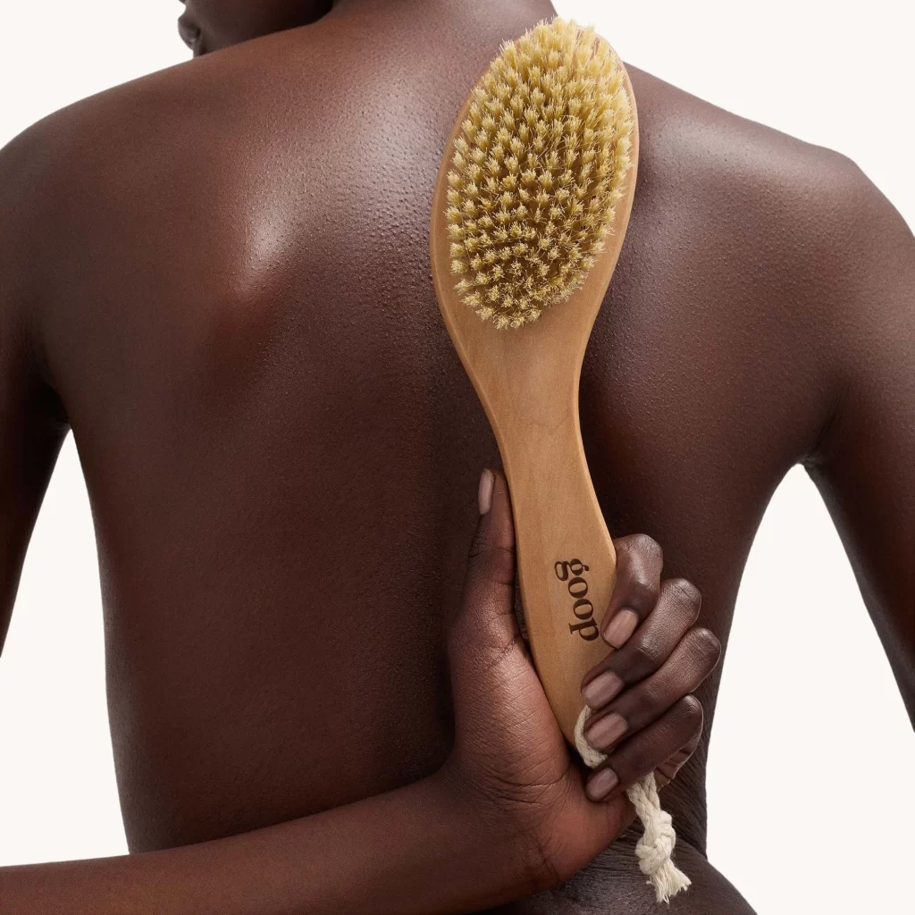
A dark-skinned figure holds a long-handled dry brush against their bare back, with the composition emphasizing both tool and skin texture. The brush features an elongated, contoured wooden handle in a warm honey tone, crowned with a dense oval head of stiff natural bristles that glow golden under bright studio lighting. Etched vertically along the grip in clean lowercase letters, the brand name "goop" identifies the product.
What distinguishes this particular iteration is its sculptural ergonomics, where the wood grain flows seamlessly into the curved silhouette of the handle, suggesting organic craftsmanship rather than mass production. The contrast between the rough, pale bristles and the smooth, dark skin creates a compelling visual dialogue about exfoliation and self-care rituals. Subtle highlights catch the moisture on the subject’s back, lending a luminous quality that elevates the product shot from mere catalog imagery to something approaching fine art photography.
Art directors developing wellness campaigns will find this reference invaluable for understanding how to position body-care tools within lifestyle contexts without losing focus on the product itself. Photographers studying lighting techniques can analyze how the high-key setup eliminates distractions while preserving textural nuance in both the wooden material and human epidermis. Packaging designers might study the placement and typography of the logo to inform their own branding strategies for premium beauty implements.