Goop Beauty Afterglow Body Oil 120ml Image 05 Packaging
Topics
Details
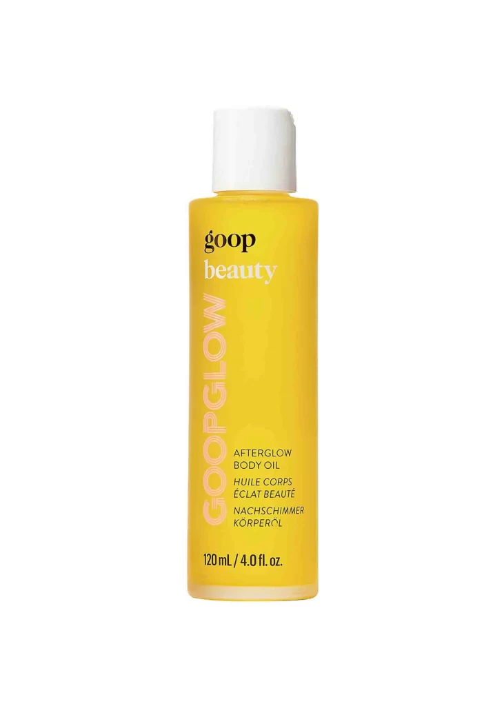
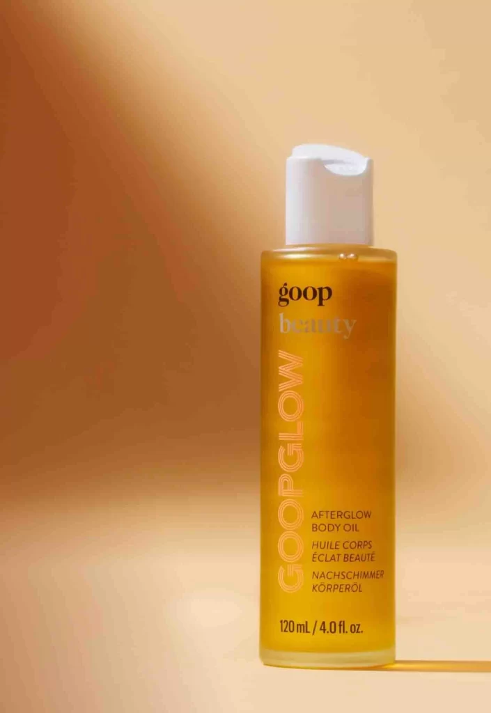
Amber-hued liquid fills a cylindrical transparent bottle, capped with a matte white flip-top dispenser that catches the light along its curved edge. The label features 'goop' in bold black lowercase above the translucent word 'beauty', while 'GOOPGLOW' runs vertically in large peach-toned sans-serif lettering. Multilingual product identification appears below in smaller black type—English, French, and German translations of 'Afterglow Body Oil'—with volume metrics '120 mL / 4.0 fl. oz.' anchoring the bottom. Soft directional lighting from the upper left creates a warm gradient background shifting from deep caramel to pale cream, positioning the bottle centrally with a subtle shadow grounding it to the right.
Vertical typography dominates the visual hierarchy here, forcing the eye to travel the full height of the container and emphasizing the product's elongated proportions. The strategic color palette—warm golden fluid against neutral white hardware and that distinctive coral-pink accent text—creates immediate brand recognition while suggesting the oil's luminous skin-finishing properties. Minimalist multilingual labeling indicates premium positioning for international markets, where clean information architecture matters as much as aesthetic appeal.
Packaging designers studying luxury skincare conventions will find this composition useful for analyzing how vertical text orientation affects shelf presence and brand memorability. Color theorists can reference the specific amber-to-peach spectrum when developing palettes for radiance-boosting beauty lines. Photographers working on cosmetic campaigns might examine the lighting setup, particularly how the gradient backdrop enhances transparency without creating harsh reflections on the curved glass surface.