OXALIS Sanctuary Body Oil Packaging
Topics
Details
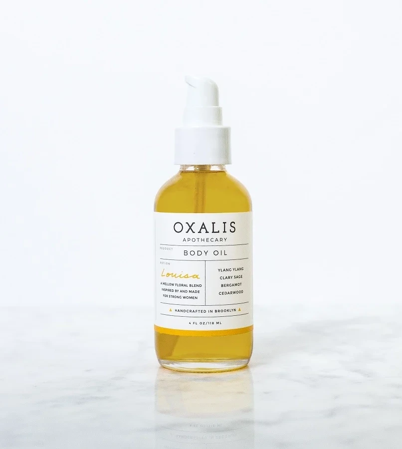
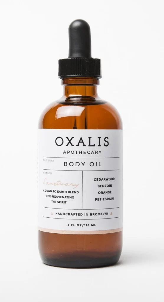
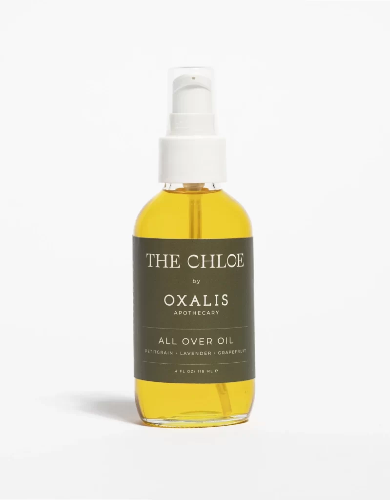
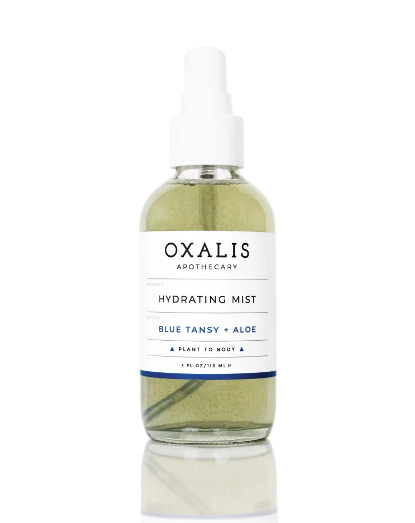
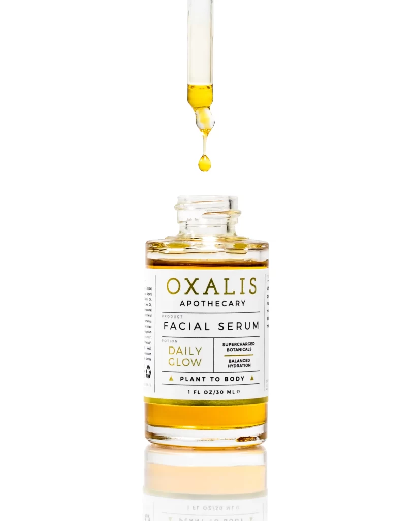
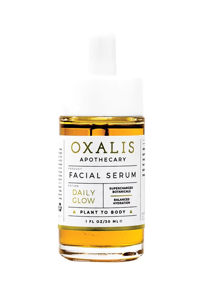
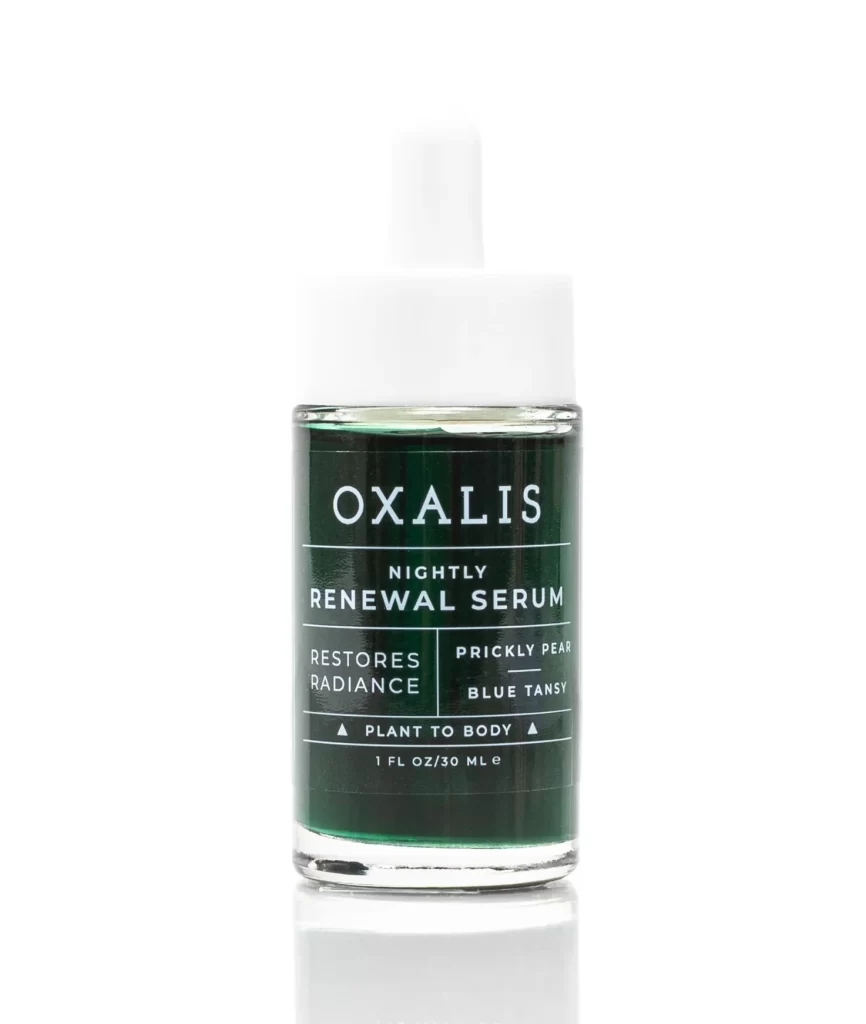
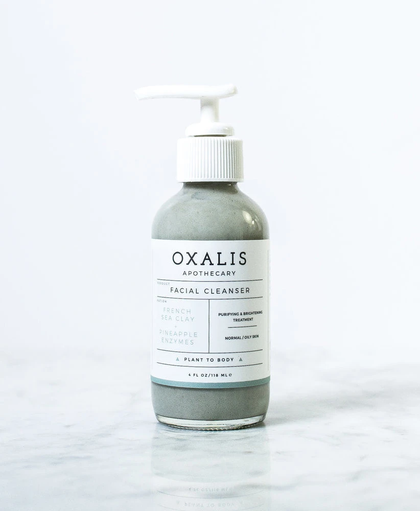
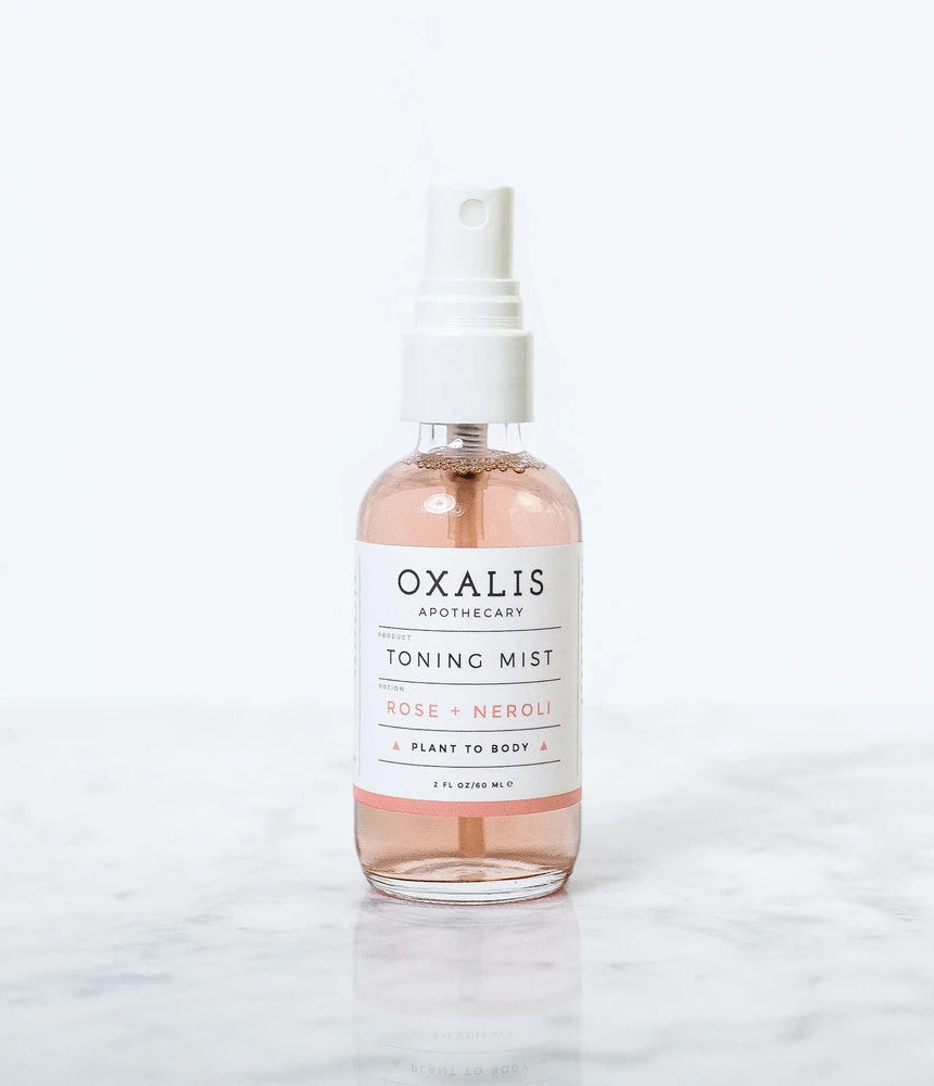
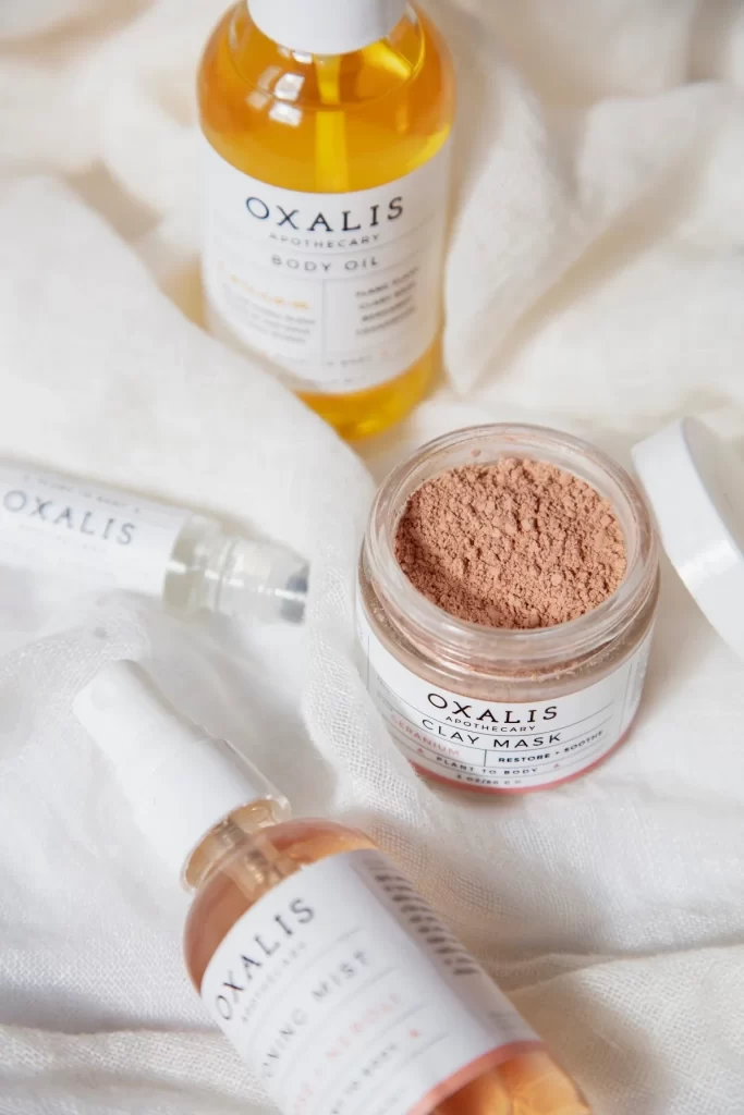
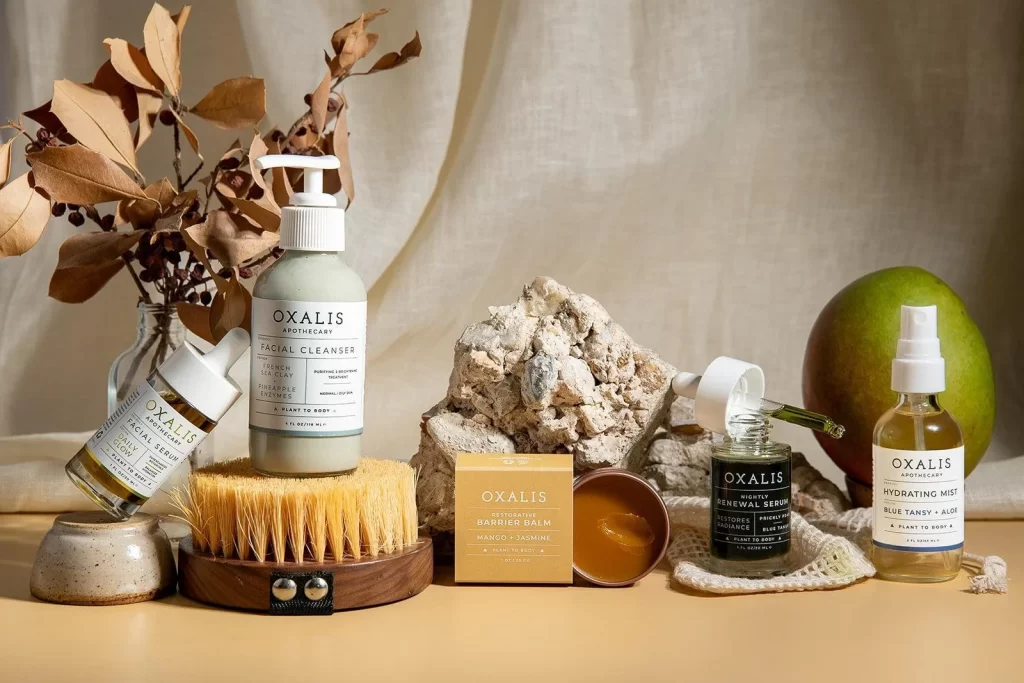
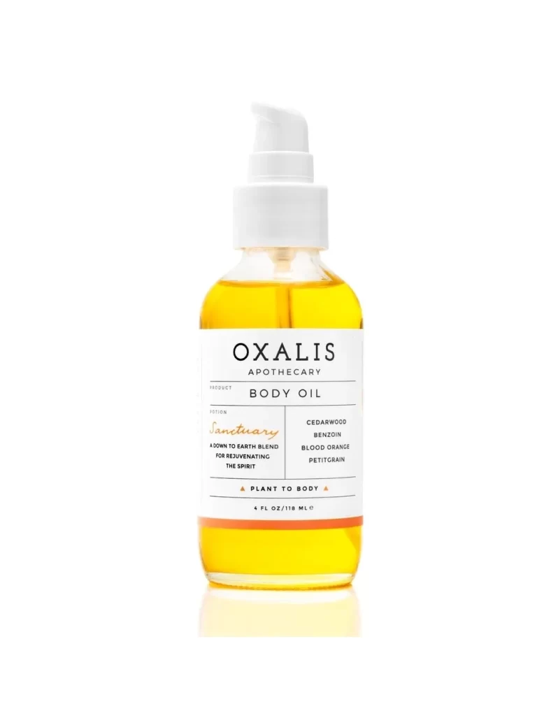
A cylindrical glass vessel filled with translucent amber liquid stands capped by a matte white pump mechanism. The label architecture relies on strict typographic hierarchy, anchoring the brand name 'OXALIS APOTHECARY' in bold serif above the product designation 'BODY OIL'. A delicate terracotta band bisects the lower third of the paper label,
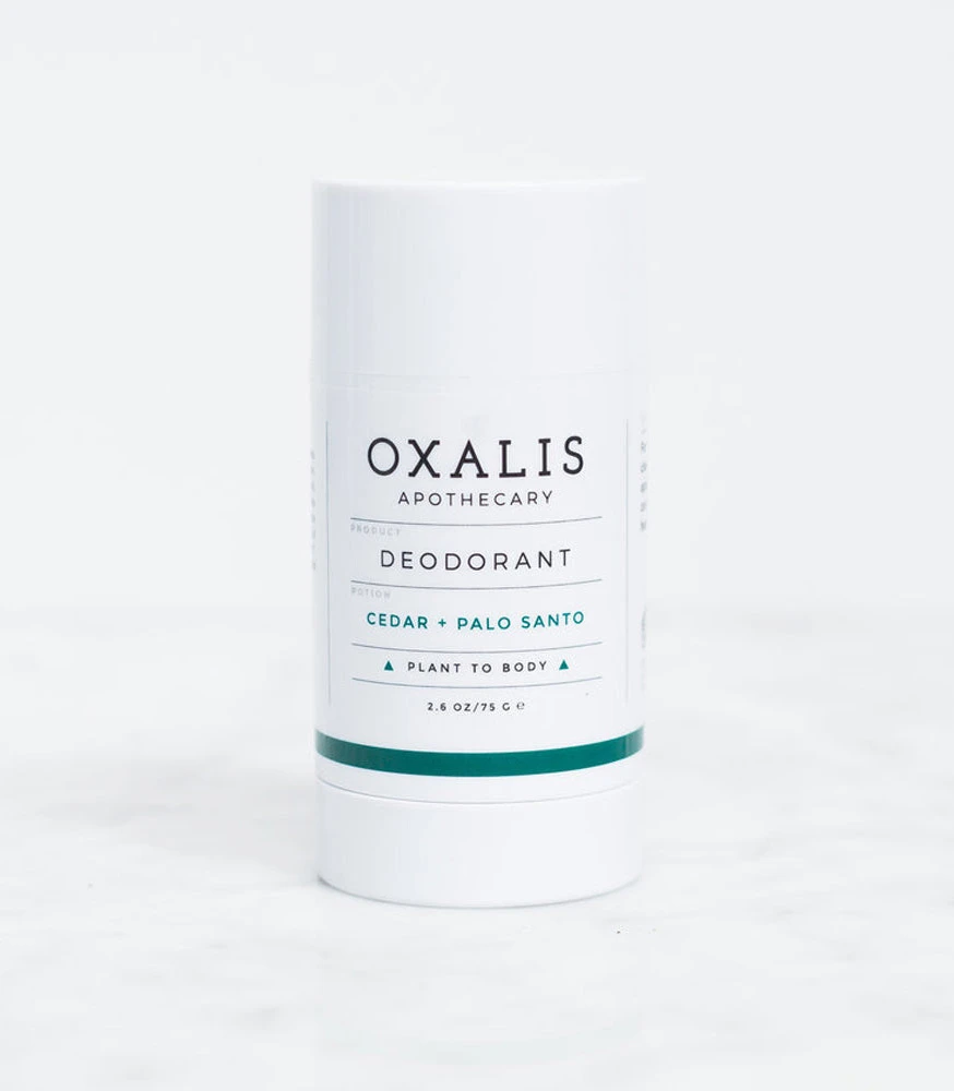
Visual interest derives from the disciplined grid system governing the text layout, which balances the ethereal script of ‘Sanctuary’ against utilitarian sans-serif ingredient lists. The interplay between the organic fluidity of the glass container and the rigid geometric lines of the printed information creates a tension typical of modern apothecary branding. Subtle reflections beneath the base suggest a controlled studio environment, emphasizing the product’s clarity and purity without distraction.
Brand strategists might deconstruct this composition to understand how minimal color palettes convey luxury and natural authenticity simultaneously. Packaging engineers could analyze the pump-to-shoulder ratio to optimize similar dispensing systems for viscous liquids. Art directors seeking to emulate this aesthetic will find the specific weight distribution between the header, body copy, and footer elements particularly instructive for their own label layouts.