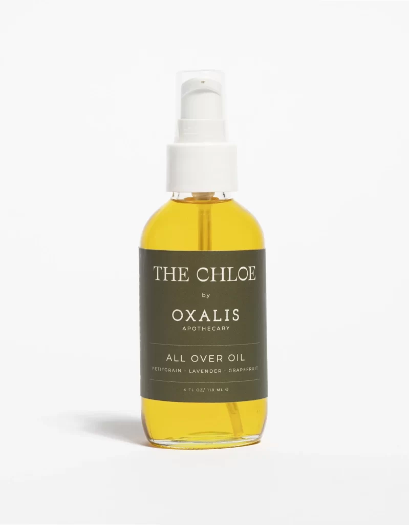
OXALIS THE CHLOE Yellow All Over Oil Packaging
Topics
Details
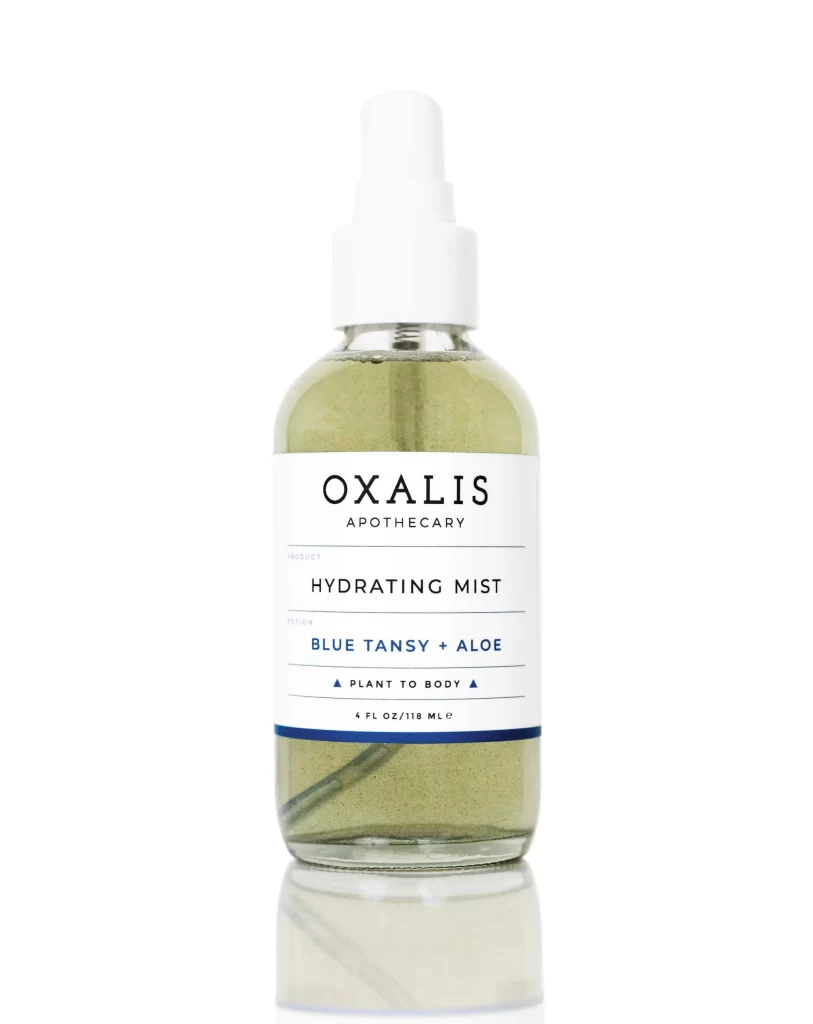
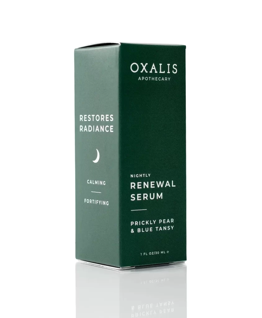
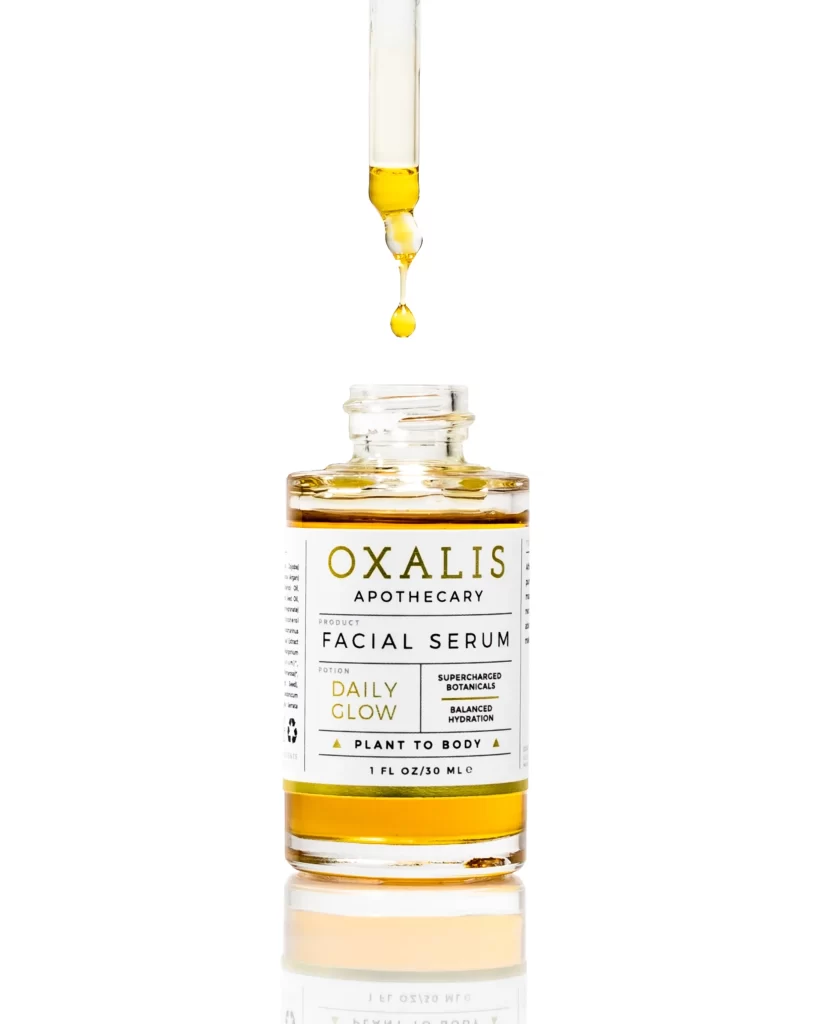
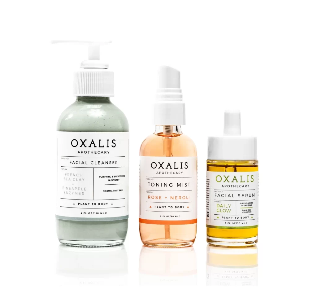
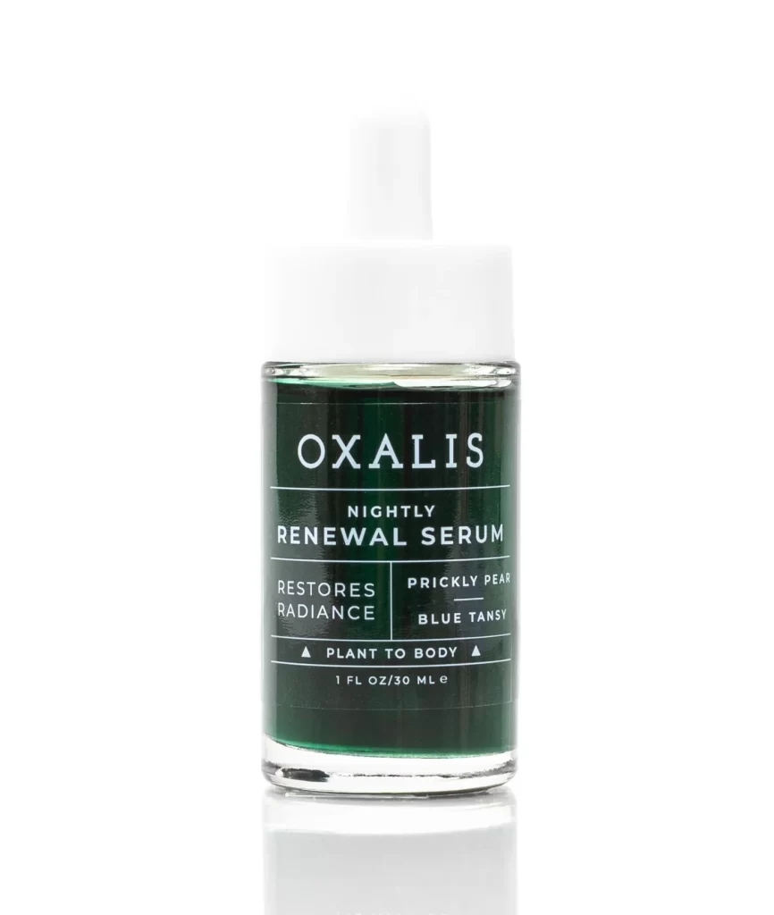
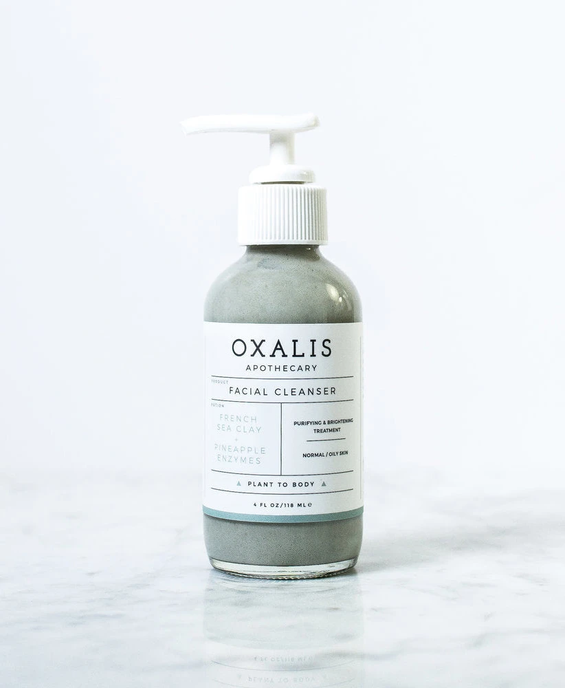
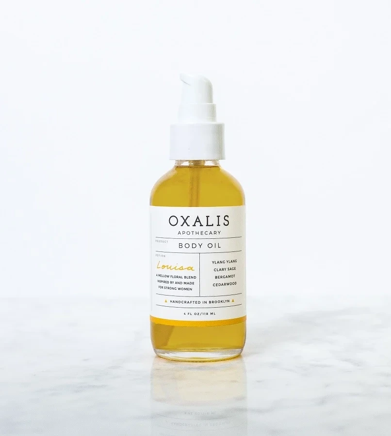
A cylindrical glass vessel filled with translucent golden liquid stands on a white surface, its clarity enhanced by soft studio lighting that casts a subtle shadow to the right. A dark olive-green label wraps the bottle's midsection, featuring crisp white serif typography that hierarchically displays 'THE CHLOE' in large capitals above 'by OXALIS APOTHECARY' and 'ALL OVER OIL' in smaller text.
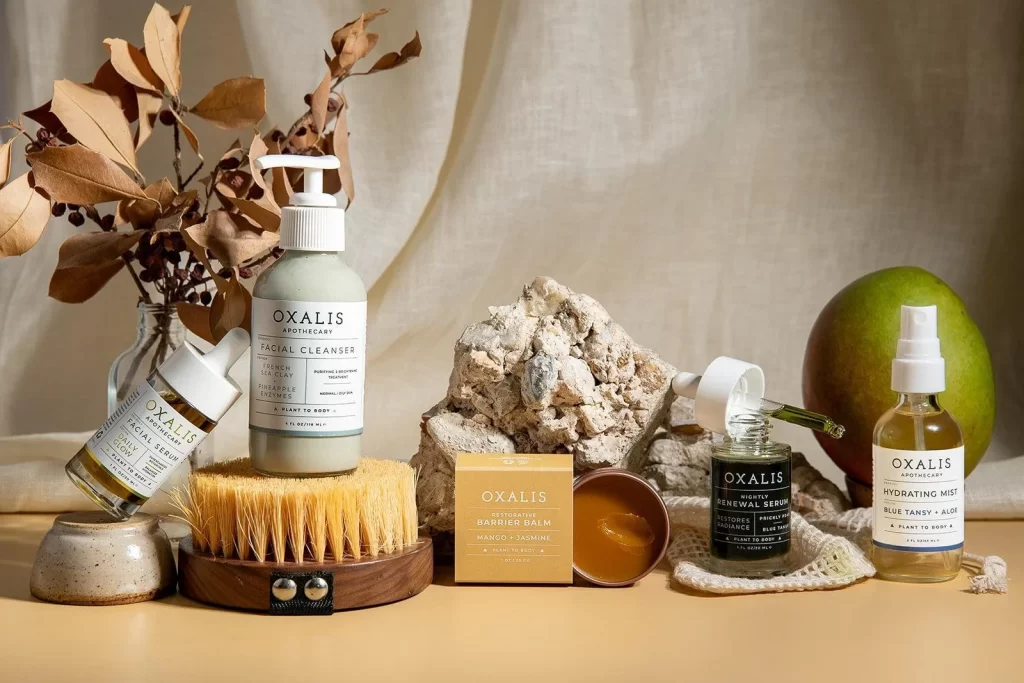
Visual distinction emerges from the restrained color palette pairing earthy forest green with warm honey tones, creating an organic yet sophisticated aesthetic that signals botanical authenticity. Typography choices demonstrate careful hierarchy through scale variation between the brand name and descriptive elements, while the pump dispenser suggests functional elegance suited for daily ritual use. Minimalist labeling avoids visual clutter, allowing the liquid’s natural coloration to serve as a primary design element alongside the matte-finished pump hardware.
Brand identity developers might analyze this packaging structure when constructing narratives for wellness or skincare lines requiring understated luxury positioning. Packaging engineers could reference the pump-to-bottle proportions and label placement when prototyping similar dispensing systems for viscous liquids. Art directors studying color theory applications would find value in how the complementary green and yellow relationship communicates freshness without resorting to aggressive saturation levels.