OXALIS Blue Tansy Aloe Light green Hydrating Mist Packaging
Topics
Details
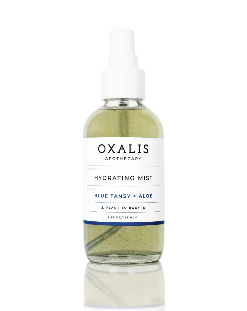
A cylindrical glass bottle filled with pale yellowish-green liquid stands on a white surface, its translucent contents revealing a thin dip tube inside. A crisp white label wraps the vessel's midsection, displaying 'OXALIS' in bold black serif capitals above the smaller subtext 'APOTHECARY', with 'HYDRATING MIST' and the blue-tinted scent designation 'BLUE TANSY + ALOE' printed beneath. A white spray pump caps the bottle, while a navy stripe anchors the label's bottom edge above the 4 FL OZ volume notation.
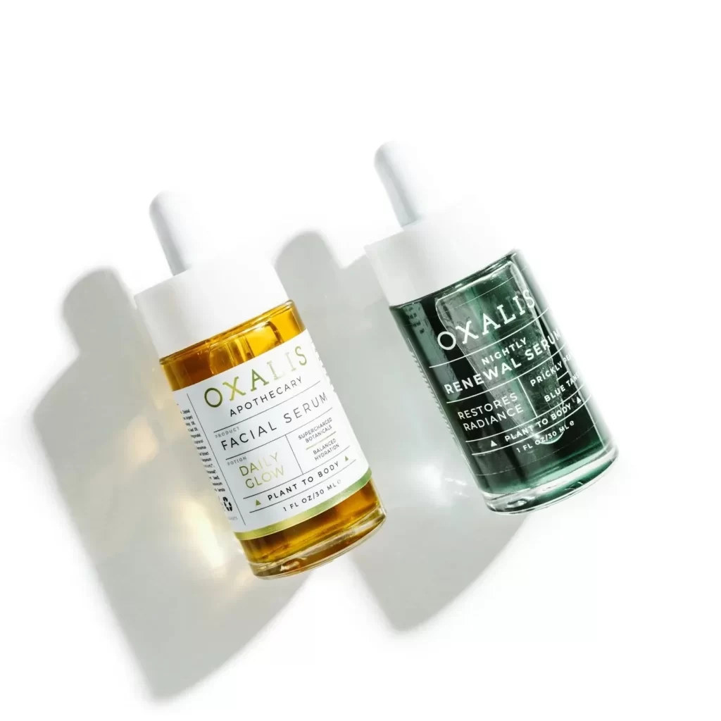
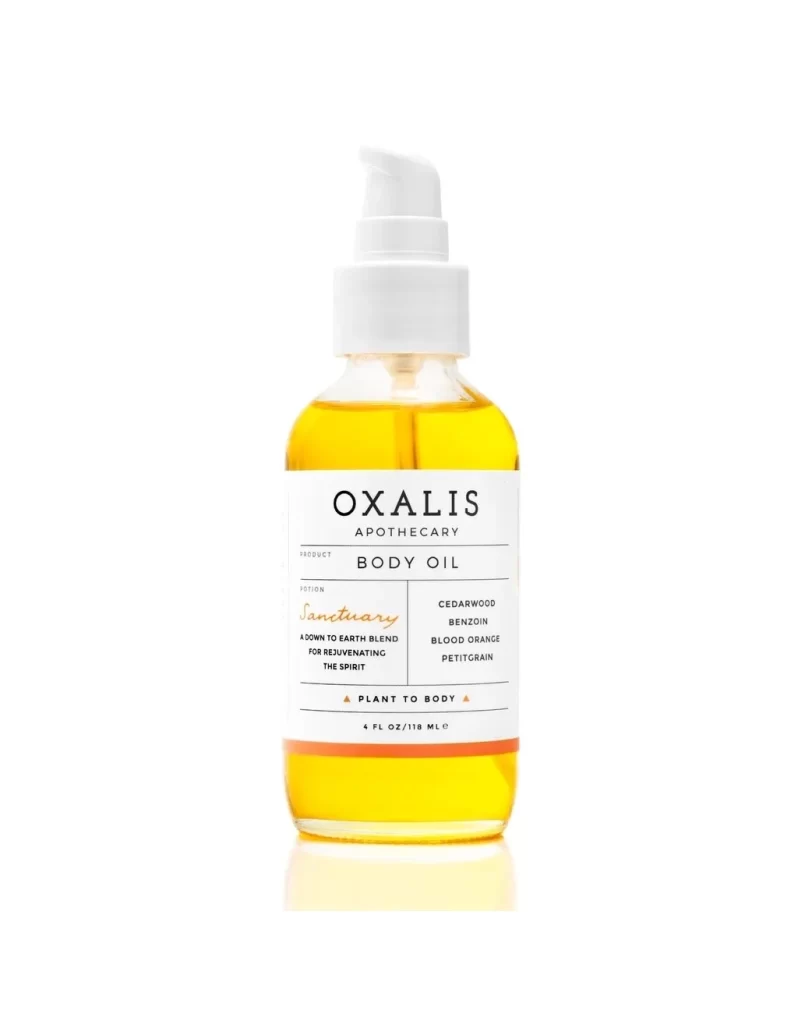
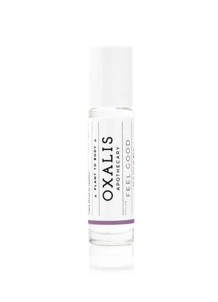
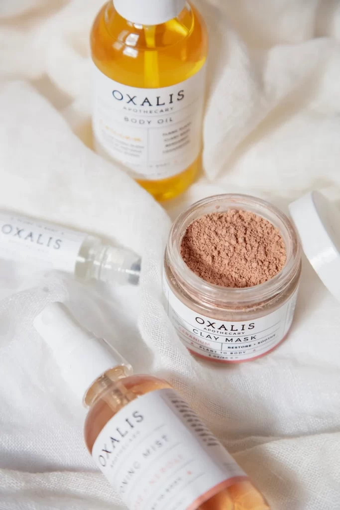
Visual interest emerges from the restrained color palette, where the single blue accent line creates a sophisticated anchor for the otherwise monochromatic typography. The choice of clear glass allows the natural tint of the botanical ingredients to serve as an organic design element, adding depth without clutter. Minimalist dividing lines and geometric triangle symbols flanking the ‘PLANT TO BODY’ tagline lend a modern, architectural quality to the overall aesthetic.
Packaging designers studying minimalist cosmetic branding would find value in analyzing how limited color accents can guide the viewer’s eye across a label. Art directors working on wellness or skincare campaigns might reference this layout to understand how to balance serif and sans-serif fonts within a tight vertical space. Additionally, photographers specializing in product shots could examine the soft, even lighting setup used to eliminate harsh reflections on the curved glass surface.