OXALIS Daily Glow Skincare Packaging
Topics
Details
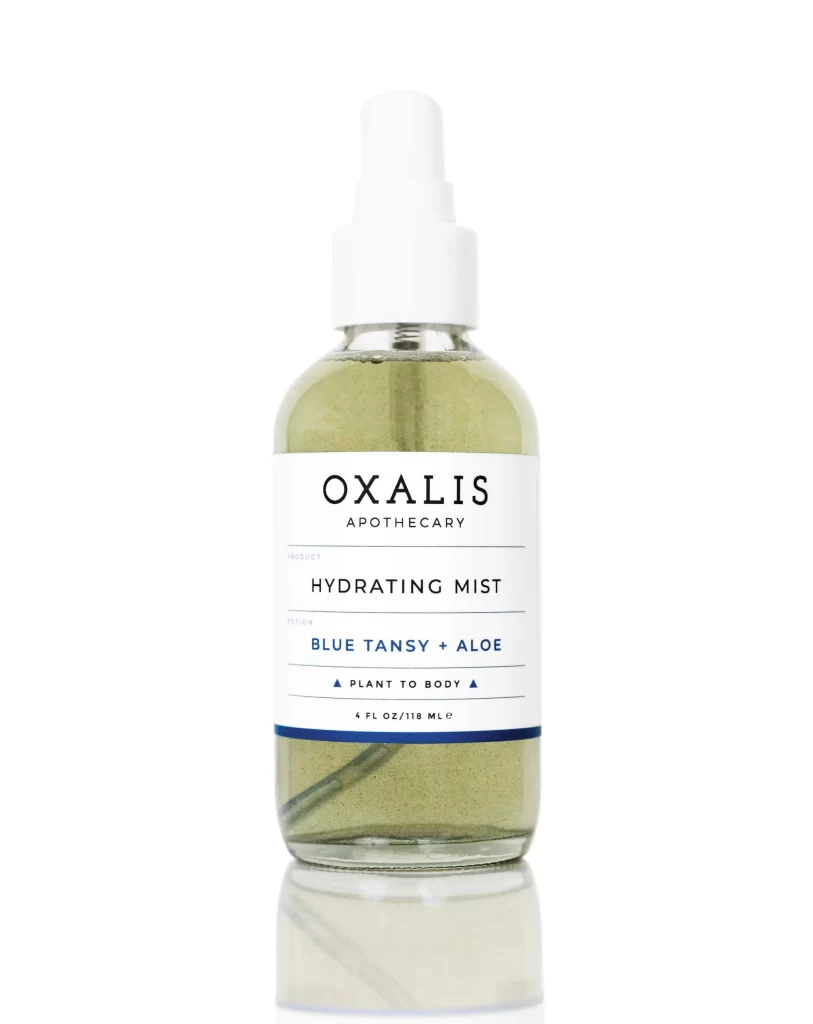
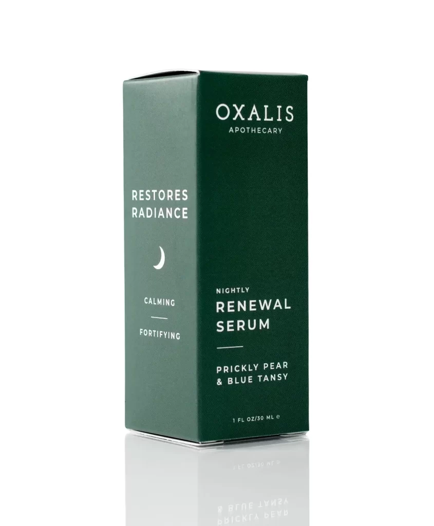
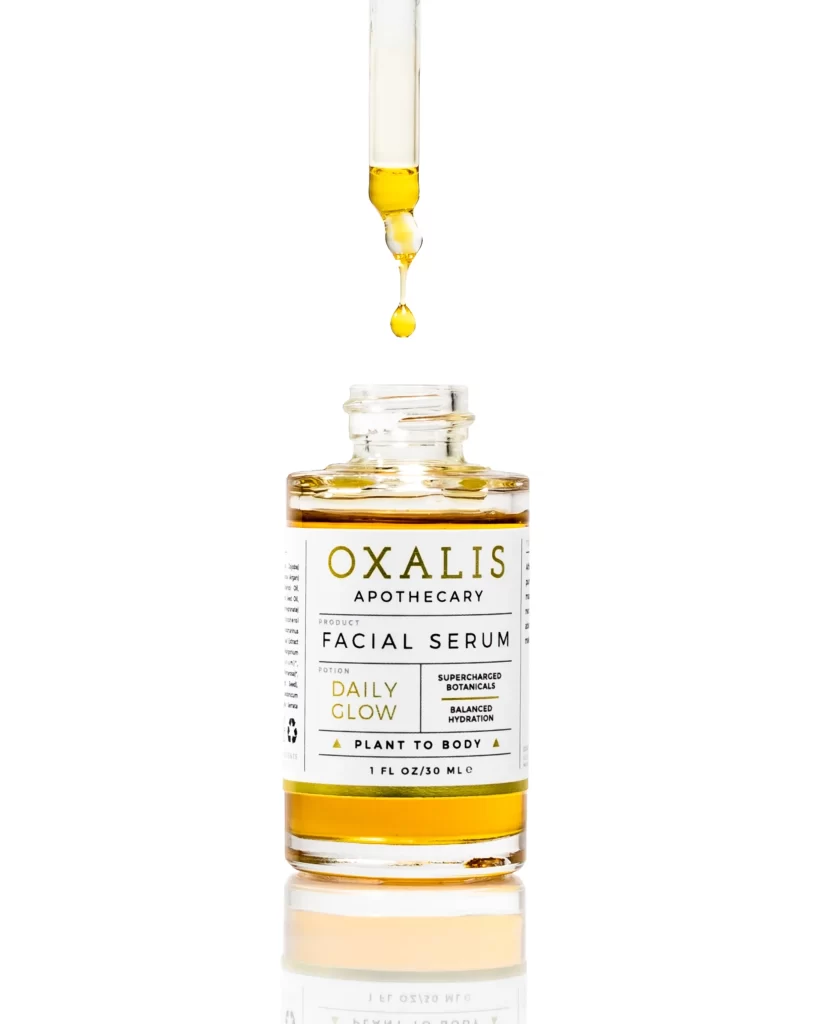
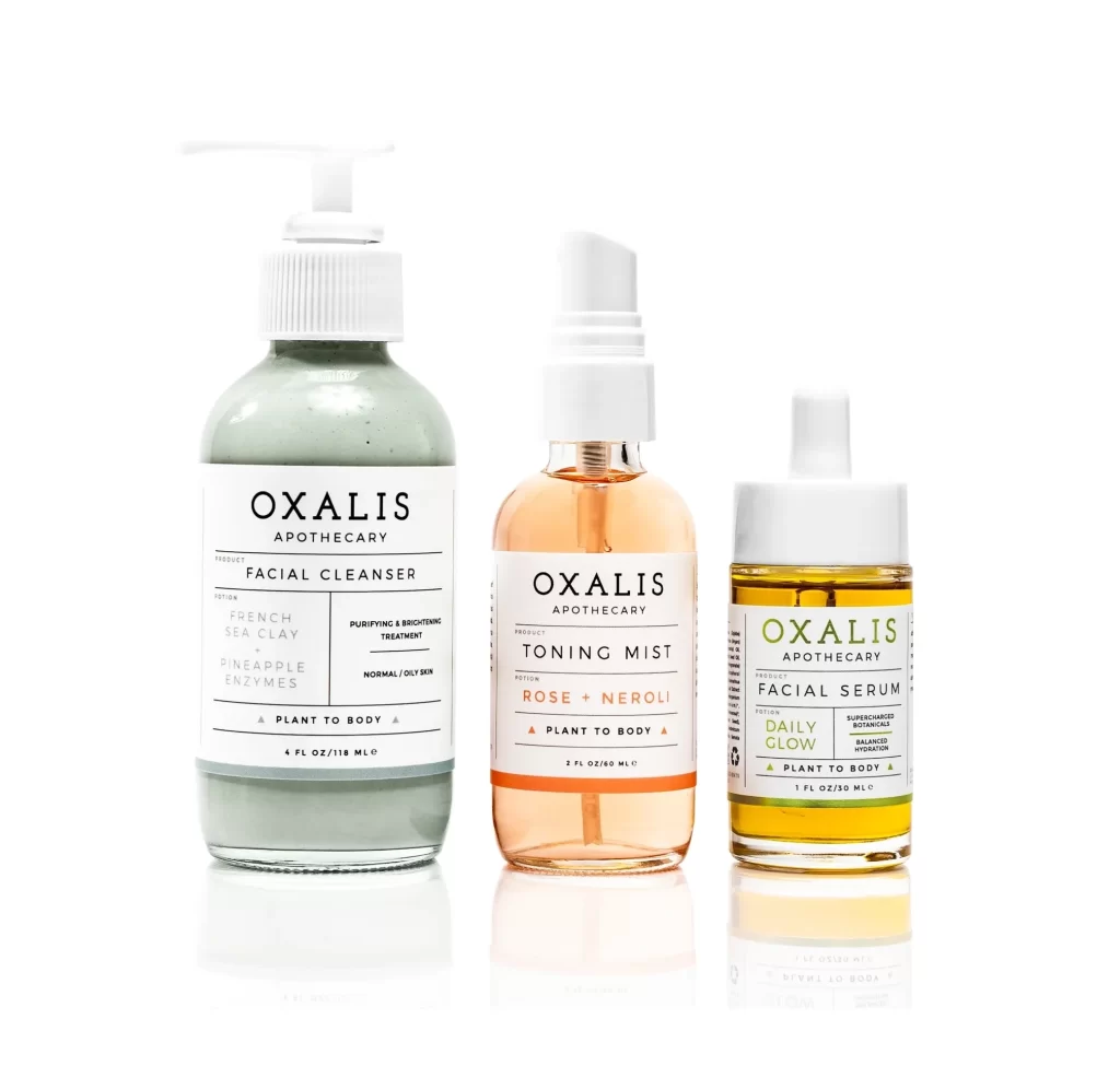
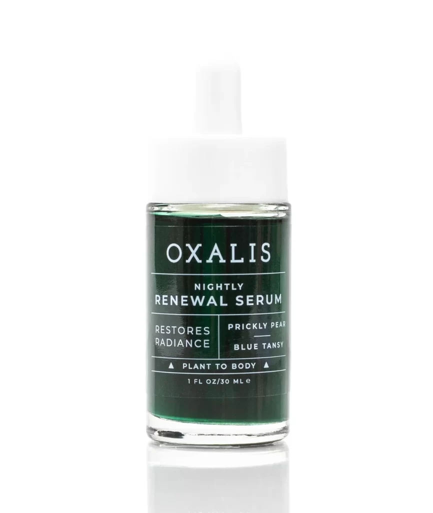
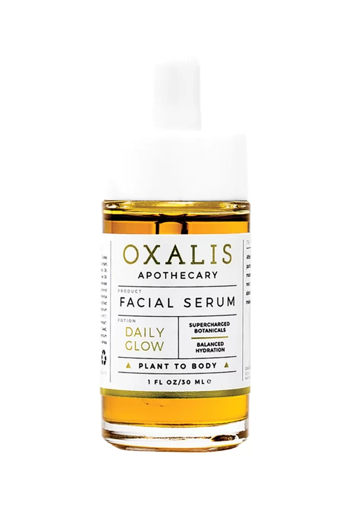
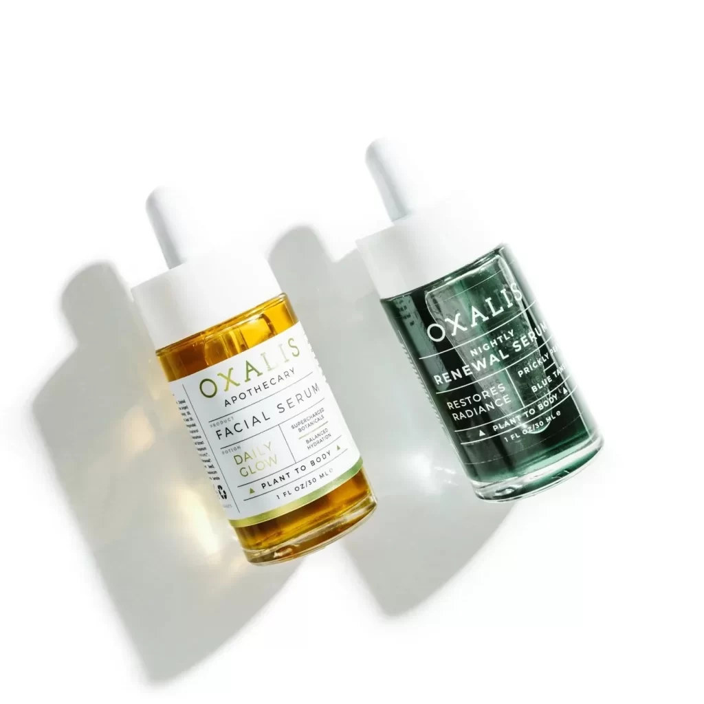
Two glass dropper bottles from OXALIS APOTHECARY lean at a slight angle on a white surface, casting soft shadows to the left. The left vessel contains a warm, golden-hued facial serum labeled 'DAILY GLOW,' while the right holds a deep teal 'NIGHTLY RENEWAL SERUM.' Both feature minimalist white labels with clean sans-serif typography, topped with matte white caps.
Visual interest comes from the deliberate contrast between the amber and emerald liquids, which immediately communicate different product functions through color psychology alone. The typography uses a clever hierarchy where the brand name is largest, followed by the product type, and finally the specific benefits like ‘RESTORES RADIANCE’ or ‘SUPERCHARGED BOTANICALS.’ This layout creates a scannable, modern look that feels both luxurious and approachable for a wellness-focused audience.
Brand identity designers studying how color-coding can differentiate product lines within a single collection will find this composition particularly useful. Packaging engineers might also examine the way the label proportions balance against the glass volume to ensure text remains legible without feeling crowded. Furthermore, art directors planning e-commerce photography could reference this lighting setup to understand how to make translucent liquids appear vibrant and pure on digital shelves.