OXALIS Apothecary Coconut Milk Bath Pouch Packaging
Topics
Details
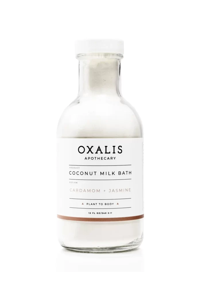
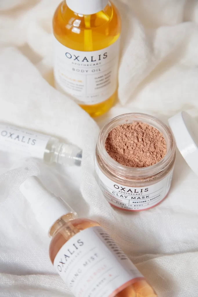
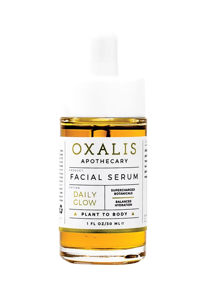
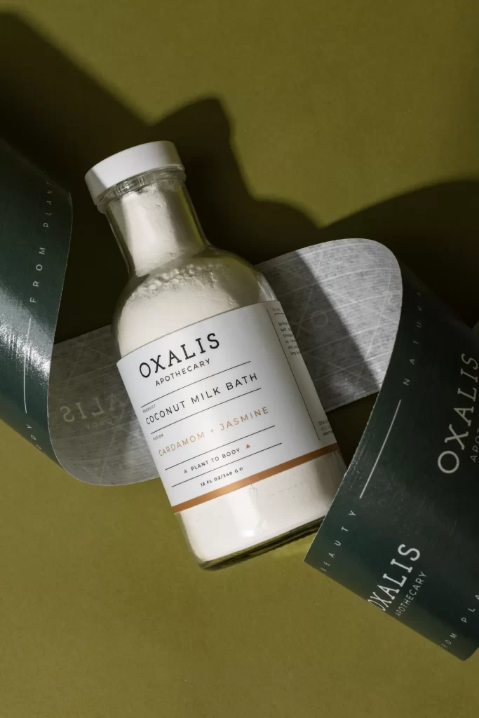
A clear glass bottle filled with white powder and sealed with a white screw cap sits at the center of the composition, its label displaying 'OXALIS APOTHECARY' in bold black serif above 'COCONUT MILK BATH' and the scent notes 'CARDAMOM + JASMINE' rendered in contrasting copper-gold. Dark green paper bands printed with 'FROM PLANT' and 'BEAUTY NATURALLY' text curve around the vessel, partially revealing a textured gray interior layer beneath. Soft directional lighting from the upper left casts gentle shadows across the matte olive-green surface beneath.
Visual distinction arises from the sophisticated interplay between the clinical clarity of the pharmaceutical-style glass vessel and the organic, earthy tones of the surrounding collateral. The copper accent line on the label provides a warm metallic counterpoint to the cool green palette, while the curled paper elements introduce dynamic curvature that breaks the rigid verticality of the bottle. This arrangement successfully balances minimalist apothecary aesthetics with tactile material variety, creating a cohesive yet layered presentation.
Brand strategists developing clean-beauty identities might examine this layout to understand how neutral backgrounds can make product labeling pop without visual clutter. Photographers planning still-life shoots for wellness goods could study the shadow placement and paper prop positioning to achieve similar depth in their own compositions. Packaging designers tasked with creating luxury bath product lines would benefit from analyzing the typographic hierarchy and color restraint demonstrated here.