OXALIS Facial Cleanser Skincare Packaging
Topics
Details
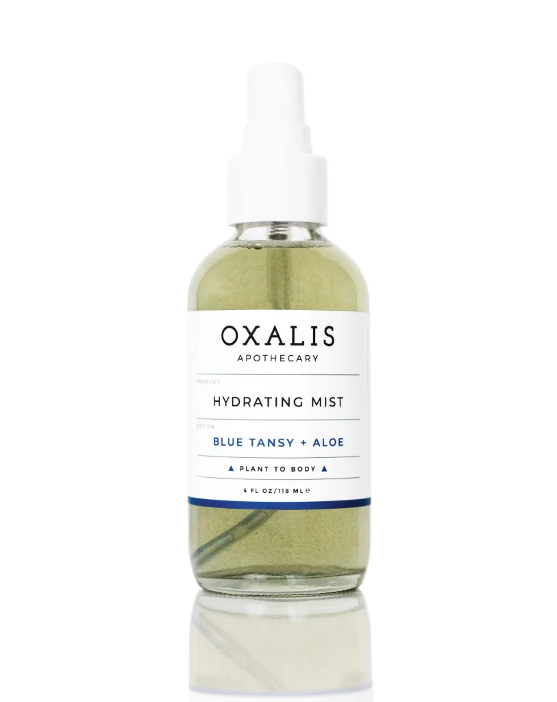
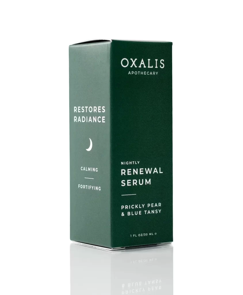
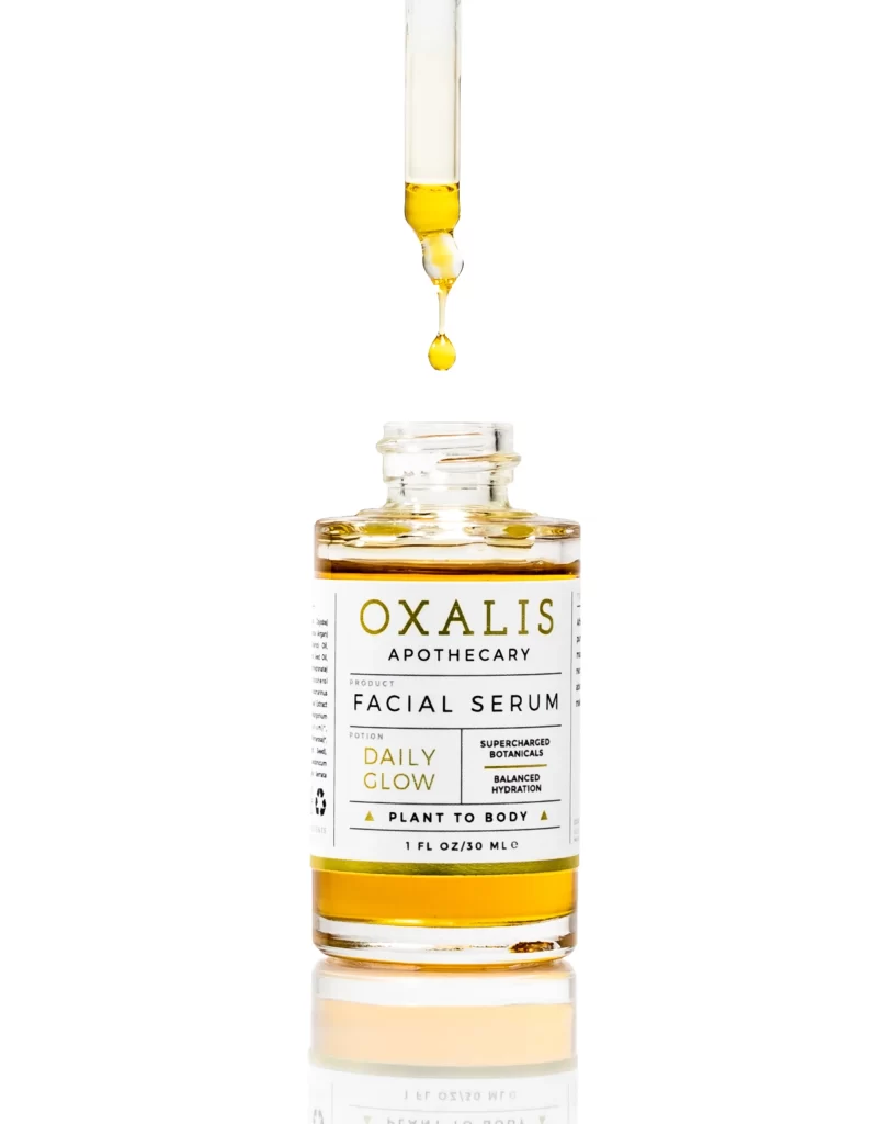
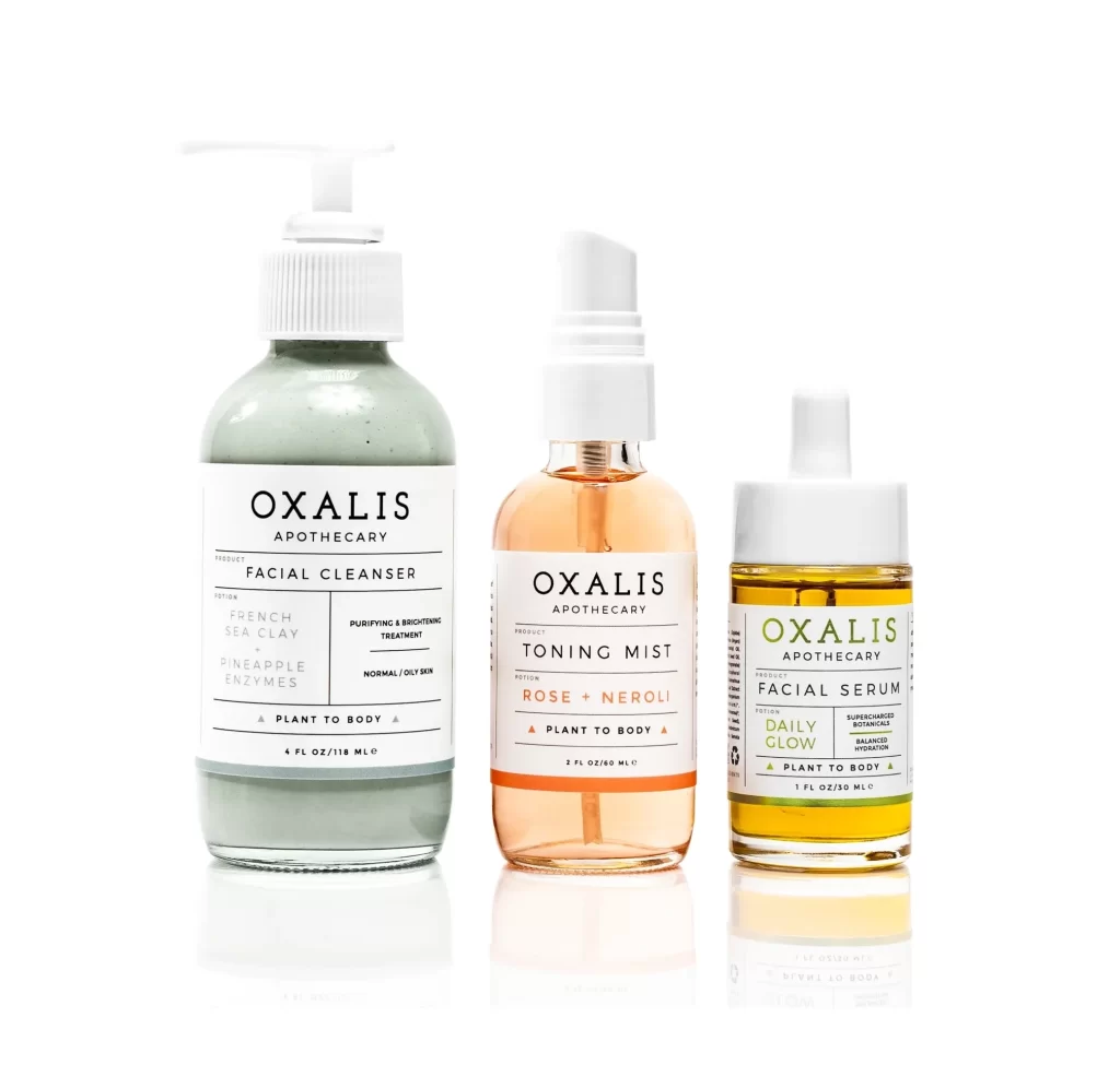
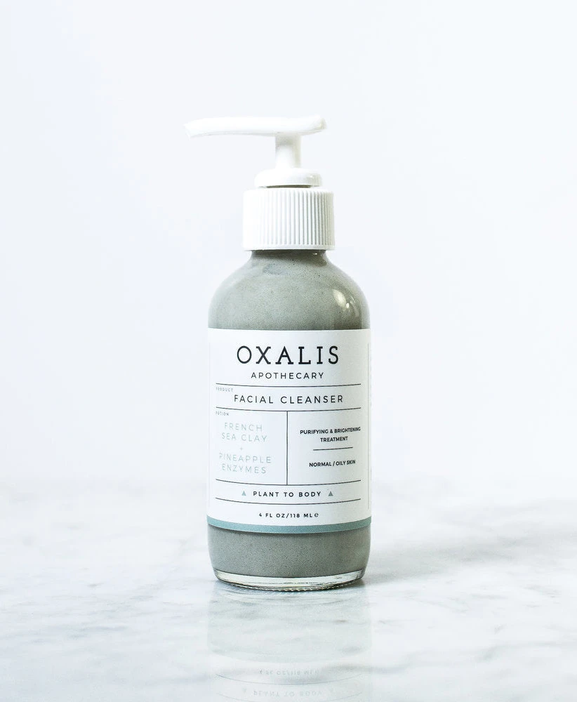
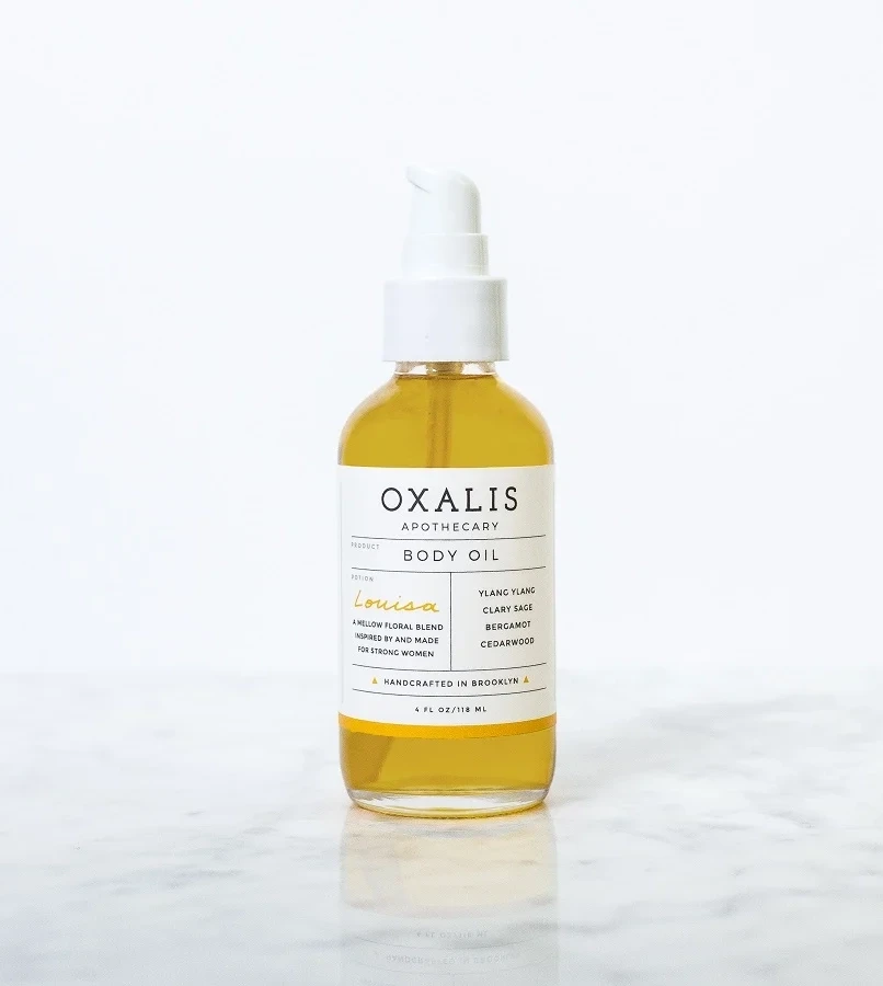
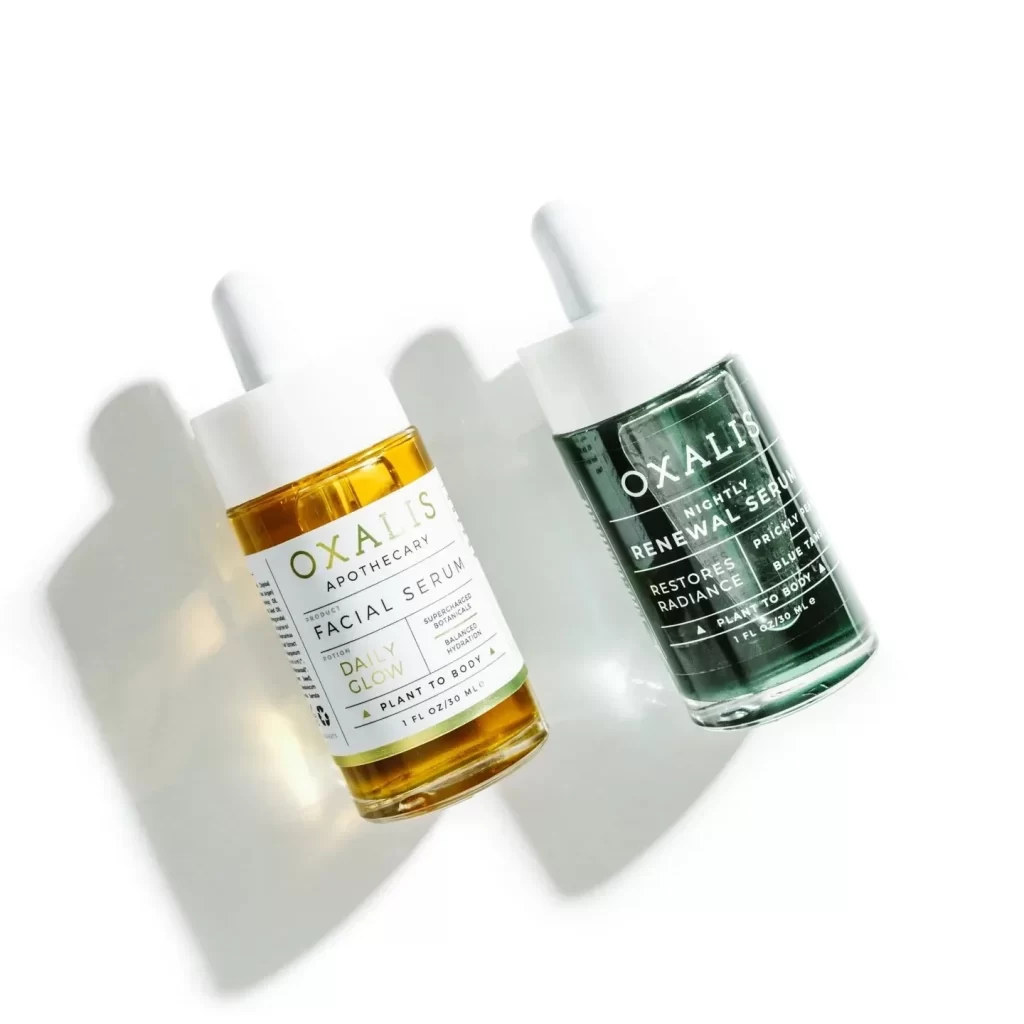
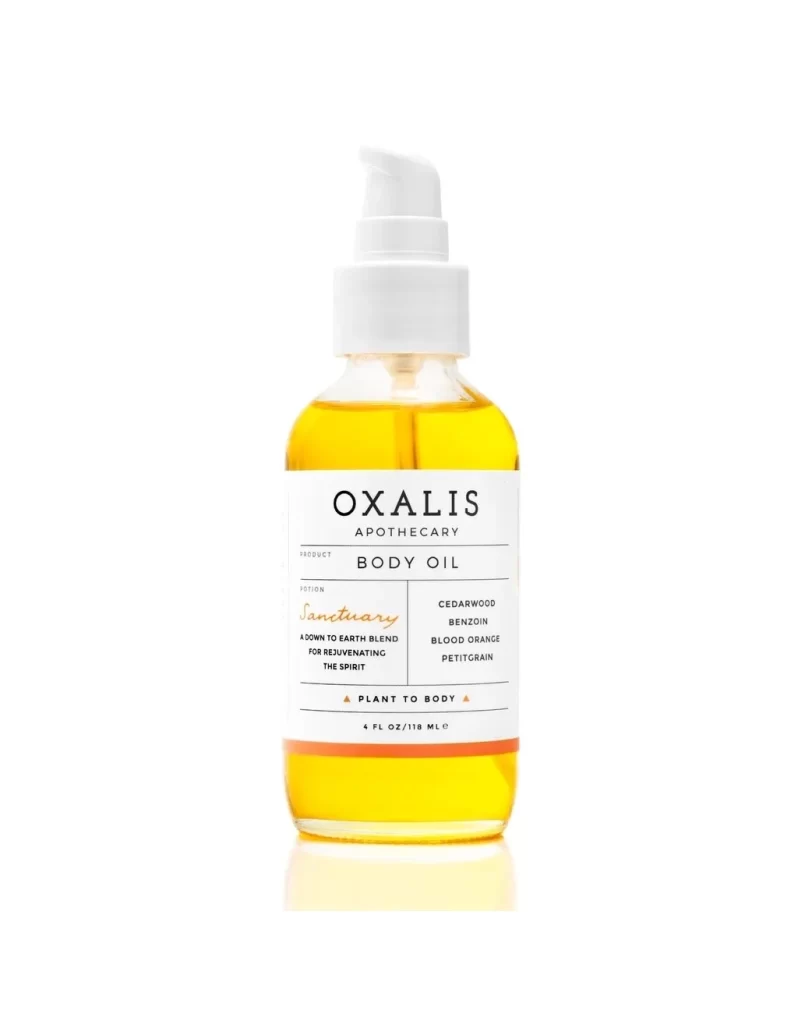
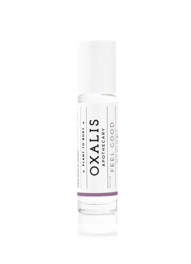
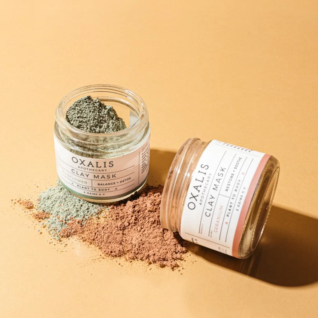
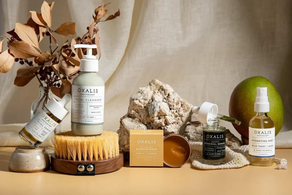
A matte grey-green cylindrical bottle with a white pump dispenser stands atop a circular wooden brush with stiff yellow bristles, displaying black serif typography that identifies the brand as 'OXALIS APOTHECARY' and lists ingredients including French Sea Clay. The facial cleanser sits on a warm beige surface with draped cream linen visible in the background, surrounded by complementary skincare products, dried botanicals, and natural stone elements under soft diffused lighting.
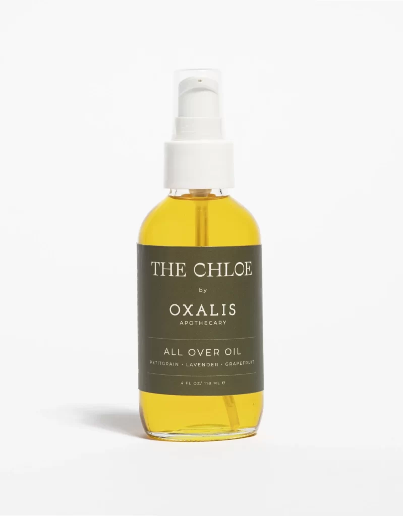
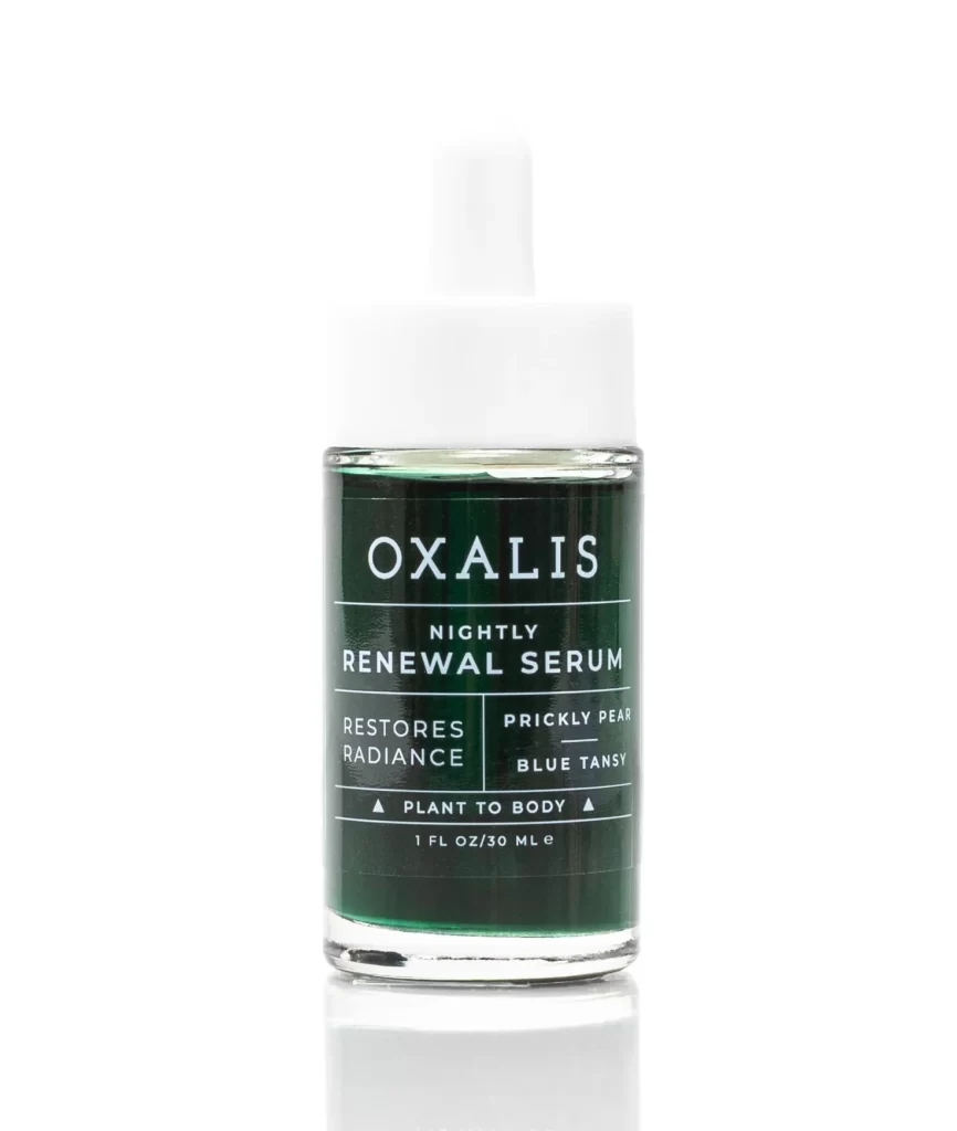
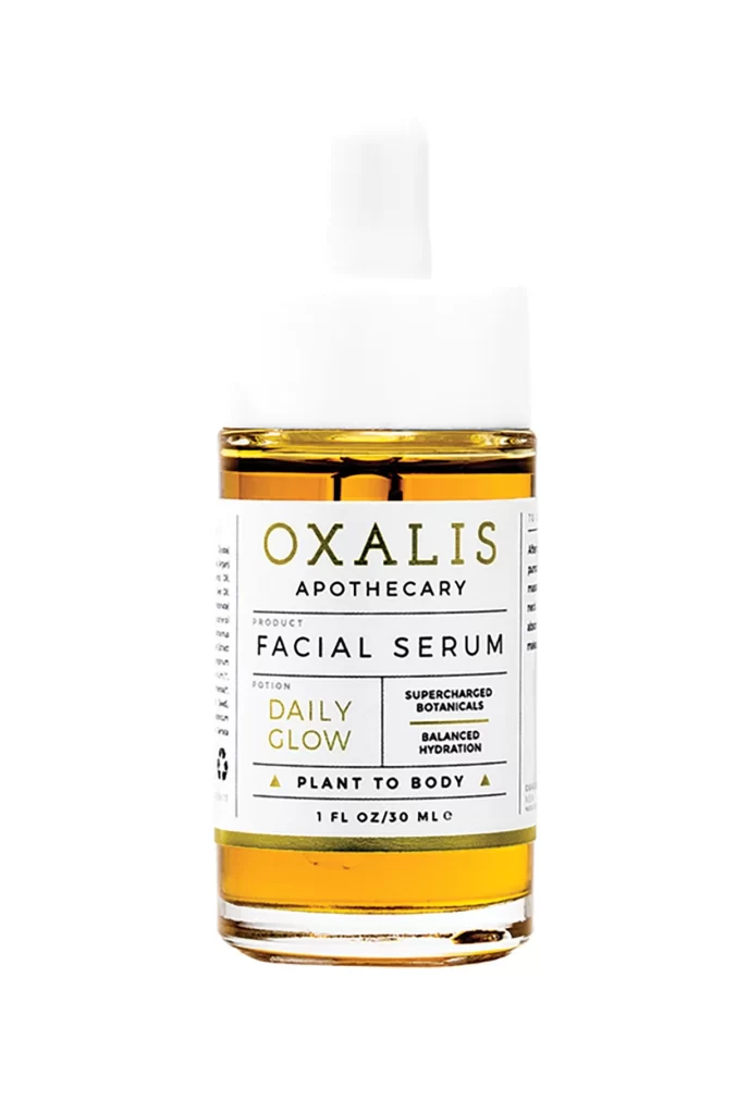
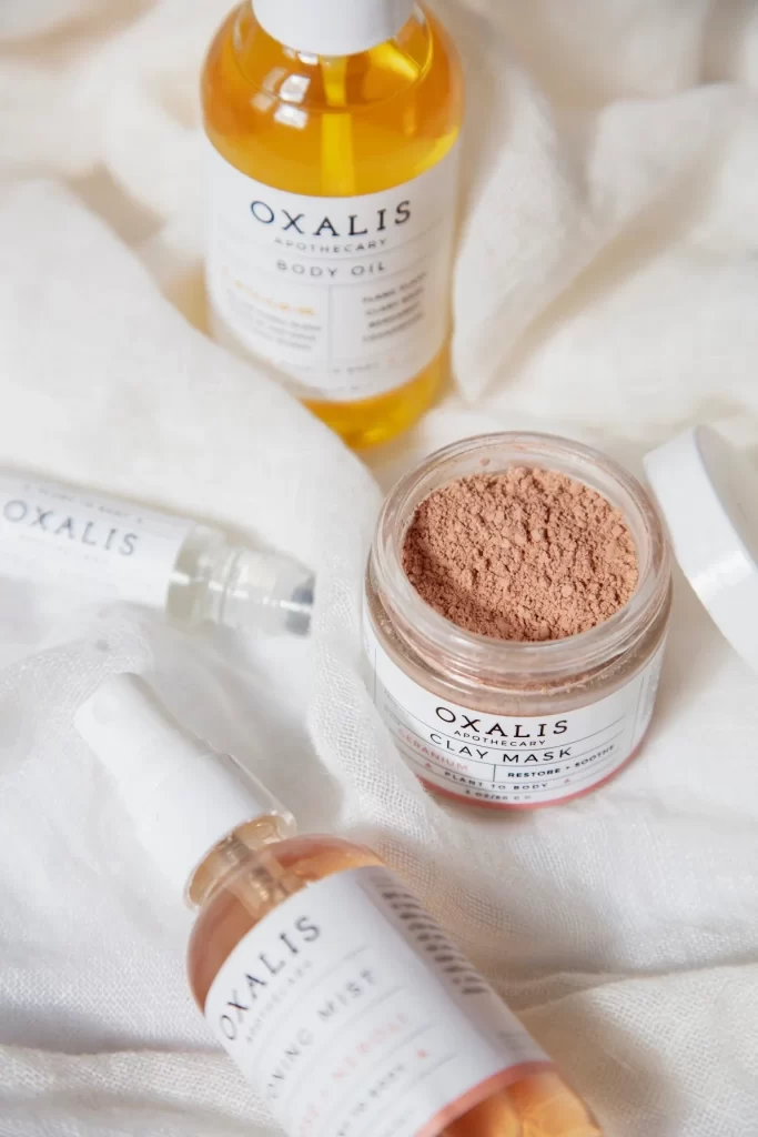
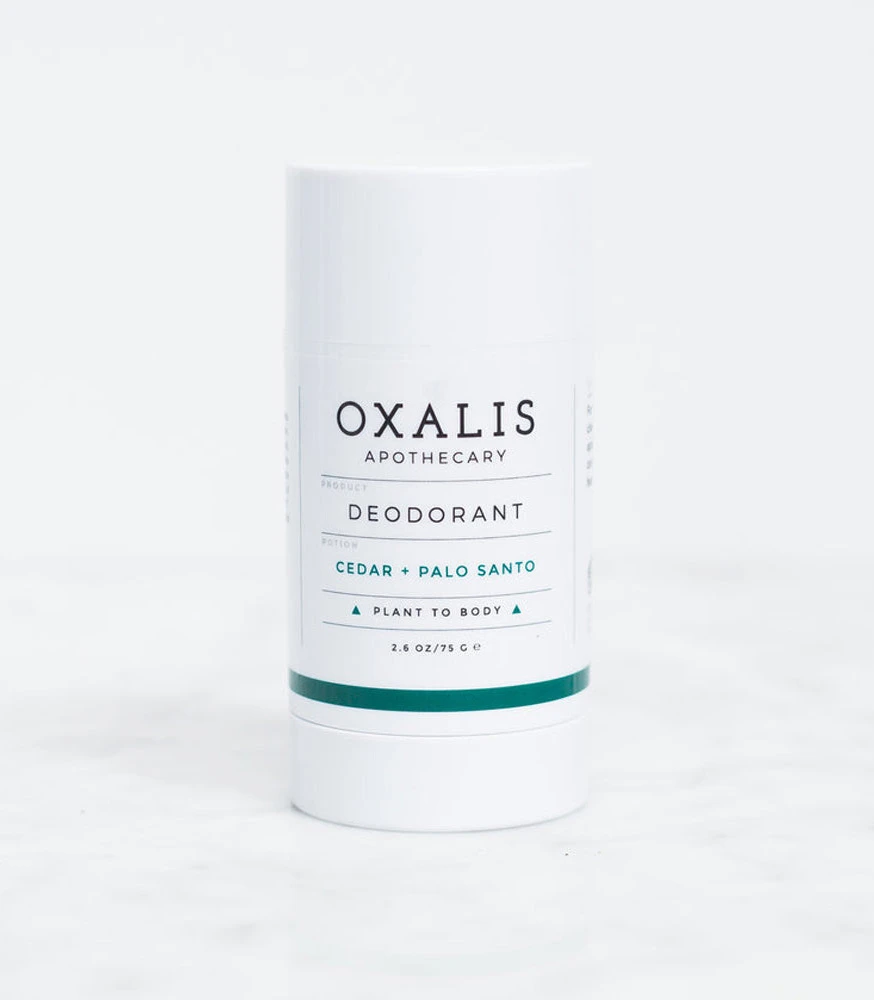
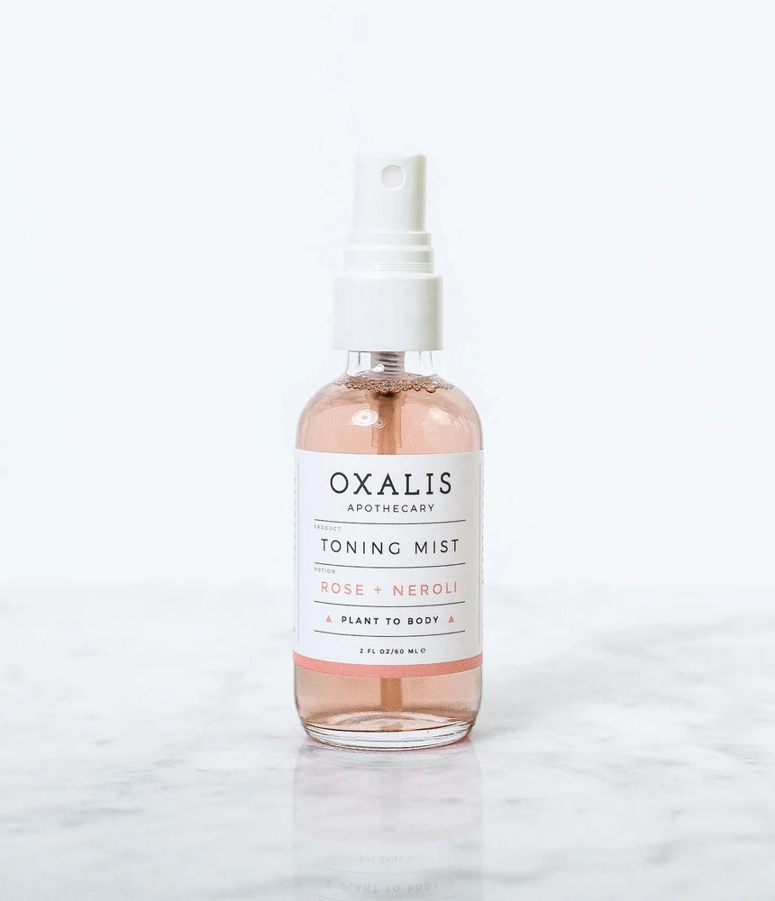
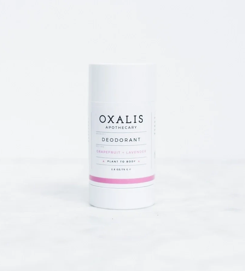
Visual distinction arises from the deliberate juxtaposition of industrial minimalism with raw, organic textures that evoke a botanical laboratory aesthetic. The packaging relies on a restrained palette of slate, ivory, and jet black, allowing the tactile qualities of the surrounding coral rock, dried foliage, and woven fibers to provide warmth and depth. Such a composition successfully communicates artisanal purity by grounding the clinical precision of the apothecary labels within a naturalistic, earthy environment.
Art directors developing campaigns for eco-luxury beauty brands will find this layout instructive for balancing product hierarchy with atmospheric styling. Photographers seeking to master flat-lay composition can study how varying heights—achieved here through pedestals and natural objects—create dynamic visual flow without cluttering the frame. Additionally, packaging designers might utilize this scene to evaluate how specific typefaces and colorways perform when photographed alongside contrasting organic materials.