OXALIS Clay Mask Skincare Packaging
Topics
Details
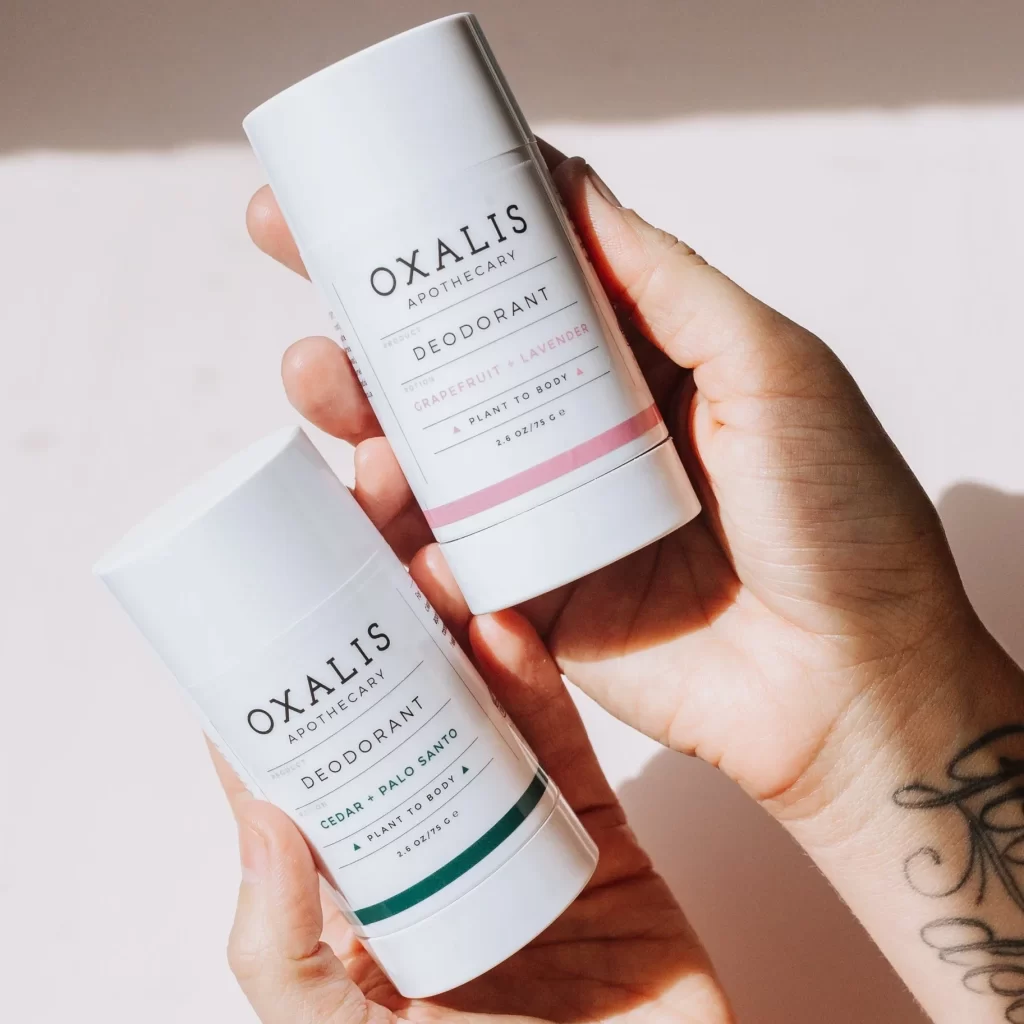
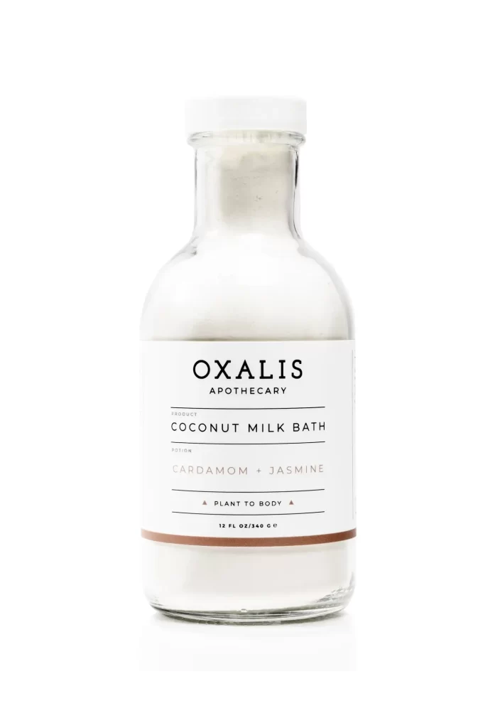
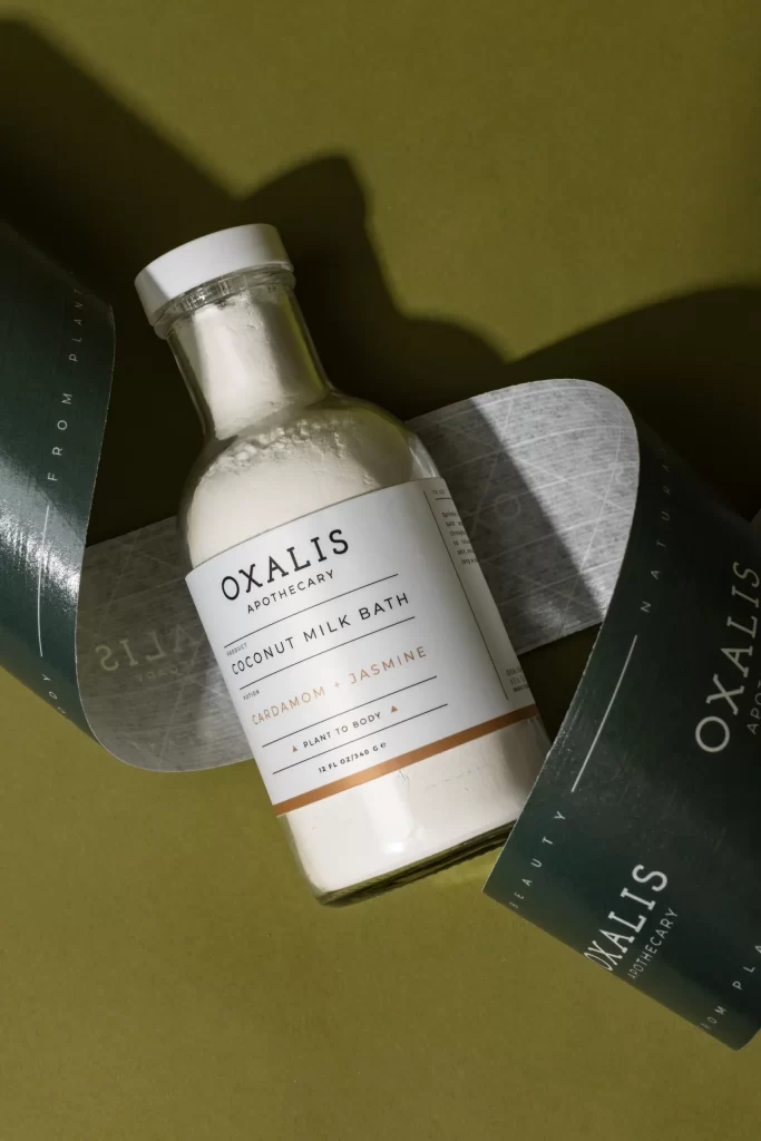
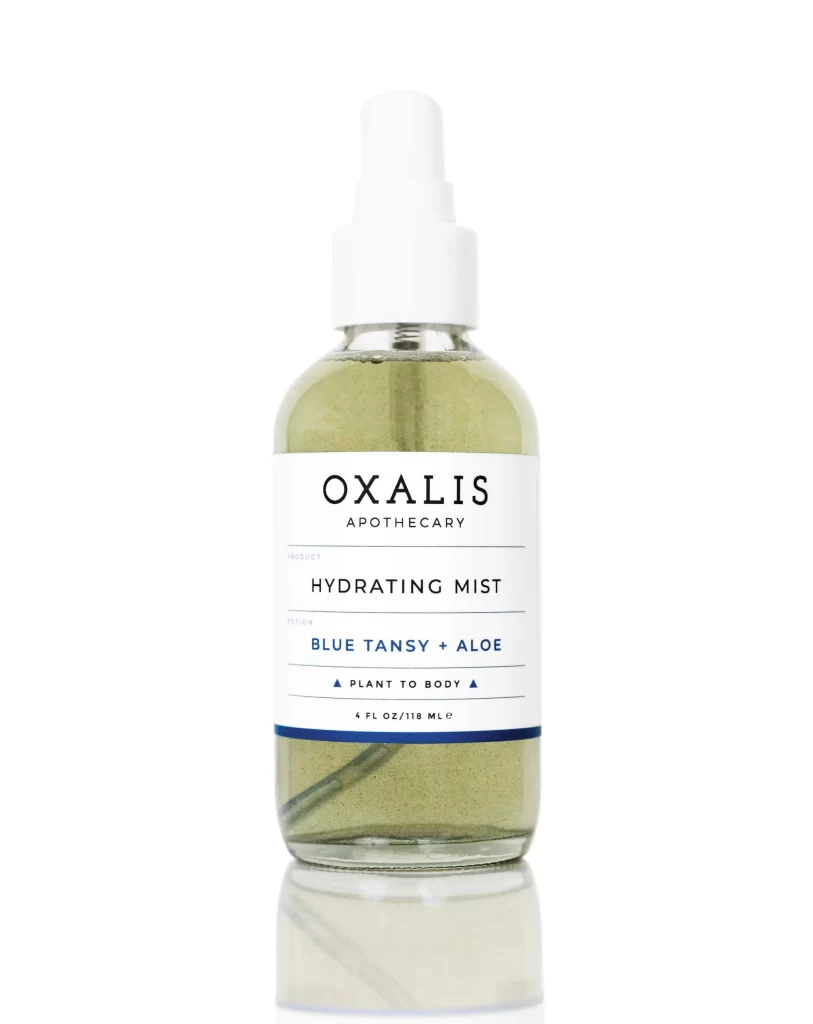
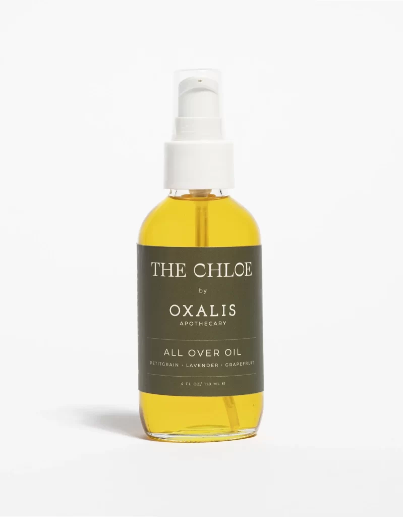
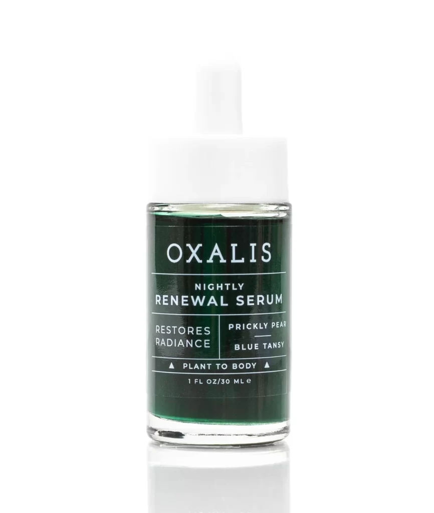
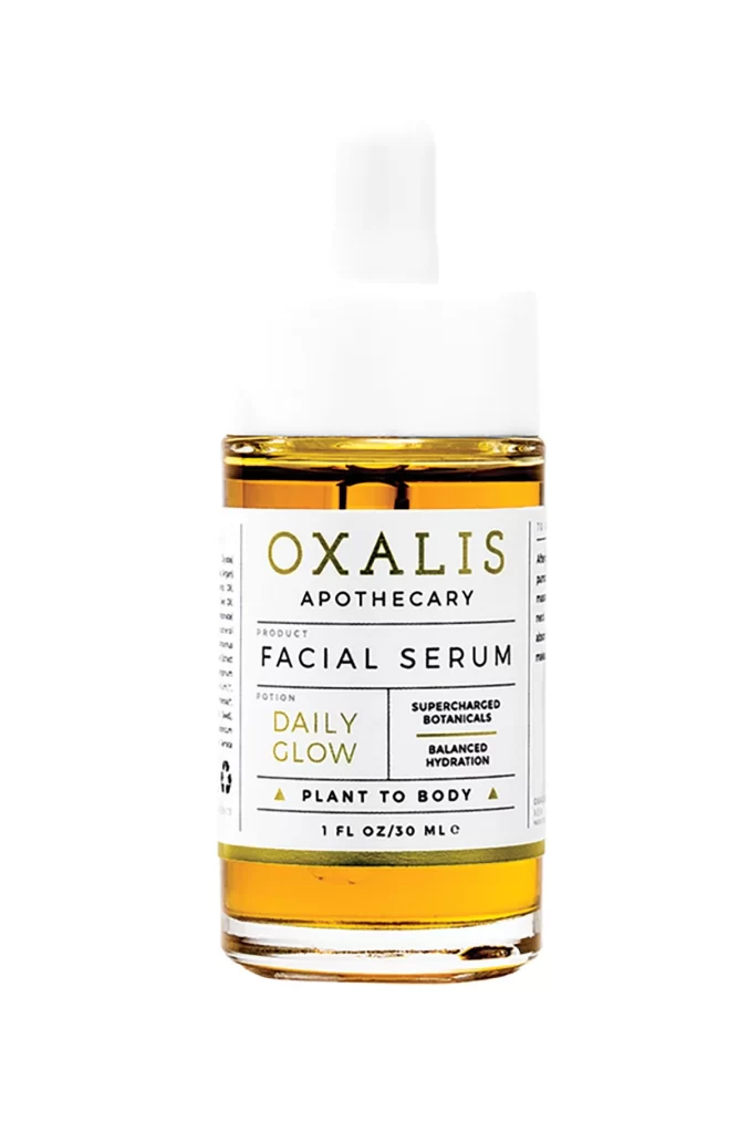
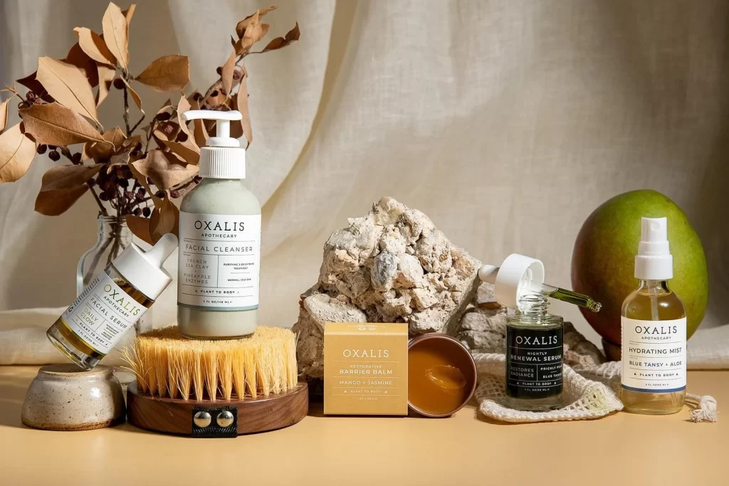
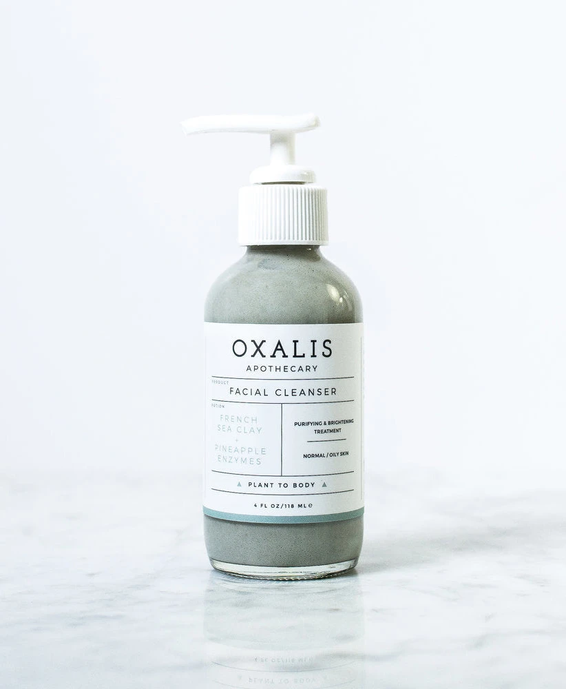
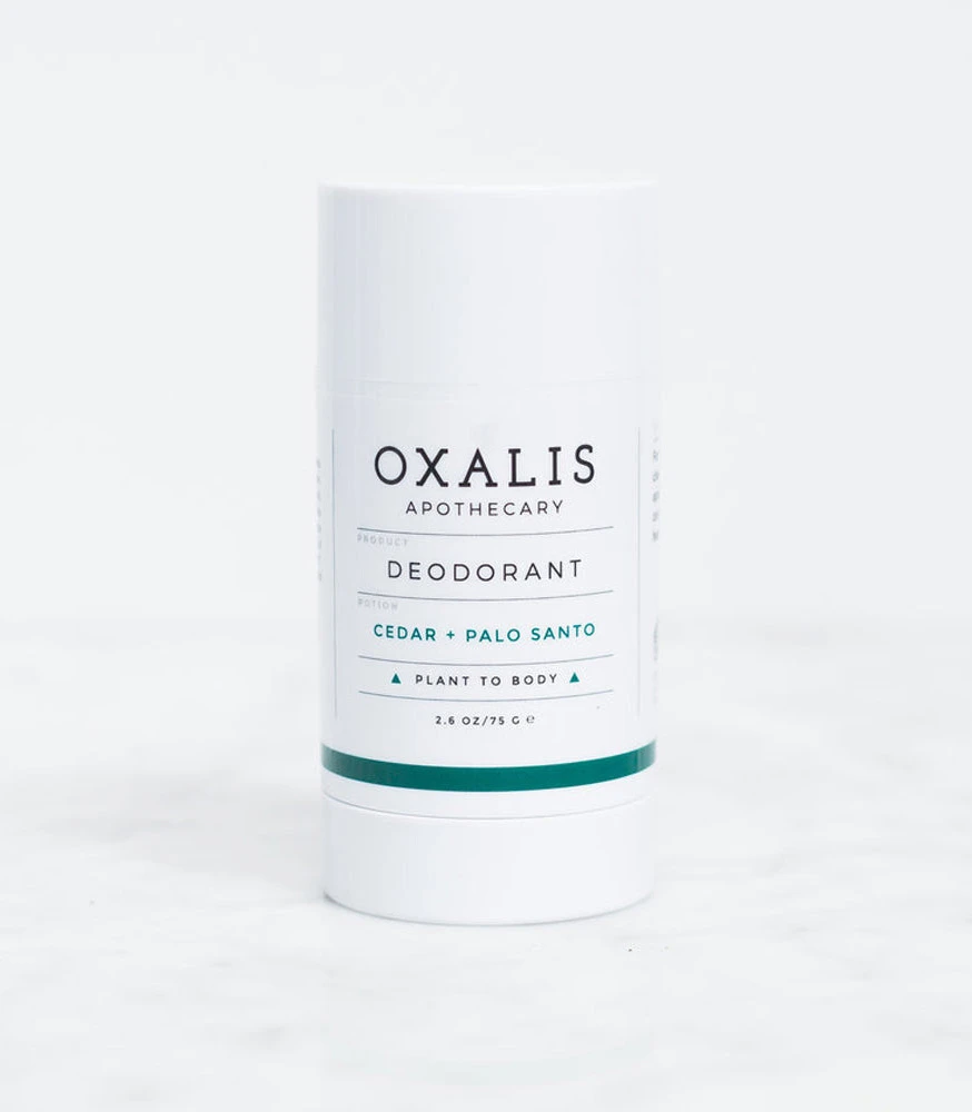
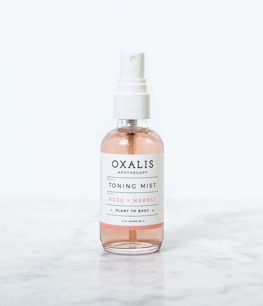
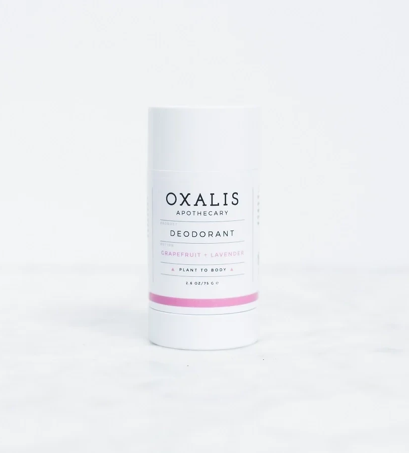
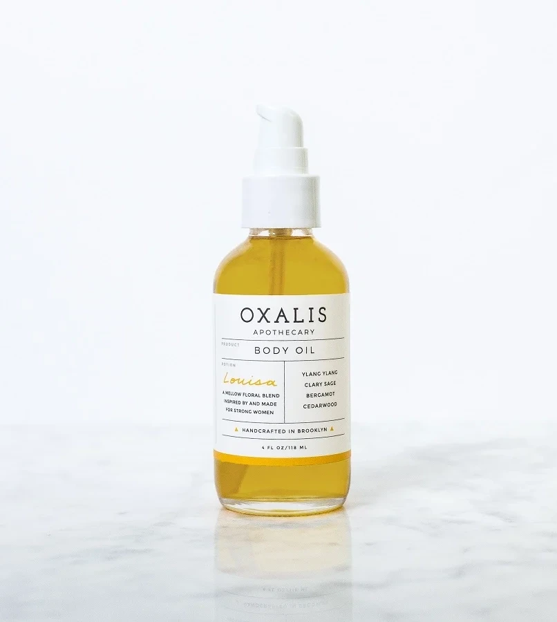
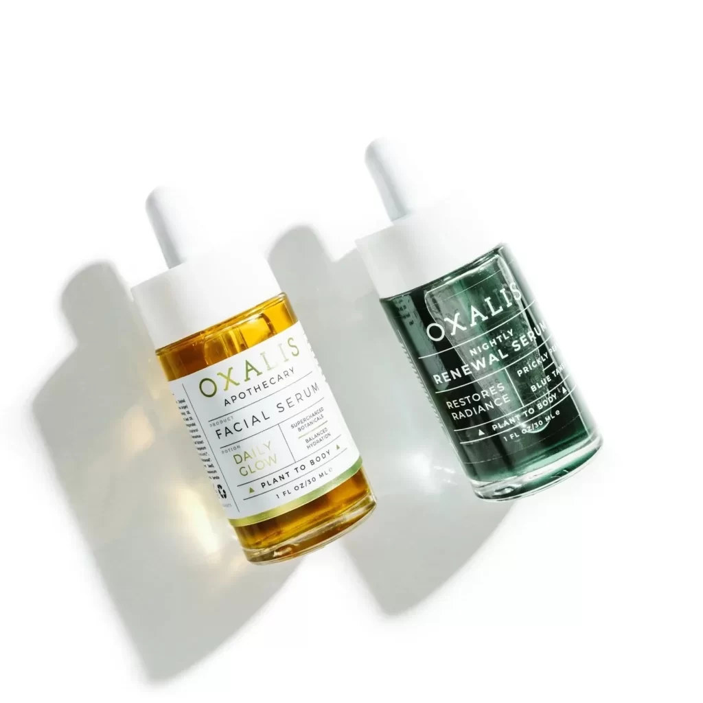
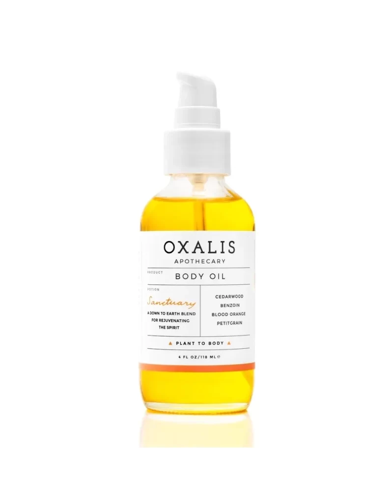
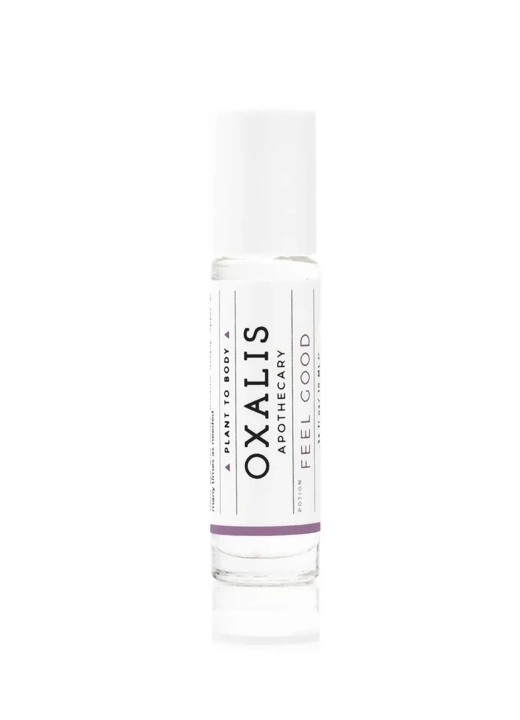
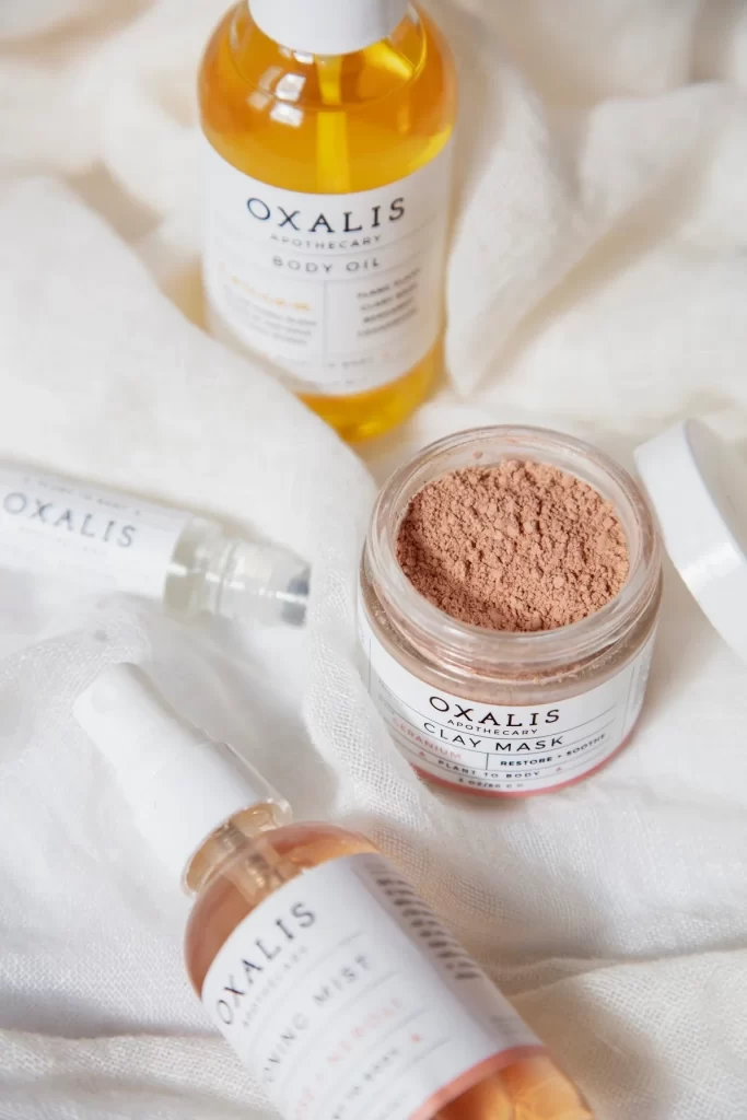
Soft white linen provides a textured backdrop for a curated arrangement of OXALIS APOTHECARY skincare products, captured from a slightly elevated perspective that emphasizes the depth of the composition. A clear glass jar filled with fine pinkish-brown clay powder sits in the foreground, its white lid resting nearby to reveal the matte texture of the mask inside. Behind it stands a cylindrical bottle containing golden-yellow body oil, while a smaller amber glass vessel labeled as mist and a translucent rollerball tube complete the grouping, all unified by minimalist white labels featuring clean serif typography.
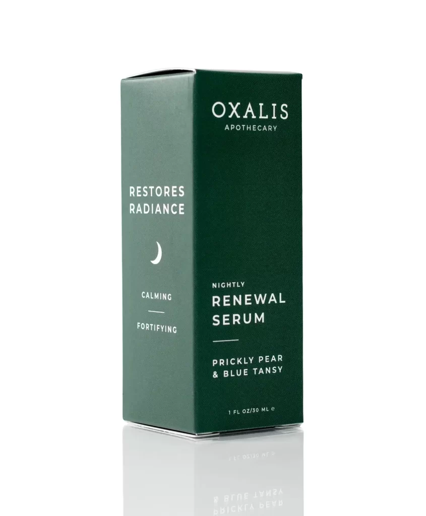
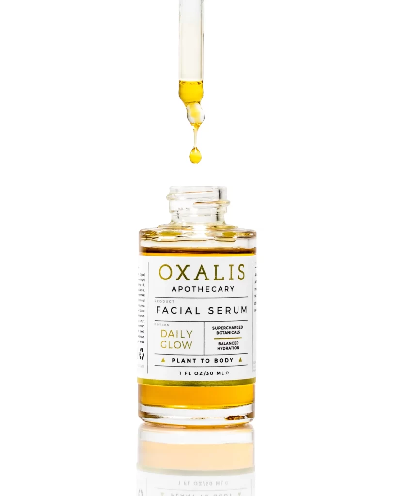
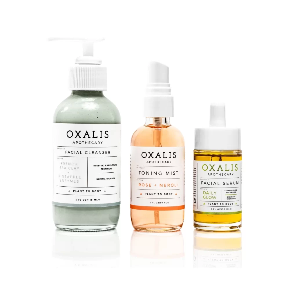
Visual cohesion emerges from the consistent use of frosted white caps and uniform label architecture across varying container shapes and sizes. The warm amber tones of the liquids contrast deliberately against the cool neutral background, drawing attention to the organic color palette inherent in the formulations themselves. Subtle shadows cast by the directional lighting accentuate the physical dimensions of each package, highlighting the interplay between transparency in the glass vessels and opacity in the powdered clay jar.
Brand identity developers studying how to maintain visual consistency across diverse product formats will find this arrangement particularly instructive for understanding scale relationships. Photographers planning natural-lifestyle product shoots can analyze the layering technique used here to create visual hierarchy without cluttering the frame. Packaging engineers evaluating material combinations might reference the specific way transparent, semi-transparent, and opaque containers coexist within a single brand ecosystem while preserving legibility and tactile appeal.