OXALIS French Sea Clay Facial Cleanser Packaging
Topics
Details
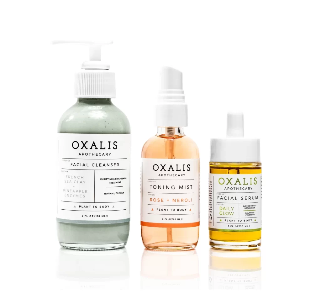
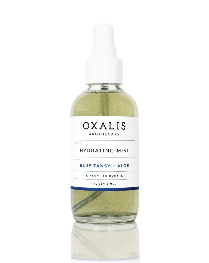
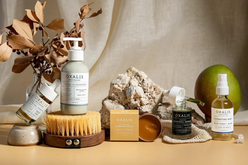
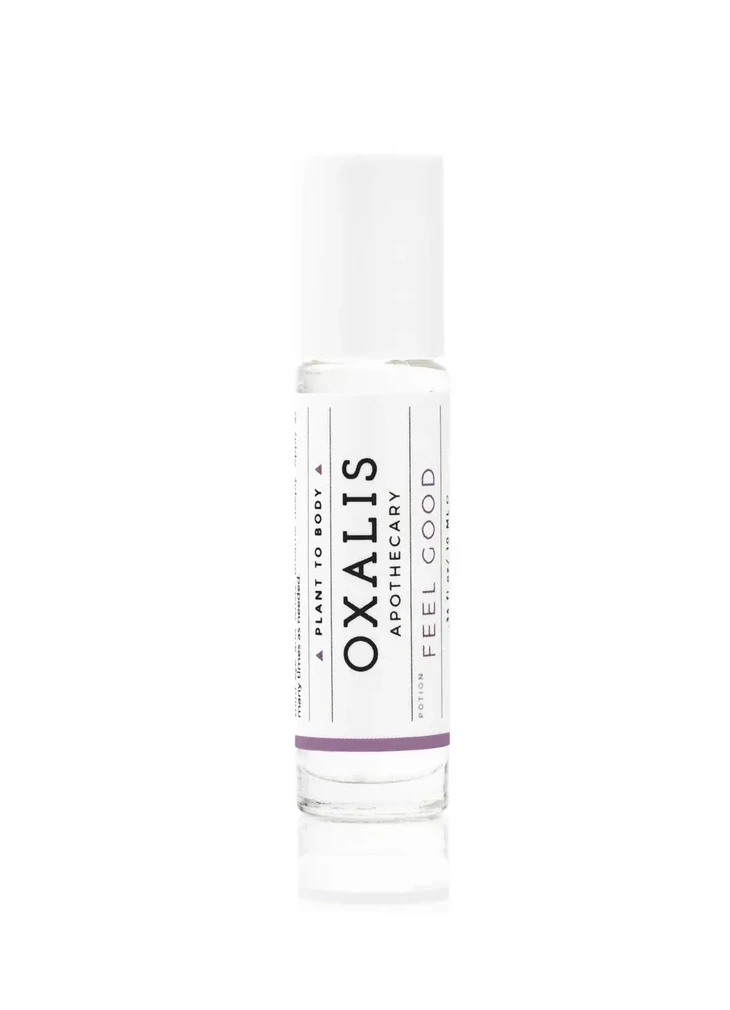
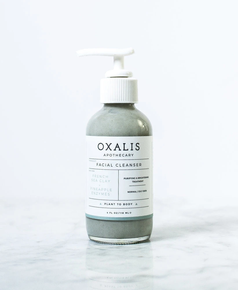
A clear glass bottle filled with muted grey liquid dominates the composition, topped by a white pump dispenser featuring a ribbed collar. The main label displays the brand name 'OXALIS' in bold, uppercase serif lettering above the word 'APOTHECARY', with text sections detailing 'FRENCH SEA CLAY' and 'PINEAPPLE ENZYMES' as key ingredients. The vessel rests on a white marble surface against a bright background, with the packaging indicating a 4 FL OZ volume for this purifying facial treatment.
Visual interest is driven by the sophisticated interplay between the organic texture of the grey cleanser and the crisp, clinical precision of the typography. The minimalist color palette—consisting primarily of white, slate grey, and black ink—conveys a sense of medical-grade purity and modern apothecary aesthetics. Furthermore, the use of thin horizontal dividers and varied font weights creates a structured hierarchy that feels both professional and approachable, making the packaging stand out in a crowded beauty market.
Brand identity specialists might utilize this visual to explore how neutral tones can effectively communicate natural ingredient lists without appearing dull. Packaging engineers could study the balance between the transparent glass and the opaque pump to understand how material choices influence consumer perception of product quality. Additionally, art directors working on wellness or skincare campaigns could reference the spatial arrangement and lighting setup to achieve a similar clean, high-end look for their own product photography.