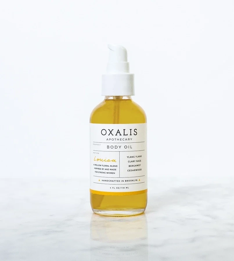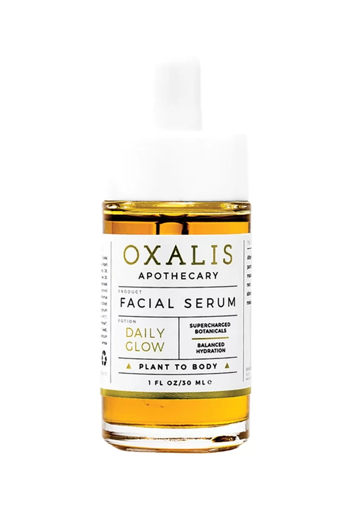
OXALIS Wildflower Ceranium Green Pink Clay Mask Packaging
Topics
Details
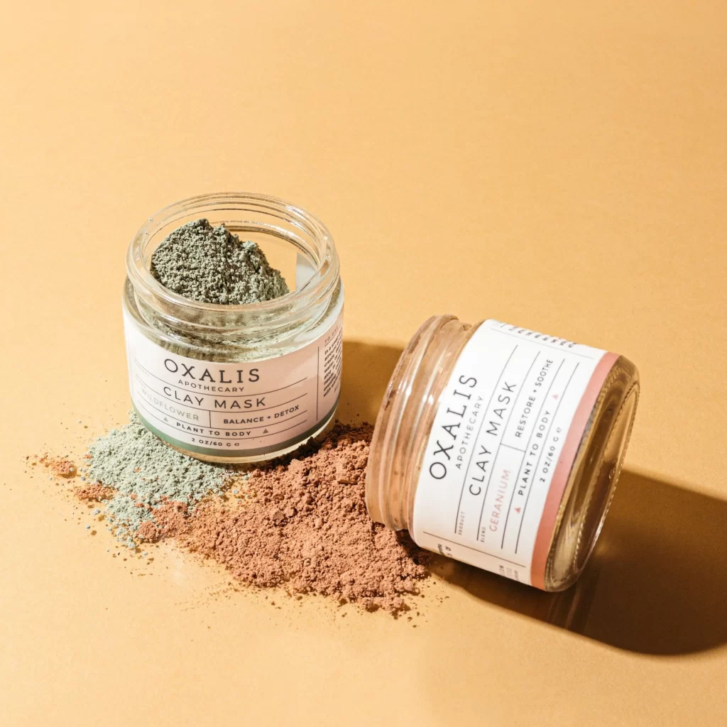
Two glass jars of Oxalis Apothecary Clay Mask sit on a warm peach-toned surface, with the upright left vessel revealing a textured mound of sage-green powder and the right jar lying on its side to display a label accented with a soft coral stripe. Natural light from the upper right casts gentle shadows across scattered piles of greenish-blue and terracotta powder, illuminating the fine granular texture of the loose clay.
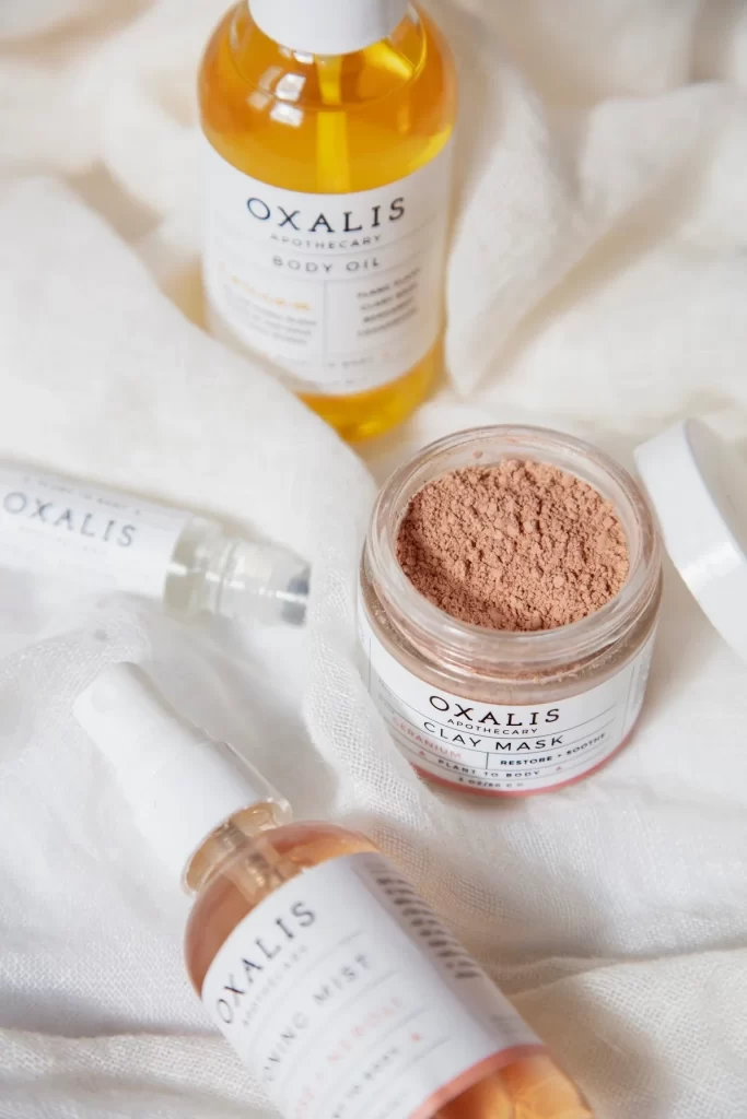
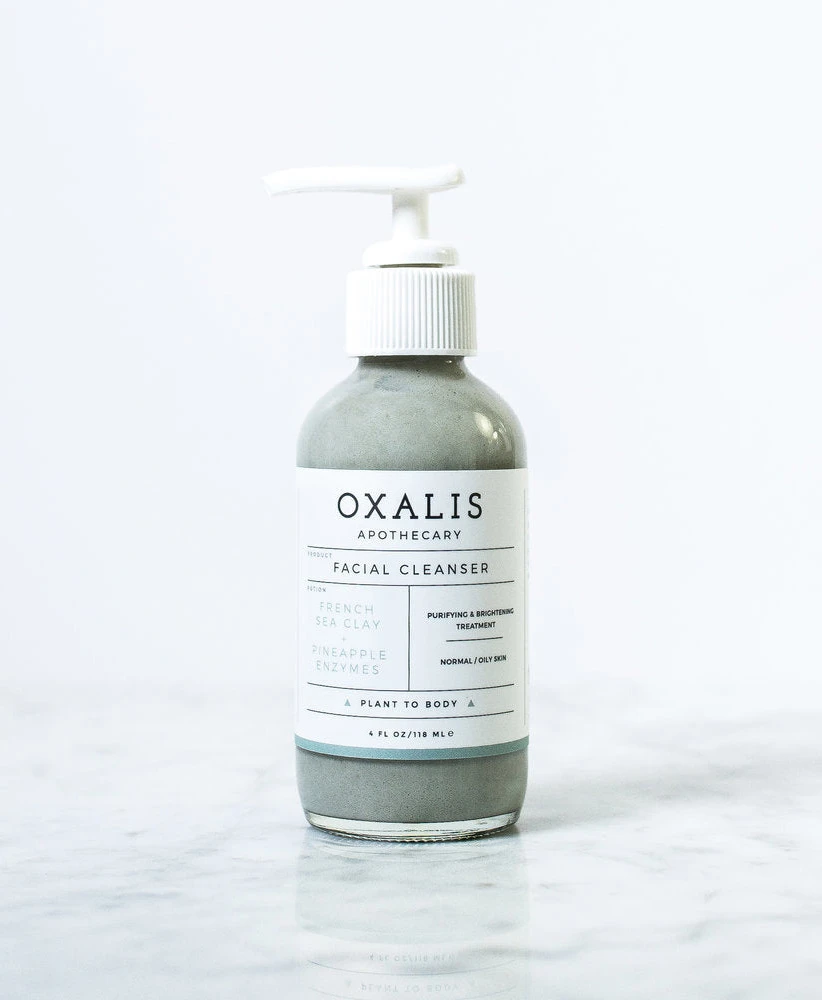
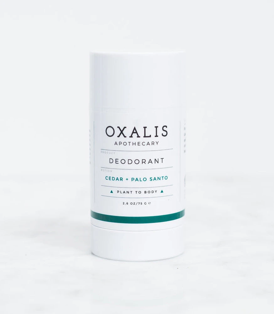
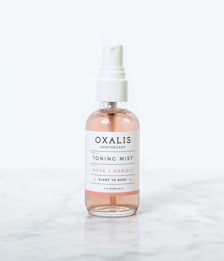
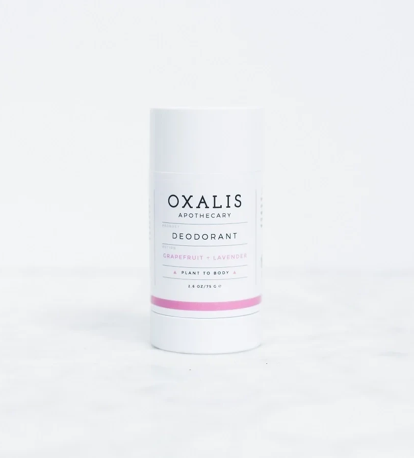
Visual distinction emerges from the deliberate contrast between the raw, earthy contents and the clinical precision of the minimalist typography. Each label employs a strict grid layout that balances the brand name with functional descriptors like ‘Balance + Detox’ or ‘Restore + Soothe,’ creating a sense of botanical authority. The color palette—muted greens, dusty pinks, and crisp white—evokes an organic aesthetic that feels simultaneously modern and rooted in natural apothecary traditions.
Art directors developing clean-beauty campaigns will find this composition useful for studying how to photograph loose powders without losing text legibility. Packaging designers can analyze the hierarchy of information on the labels to understand how to effectively communicate product benefits within a limited space. Furthermore, stylists planning flat-lay photography sessions might reference this image to master the technique of spilling product samples in a way that looks intentional rather than messy.