OXALIS Feel Good Skincare Packaging
Topics
Details
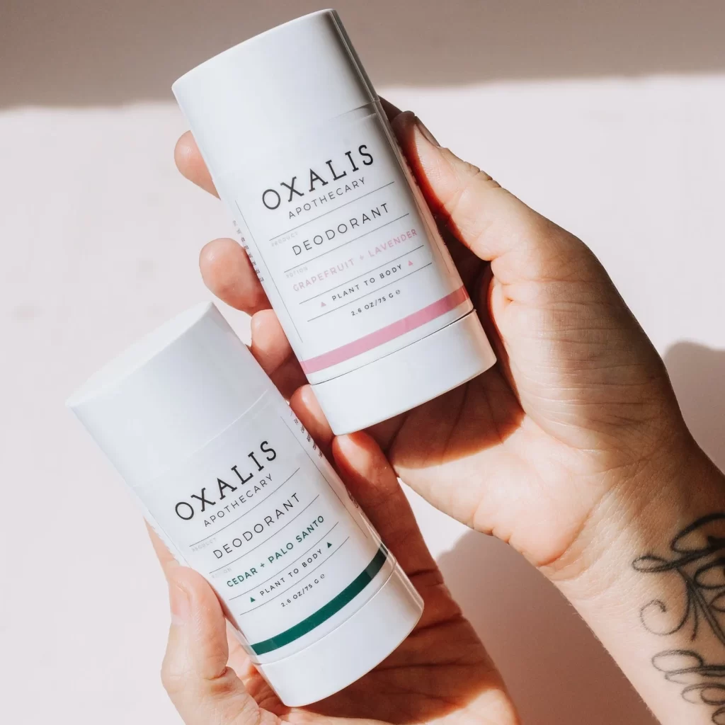
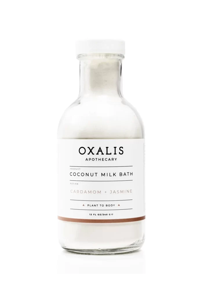
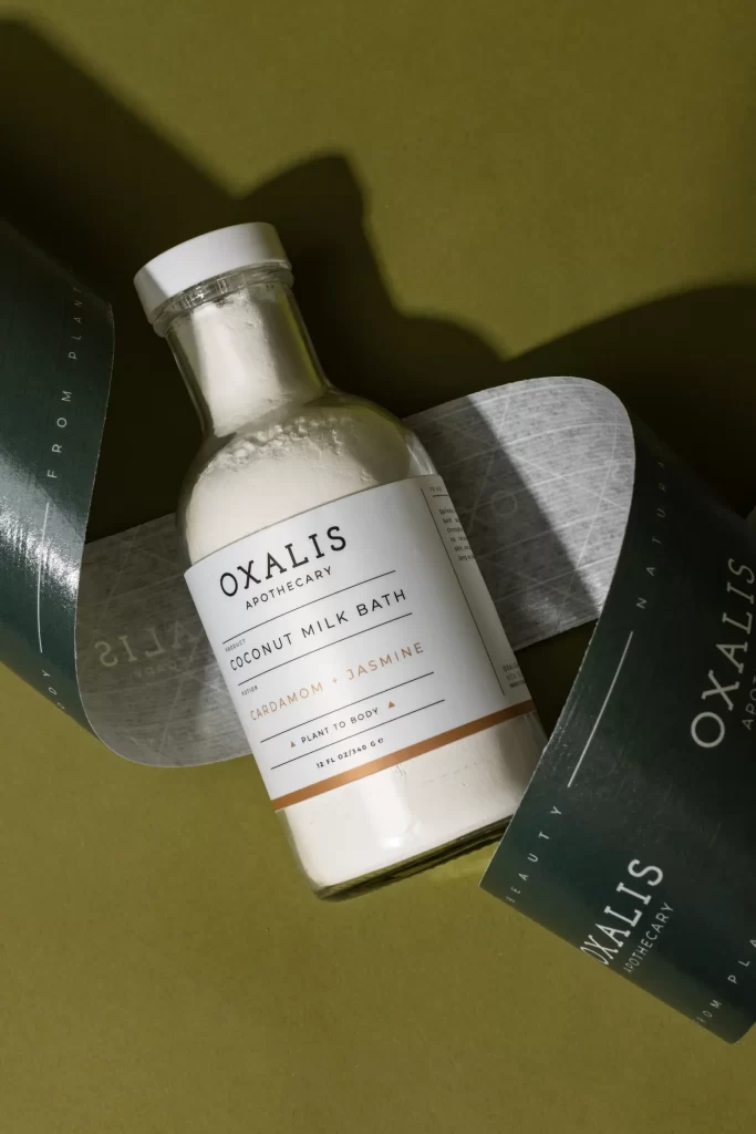
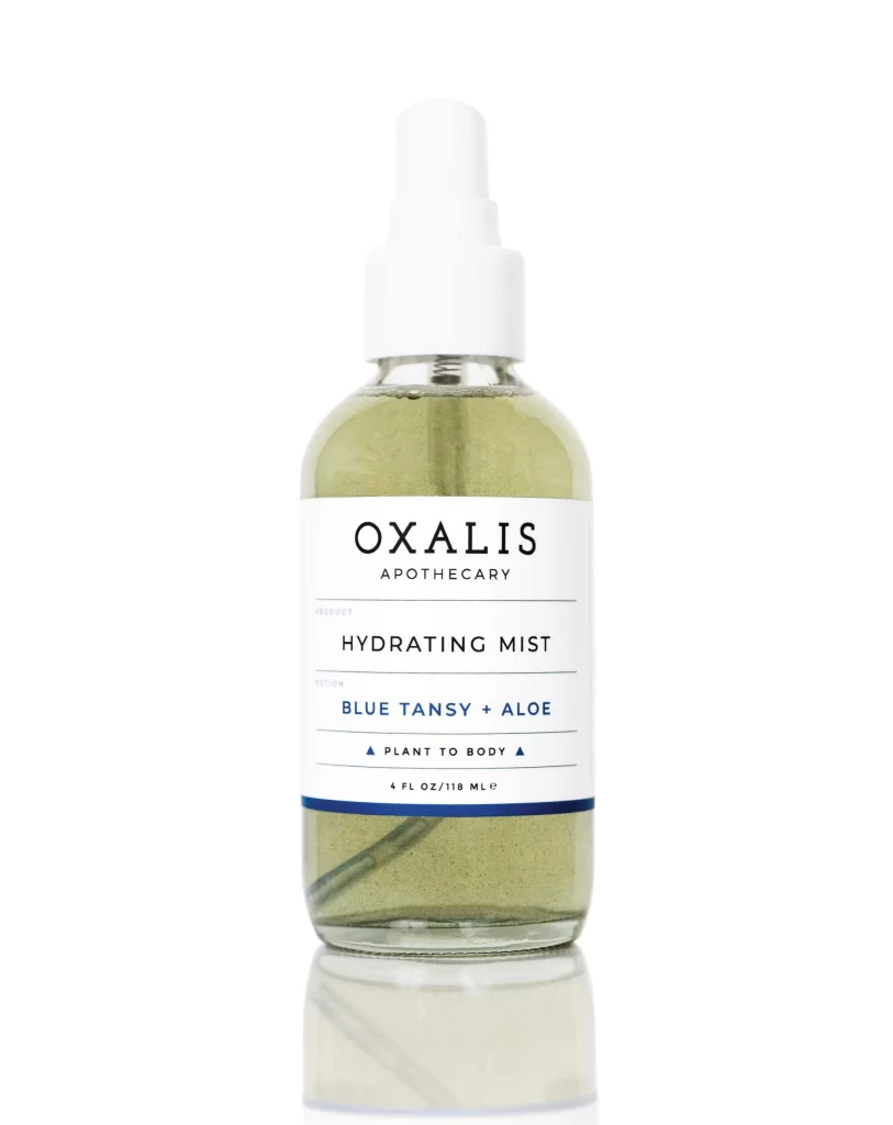
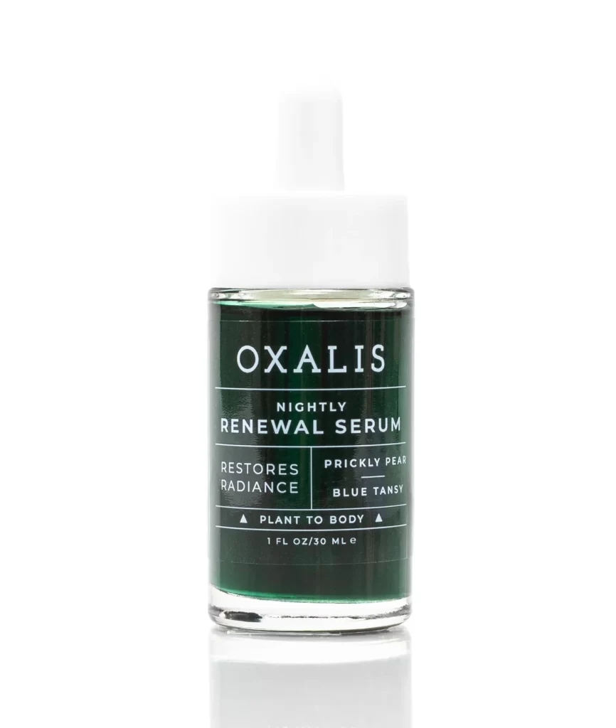
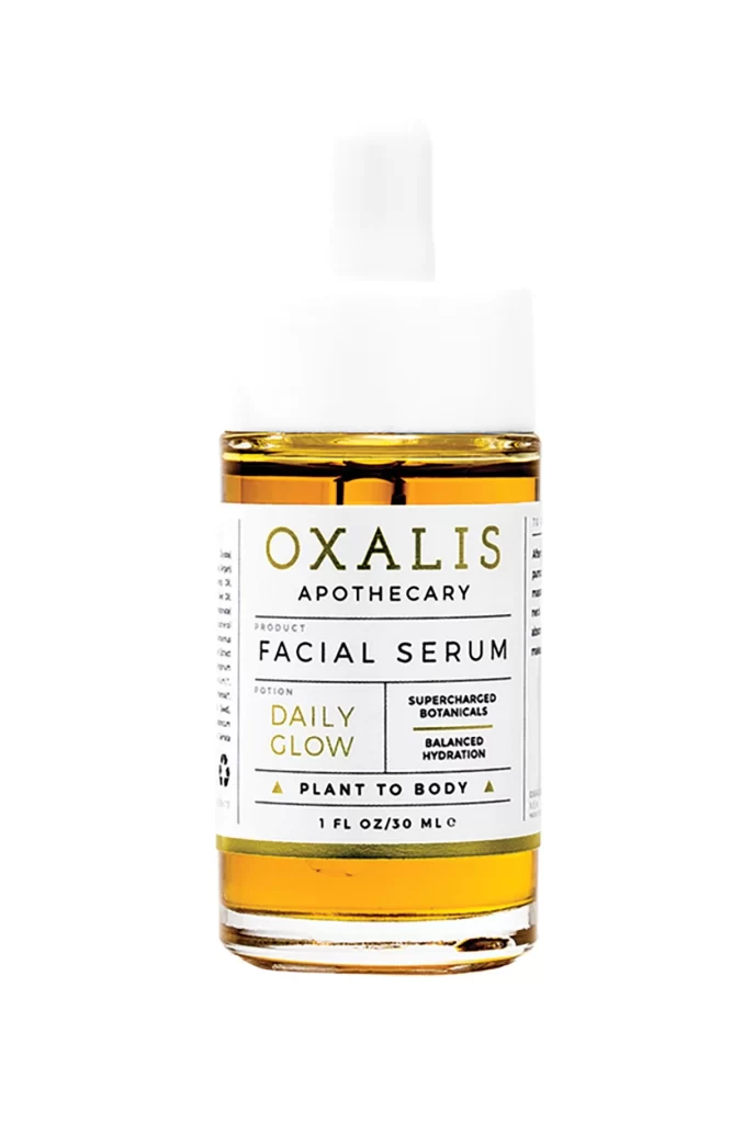
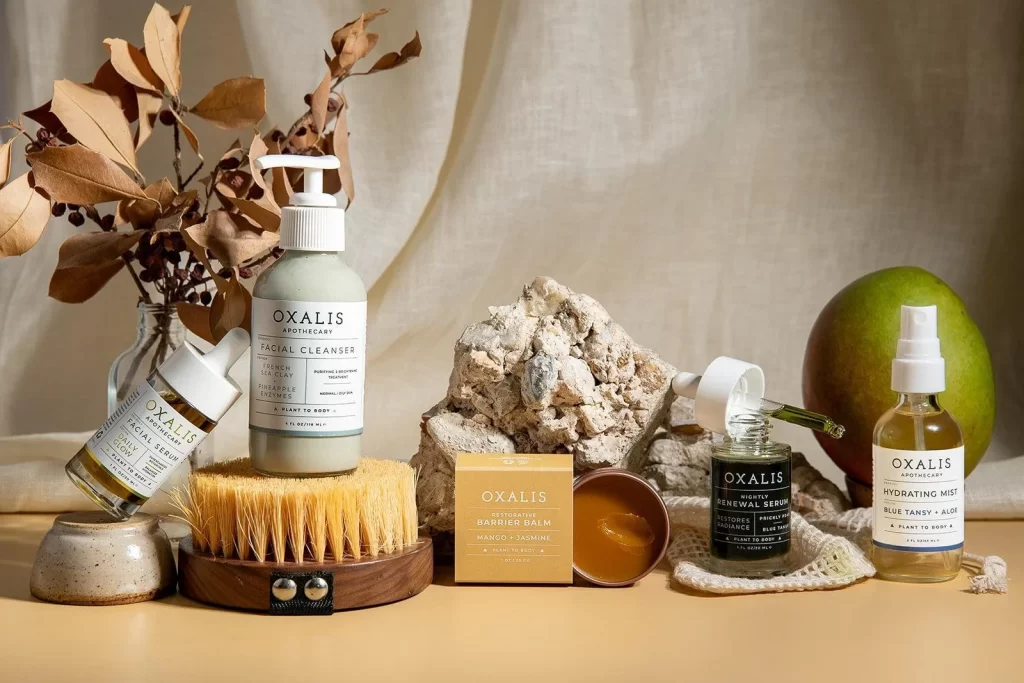
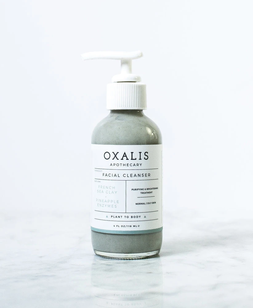
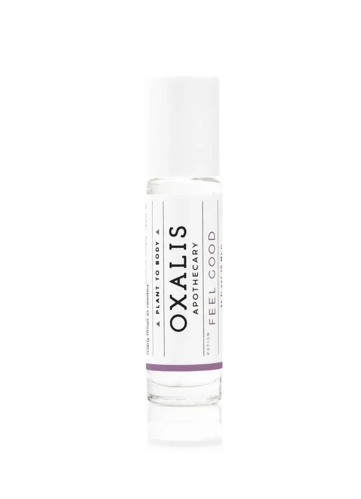
A cylindrical glass roll-on bottle with a transparent body and white cap stands vertically, its label displaying 'OXALIS' in bold black sans-serif capitals with 'APOTHECARY' and 'FEEL GOOD' in smaller text flanking either side. A thin purple band accents the bottom of the white label, while the clear glass reveals liquid contents inside against a white background.
Visual hierarchy emerges through deliberate scale contrast between the dominant brand name and supporting copy, establishing immediate recognition without decorative clutter. The restrained color palette—white, black, and a muted purple accent—signals botanical purity while maintaining contemporary minimalism. Vertical text orientation on both margins creates a structured frame that elongates the bottle’s silhouette, reinforcing the apothecary aesthetic through geometric precision rather than ornamental detail.
Brand strategists developing wellness or clean-beauty identities could analyze this layout for balancing information density with breathing room. Packaging designers seeking to modernize traditional apothecary formats might reference how the lavender stripe functions as both visual anchor and subtle category indicator. Art directors commissioning product photography would benefit from studying how this frontal perspective eliminates distraction while emphasizing label typography as the primary communication vehicle.