OXALIS Cedar + Palo Santo Natural Deodorant Packaging
Topics
Details
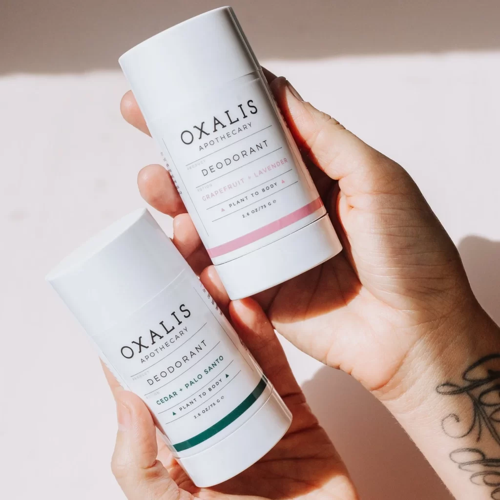
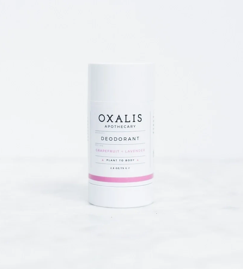
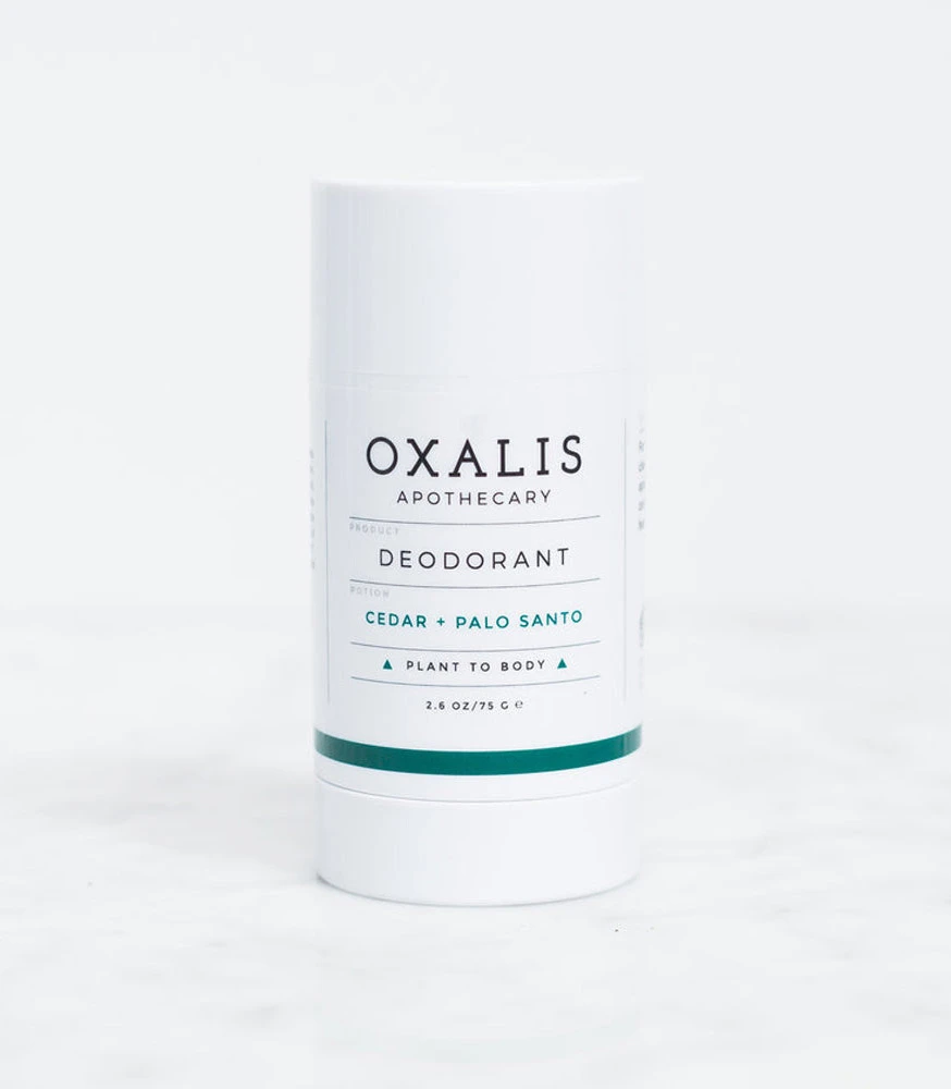
A cylindrical white deodorant stick with a matte finish stands on a white surface, its label displaying crisp black typography for the brand name OXALIS APOTHECARY and product category DEODORANT. The scent variant CEDAR + PALO SANTO appears in contrasting teal lettering above the phrase PLANT TO BODY flanked by small triangles, while a solid teal band anchors the bottom of the container near the 2.6 OZ/75 G weight marking.
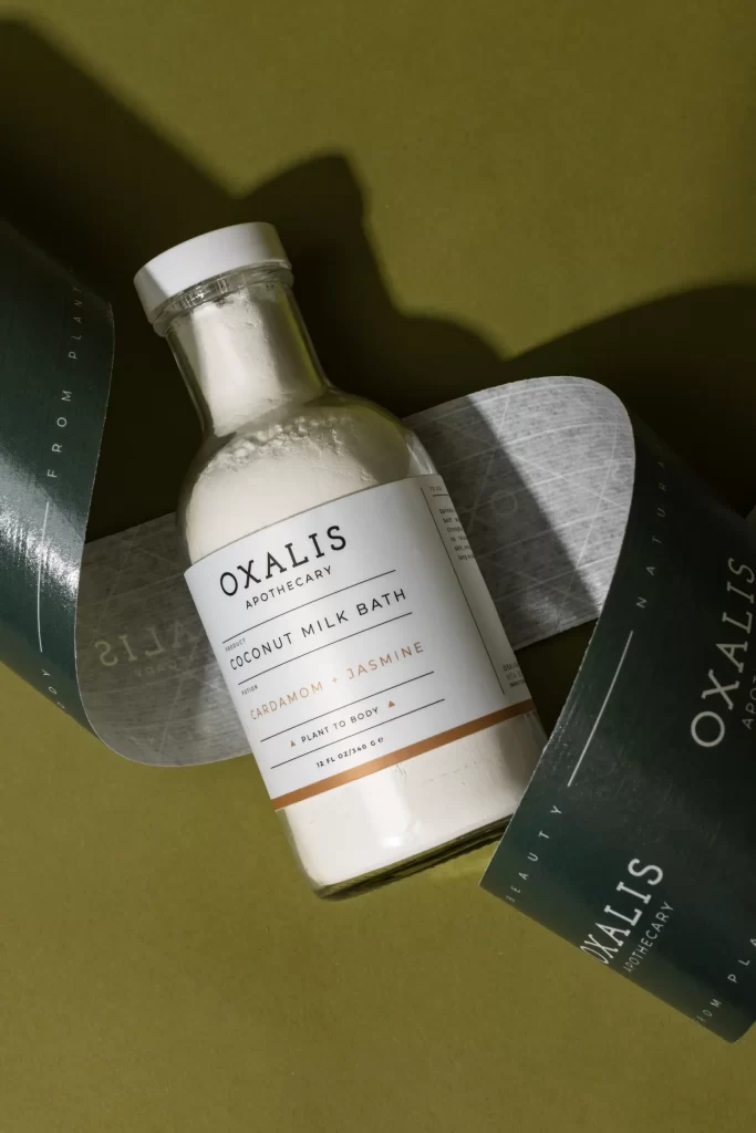
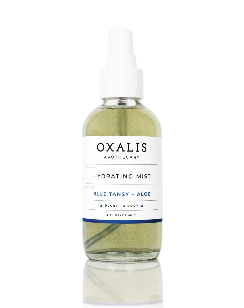
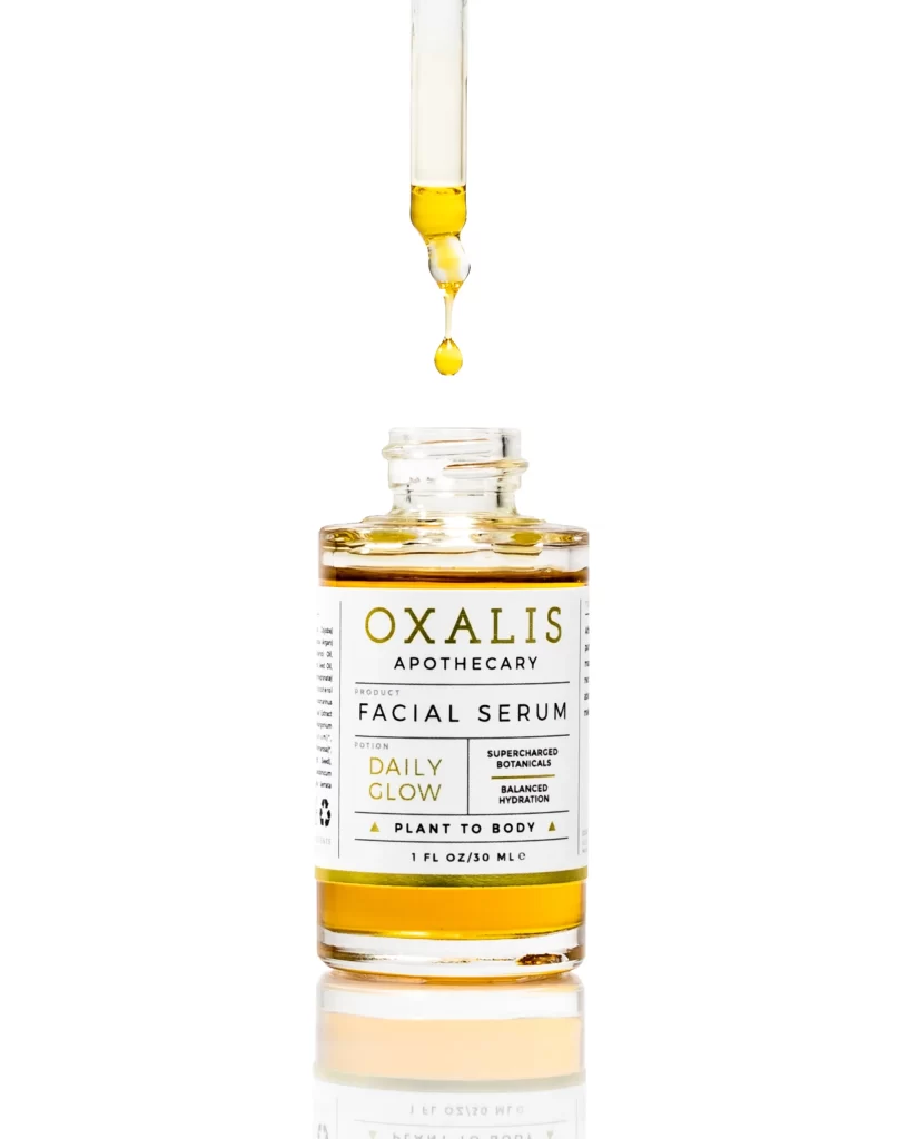
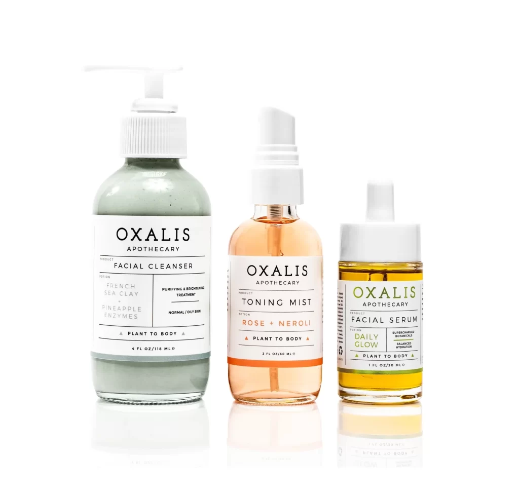
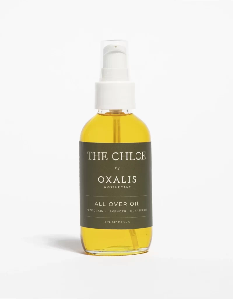
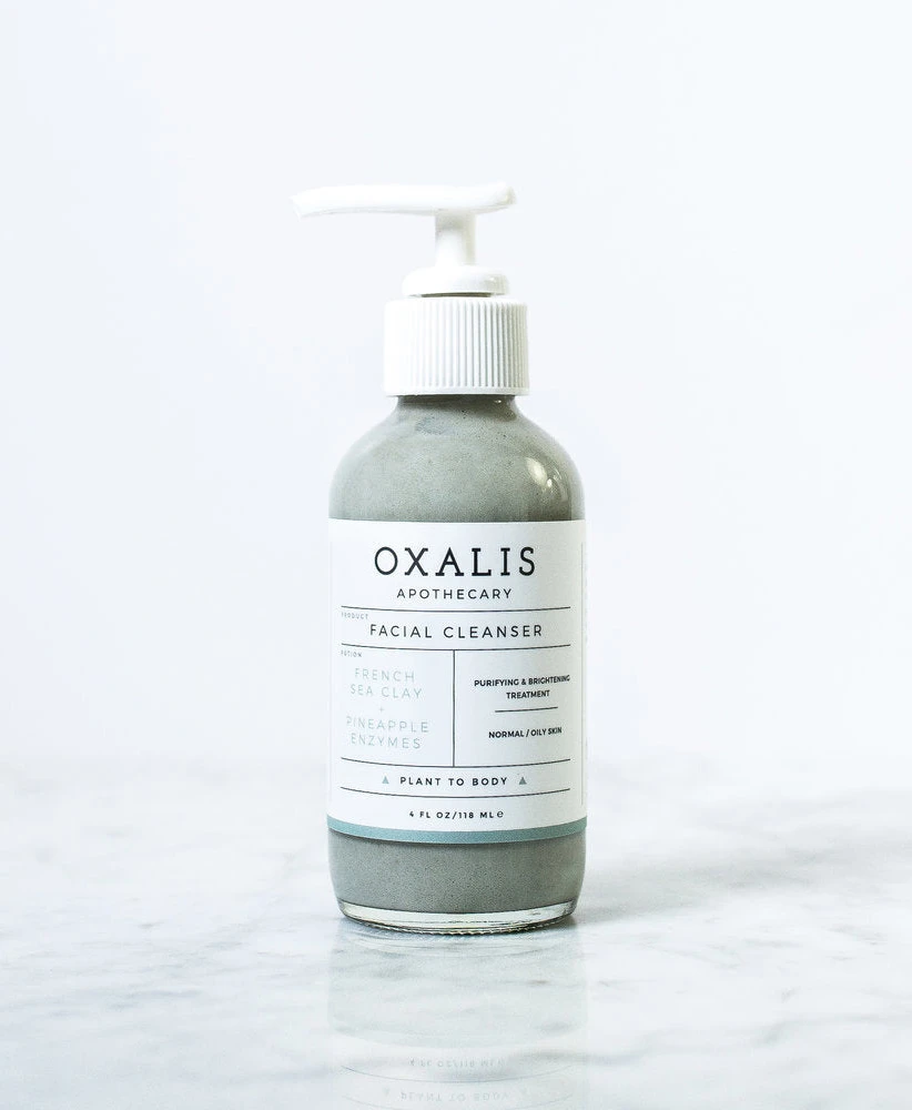
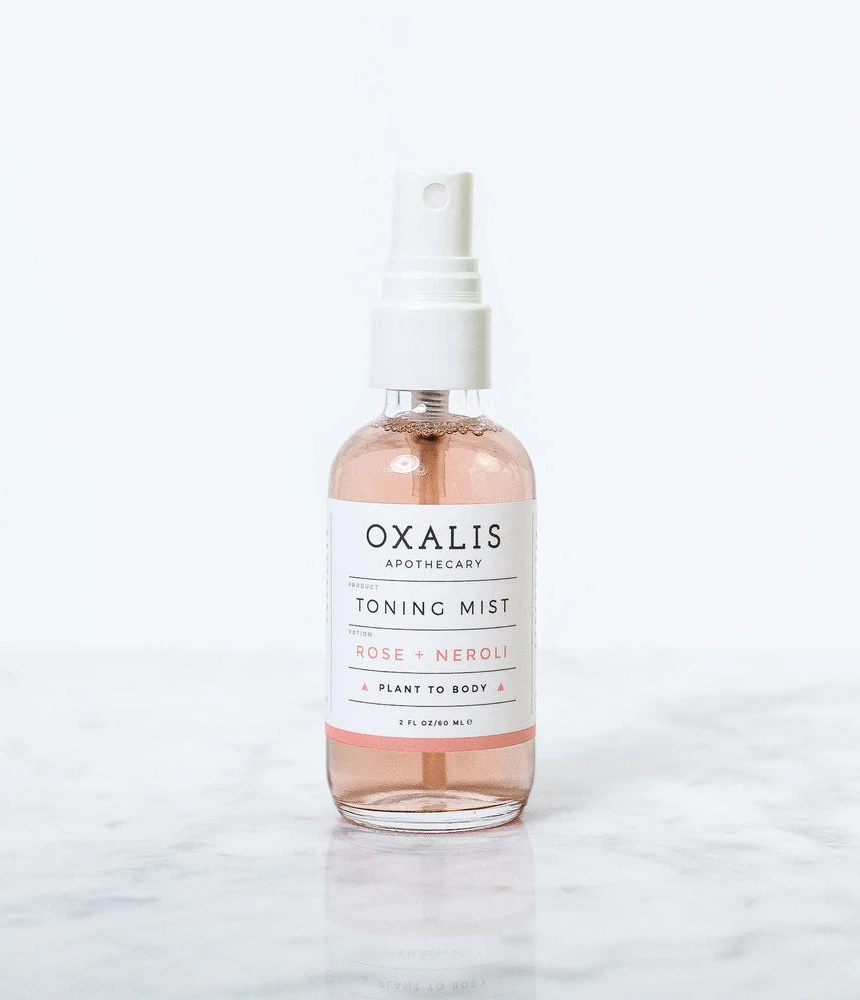
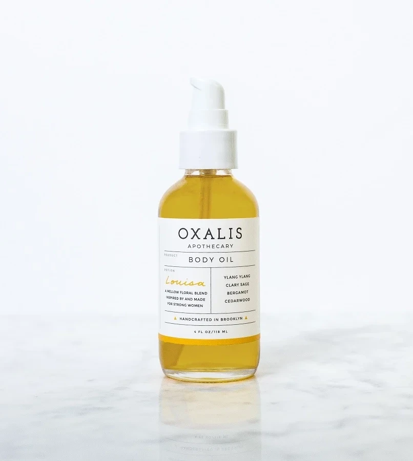
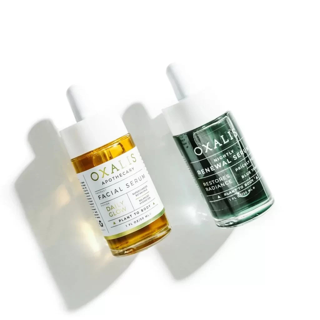
Minimalist restraint defines this packaging concept, where generous negative space and a strictly limited palette of white, black, and teal create an immediate sense of botanical purity. The deliberate use of thin horizontal rules to separate information hierarchy suggests a clinical yet artisanal sensibility, while the triangular icons flanking the PLANT TO BODY tagline add subtle geometric interest without cluttering the layout. Such disciplined typographic arrangement signals premium positioning through understated elegance rather than ornate decoration.
Brand strategists developing clean-beauty identities will find this execution particularly useful for analyzing how whitespace communicates luxury and trustworthiness. Packaging engineers can study the proportions of the cylindrical form relative to the label wrap to understand optimal text placement on curved surfaces. Art directors commissioning product photography might reference this lighting setup to achieve similar high-key results that eliminate distracting shadows while preserving material texture.