OXALIS Grapefruit + Lavender Natural Deodorant Packaging
Topics
Details
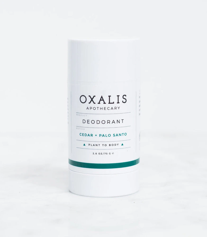
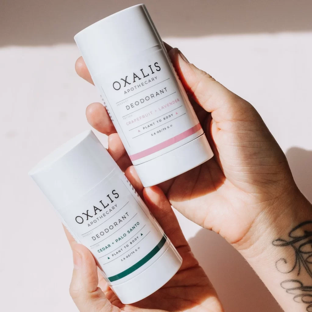
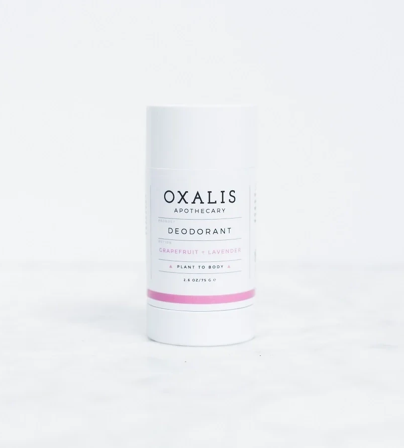
A cylindrical deodorant stick of opaque white plastic stands upright on a white surface, its clean label dominated by black serif typography spelling out 'OXALIS APOTHECARY' above the word 'DEODORANT'. The scent variant 'GRAPEFRUIT + LAVENDER' appears in muted pink lettering, echoed by a singular horizontal band of soft pink that encircles the lower portion of the tube. Small text at the bottom indicates the 2.6 OZ/75 G weight and the phrase 'PLANT TO BODY', completing the minimalist aesthetic.
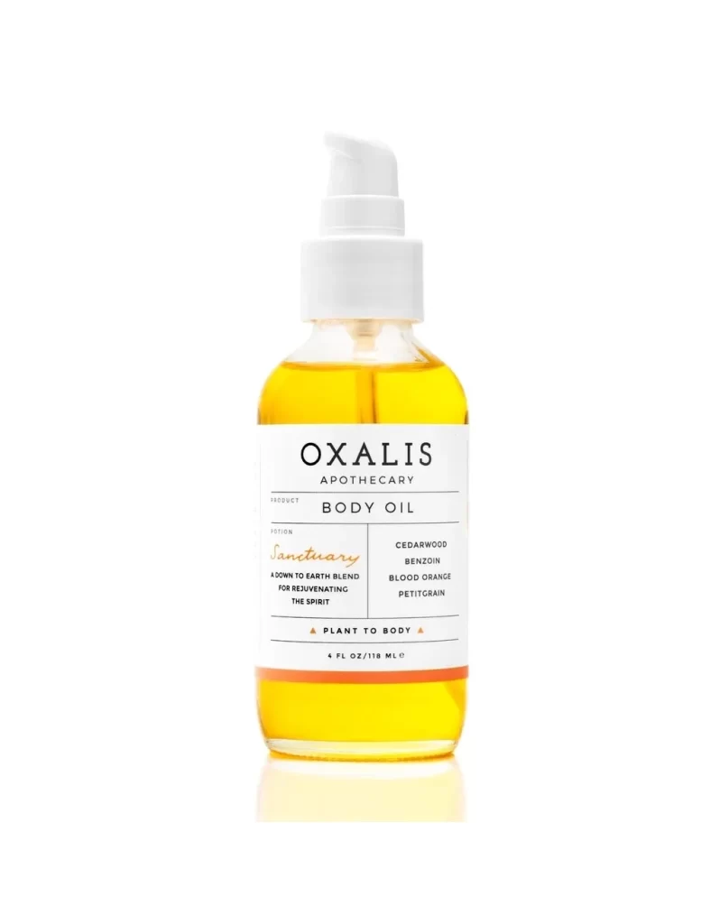
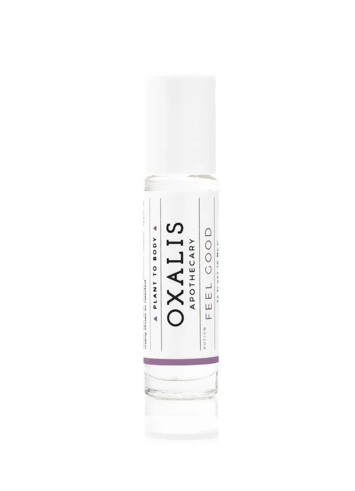
Visual interest is generated through the disciplined use of negative space and the strategic contrast between the bold, authoritative header and the delicate, light pink script used for the scent description ‘GRAPEFRUIT + LAVENDER’. The layout relies on precise alignment and thin divider lines to create a sense of order and premium quality without clutter. By restricting the palette to white, black, and a hint of blush, the design communicates a sense of botanical purity and modern sophistication that feels both approachable and high-end.
Packaging designers looking to master the art of ‘clean beauty’ branding will find this composition a perfect case study in restraint and hierarchy. It serves as an excellent benchmark for art directors aiming to balance traditional apothecary vibes with contemporary minimalism. Furthermore, photographers can analyze the soft, diffused lighting setup here to understand how to highlight texture and form without creating harsh shadows on reflective surfaces.