OXALIS Nightly Renewal Serum Green Bottle Packaging
Topics
Details
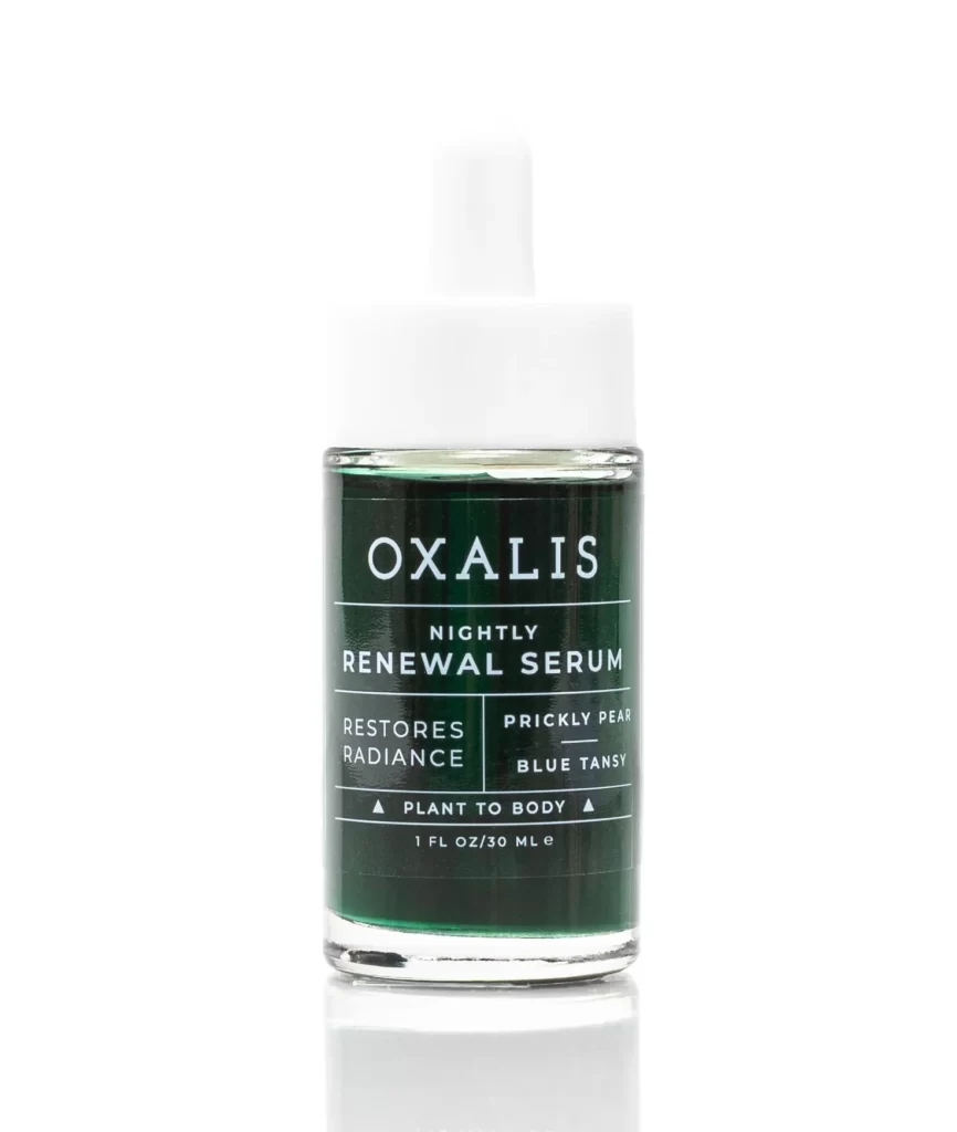
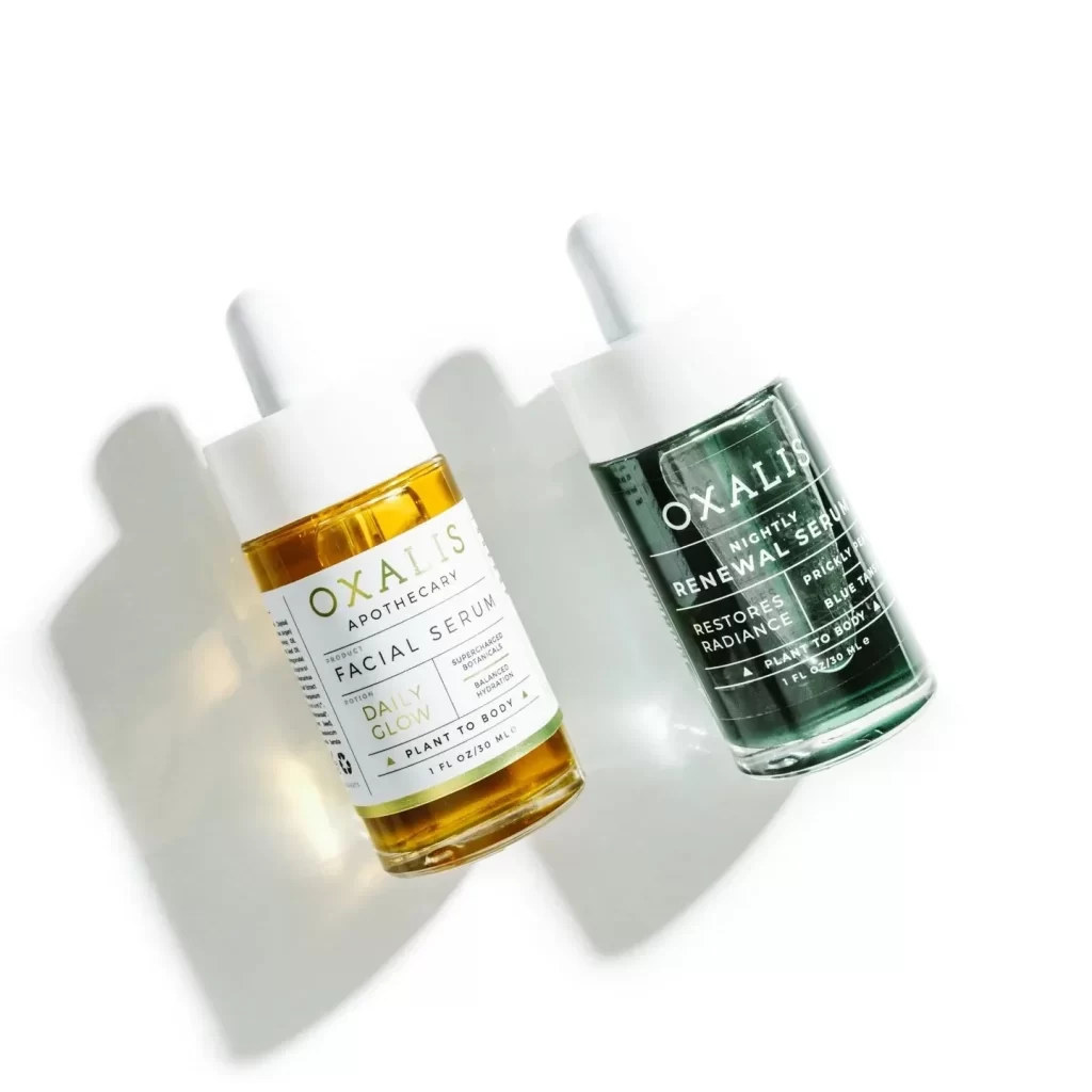
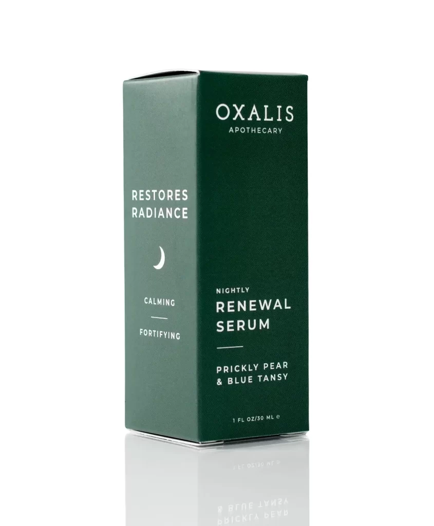
A deep forest green rectangular box stands at a slight three-quarter angle, revealing both its front and left side panels against a white background. Crisp white typography adorns the packaging, with the brand name 'OXALIS APOTHECARY' positioned prominently above the product title 'NIGHTLY RENEWAL SERUM'. A delicate crescent moon icon sits between the phrases 'RESTORES RADIANCE' and the dual descriptors 'CALMING' and 'FORTIFYING' on the left panel.
Visual interest stems from the sophisticated monochromatic palette and the strategic use of negative space that allows each text element to breathe. The matte texture of the cardboard suggests an eco-conscious, premium aesthetic, while the minimalist iconography reinforces the nocturnal skincare theme without cluttering the layout. Such restrained elegance creates a sense of trust and botanical purity that aligns perfectly with the apothecary branding.
Brand strategists developing clean-beauty identities will find this composition useful for studying how hierarchy guides the eye from brand to benefit to ingredient. Packaging designers can analyze the balance between serif and sans-serif typefaces to understand how font pairing influences perceived luxury. Art directors planning e-commerce photography might reference this lighting setup to achieve similar soft reflections on product surfaces for their own catalog shoots.