OXALIS Rose + Neroli Facial Toner Packaging
Topics
Details
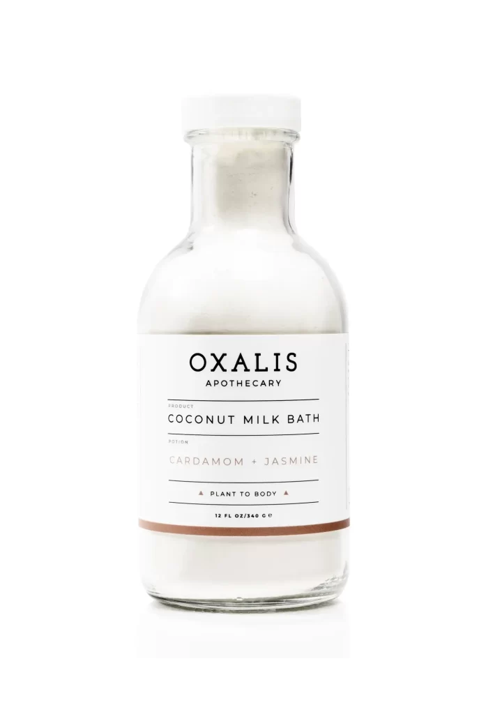
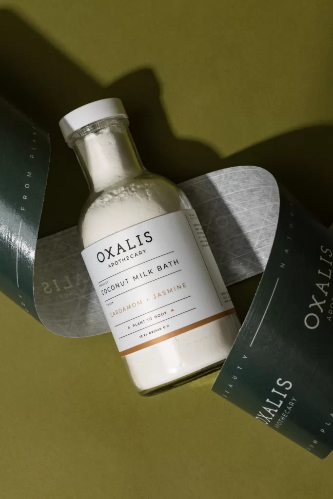
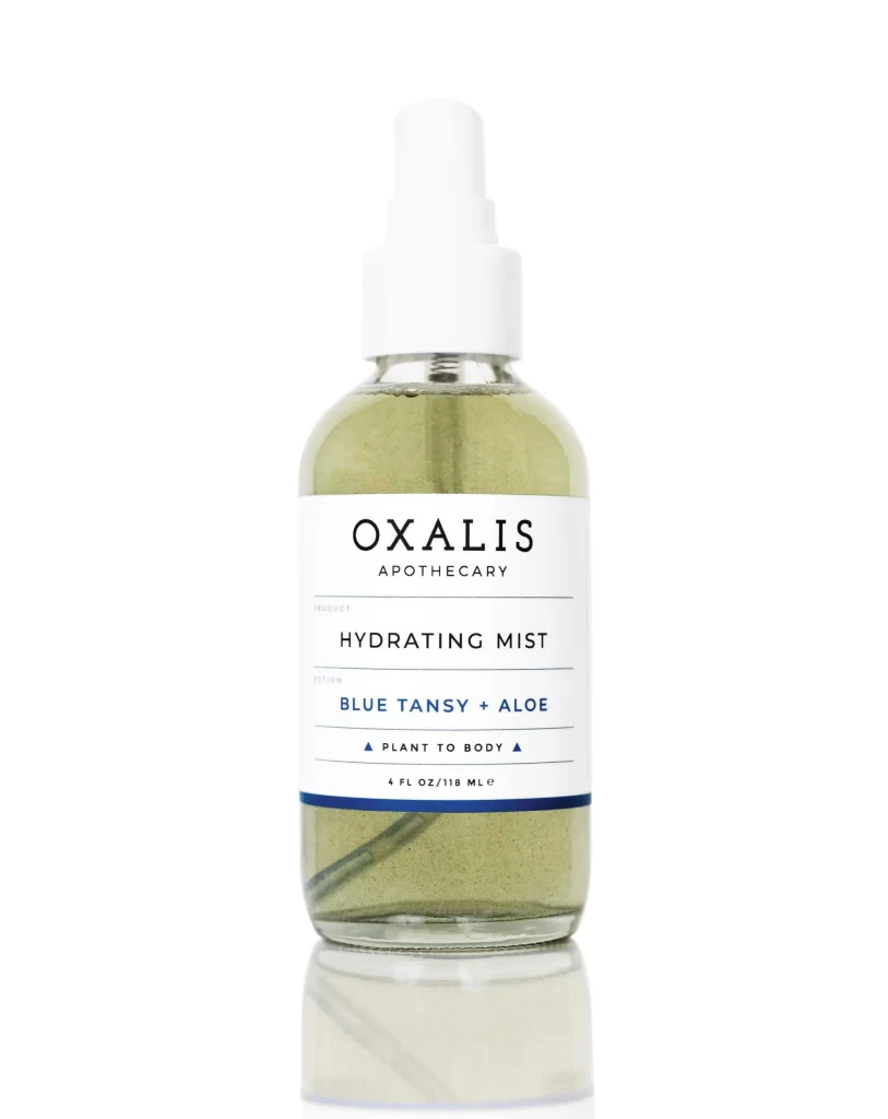
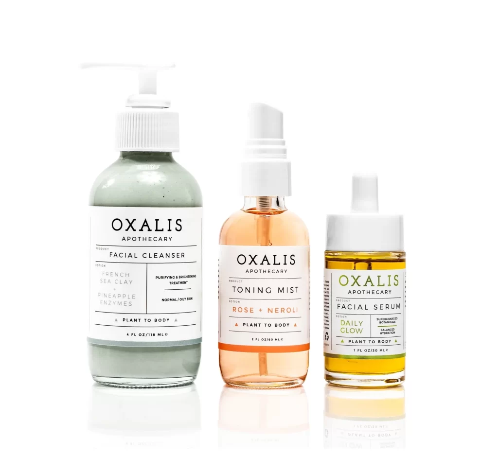
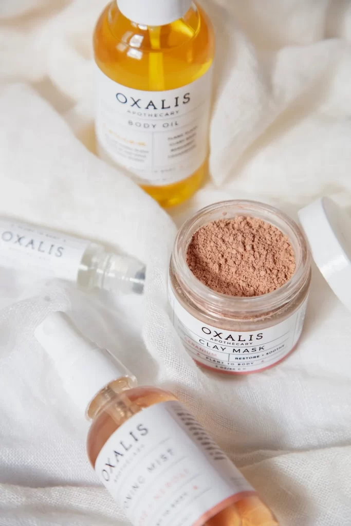
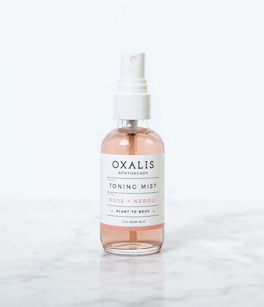
A clear glass bottle filled with pale pink liquid stands on a polished marble surface, fitted with a white fine-mist spray pump. The vessel features a rectangular white label with black and rose-gold typography displaying the brand name OXALIS APOTHECARY, the product title TONING MIST, the scent variant ROSE + NEROLI, and the tagline PLANT TO BODY. The 2 FL OZ/60 ML container is photographed against a white backdrop.
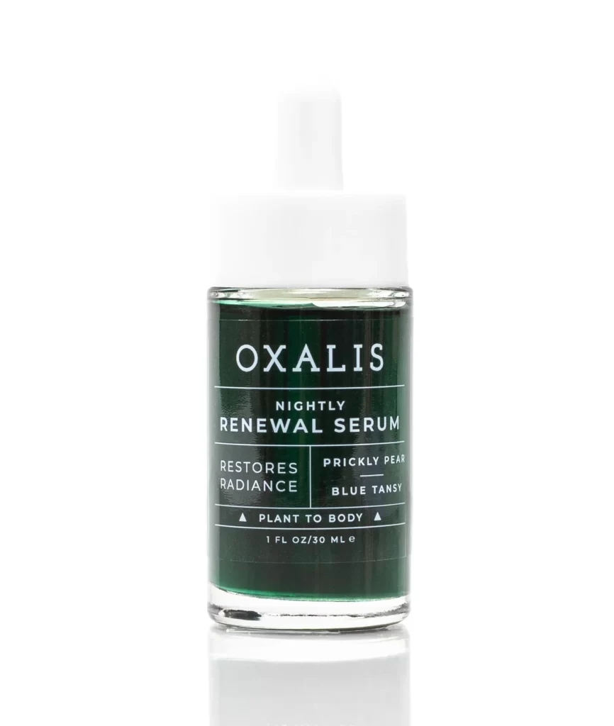
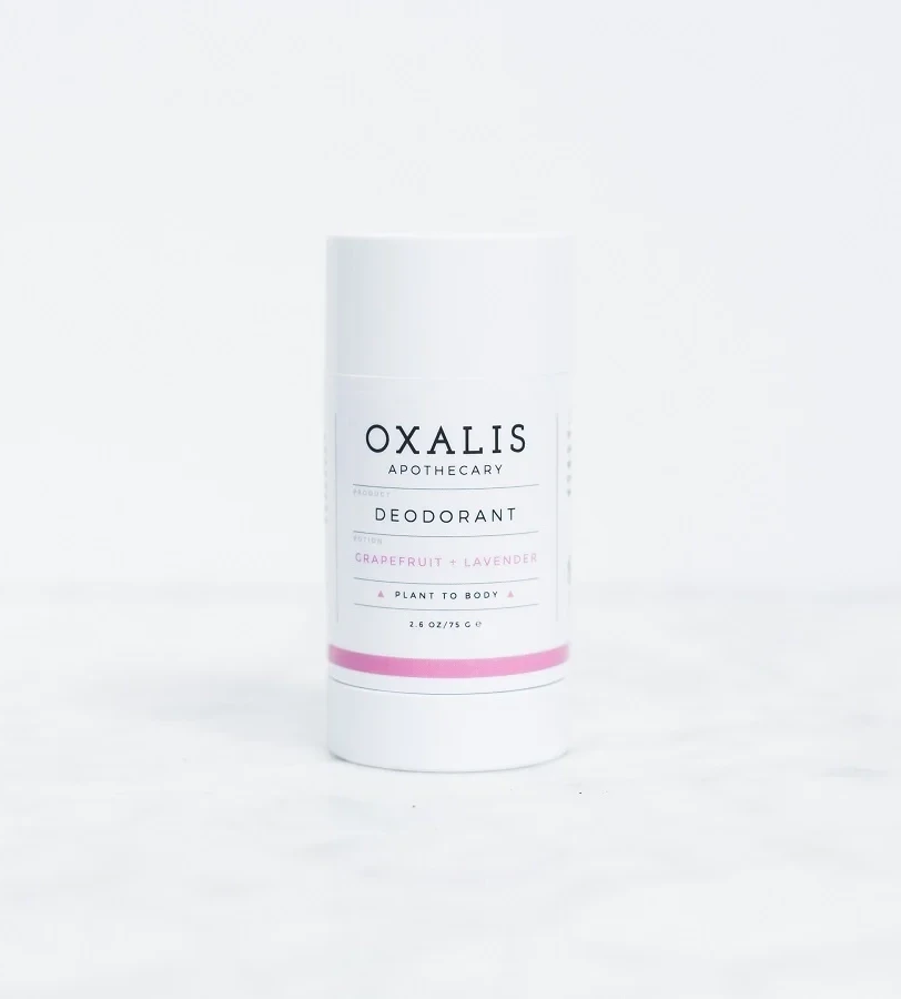
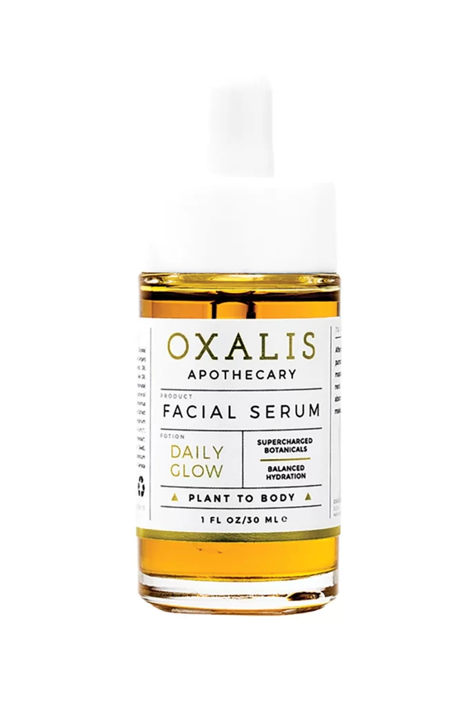
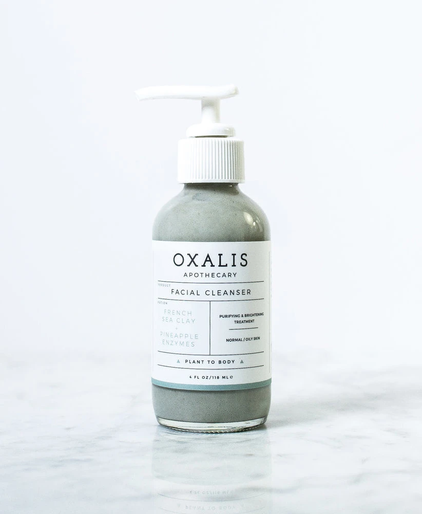
Visual distinction arises from the restrained color palette, where the blush-toned liquid provides the only chromatic warmth against the clinical whites and grays. The label employs a sophisticated typographic hierarchy, utilizing thin sans-serif fonts and delicate horizontal rules to organize information with ample negative space. A narrow peach band at the base of the label echoes the hue of the toner inside, creating a cohesive link between the packaging graphics and the physical product.
Brand identity designers might study this composition to understand how minimalist layouts convey organic luxury without excessive ornamentation. Photographers specializing in product styling could analyze the interplay between the reflective stone texture and the matte paper elements to replicate similar high-end aesthetics. Packaging engineers may also reference the specific proportions of the pump mechanism relative to the bottle’s shoulder to inform their own container specifications.