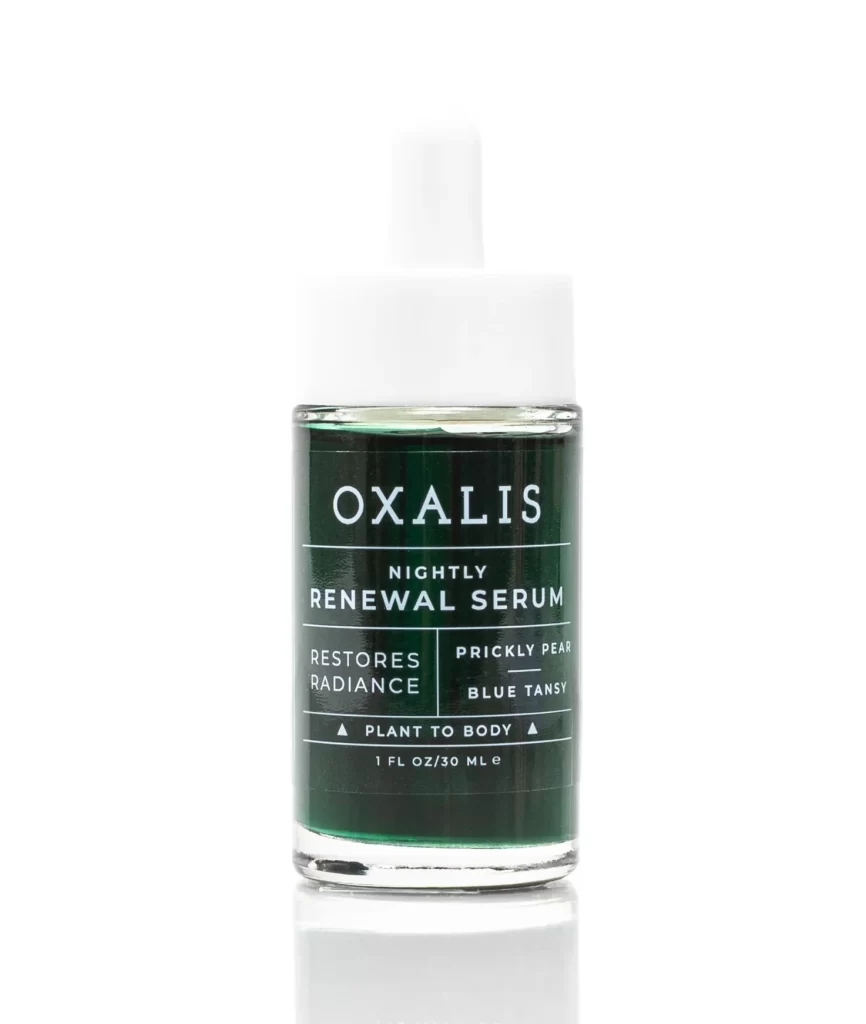
OXALIS Nightly Renewal Serum Dropper Packaging
Topics
Details
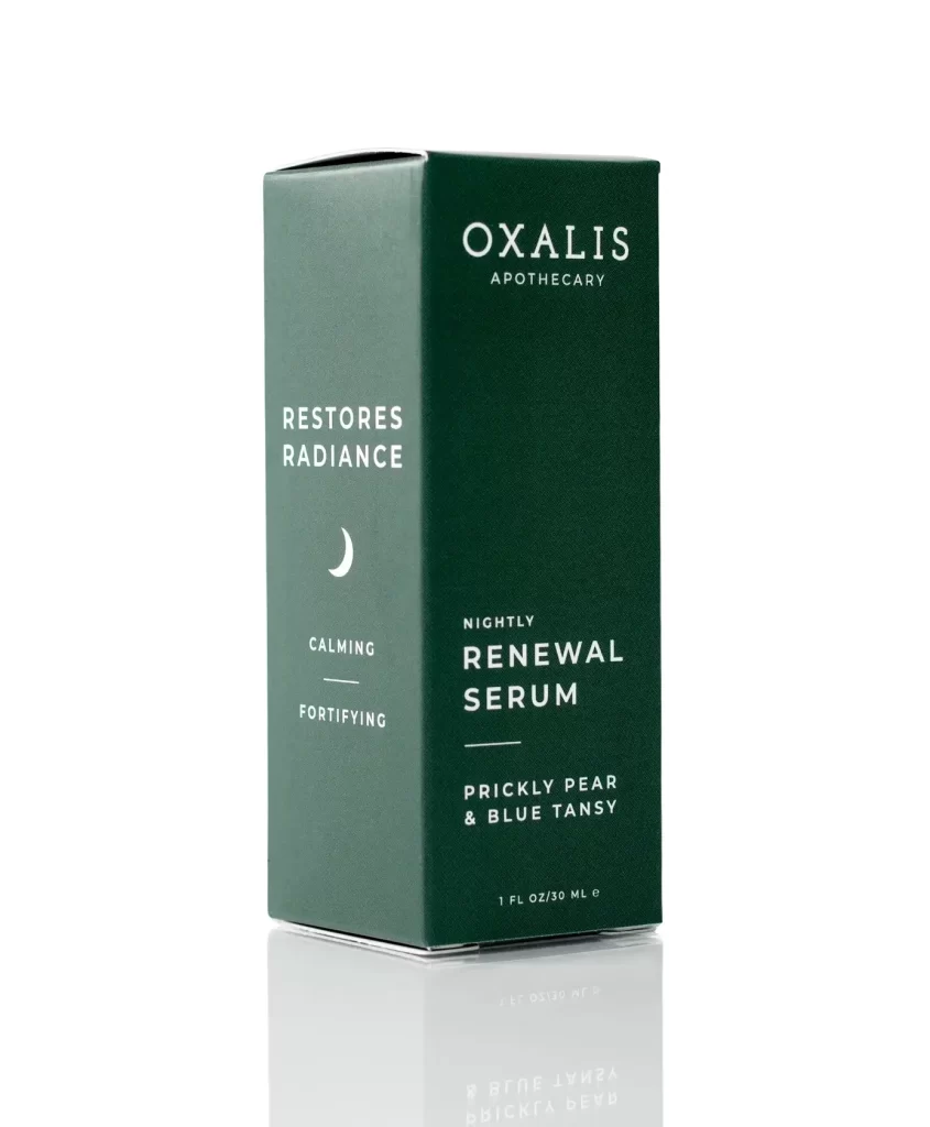
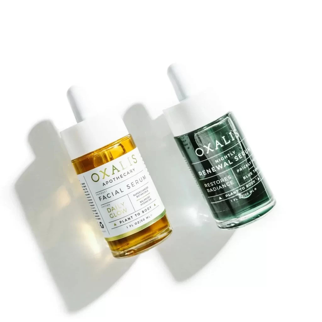
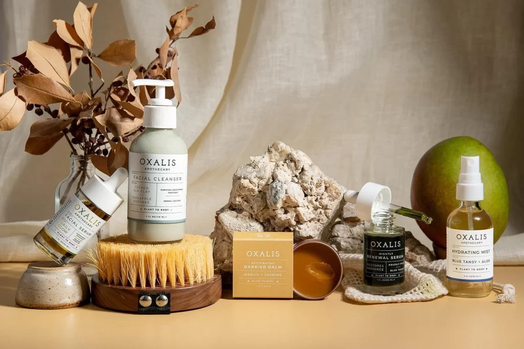
A cylindrical glass vessel filled with deep emerald liquid stands capped by a matte white dropper assembly, its dark label bearing crisp white typography that identifies the product as OXALIS Nightly Renewal Serum alongside key ingredients Prickly Pear and Blue Tansy. The bottle occupies a direct frontal perspective on a white surface, where soft studio lighting accentuates the transparency of the glass and the rich saturation of the serum within.
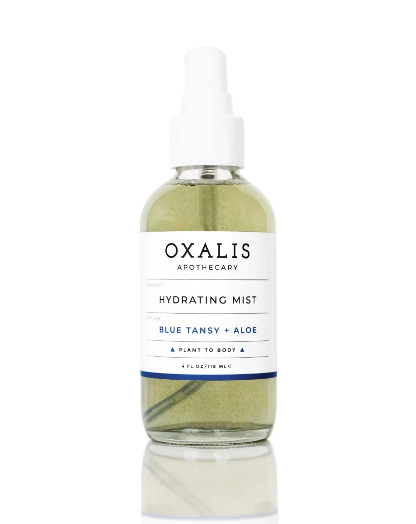
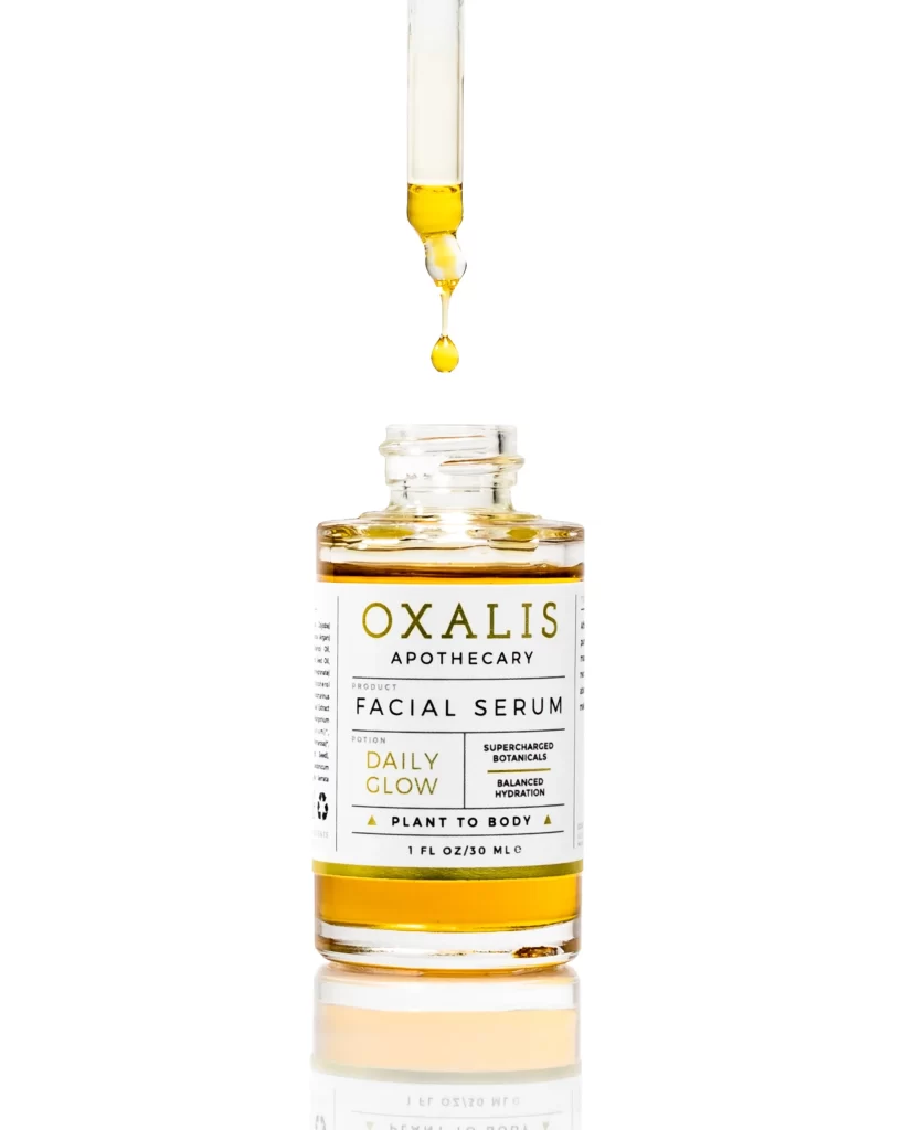
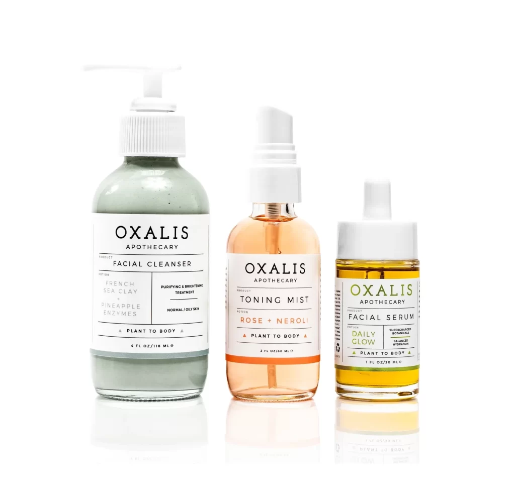
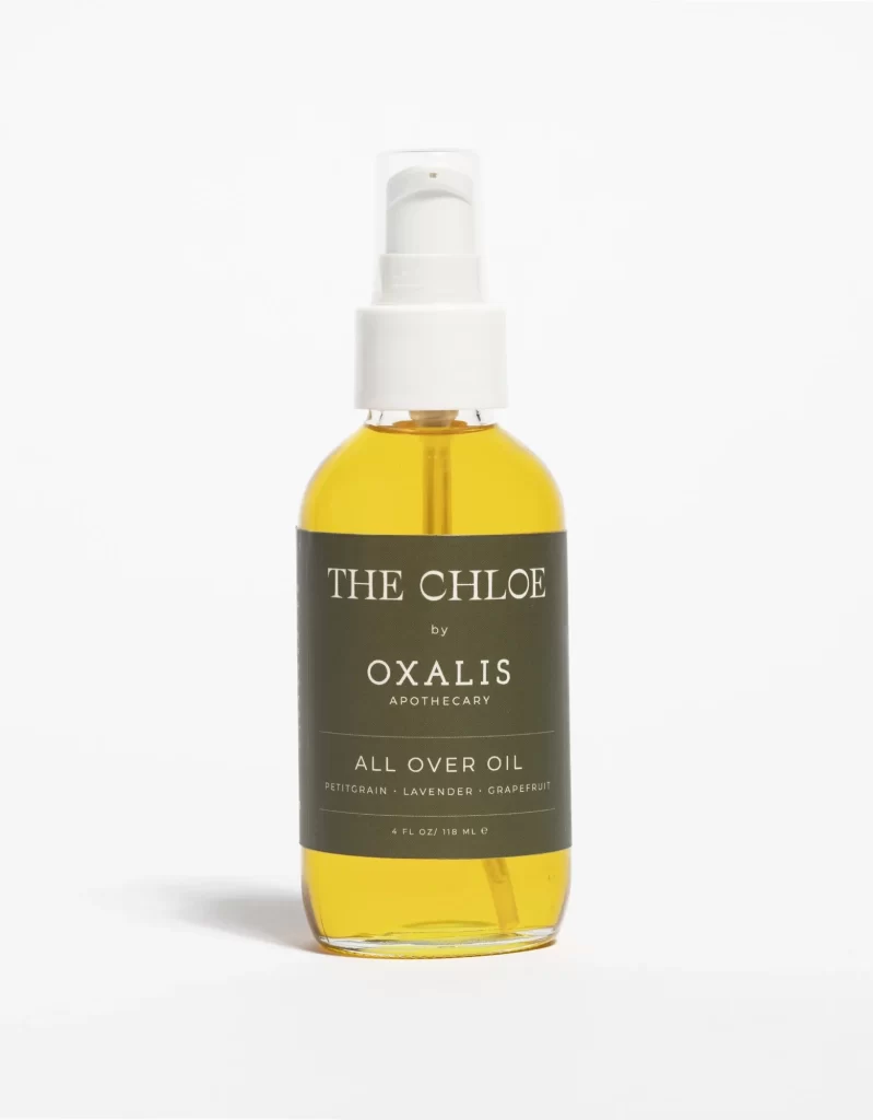
Visual distinction arises from the striking contrast between the saturated botanical hue of the serum and the minimalist monochrome labeling system. Geometric dividers organize the text into a clean grid, lending the packaging a clinical yet organic aesthetic that balances modernist structure with natural color. This particular iteration emphasizes legibility through generous negative space, allowing the rich green tone to serve as the primary visual anchor.
Brand strategists developing clean-beauty identities might study this example to understand how restrained color palettes convey efficacy without clutter. Packaging engineers could analyze the dropper mechanism’s proportions relative to the bottle shoulder for similar dispensing applications. Art directors planning e-commerce photography would find the lighting setup instructive for showcasing translucent liquids with maximum clarity.