OXALIS Louisa Body Oil Packaging
Topics
Details
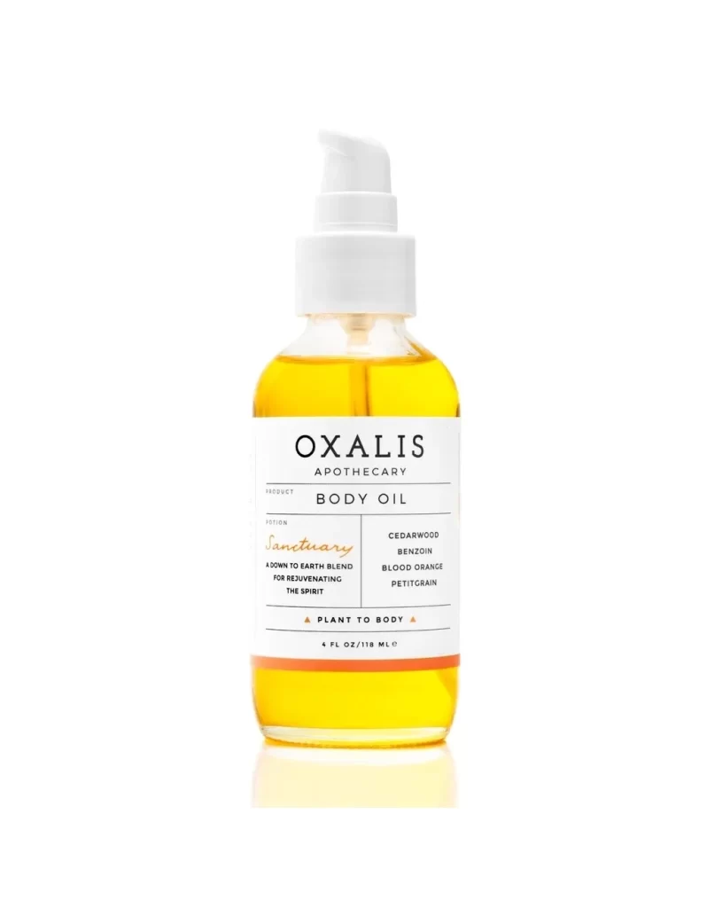
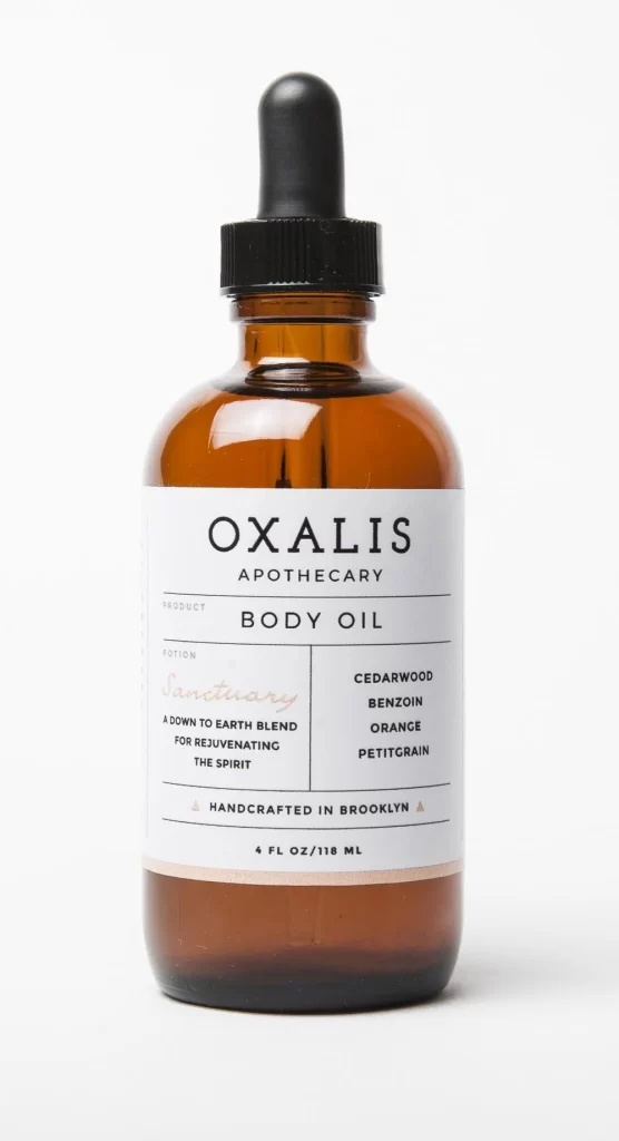
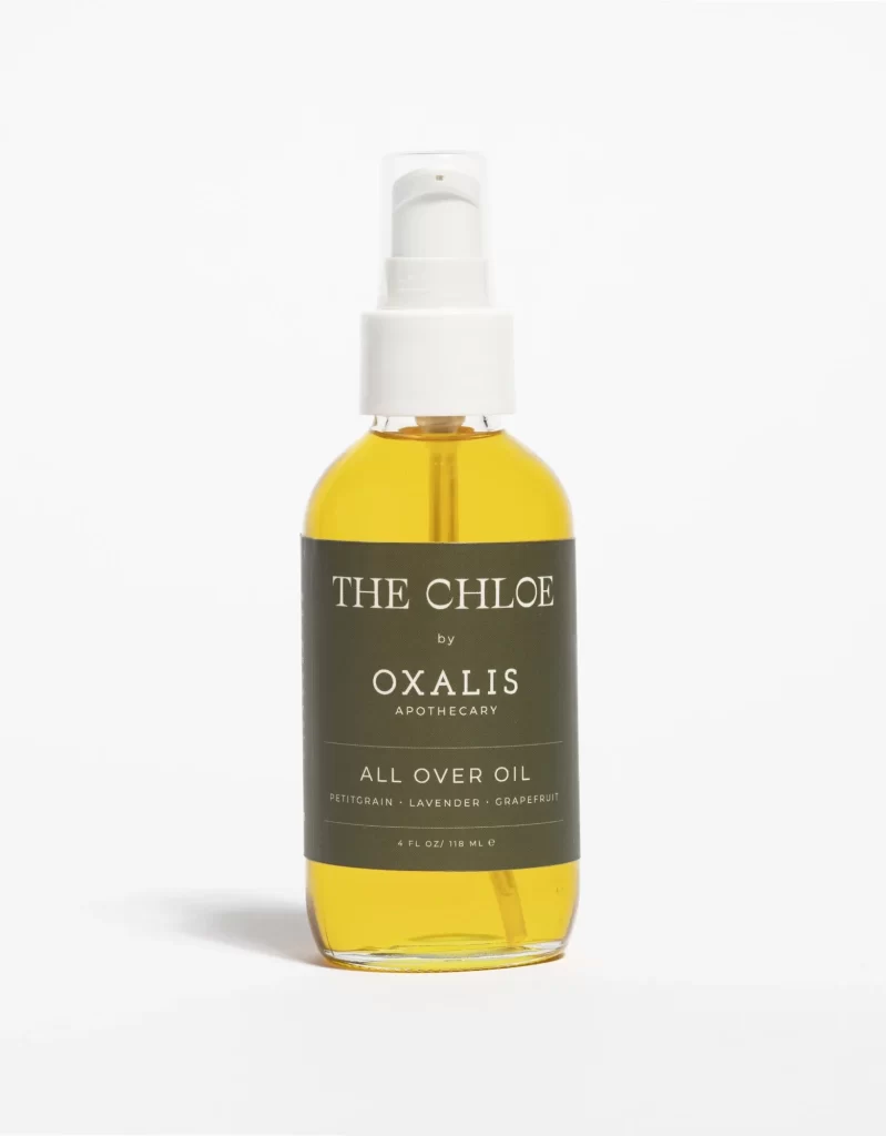
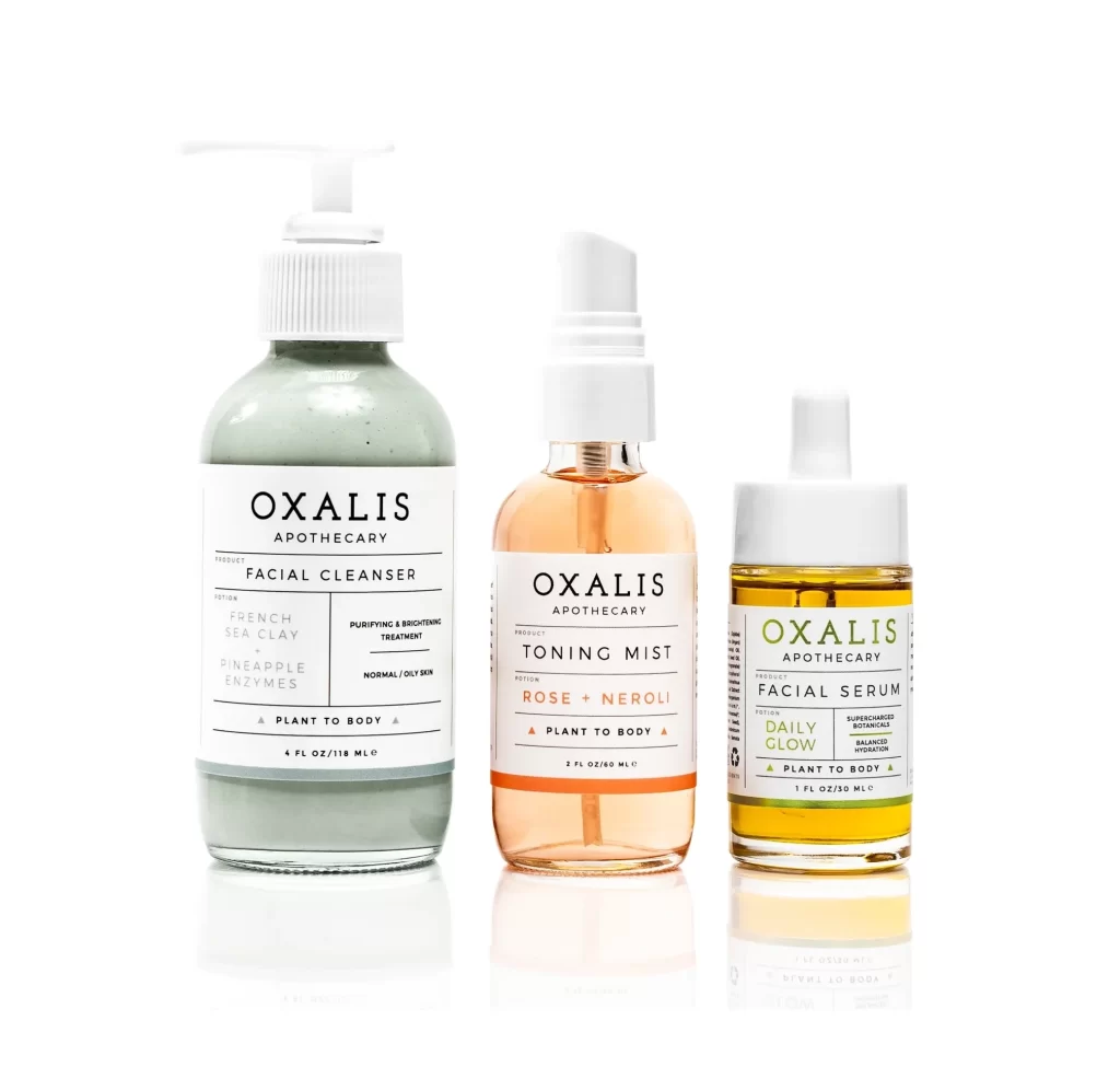
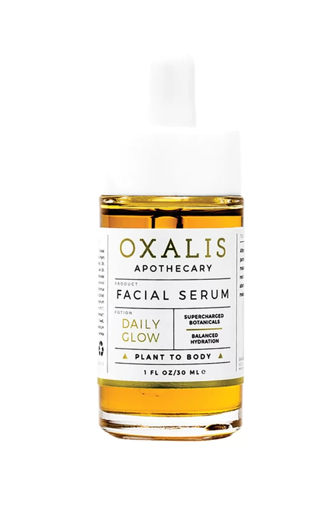
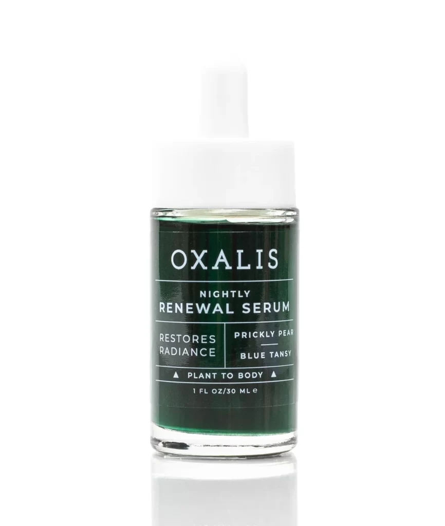
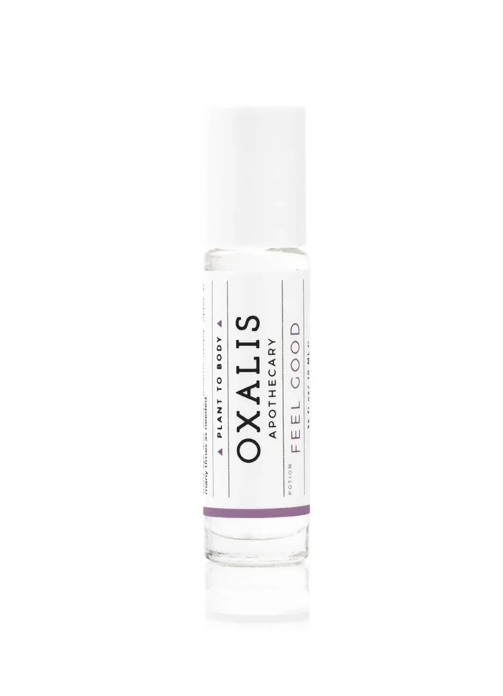
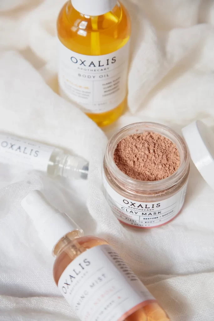
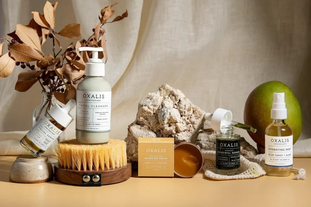
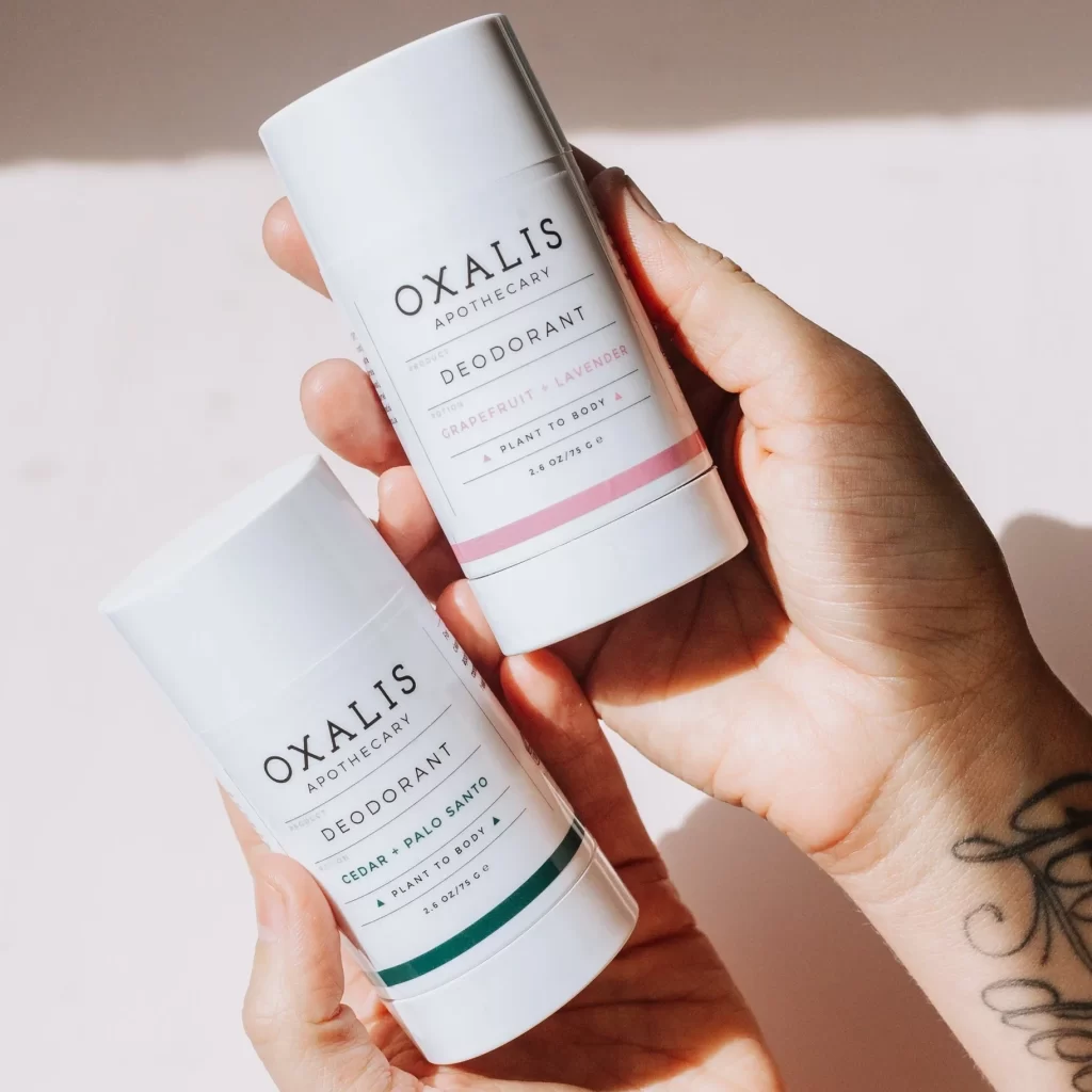
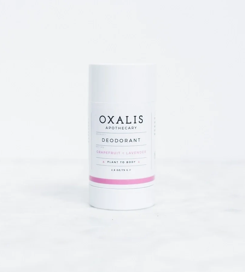
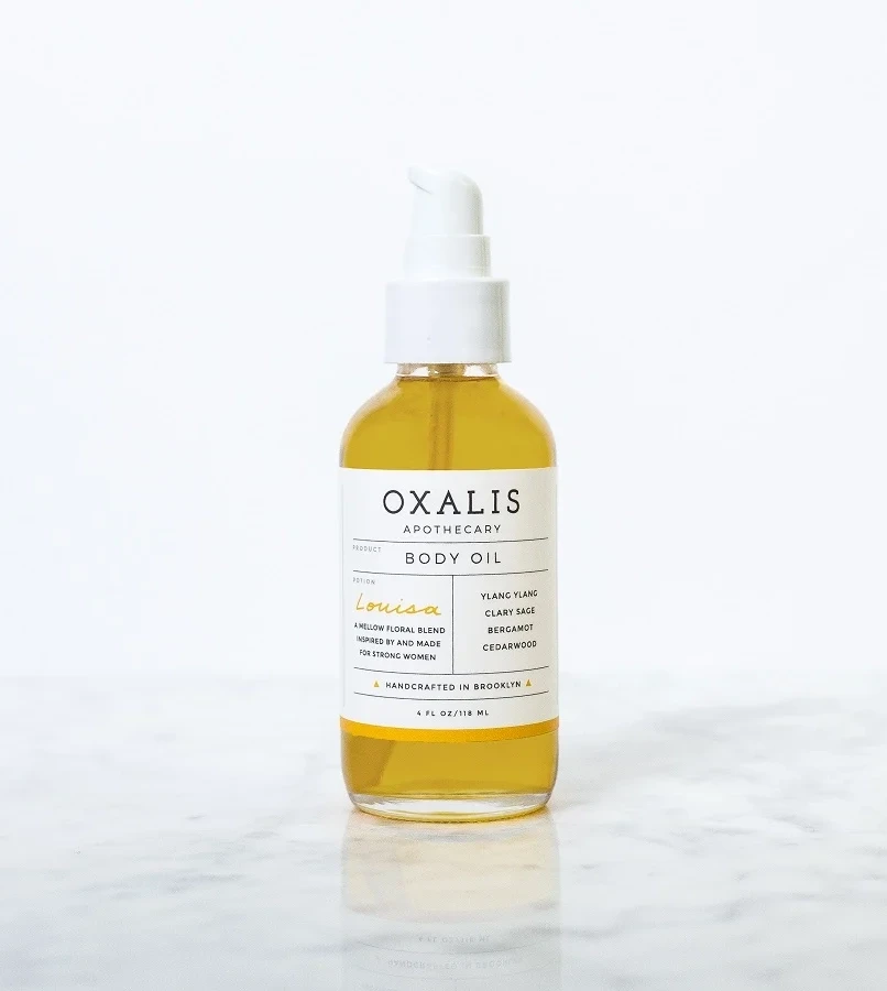
A clear glass bottle filled with golden-yellow liquid stands on a pale marble surface, topped by a matte white pump dispenser. The label displays a clean grid of black and gold typography reading 'OXALIS APOTHECARY' and 'Louisa' in elegant lettering. Soft, diffused lighting casts gentle shadows beneath the base against a white backdrop.
Visual interest stems from the sophisticated interplay between the warm amber hue of the oil and the crisp, clinical layout of the packaging information. The deliberate use of a script font for the edition name adds an organic touch that balances the otherwise rigid sans-serif text blocks. Such a composition effectively communicates artisanal quality through its uncluttered hierarchy and refined color palette.
Brand identity specialists might study this example to understand how negative space can elevate premium positioning in the beauty sector. Packaging engineers could analyze the pump-to-bottle ratio to ensure functional elegance matches the visual promise. Art directors seeking to evoke a sense of handcrafted authenticity will find the typographic contrast particularly instructive for their own label projects.