Goop Beauty Afterglow Body Oil 120ml Image 01 Packaging
Topics
Details
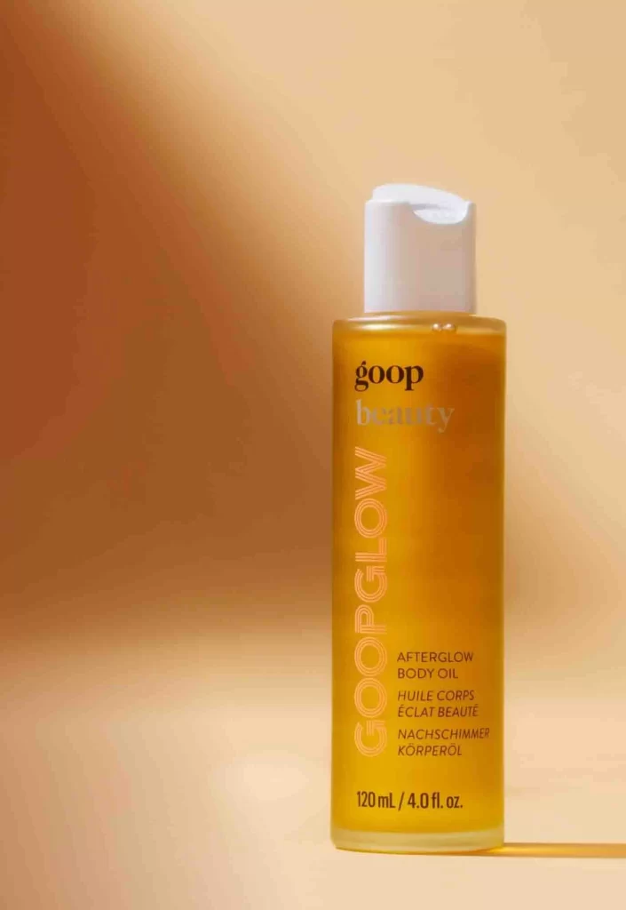
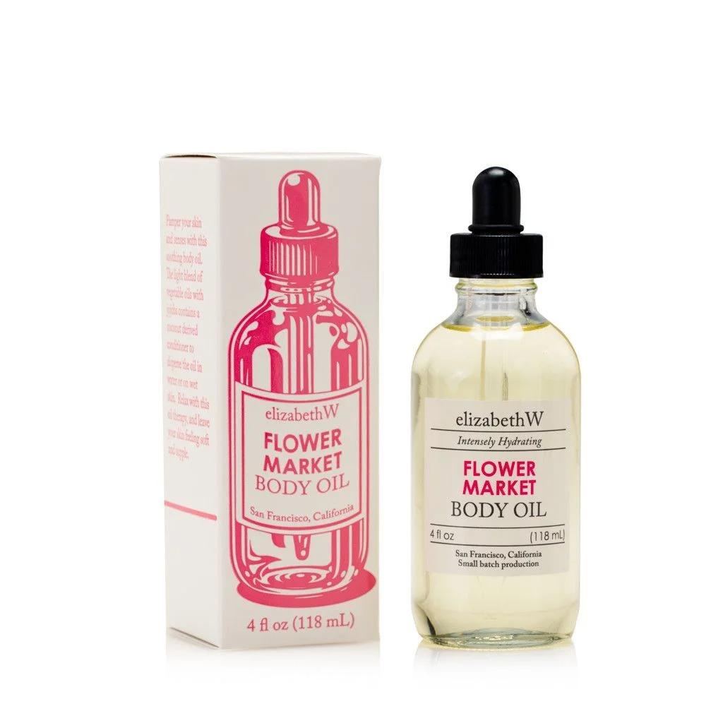
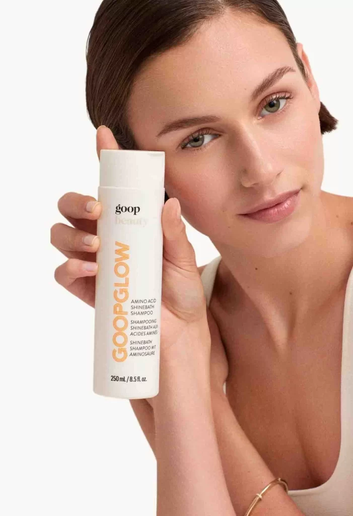
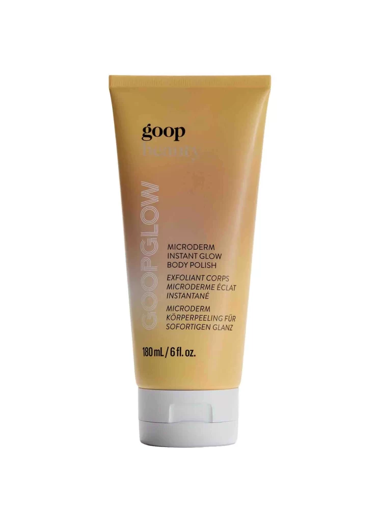
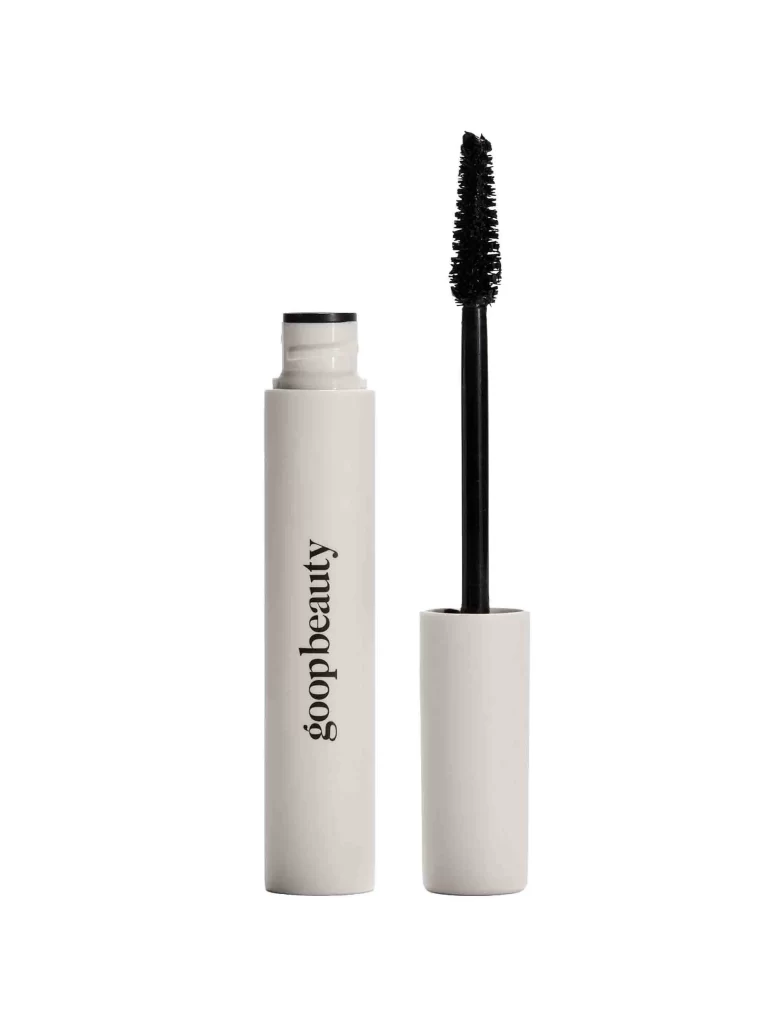
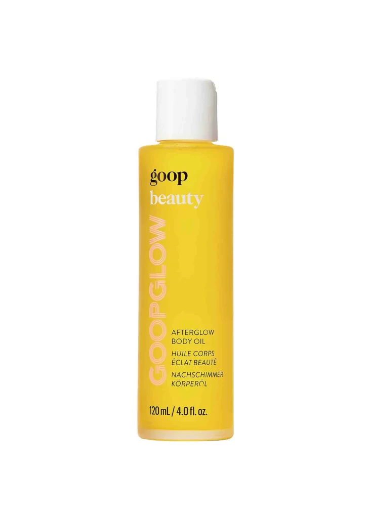
A cylindrical bottle of Goop Beauty Afterglow Body Oil stands upright, filled with a translucent golden-yellow liquid that glows under even studio lighting. The container features a matte white screw cap and displays a clean typographic hierarchy: 'goop' in bold black lowercase, followed by 'beauty' in delicate white script. Running vertically along the left side, 'GOOPGLOW' appears in large pink letters, while the product name and 120 mL / 4.0 fl. oz. volume are printed in smaller black text on the lower right portion of the bottle.
Visual interest emerges from the striking contrast between the warm amber hue of the oil and the crisp white packaging elements, creating an immediate sense of luxury and warmth. The vertical orientation of the brand’s signature glow terminology breaks the horizontal flow of standard labeling, drawing the eye upward along the bottle’s silhouette. This particular composition emphasizes the product’s luminous quality through the transparent material, suggesting radiance before the package is even opened.
Packaging designers studying minimalist cosmetic branding would find this reference valuable for analyzing how color psychology and typography work together to convey premium skincare positioning. Marketing teams developing visual assets for body care launches could utilize this shot to benchmark lighting techniques that highlight liquid translucency without creating harsh reflections. Art directors planning e-commerce photography might study the negative space usage here to understand how isolation shots enhance product recognition across digital platforms.