OXALIS Daily Glow Facial Serum Packaging
Topics
Details
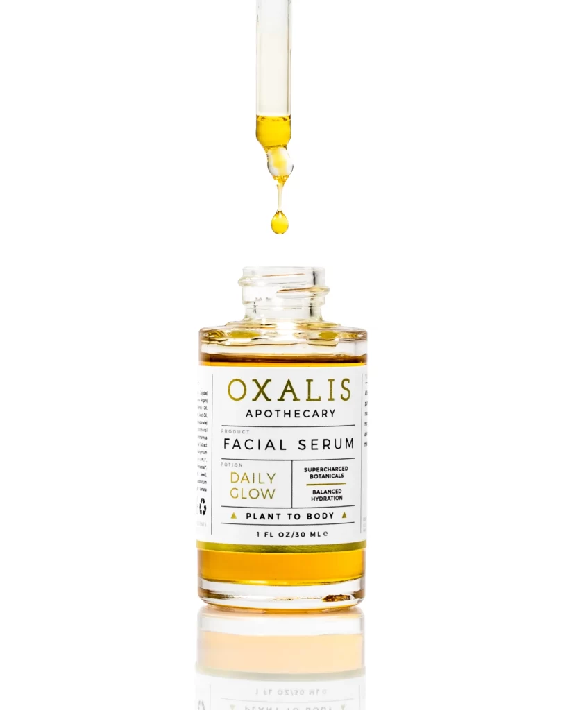
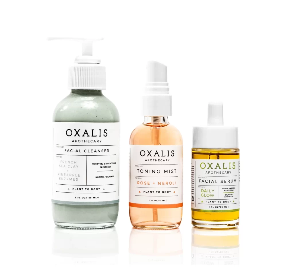
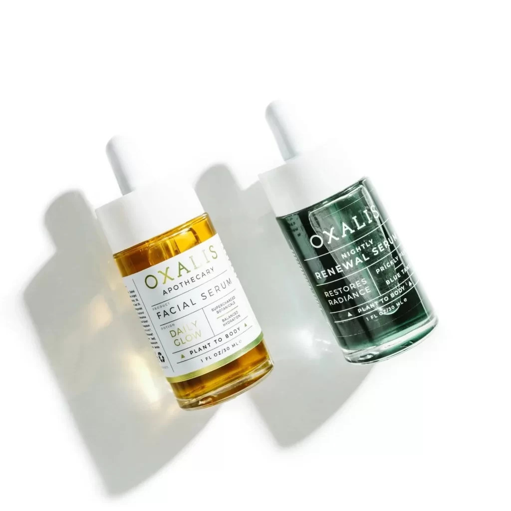
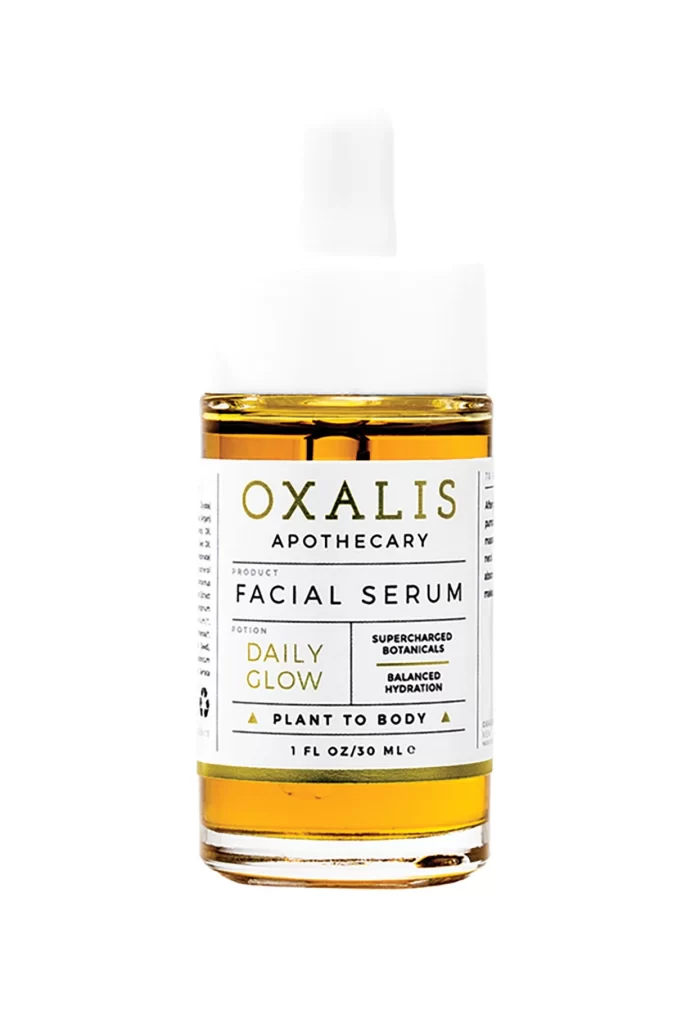
A clear glass cylinder reveals a viscous amber liquid that catches the light with a warm, translucent glow, topped by a crisp white dropper cap. A white label wraps the midsection, featuring a typographic hierarchy that balances the bold serif weight of the brand name 'OXALIS' with clean sans-serif text for 'APOTHECARY' and 'FACIAL SERUM' below. The design highlights 'DAILY GLOW' in gold lettering alongside claims of 'SUPERCHARGED BOTANICALS' and 'BALANCED HYDRATION', all set against a simple white background.
Visual interest is generated through the sophisticated interplay between the organic hue of the botanical oil and the rigid geometry of the container. The label design employs a restrained palette of black and muted gold ink, creating a high-contrast aesthetic that feels both modern and artisanal. By utilizing generous negative space and a structured grid layout, the design communicates a sense of clinical efficacy without sacrificing the warmth implied by the ‘Daily Glow’ nomenclature. This specific iteration succeeds in making the internal product color a primary visual element, turning the serum itself into a branding asset.
Brand strategists and packaging designers would utilize this reference to analyze effective hierarchy in premium skincare labeling. It serves as an excellent case study for balancing legibility with aesthetic appeal in the ‘clean beauty’ market sector. Furthermore, 3D artists modeling cosmetic products can examine the material properties shown here, specifically the refractive qualities of the glass and the specific opacity of the dropper assembly. Art directors might also consult this when planning photoshoots for liquid-based cosmetics, noting how the vertical orientation and centered framing maximize product visibility.