OXALIS Apothecary Coconut Milk Bath Jar Packaging
Topics
Details
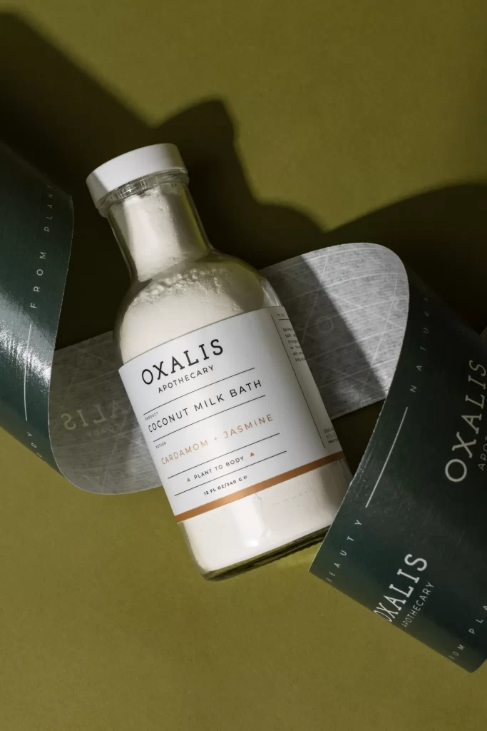
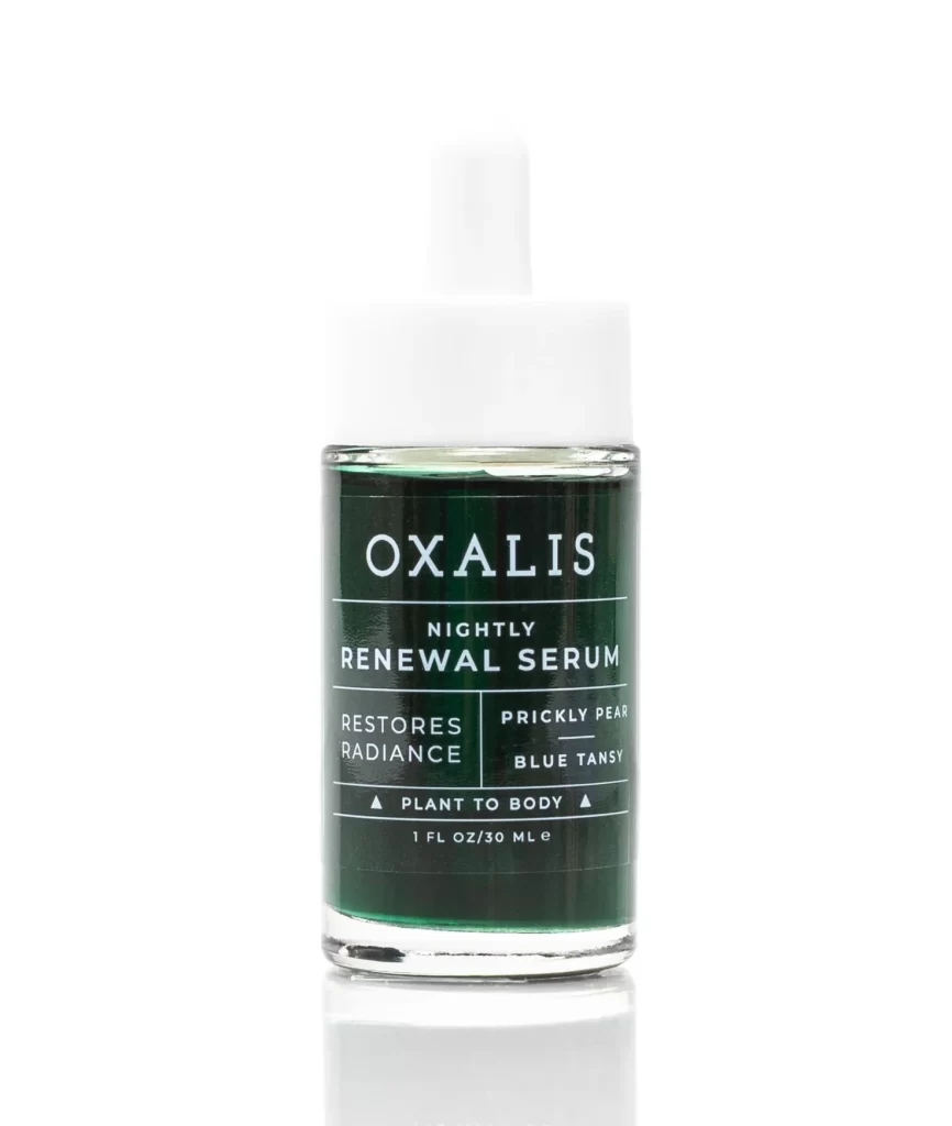
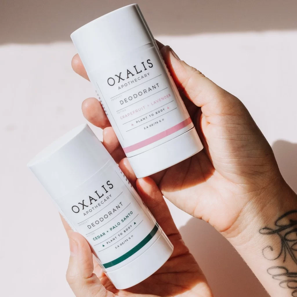
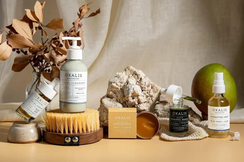
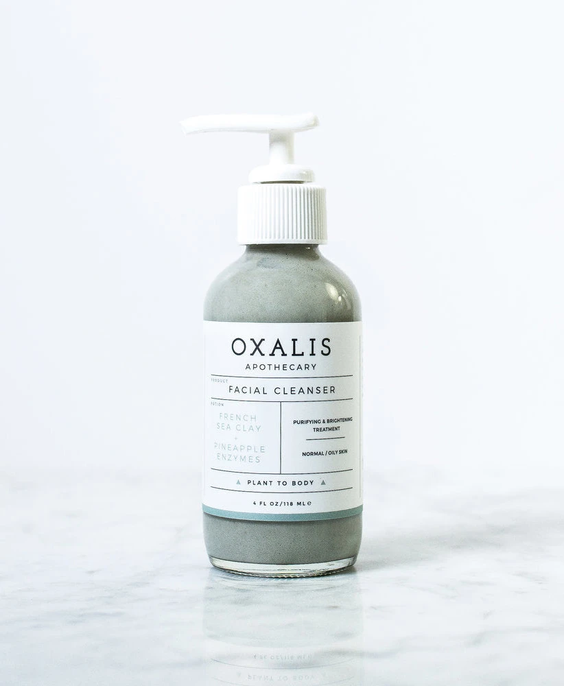
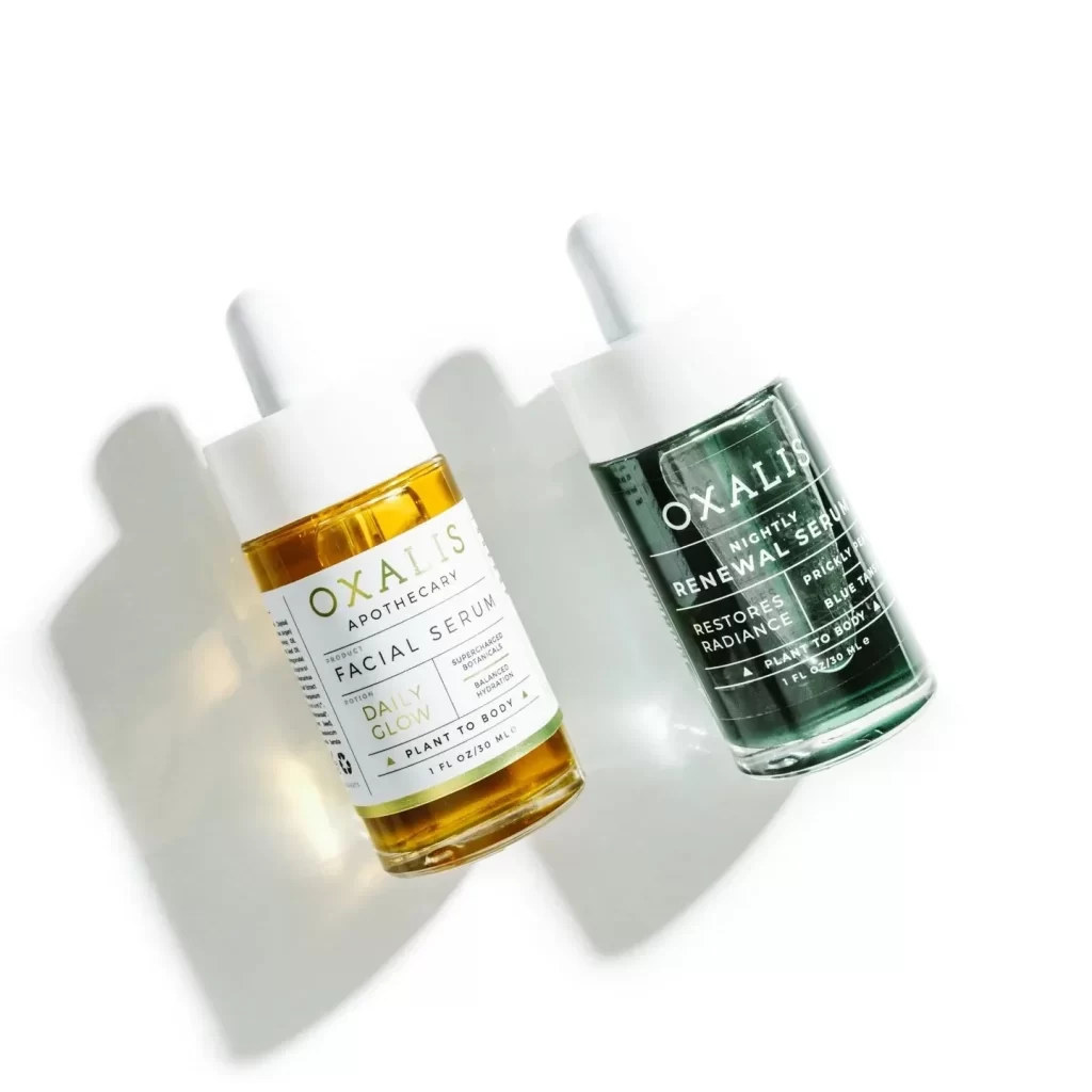
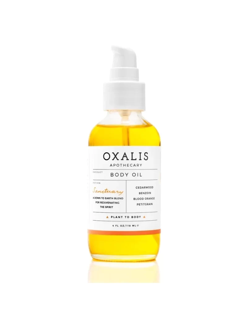
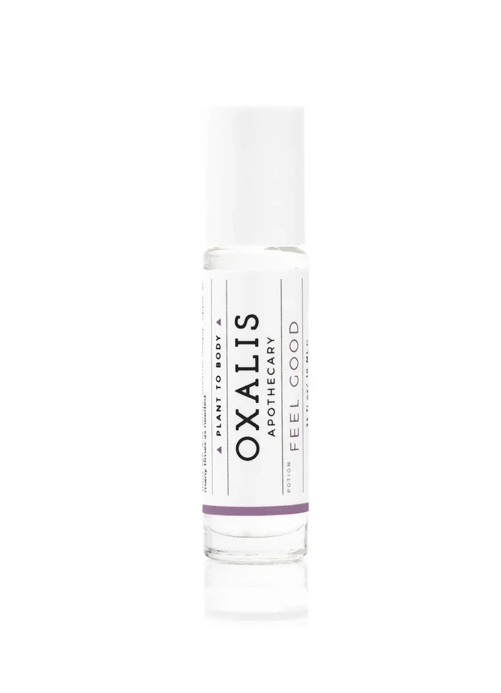
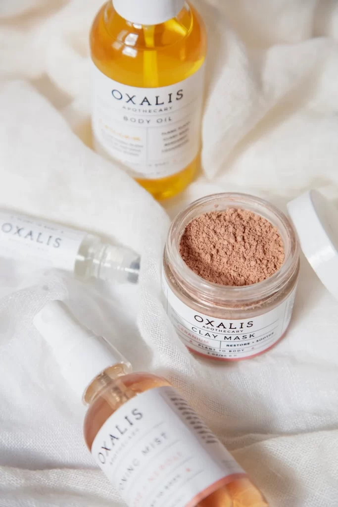
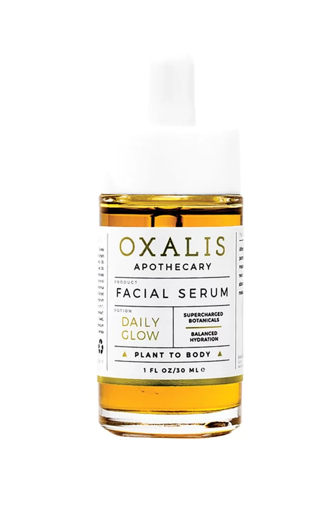
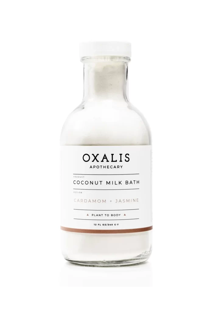
The glass vessel features a classic apothecary silhouette with a cylindrical body tapering into a short, narrow neck, topped by a crisp white screw cap. Inside the clear container sits an opaque, milky-white powder suggesting a rich, creamy texture. A white label with black sans-serif typography dominates the mid-section, displaying the brand name OXALIS APOTHECARY above COCONUT MILK BATH and the scent notes CARDAMOM + JASMINE.
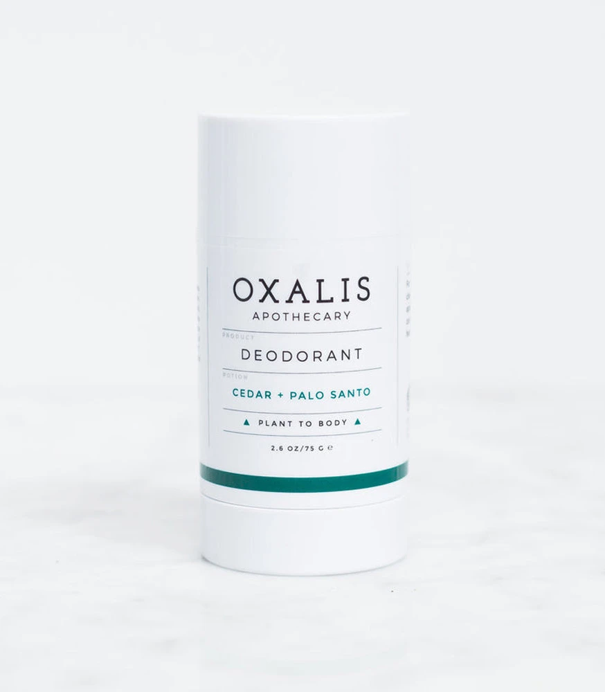
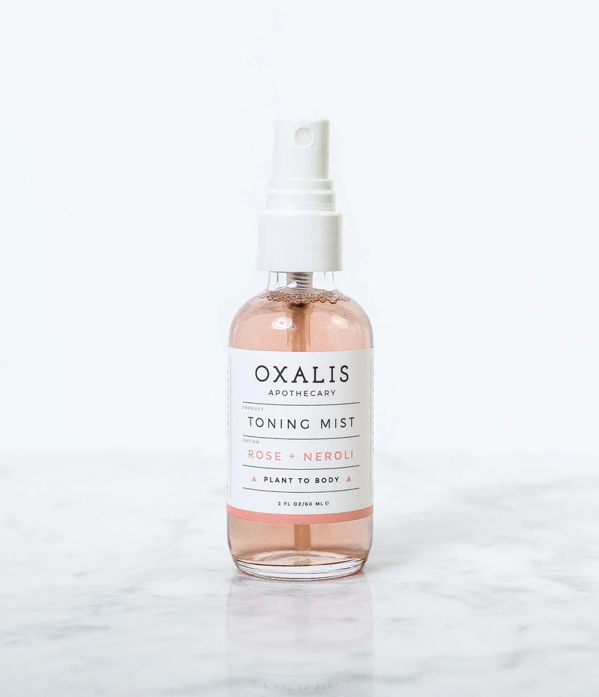
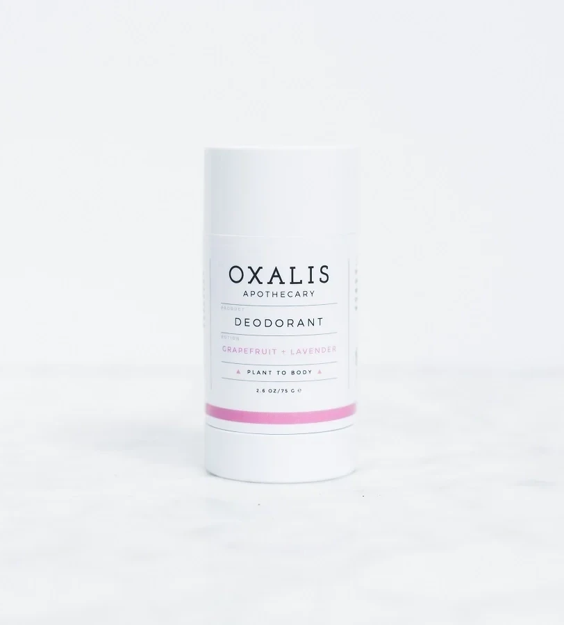
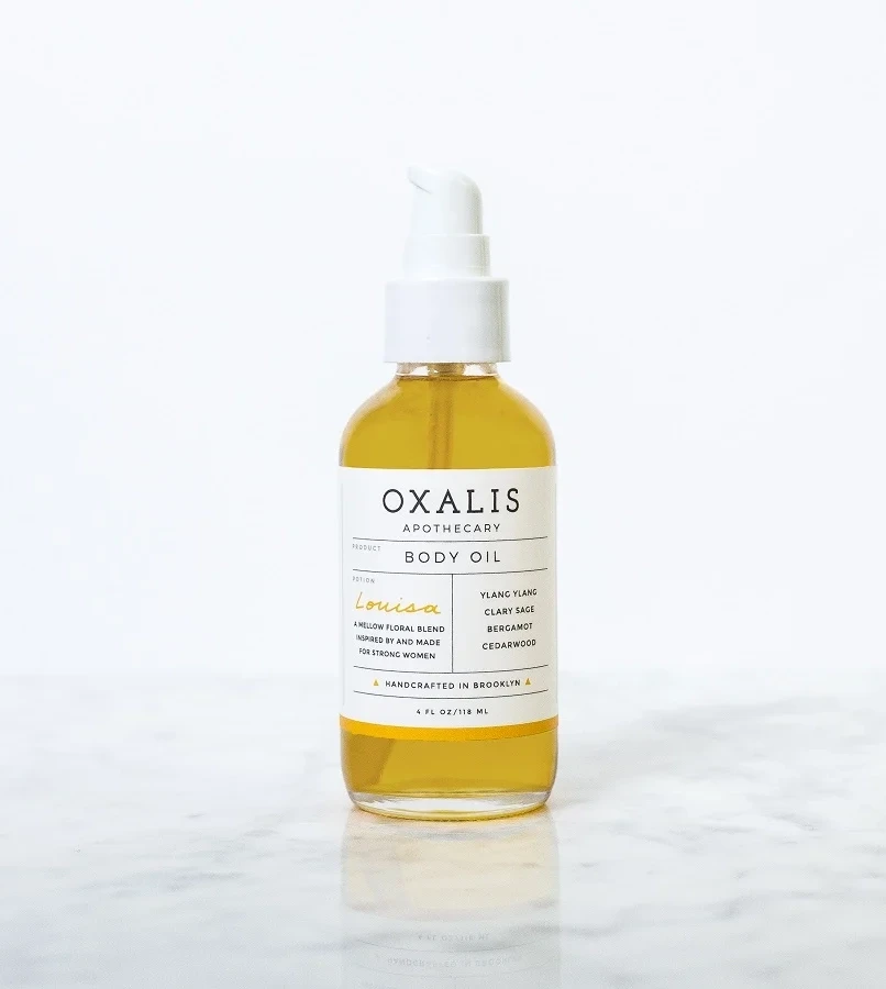
Visual hierarchy is established through meticulous typographic weight and spacing, creating a sense of clinical purity mixed with artisanal warmth. The restraint in color usage—limited to black, white, and a single earthy stripe—directs focus entirely to the informational architecture of the label. Such minimalism allows the product’s natural ingredients to feel premium and uncluttered, while the choice of clear glass subtly reveals the physical texture of the bath soak inside. This approach balances modern graphic design principles with the nostalgic connotations of traditional pharmaceutical packaging.
Brand identity designers might study this composition to understand how negative space can elevate perceived value in luxury skincare markets. Packaging engineers could analyze the label-to-glass ratio to determine optimal information density for small-format containers. Furthermore, photographers specializing in product styling could utilize this lighting setup as a baseline for capturing translucent materials without harsh reflections or distracting shadows.