Kitkat Ice Cream Cocoa Nestle Brand
Topics
Details
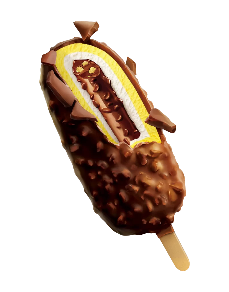
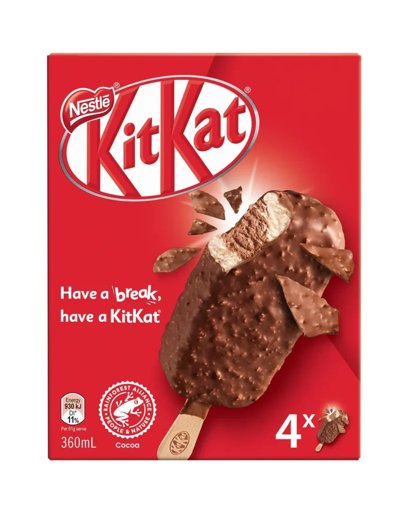
A vibrant crimson field dominates the frame, hosting the iconic Nestlé KitKat oval logo in white and red at the upper center. Below this branding, a single cocoa-flavored ice cream bar rests on a wooden stick, its surface coated in textured chocolate studded with crisp fragments. One end of the treat appears bitten or broken, revealing a pale interior that contrasts sharply with the dark exterior coating, while scattered chocolate shards float around the main subject to suggest snap and crunch.
Visual tension emerges from the interplay between the rigid geometric logo and the organic, irregular shape of the frozen confection. The lighting creates subtle highlights across the bumpy chocolate shell, emphasizing its tactile quality and three-dimensional form against the flat, saturated background. White typography stating "Have a break, have a KitKat" anchors the lower left quadrant, balanced by nutritional information and Rainforest Alliance certification seals near the bottom edge.
Packaging designers studying color psychology in food marketing will find value in how the red backdrop amplifies appetite appeal while maintaining brand recognition. Food photographers can analyze the composition techniques used to make the product appear freshly broken and indulgent without appearing messy. Marketing teams developing frozen dessert campaigns might reference the strategic placement of sustainability credentials alongside energy content data.