Pink Ice Cream Packaging
Topics
Details
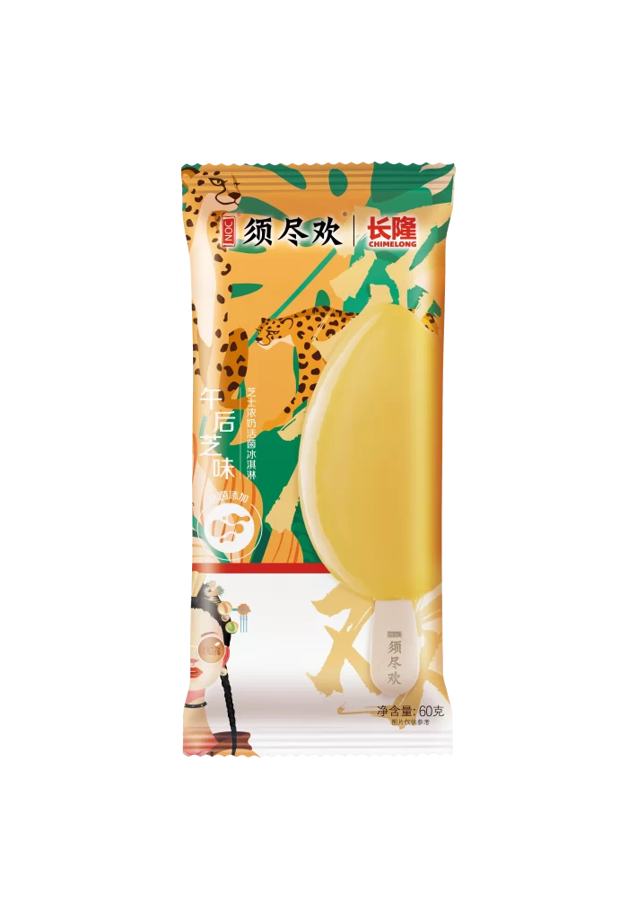
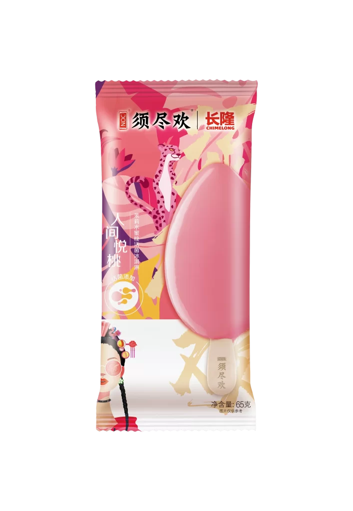
A glossy, teardrop-shaped pink popsicle dominates the center of a vertically oriented foil wrapper, its smooth surface reflecting light against a vibrant background of magenta and coral floral patterns. The packaging features the brand names '须尽欢' and '长隆 CHIMELONG' in bold red characters at the top, while vertical text reading '人间悦桃' runs down the left side. A stylized spotted leopard peeks from behind the frozen treat, and the bottom portion reveals an illustration of a woman in traditional Chinese attire with braided hair and red accessories.
The visual identity merges contemporary pop-art aesthetics with traditional Chinese cultural elements, creating a striking contrast between the modern leopard motif and the classical female figure. The color palette relies heavily on warm pinks and reds that harmonize with the actual product's hue, making the wrapper feel like an extension of the ice cream itself. This cohesive approach turns the packaging into a storytelling canvas that balances playful energy with cultural sophistication.
Product photographers studying food packaging compositions can analyze how the oversized product window creates immediate appetite appeal while maintaining brand narrative space. Marketing teams developing cross-brand collaborations might examine how the partnership between the ice cream brand and Chimelong theme park is visually integrated through shared logo placement. Illustrators working on confectionery projects could reference the way flat graphic elements combine with photographic realism to create depth without cluttering the design.