La Mer Green Bottle Cosmetics Packaging
Topics
Details
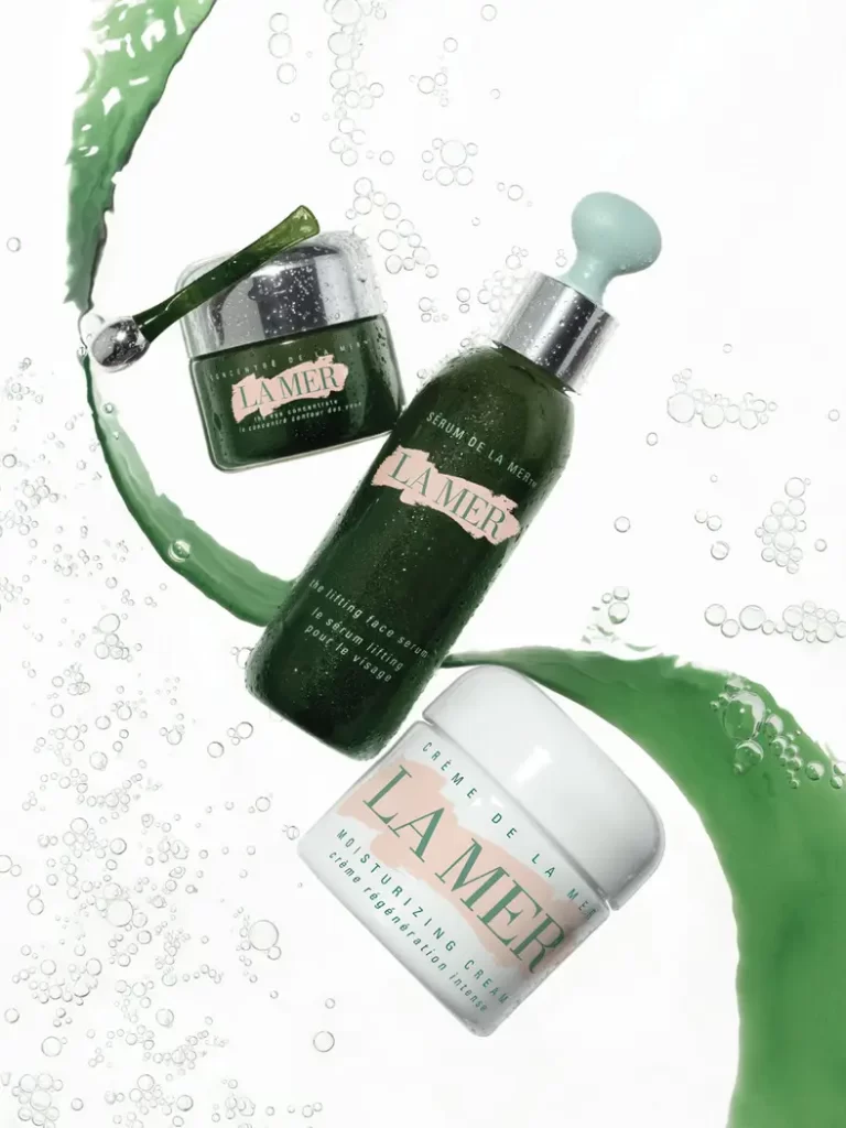
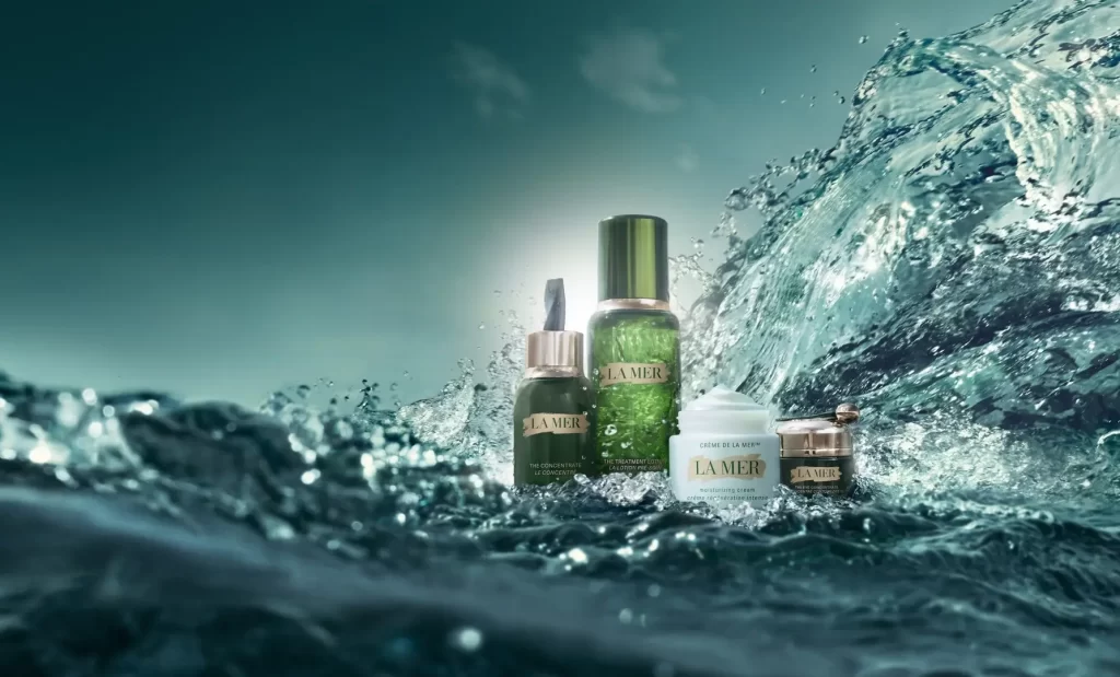
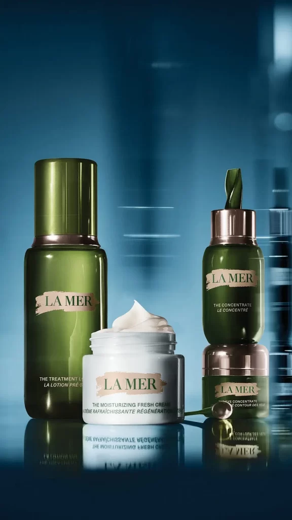
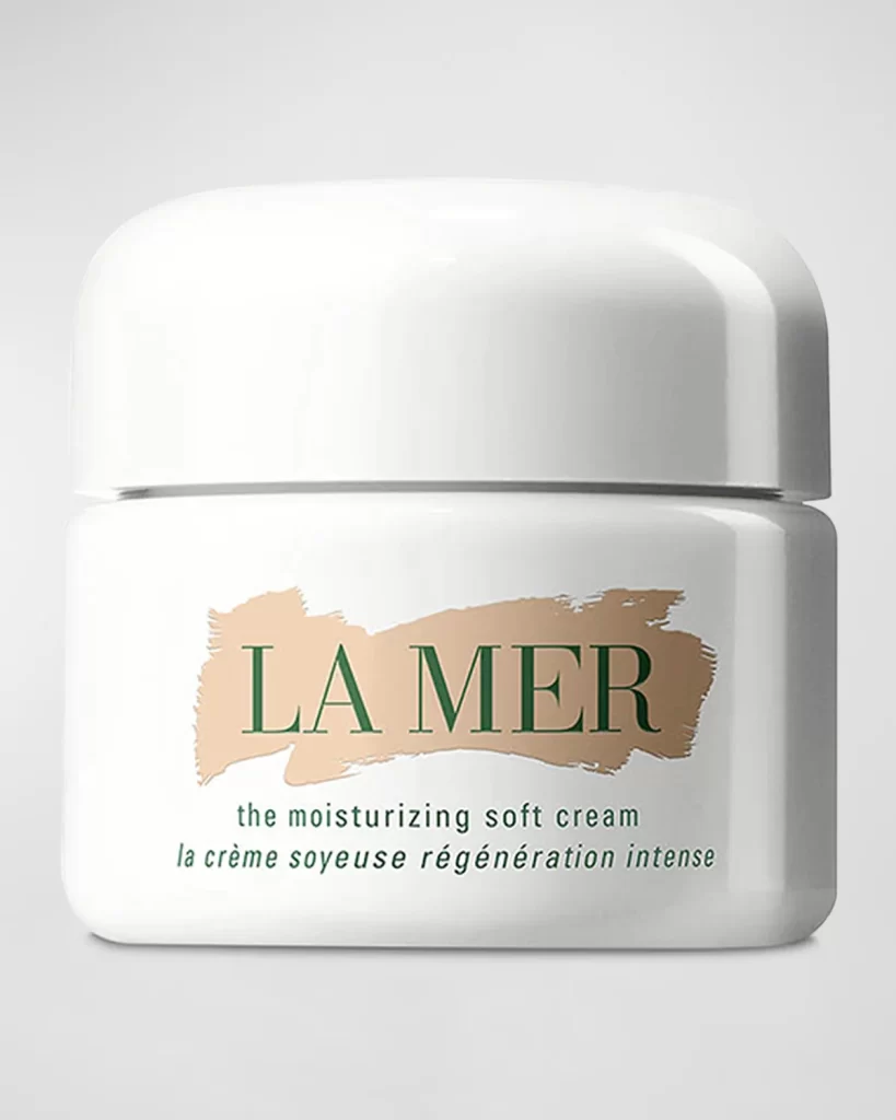
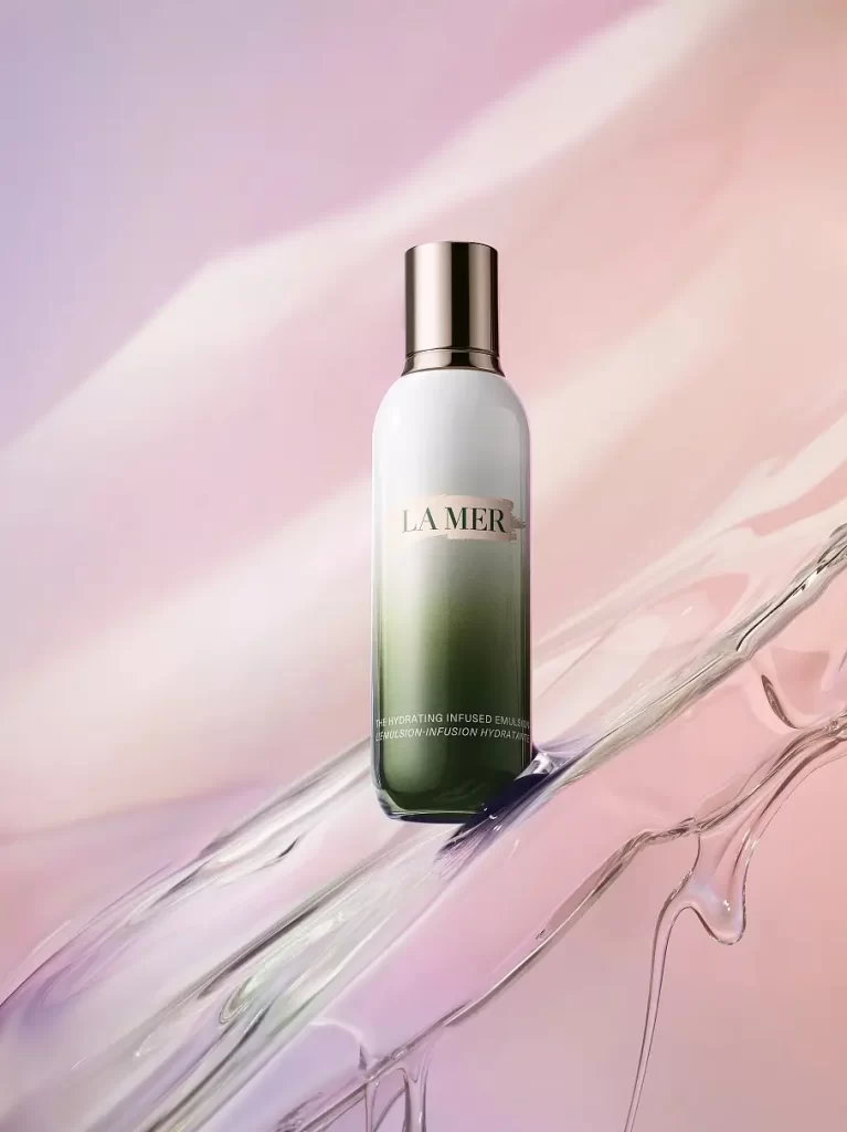
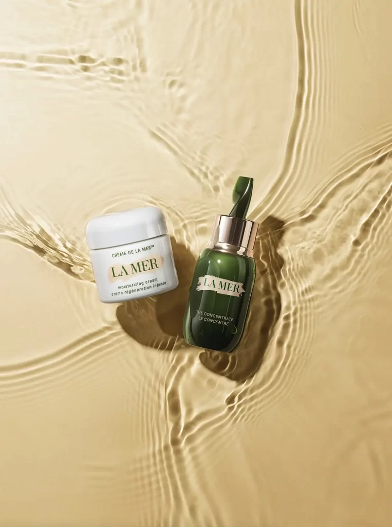
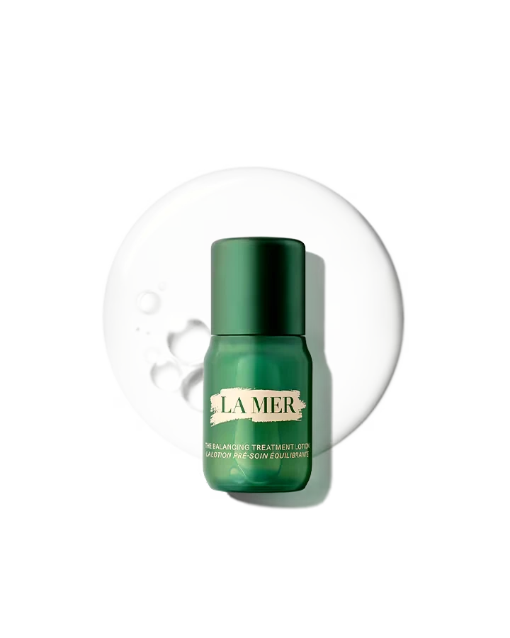
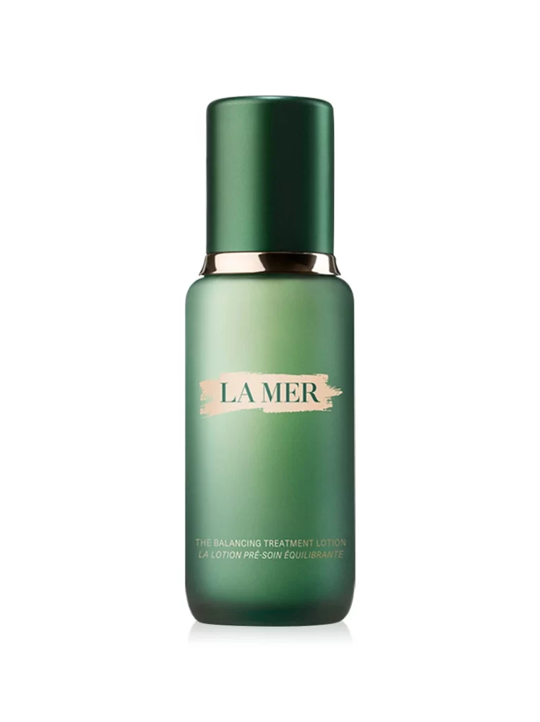
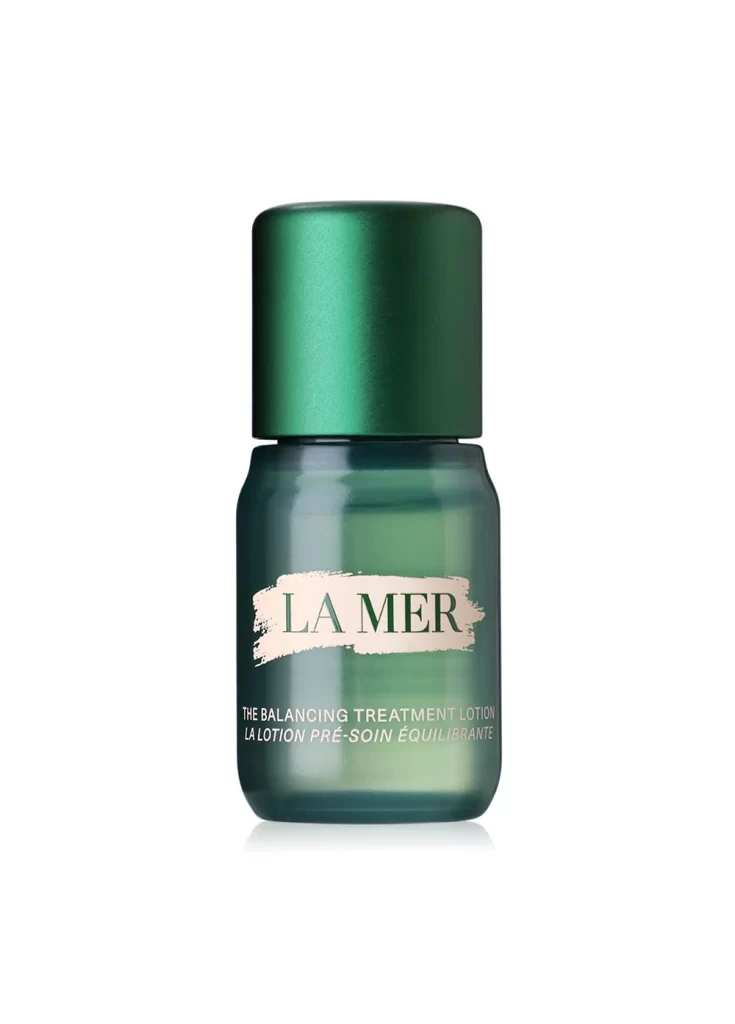
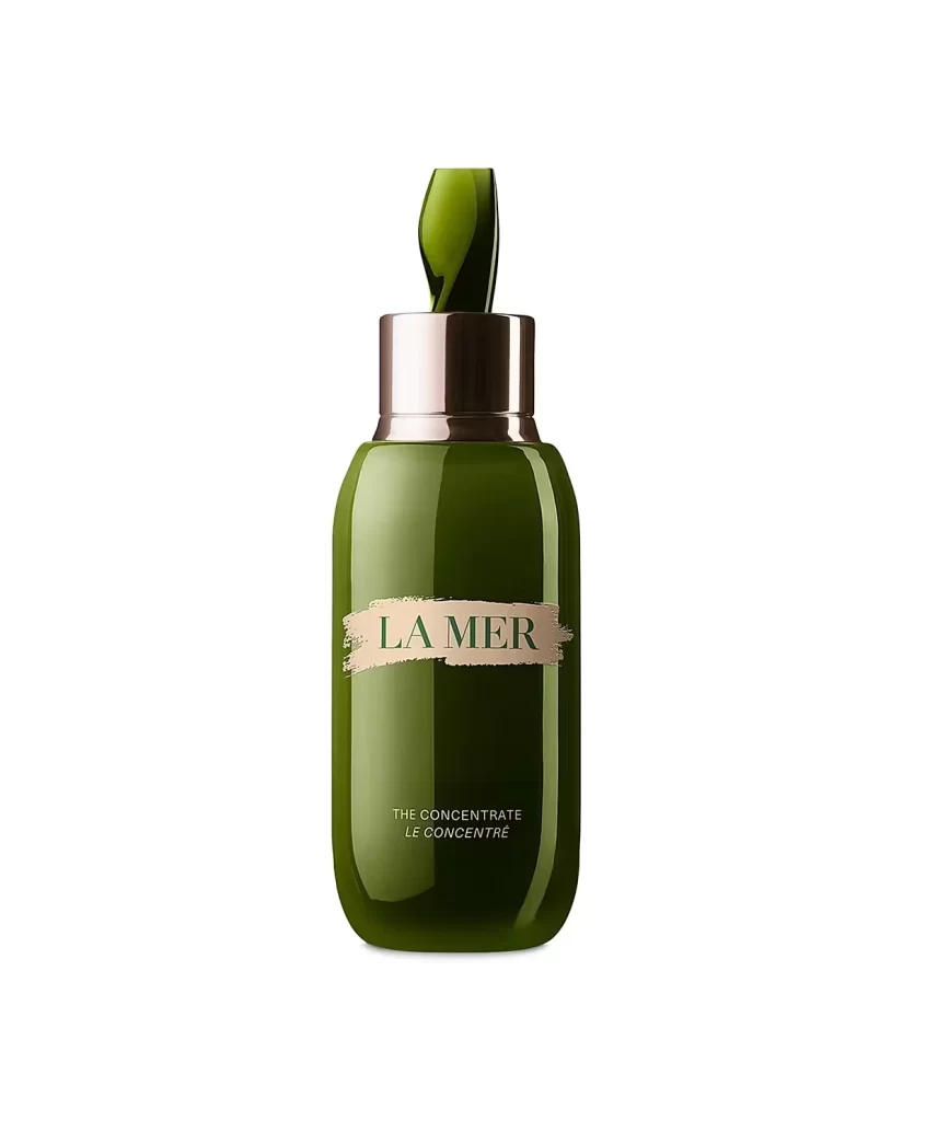
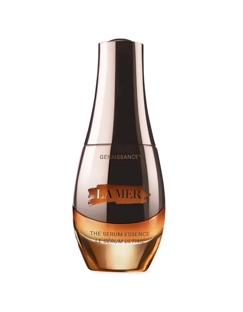
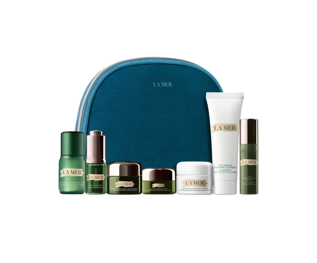
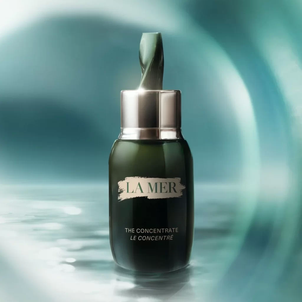
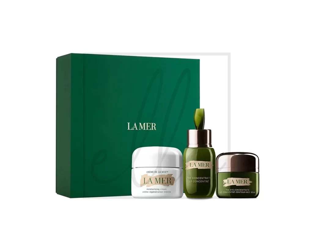
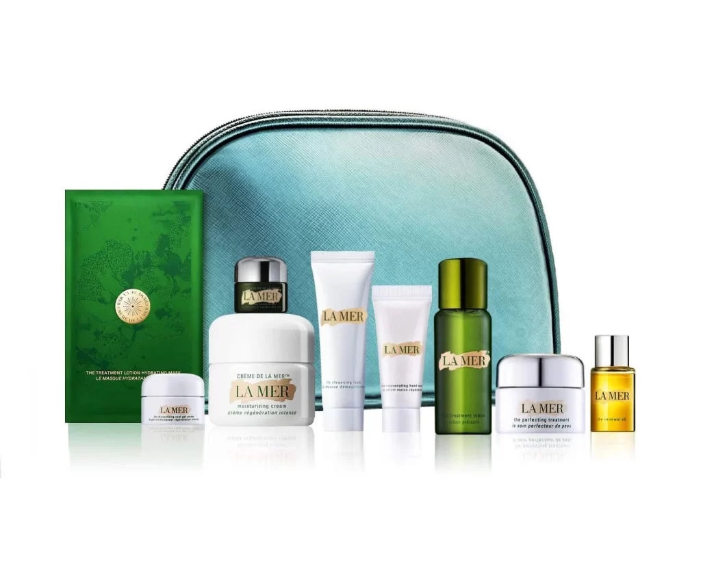
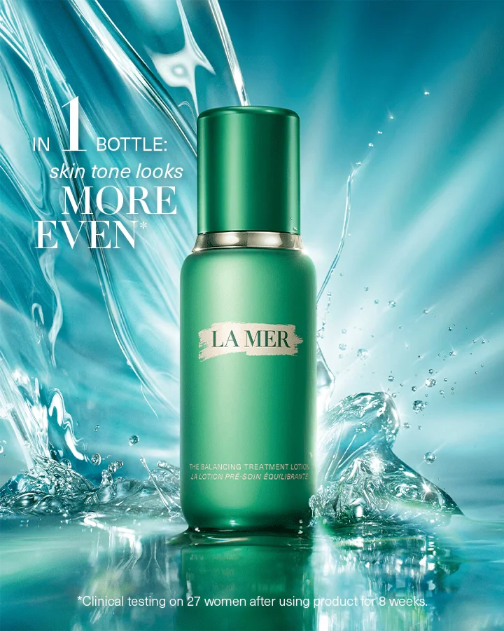
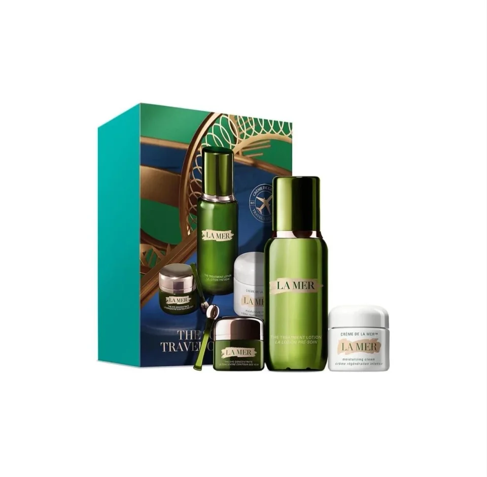
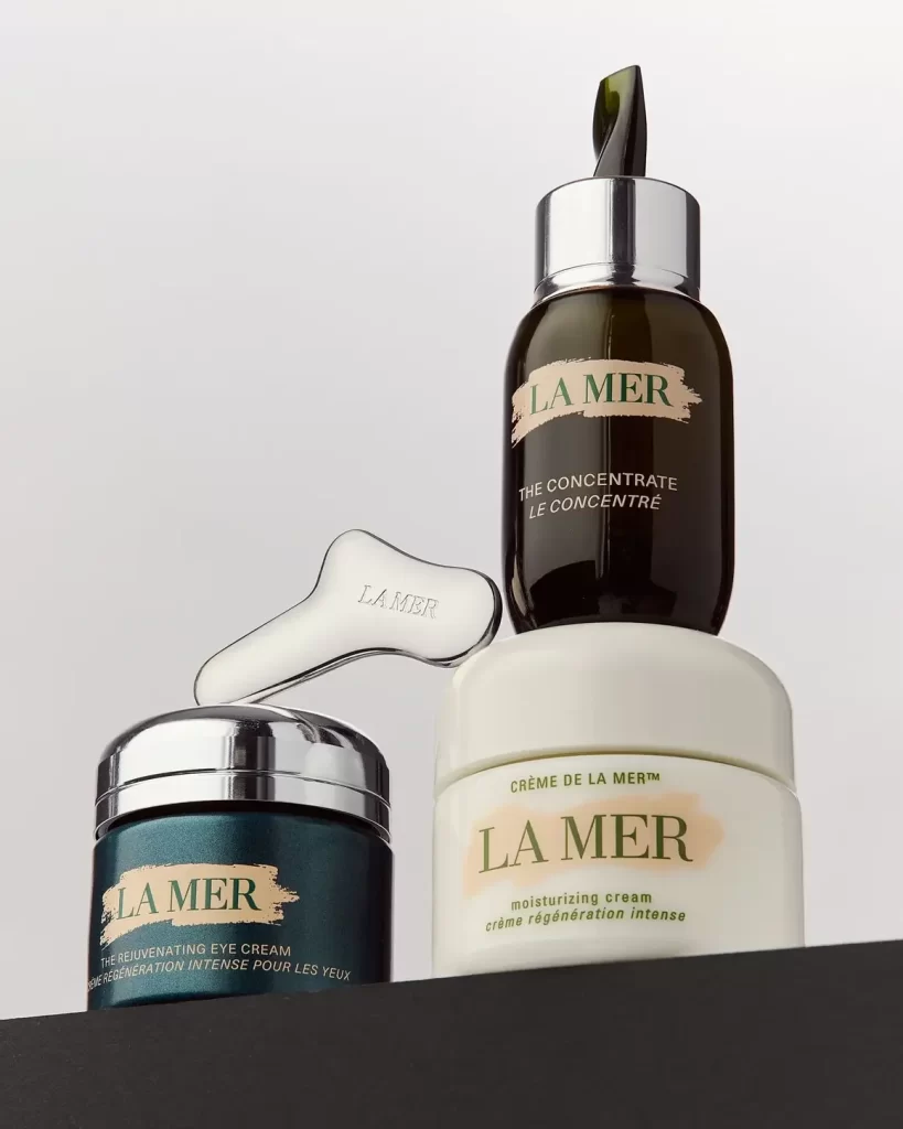
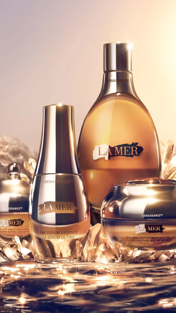
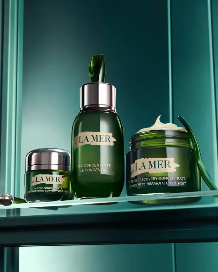
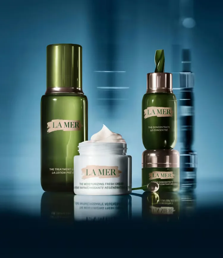
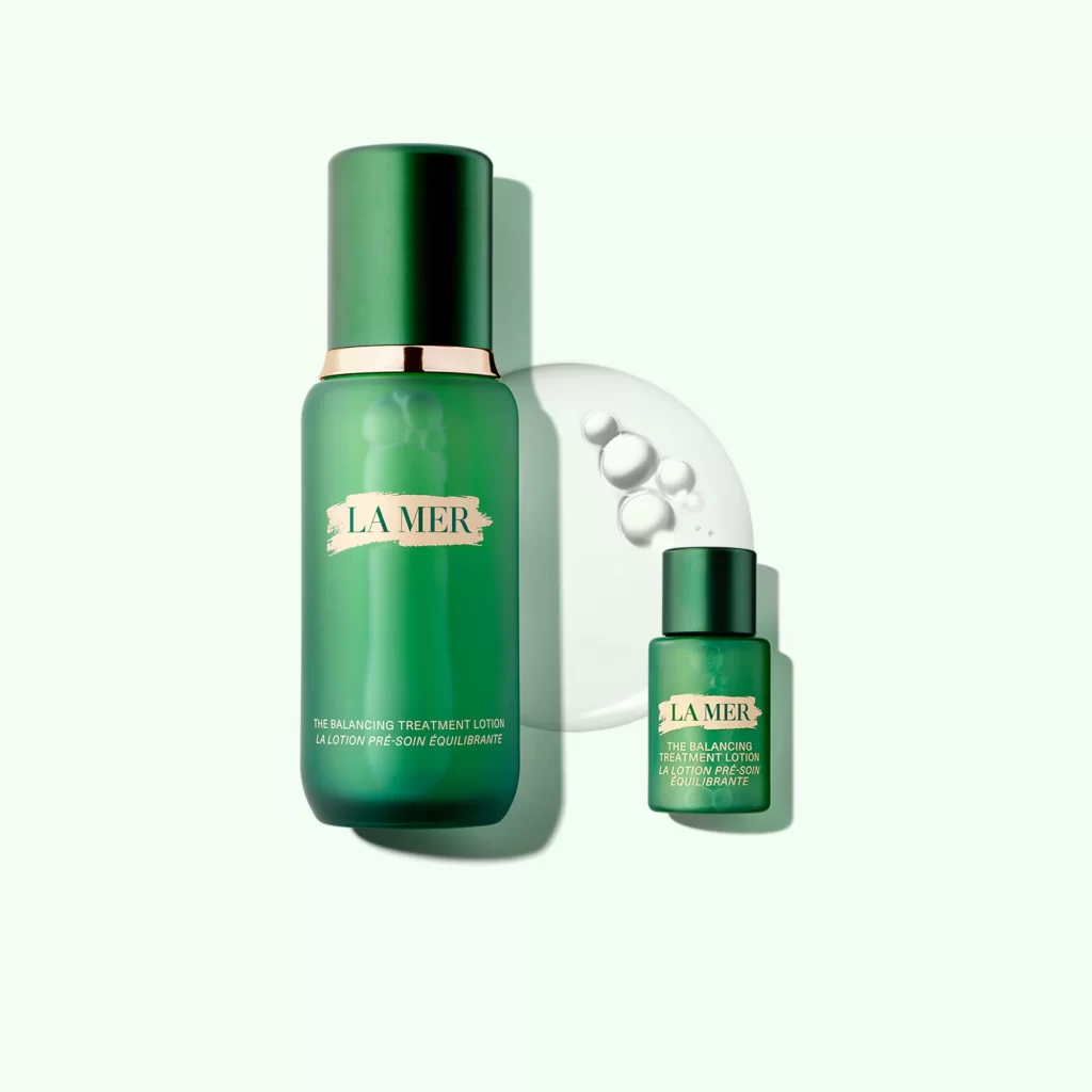
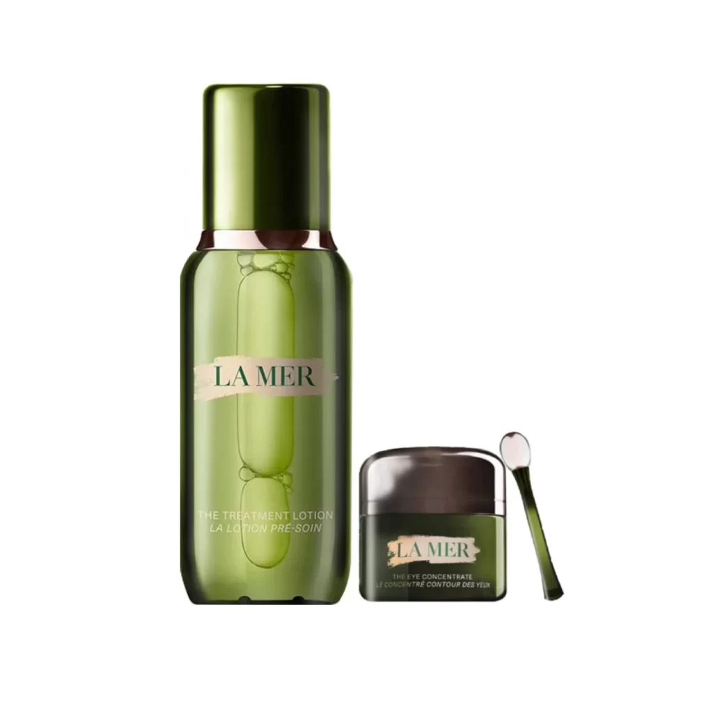
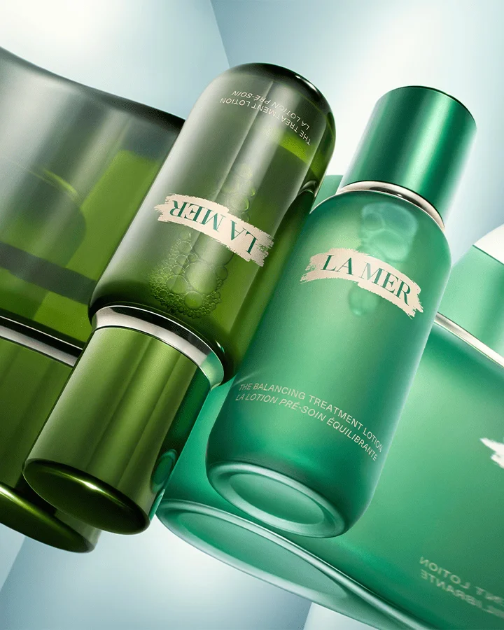
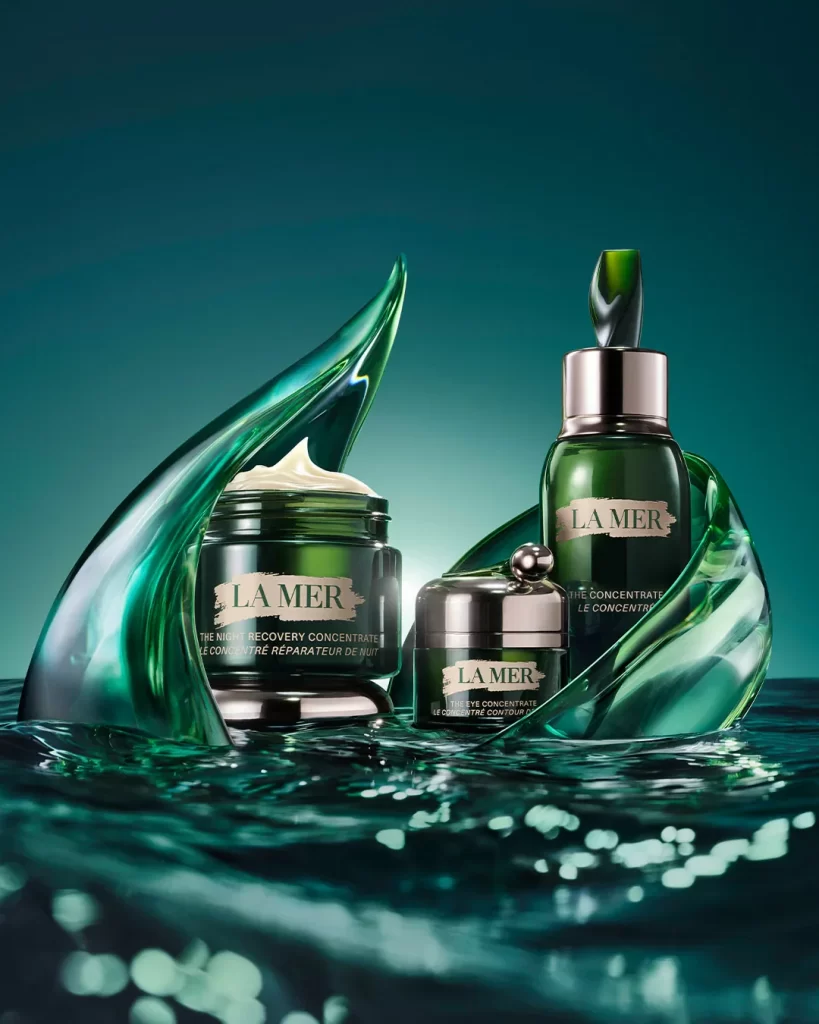
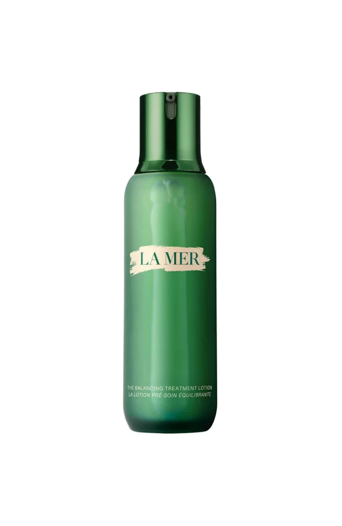
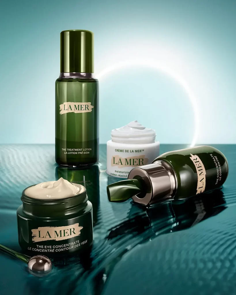
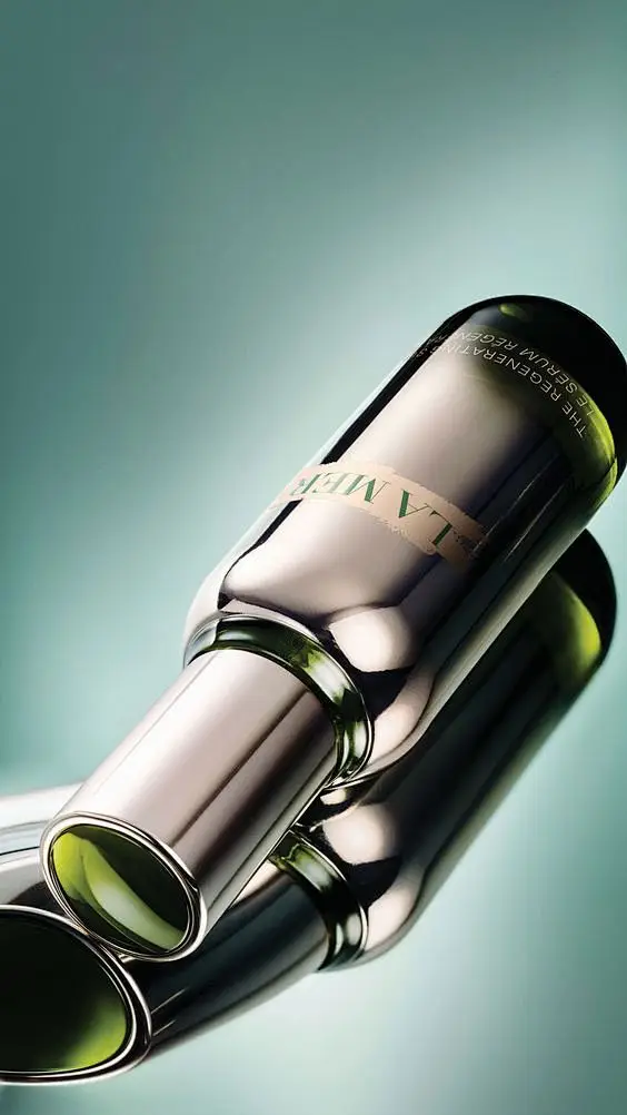
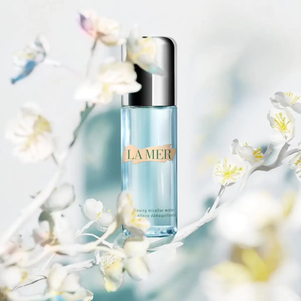
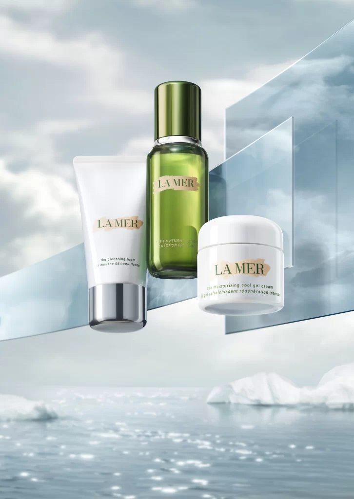
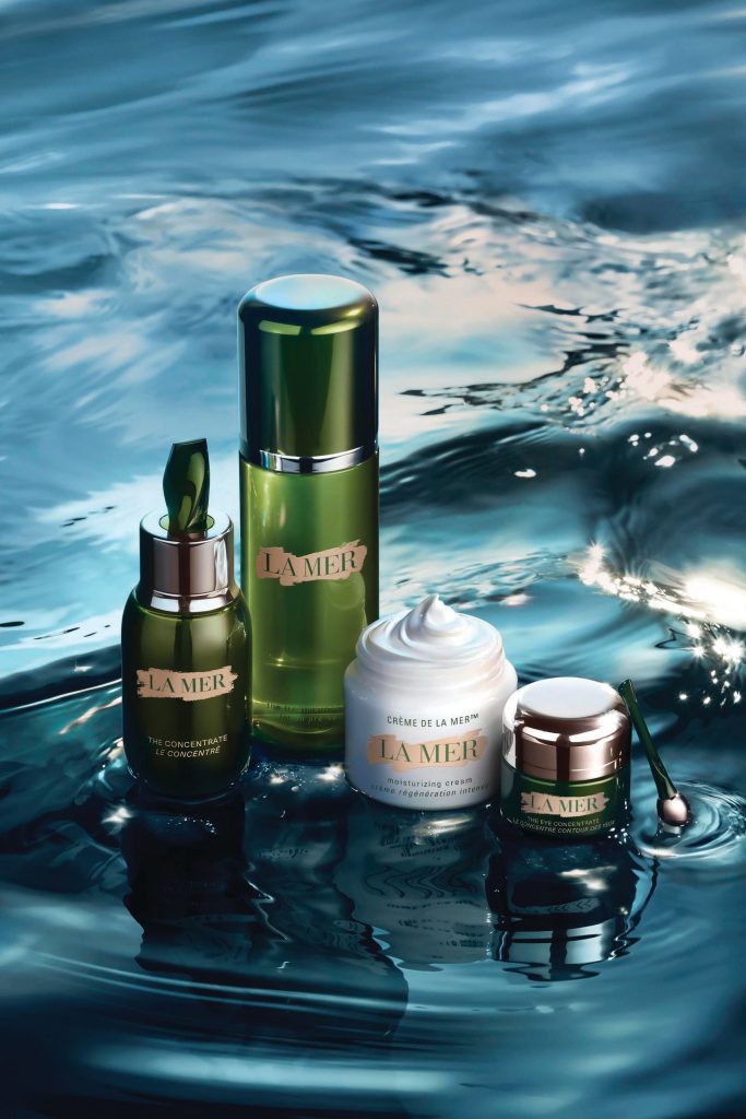
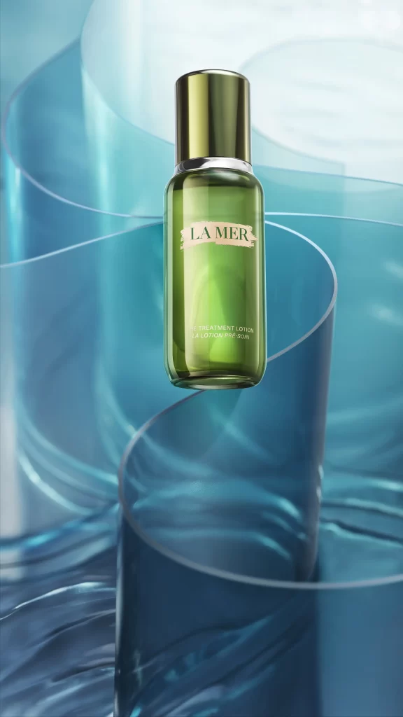
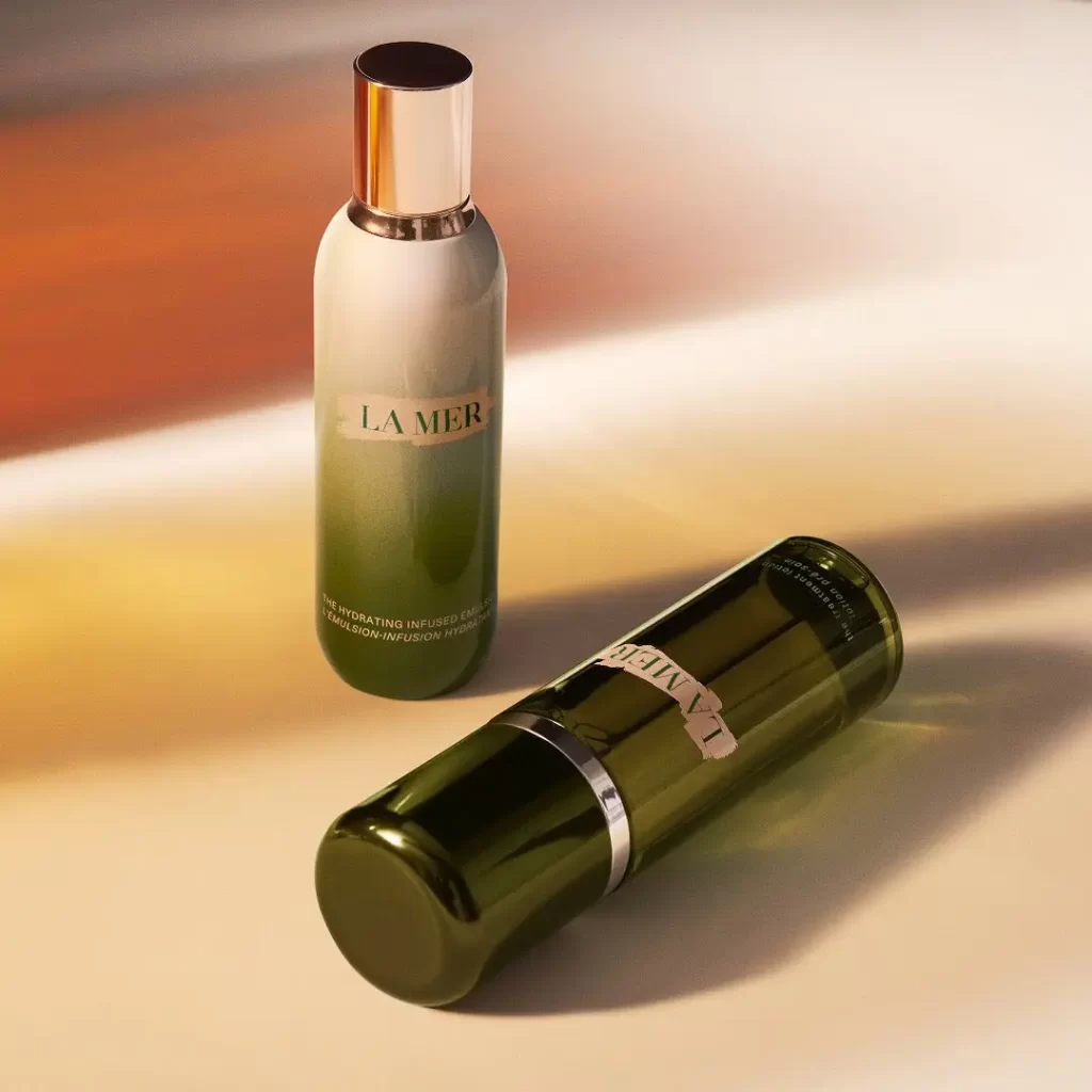
Warm amber light washes across a cream-colored surface, casting long shadows behind two cylindrical cosmetic containers. One vessel stands upright, displaying a frosted white-to-olive gradient glass body topped with a polished rose-gold cap, while the second lies horizontally in deep forest-green translucent glass with a silver band near its base. Both feature the brand name 'LA MER' in dark serif lettering on off-white labels, with smaller product text visible beneath the primary logo.
The visual distinction lies in the material contrast between the two bottles and the sophisticated color palette that bridges clinical luxury with organic earthiness. The upright bottle's matte ombre finish diffuses light softly, whereas the recumbent container's glossy surface creates sharp highlights that emphasize its cylindrical volume. This specific iteration of the packaging demonstrates how gradient tinting and metallic accents can elevate standard pharmaceutical shapes into premium beauty objects.
Product photographers studying luxury cosmetics lighting setups will find value in analyzing how the directional illumination defines the glass curvature without creating distracting glare. Packaging designers researching high-end skincare branding can examine the typographic hierarchy and label placement across curved surfaces. 3D artists constructing cosmetic product renders might reference the specific specular qualities of the metallic caps against the varying opacity levels of the tinted glass materials.