La Mer Moisturizing Cream Ice Blue
Topics
Details
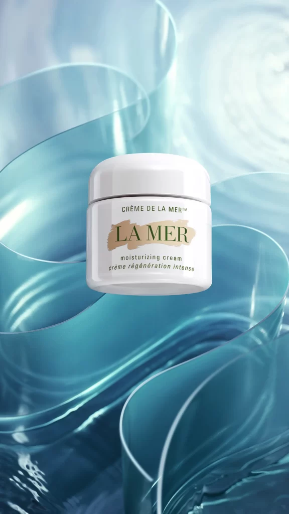
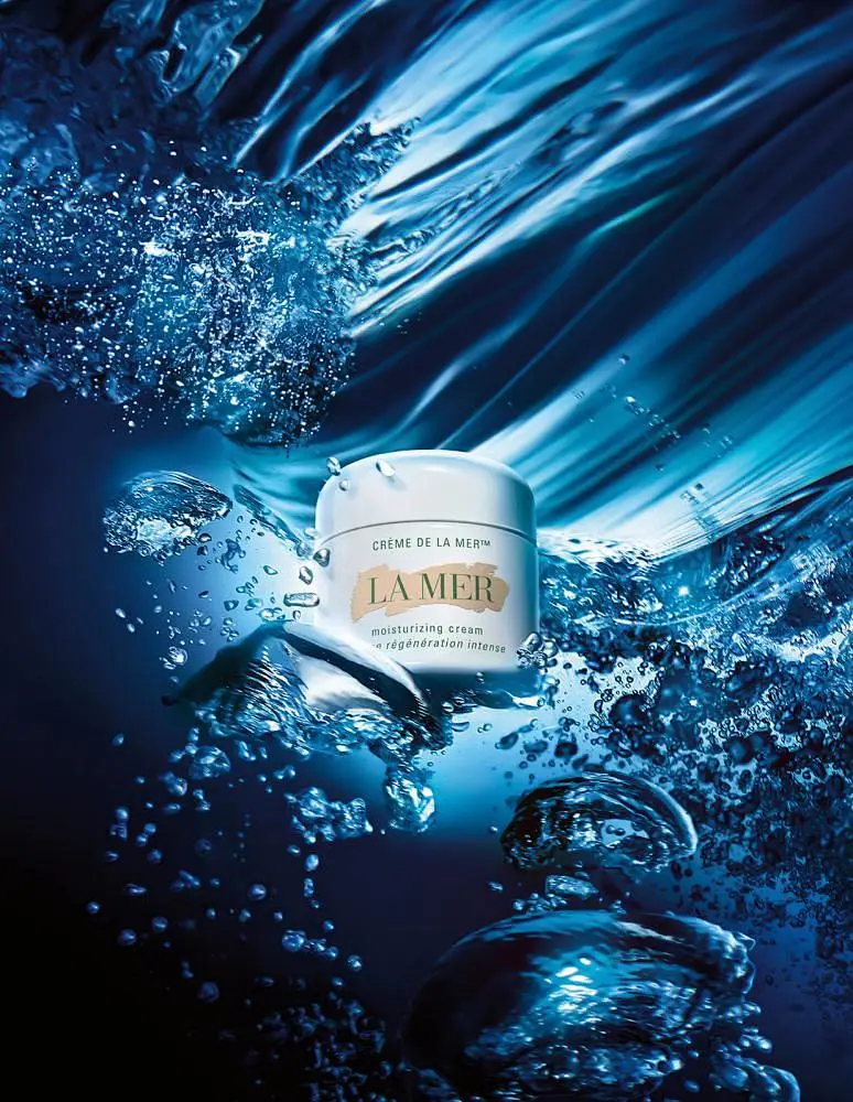
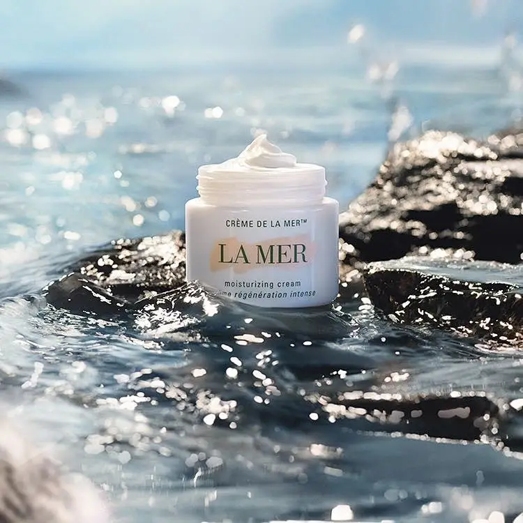
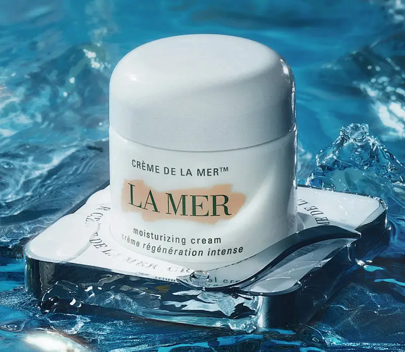
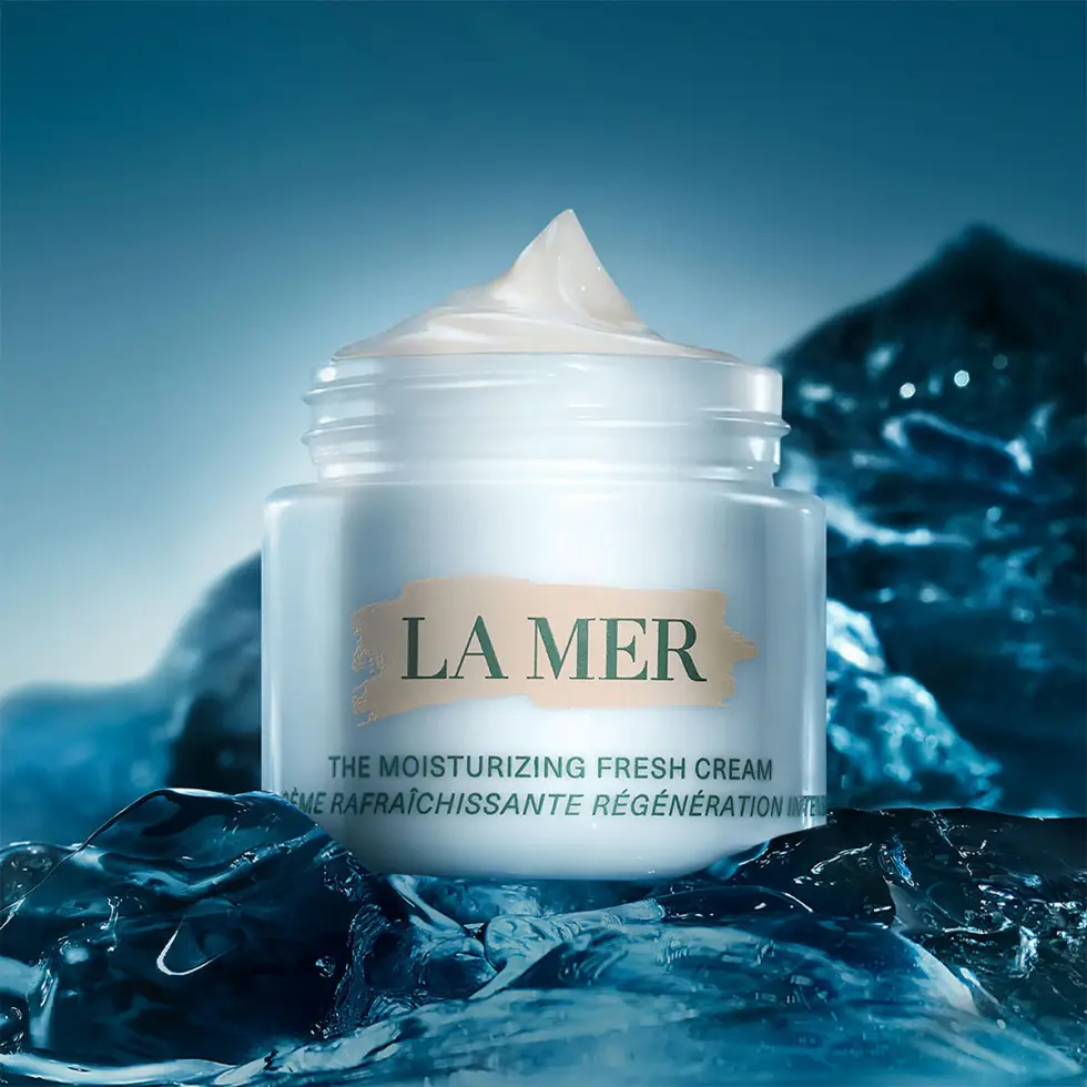
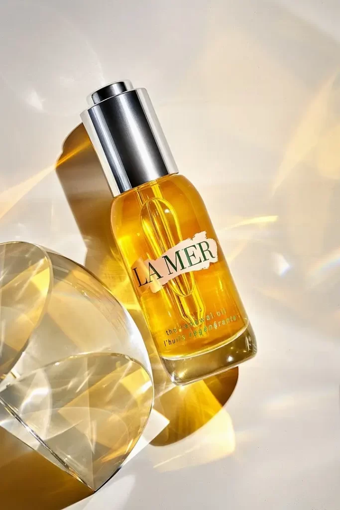
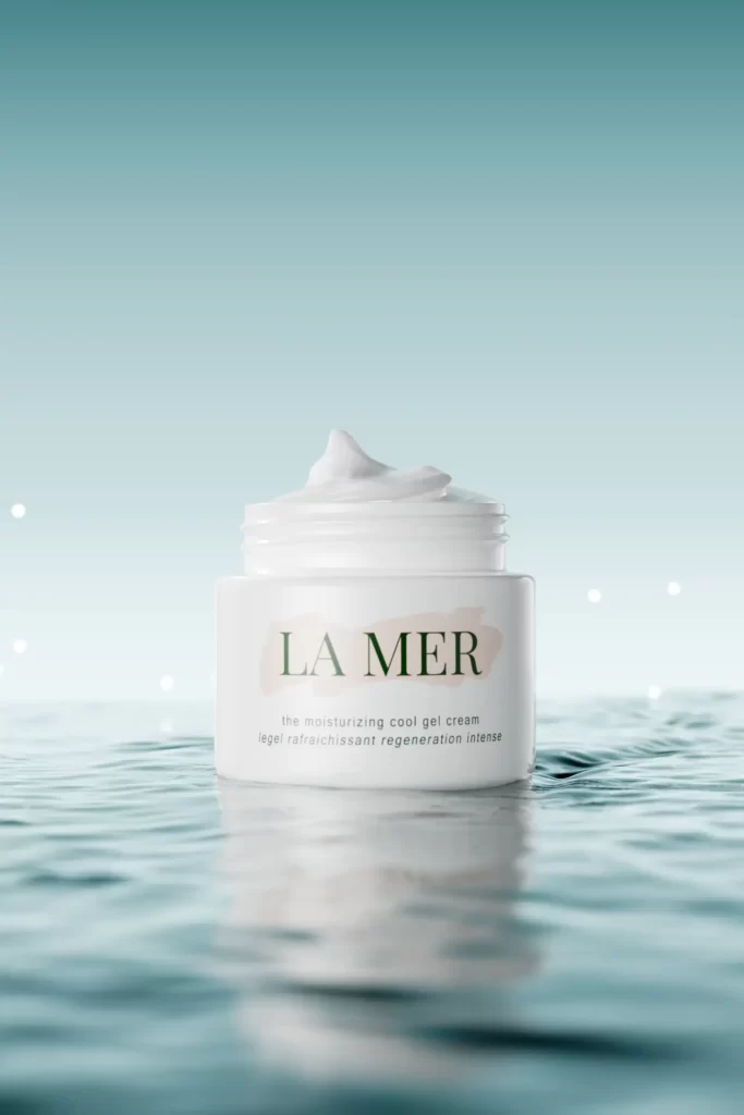
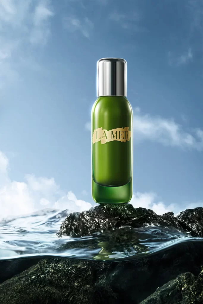
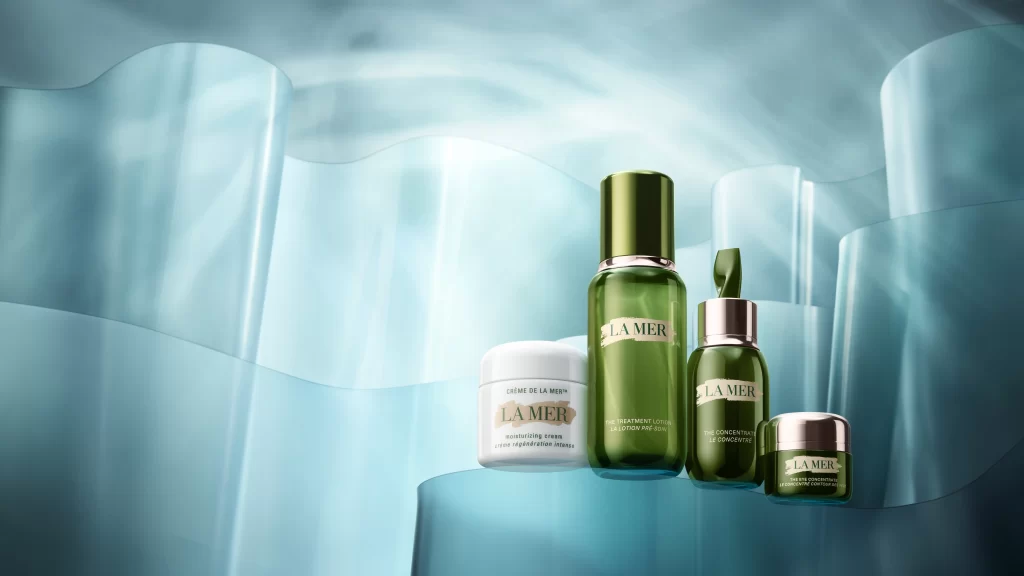
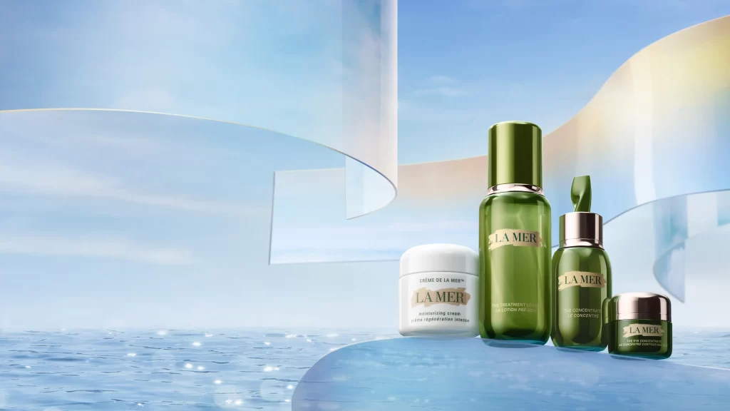
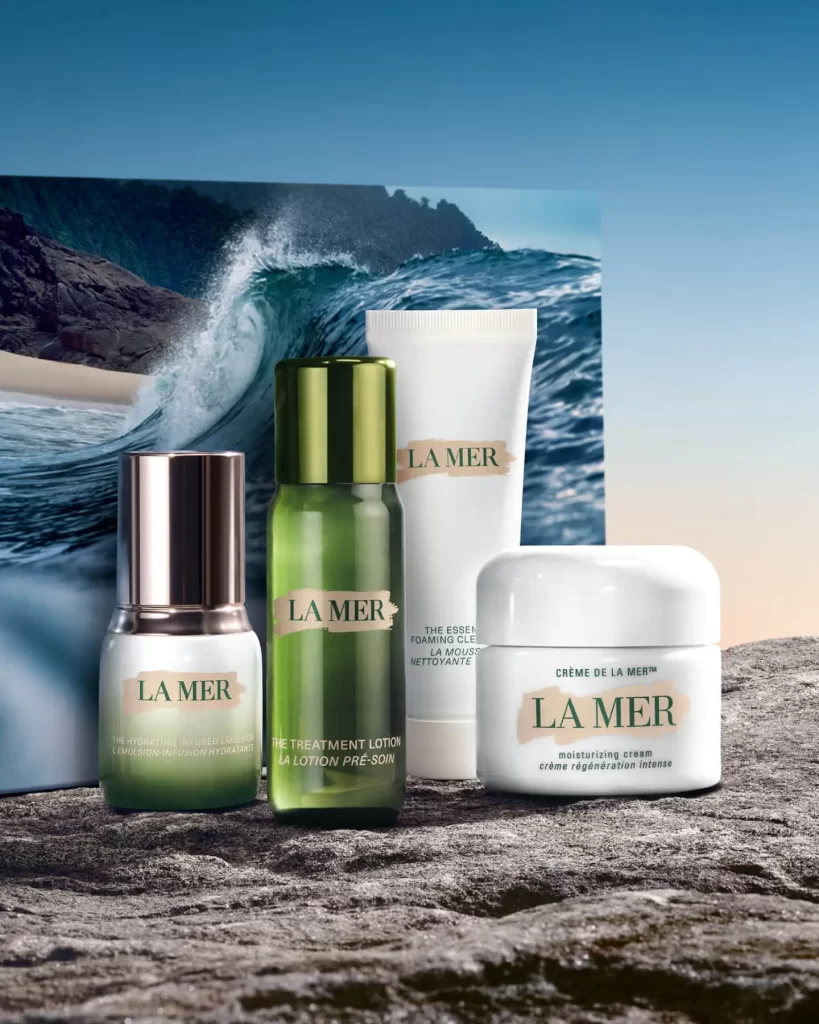
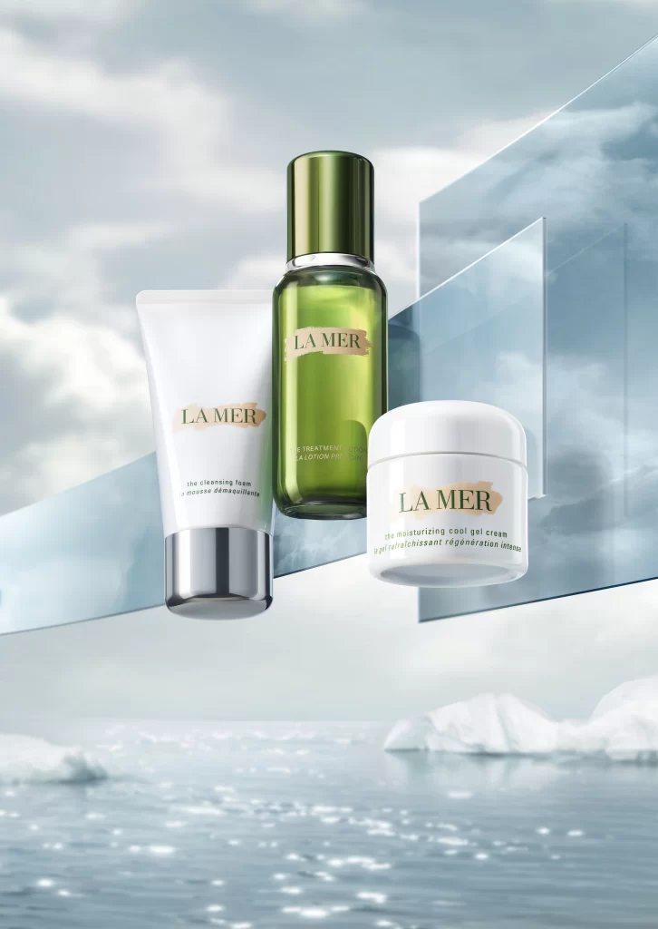
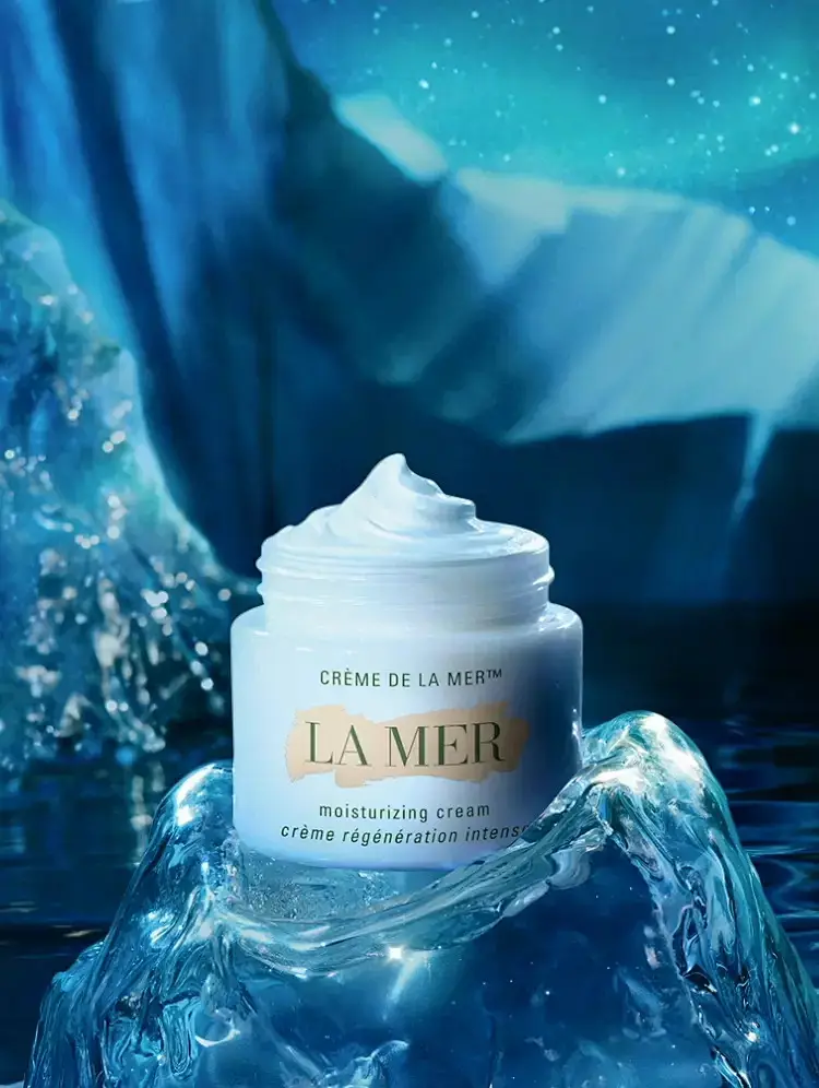
A cylindrical white jar of Crème de la Mer Moisturizing Cream sits centered atop a translucent, crystalline formation resembling frozen water, its lid removed to reveal a swirl of thick white cream. The container displays 'CRÈME DE LA MER™' in black serif typeface above the prominent gold-toned 'LA MER' logo, with 'moisturizing cream' and the French subtitle 'crème régénération intense' printed in smaller text below. Deep cerulean blue tones suggesting submerged glacial depths form the backdrop behind the product.
Visual distinction emerges from the deliberate juxtaposition of the opaque, matte pharmaceutical-grade packaging against the highly refractive, liquid-like qualities of the supporting ice structure. The color palette restricts itself to cool blues, whites, and metallic gold accents, establishing a cohesive temperature-based narrative that reinforces the product’s moisturizing claims through environmental association. Compositionally, the slight low-angle perspective elevates the jar to monument status while the surrounding aqueous elements suggest both purity and preservation.
Product photographers studying luxury cosmetic advertising might analyze this composition for its mastery of material contrast between solid and fluid states. Art directors developing campaigns for marine-derived skincare formulations could reference the specific lighting techniques used to render translucency in frozen substrates. 3D environment artists constructing underwater or arctic scenes would benefit from examining how the depth of field blurs background elements while maintaining sharp focus on the primary subject’s typographic details.