La Mer Moisturizing Cream 2
Topics
Details
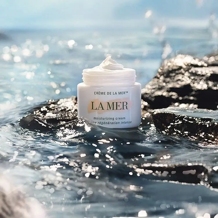
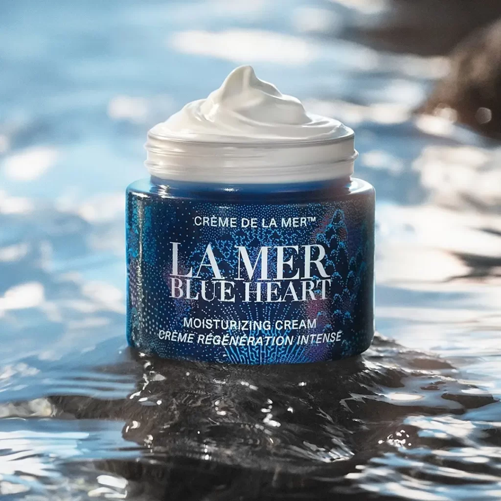
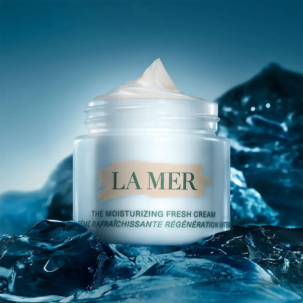
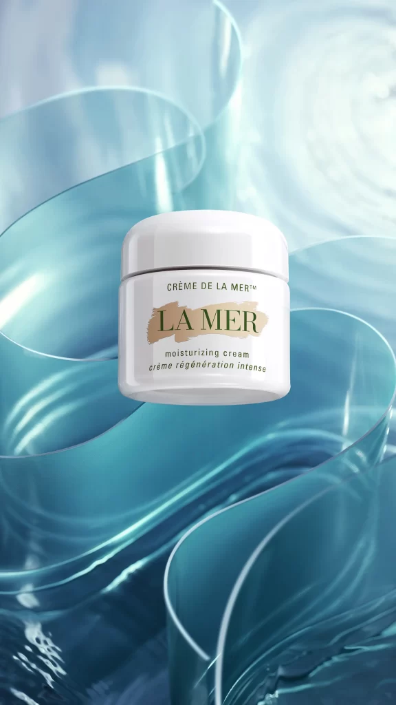
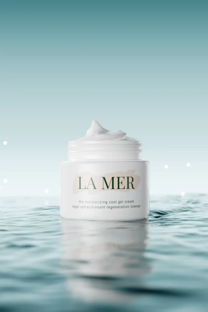
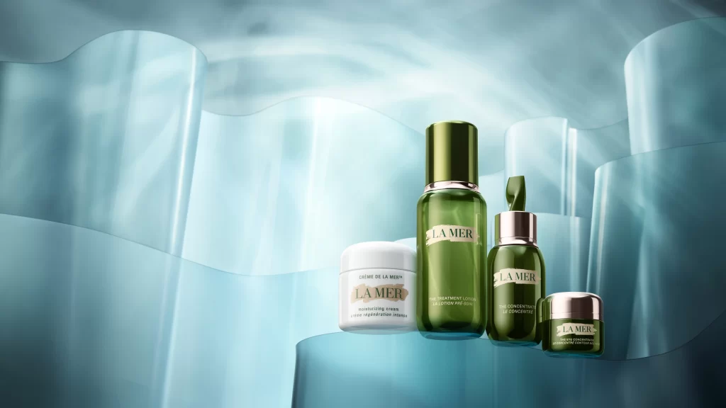
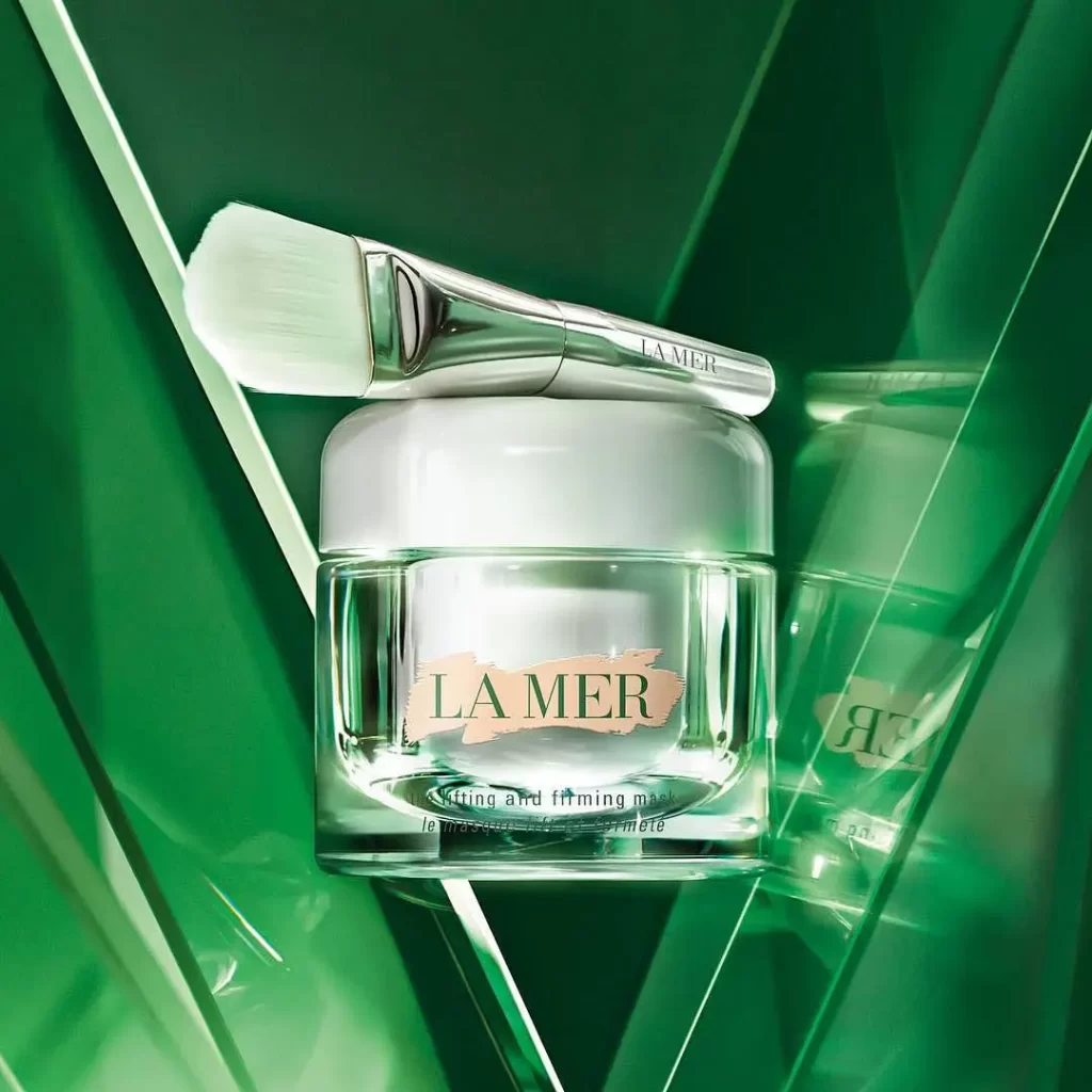
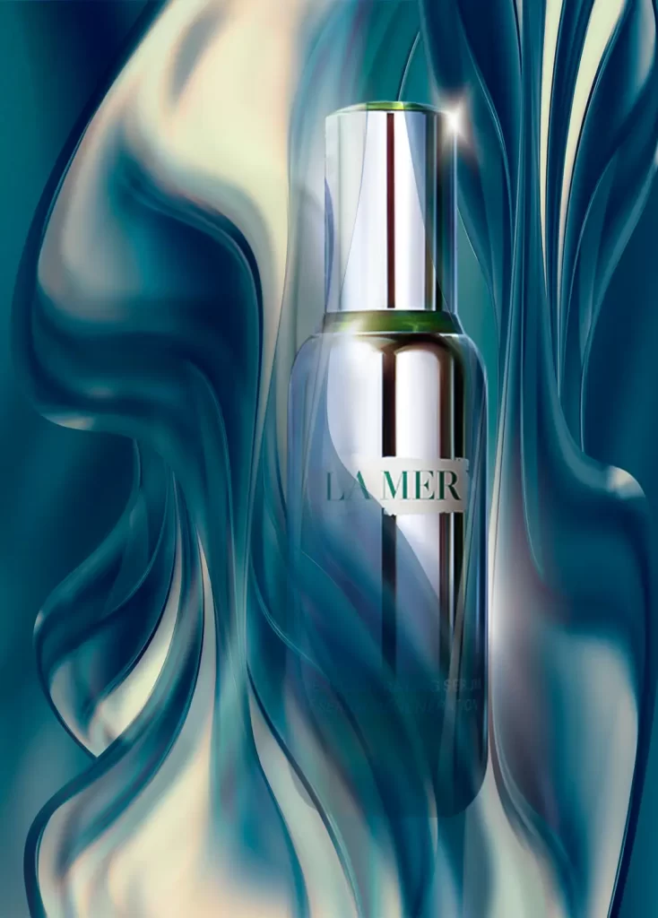
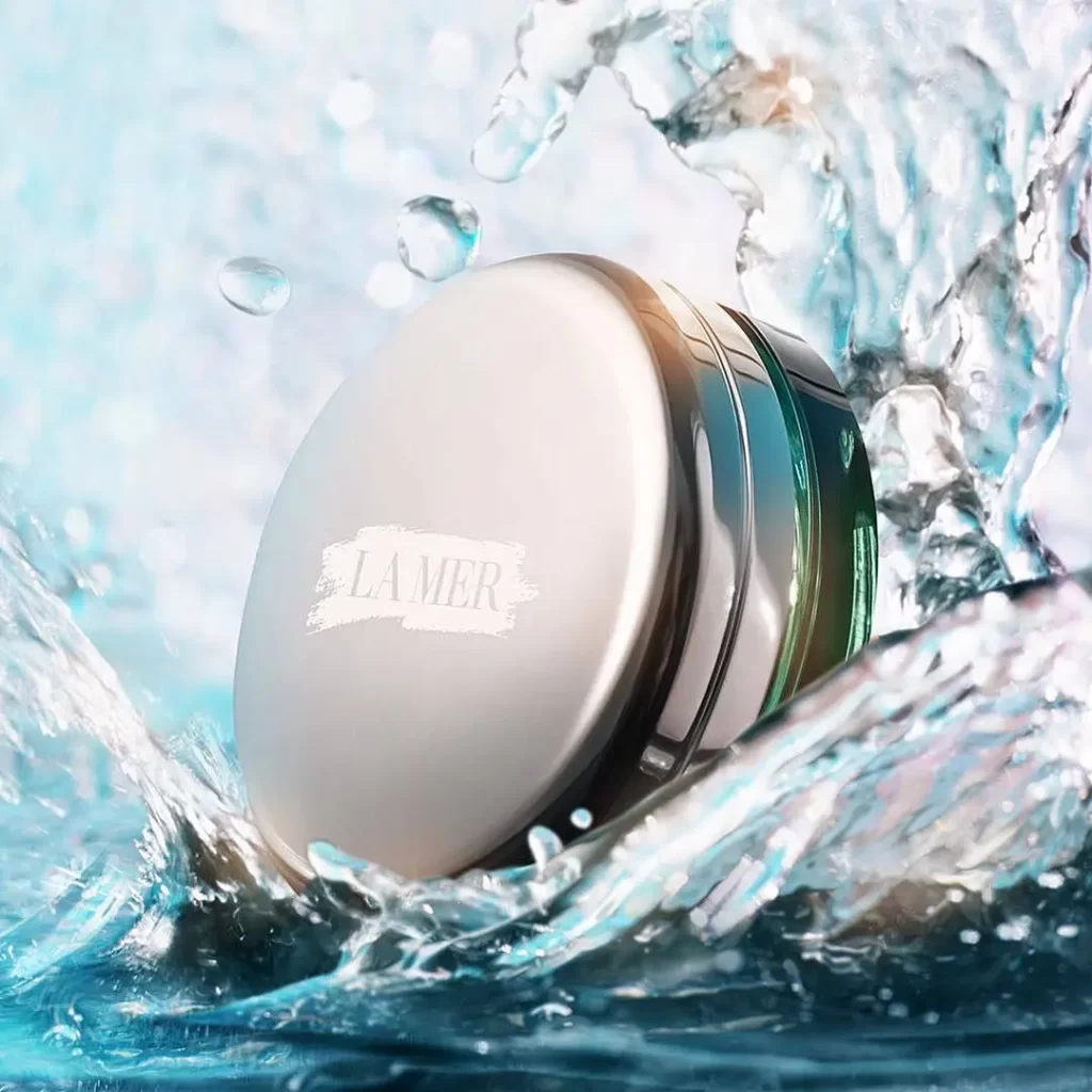
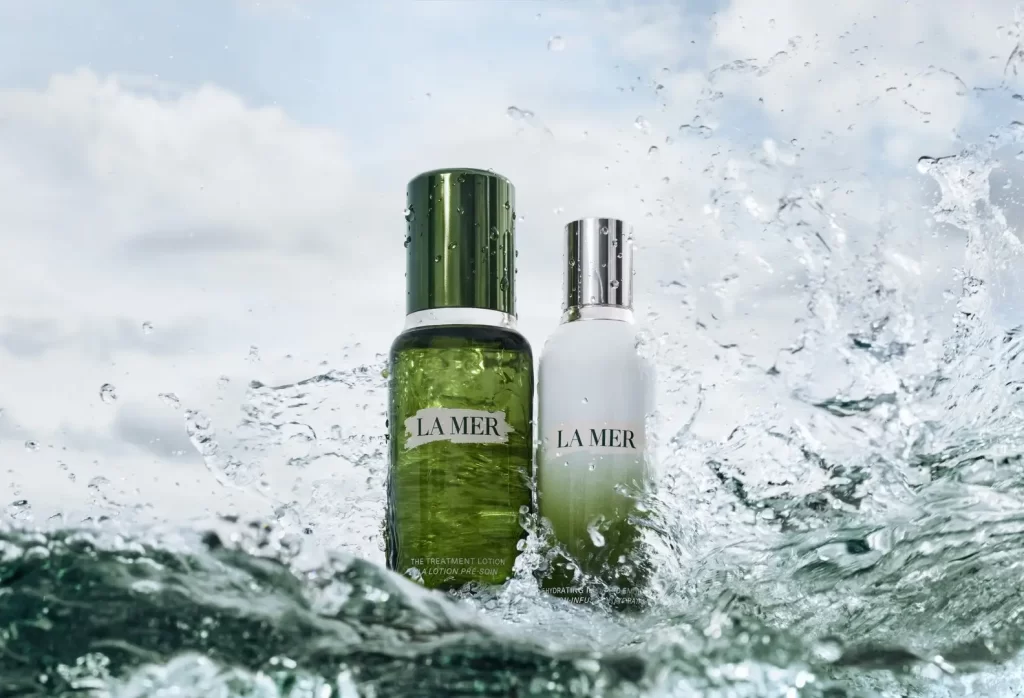
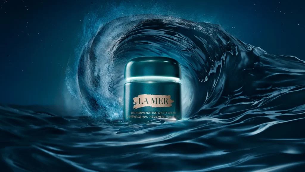
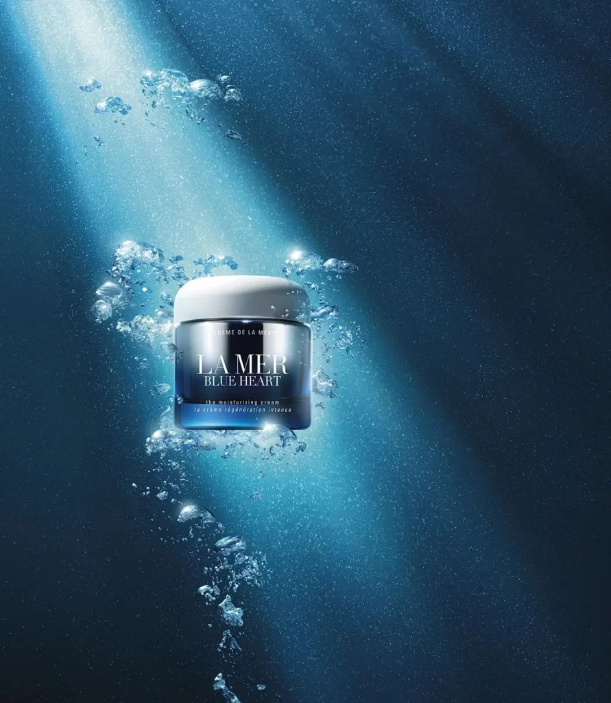
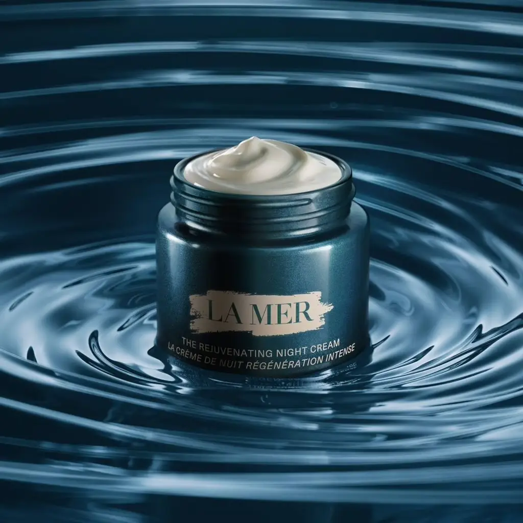
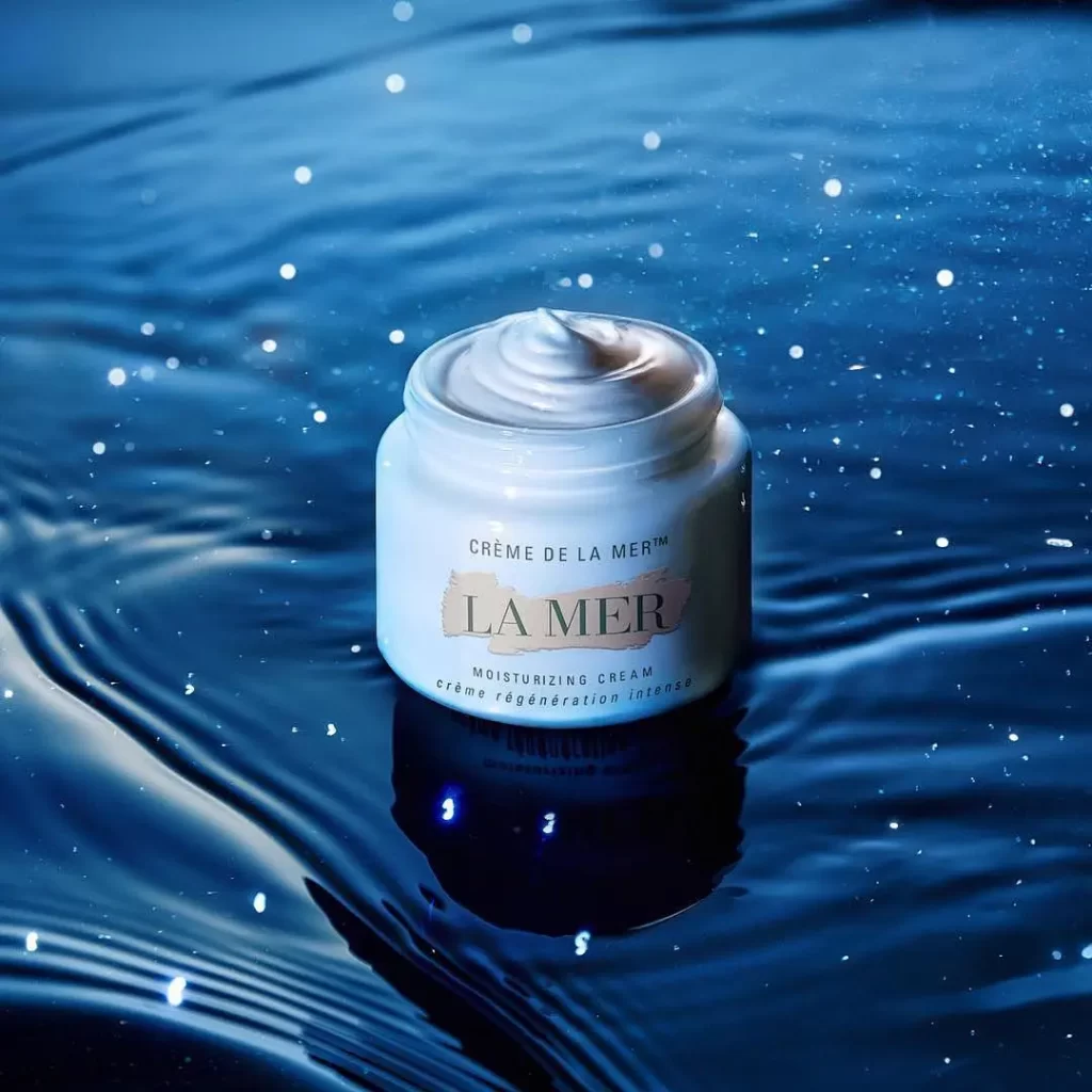
A white cylindrical jar of Crème de la Mer sits centrally with its lid removed, revealing a thick, sculpted swirl of pale cream inside. The container displays the brand's signature typography, with 'LA MER' printed in dark serif letters over a subtle beige rectangle and smaller text identifying the product as Moisturizing Cream above and below. Rippling deep blue water surrounds the base, catching light in scattered bright highlights across its surface.
Visual distinction emerges from the interplay between the product’s clinical white opacity and the fluid, organic movement surrounding it. The texture of the cream itself becomes a focal point, its smooth ridges catching light differently than the glossy waves, creating a study in contrasting materials. This specific arrangement emphasizes the brand’s oceanic heritage through color psychology, using the saturated blues to evoke depth and hydration without relying on explicit marine imagery.
Photographers studying liquid surface interactions might examine how the ripples distort the reflection while maintaining legibility of the object above. Cosmetic brands developing campaign visuals could reference the lighting technique used to make the cream appear both substantial and ethereal simultaneously. Art directors working on luxury packaging presentations would find value in the compositional balance between the rigid geometric jar and the undulating natural environment.