La Mer Night Cream Packaging Cosmetics
Topics
Details
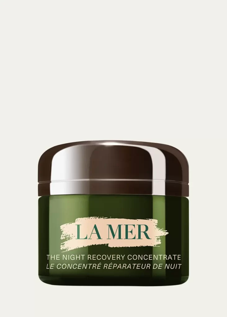
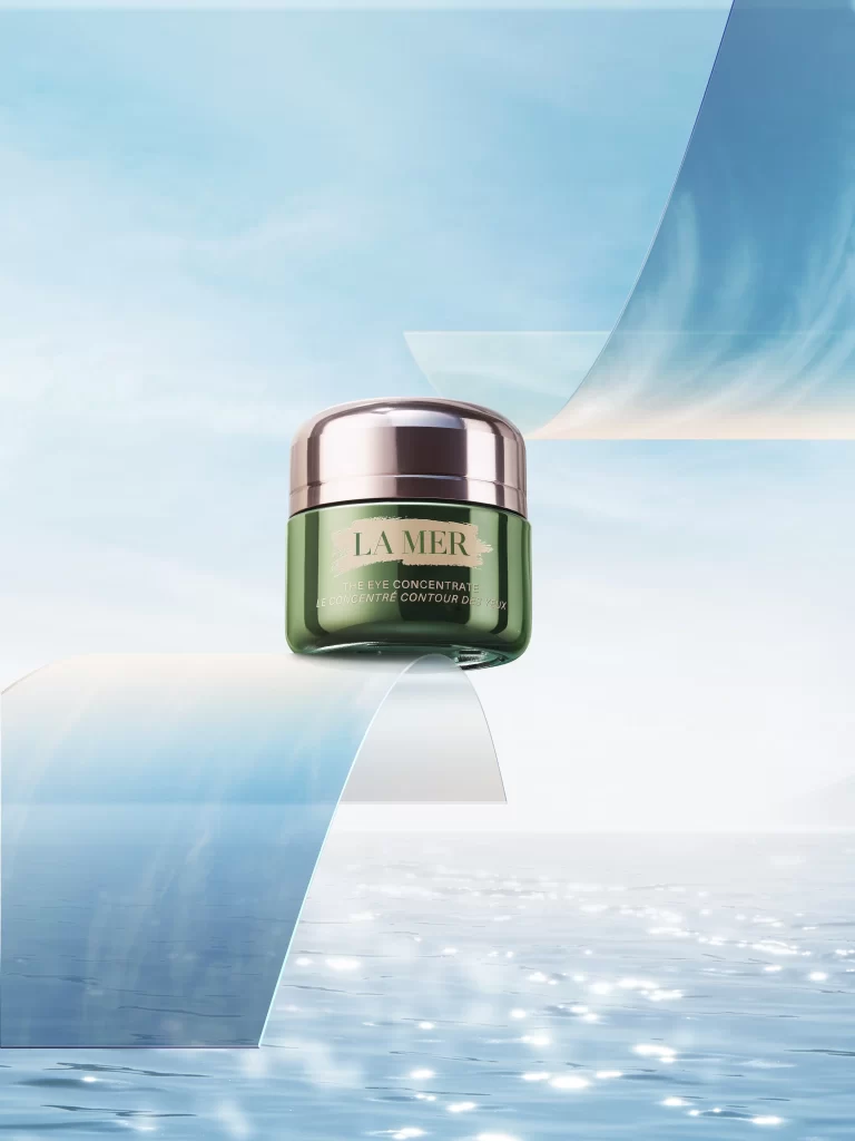
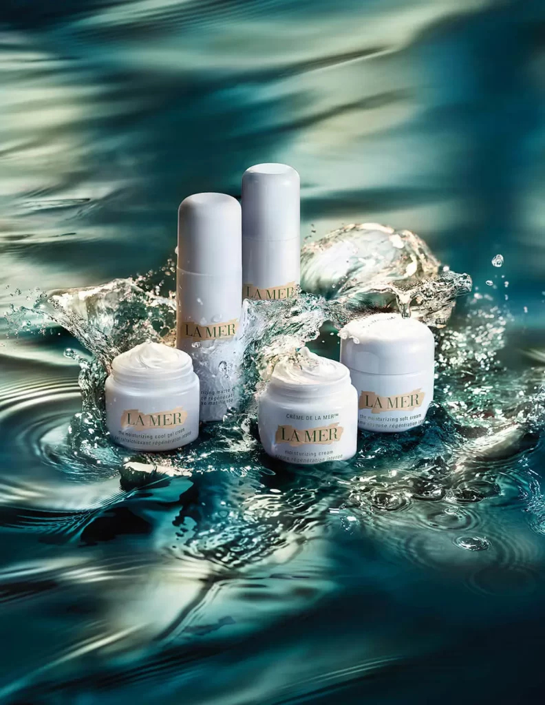
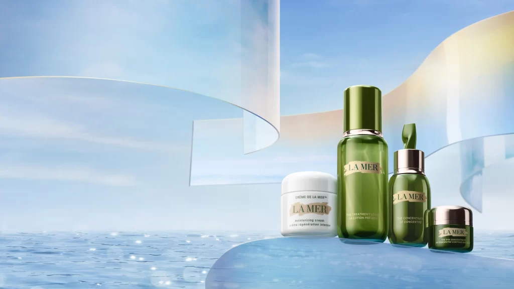
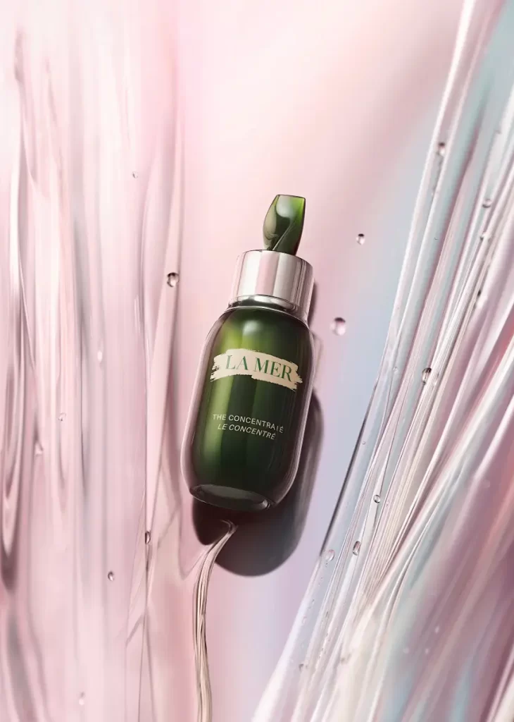
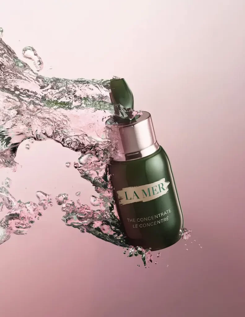
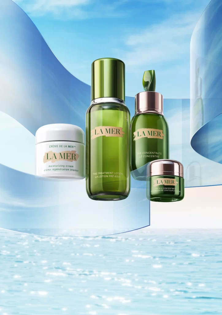
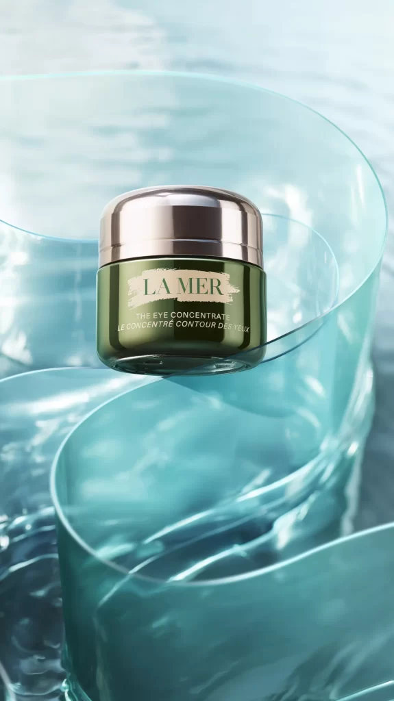
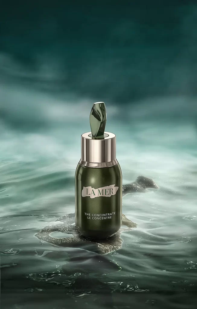
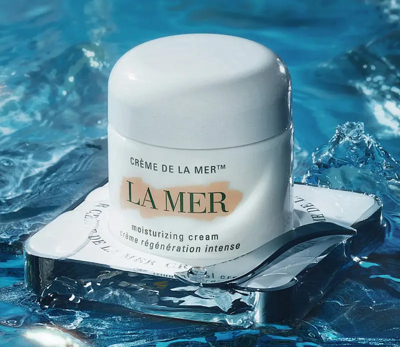
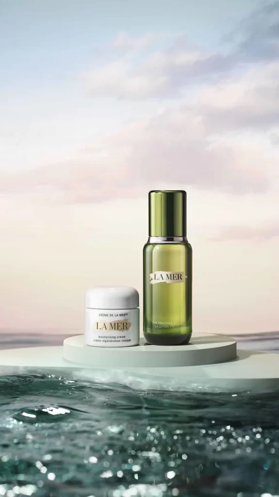
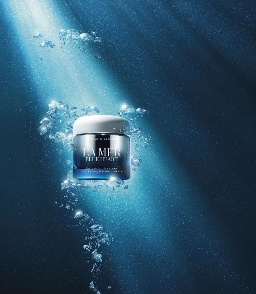
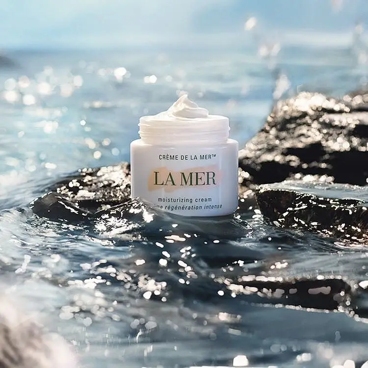
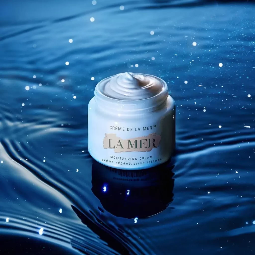
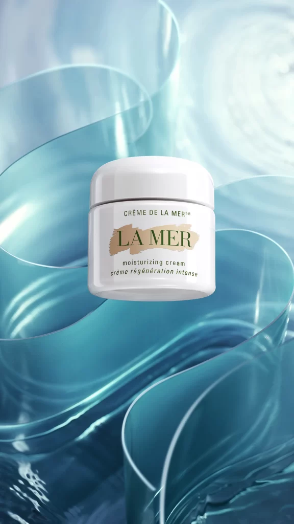
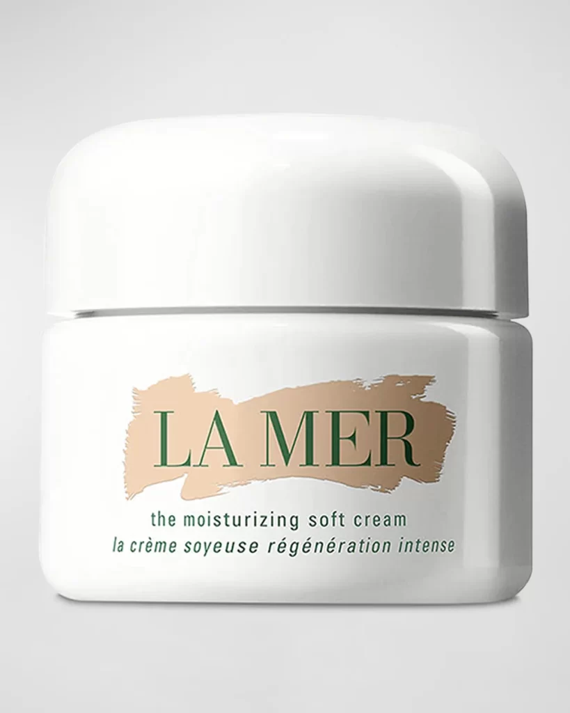
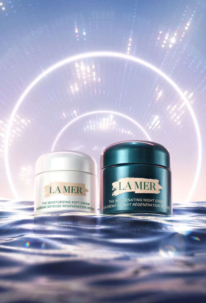
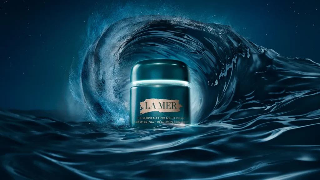
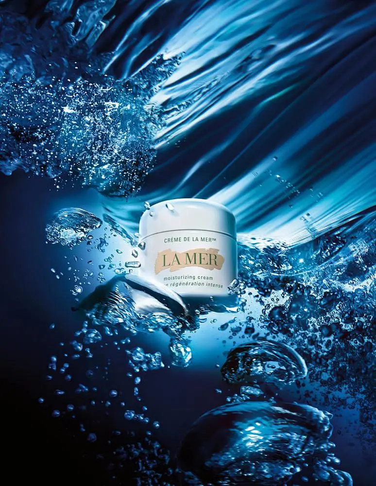
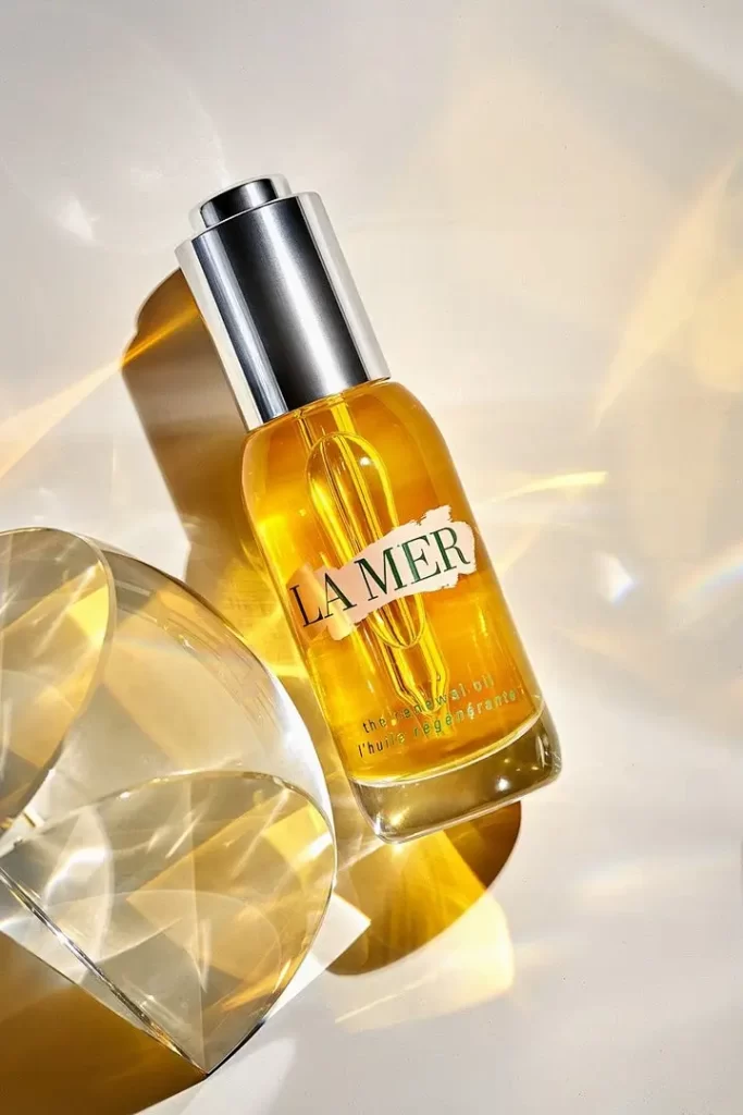
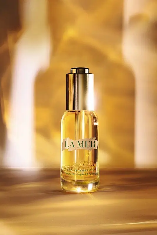
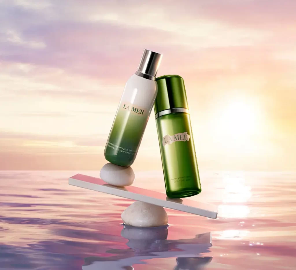
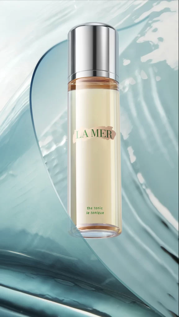
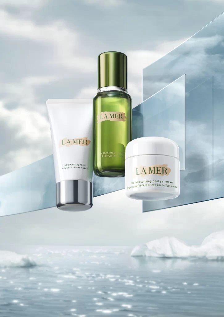
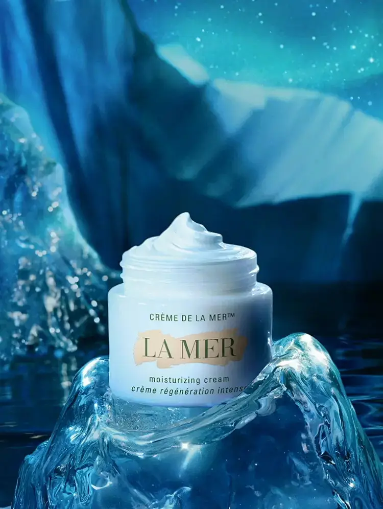
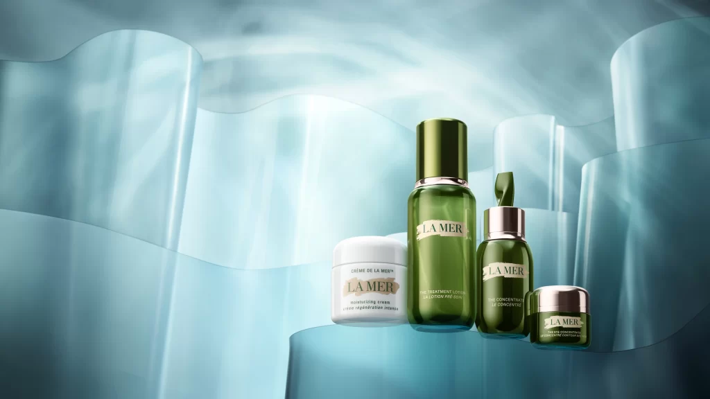
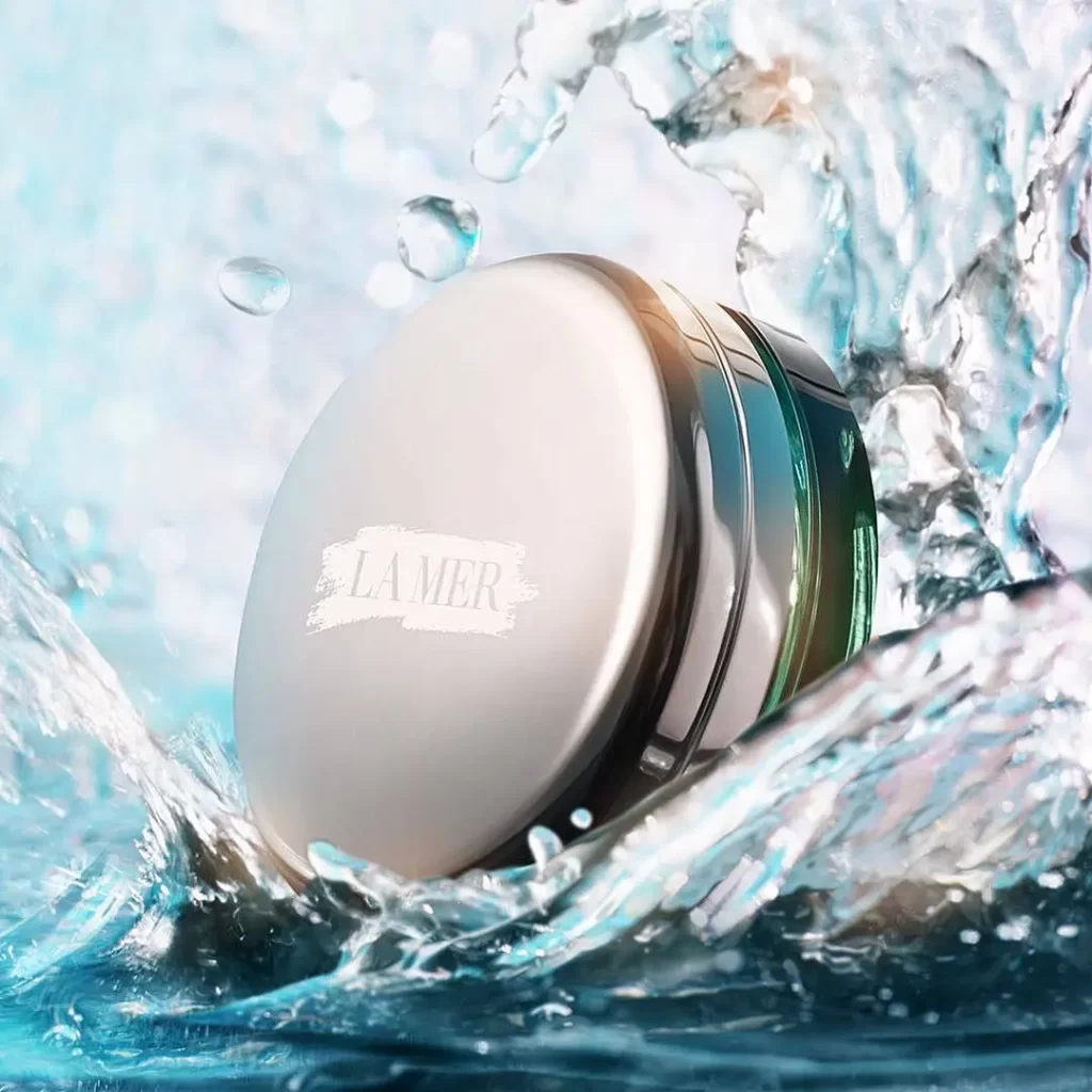
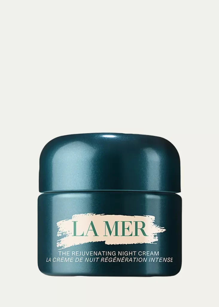
A cylindrical jar of La Mer night cream presents a deep teal, metallic-finish body topped with a matching domed lid that catches highlights along its curved surface. White text spans the front, displaying the brand name in serif capitals over a textured brushstroke banner, followed by smaller sans-serif lettering. The vessel sits in direct frontal view on a flat, pale cream backdrop.
Visual distinction arises from the interplay between the cool, oceanic blue-green hue and the warm off-white graphic element. The brushed texture behind the logo introduces an organic contrast to the otherwise sleek, industrial geometry of the container. Subtle gradients across the metallic surface suggest a premium material quality that elevates the object beyond standard cosmetic packaging into luxury territory.
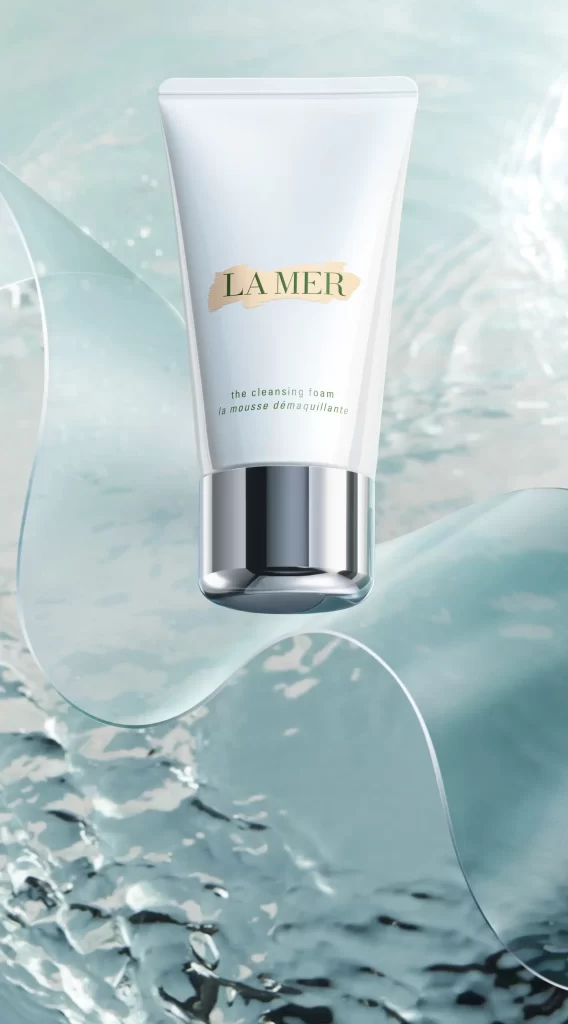
Brand strategists might examine this composition to understand how color psychology communicates skincare efficacy through aquatic tones. Packaging engineers could study the lid-to-base proportions to inform similar container designs for high-end moisturizers. Marketing teams analyzing competitor visuals would find the bilingual typography layout particularly useful for international product positioning strategies.