Lip Balm La Mer Packaging Cosmetics
Topics
Details
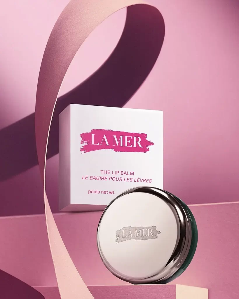
A circular silver tin with a green base and a white rectangular box sit on a pale pink geometric platform, both bearing the LA MER brand name in textured brushstroke lettering—magenta on the box and silver on the lid. A sweeping curved paper element in pale blush cuts diagonally across the composition, casting an elongated shadow against the soft rose and deep plum gradient background. The packaging identifies the product as THE LIP BALM with French translation LE BAUME POUR LES LÈVRES printed below.
Visual distinction arises from the interplay between the reflective, mirror-like finish of the metal container and the matte, tactile quality of the cardboard box. The deliberate use of curved versus straight lines creates a dynamic tension, while the monochromatic pink palette unifies the disparate elements into a cohesive luxury aesthetic. Lighting is strategically employed to highlight the metallic sheen of the lid, emphasizing the premium nature of the materials used.
Art directors studying high-end cosmetic campaigns will find the color blocking and shadow play particularly instructive for mood board development. 3D environment artists can utilize this as a study in material rendering, specifically focusing on how soft light interacts with brushed metal versus porous paper. Furthermore, typographers may analyze the weight and placement of the bilingual text to understand hierarchy within luxury branding layouts.