La Mer Moisturizing Cream Concentrate Green
Topics
Details
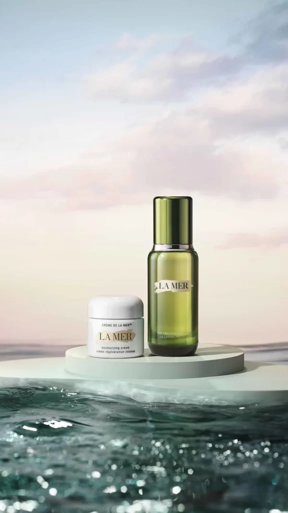
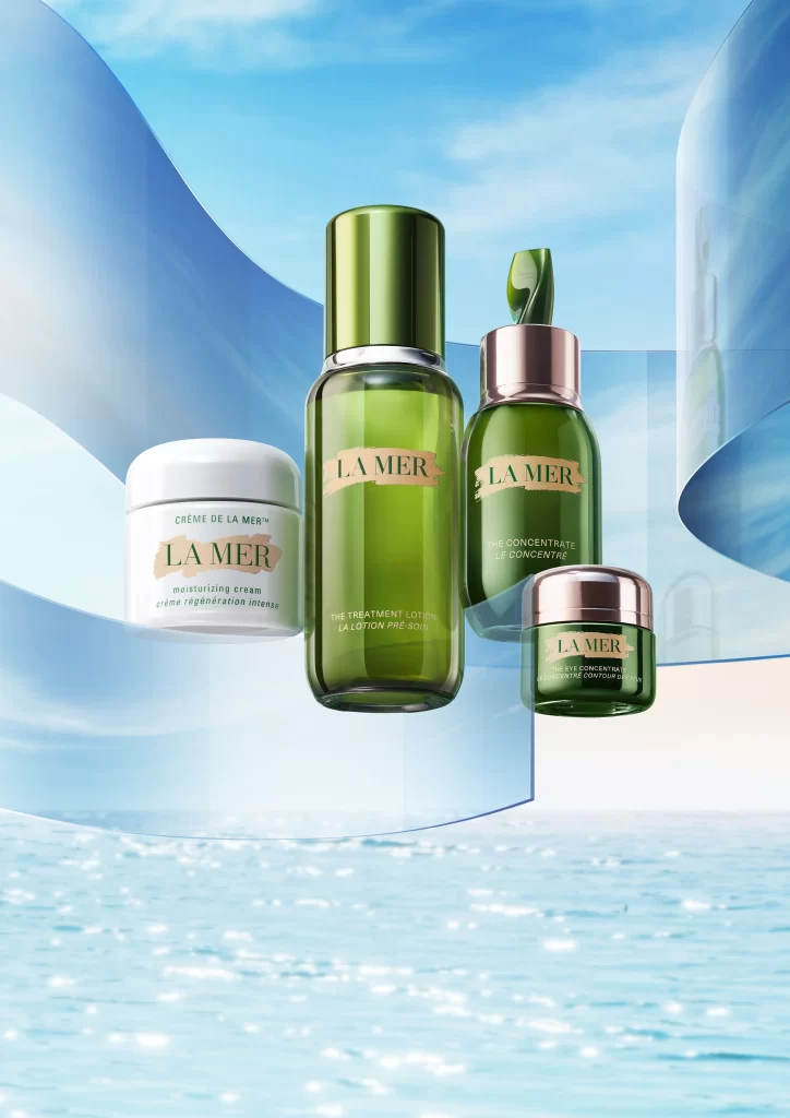
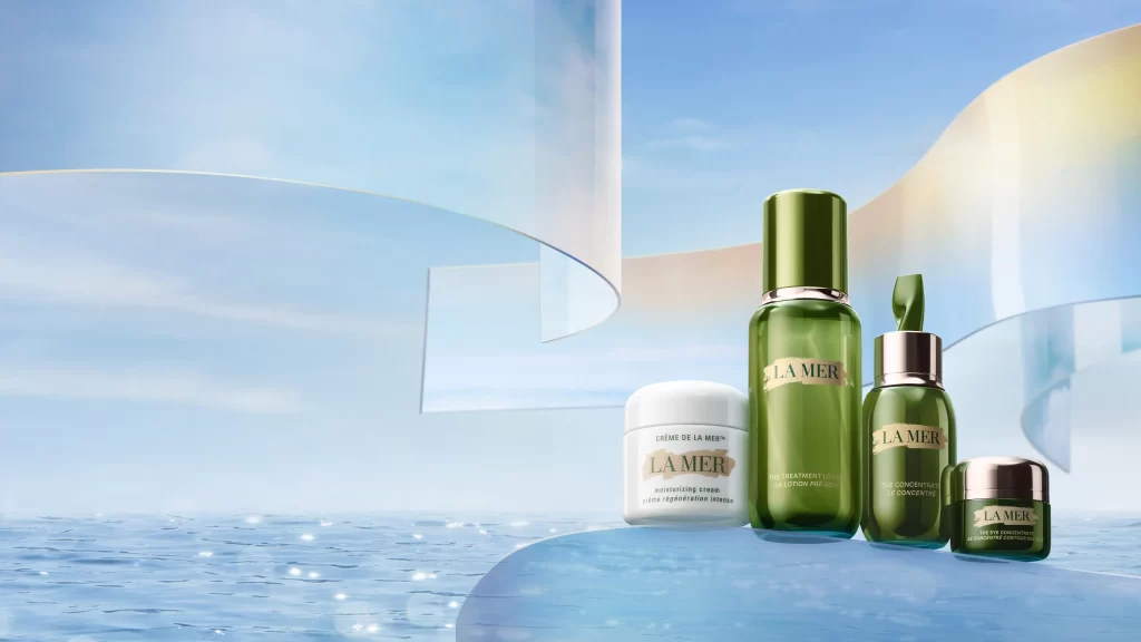
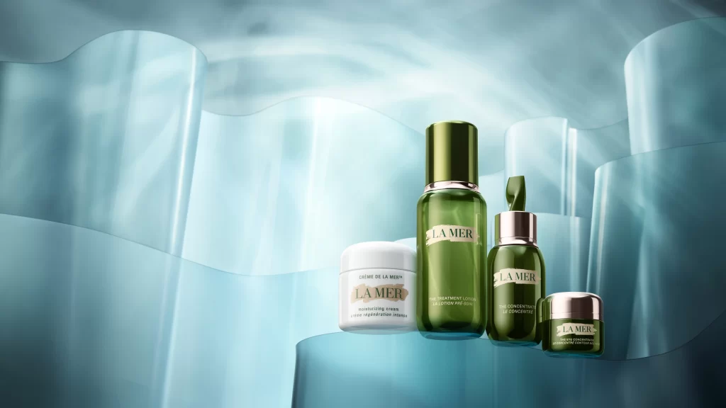
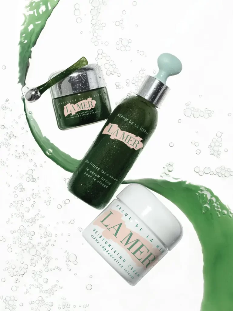
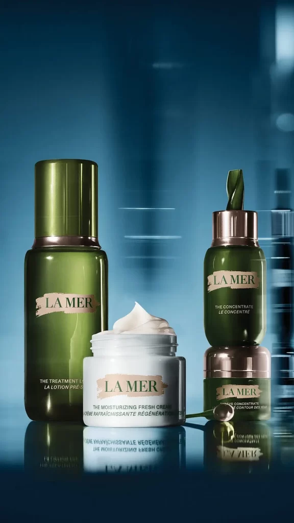
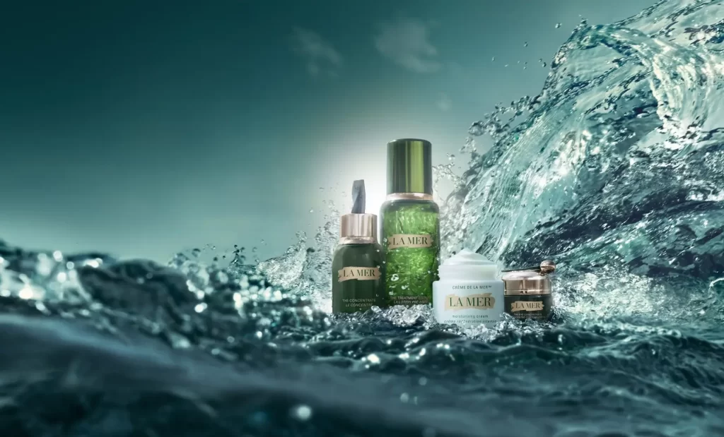
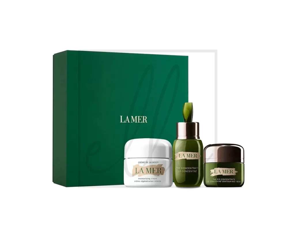
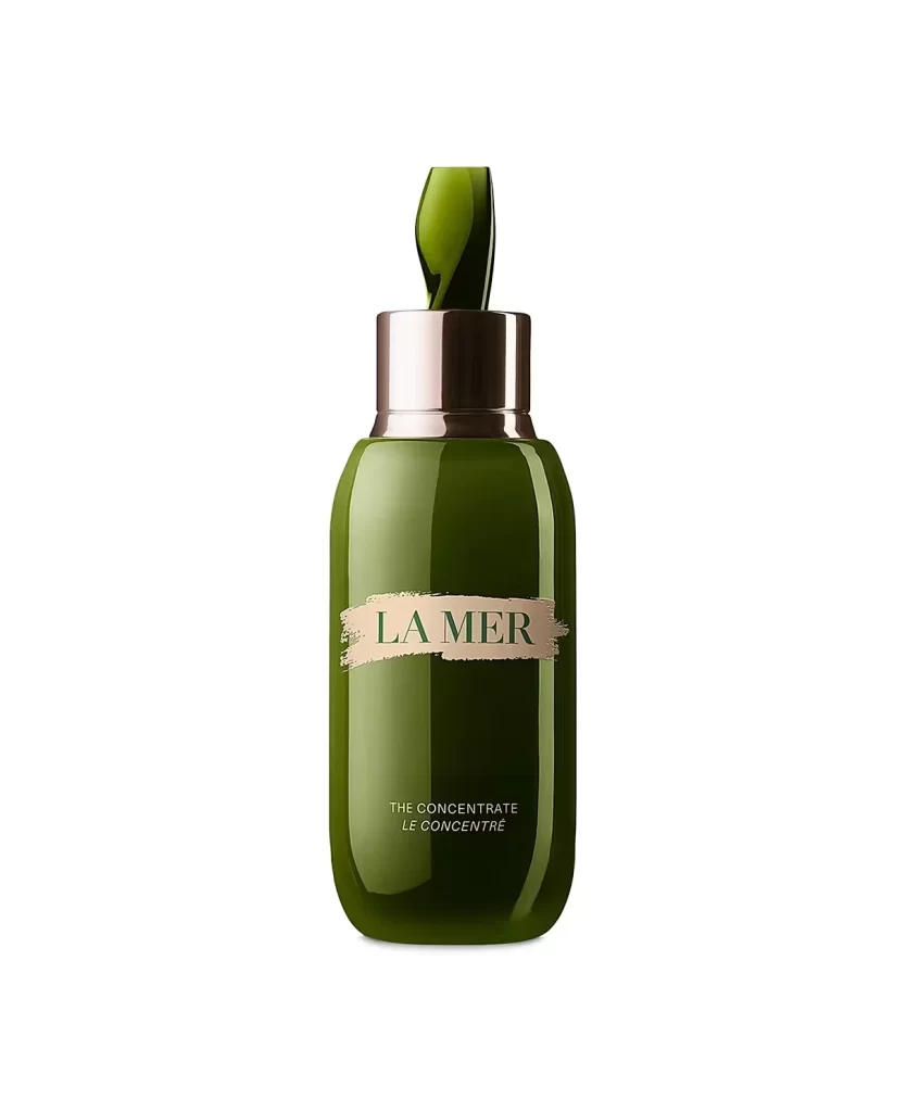
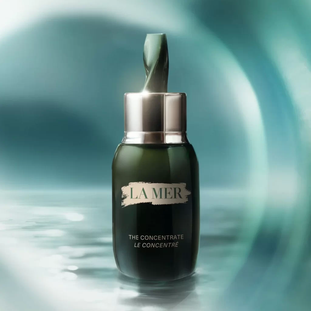
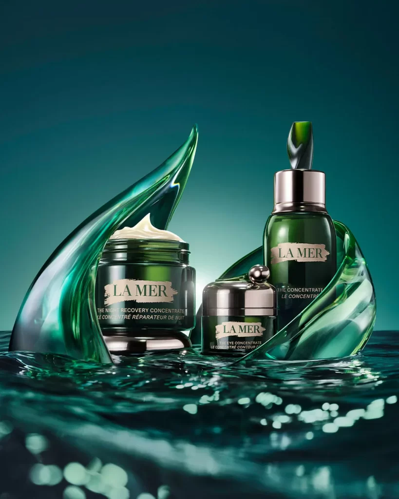
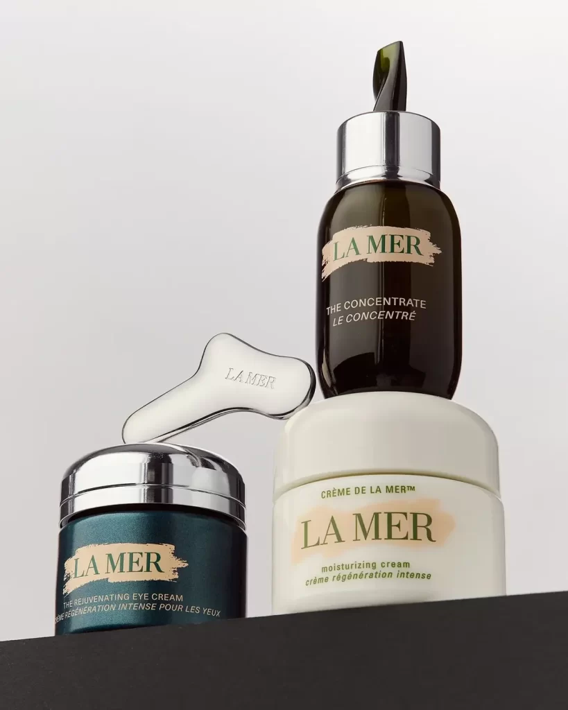
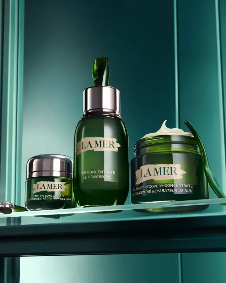
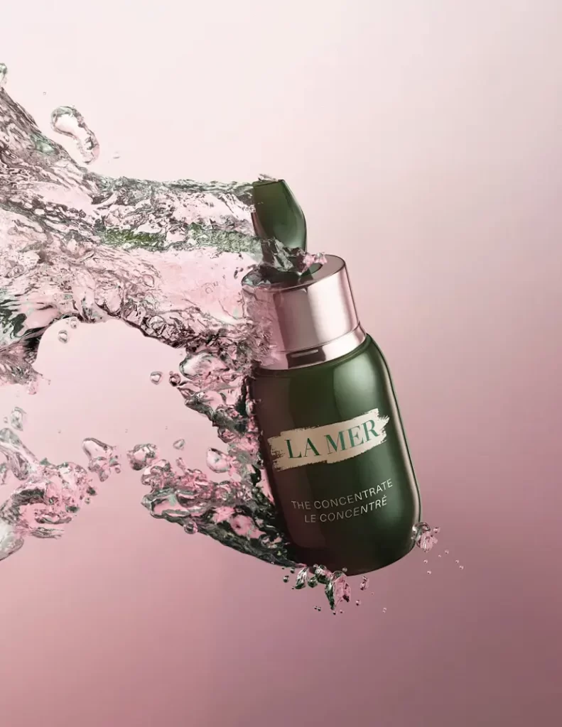
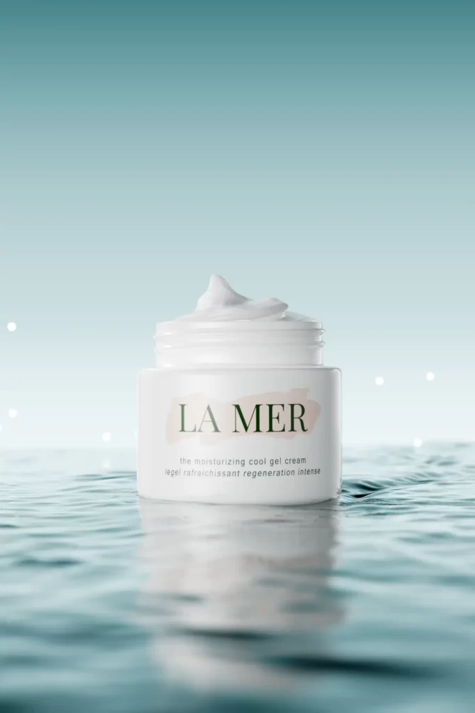
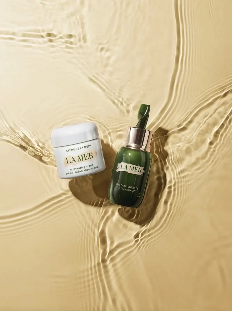
A small, round white jar with a smooth lid sits to the left, bearing the text 'CRÈME DE LA MER' above 'moisturizing cream' and the French translation 'crème régénération intense'. Beside it stands an emerald green glass bottle featuring a silver cap and a green dropper, labeled with 'LA MER' and 'THE CONCENTRATE LE CONCENTRÉ'. Both containers rest on a pale golden surface that mimics rippling water, illuminated by soft, diffused light.
Visual distinction emerges from the striking contrast between the pristine white ceramic-like jar and the deep forest-green glass bottle, creating a balanced yet dynamic color palette. The water-ripple effect surrounding the products adds organic movement and depth, suggesting hydration and fluidity without literal splashes. Typography plays a crucial role here, with elegant serif fonts and bilingual labeling reinforcing the brand’s premium, international aesthetic while maintaining clean readability across both packaging designs.
Product photographers studying high-end cosmetic styling will find valuable lessons in how lighting interacts with different materials—matte versus glossy surfaces. Art directors developing campaigns for luxury beauty brands can analyze the spatial relationship between primary and secondary products within a cohesive visual narrative. Color theorists examining sophisticated neutral palettes might reference this composition when selecting tones that convey both clinical purity and natural richness.