La Mer Moisturizing Cream Packaging
Topics
Details
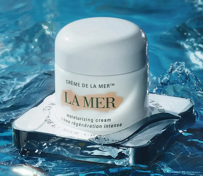
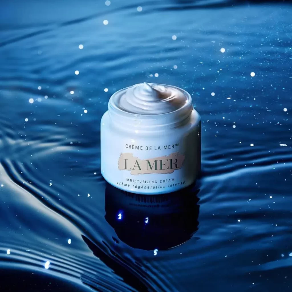
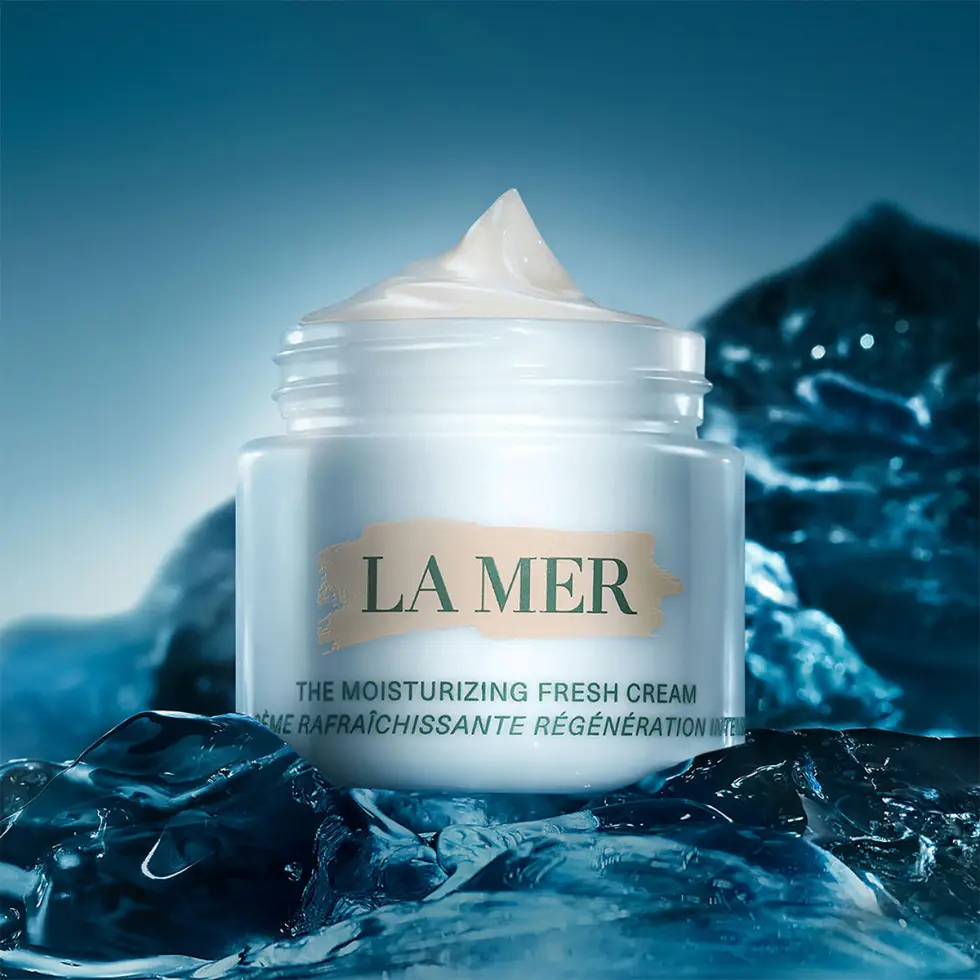
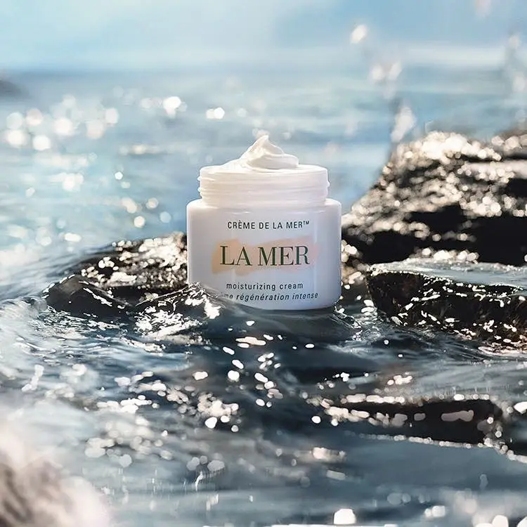
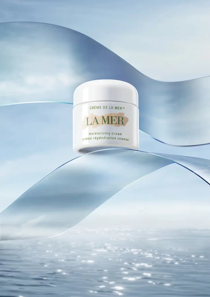
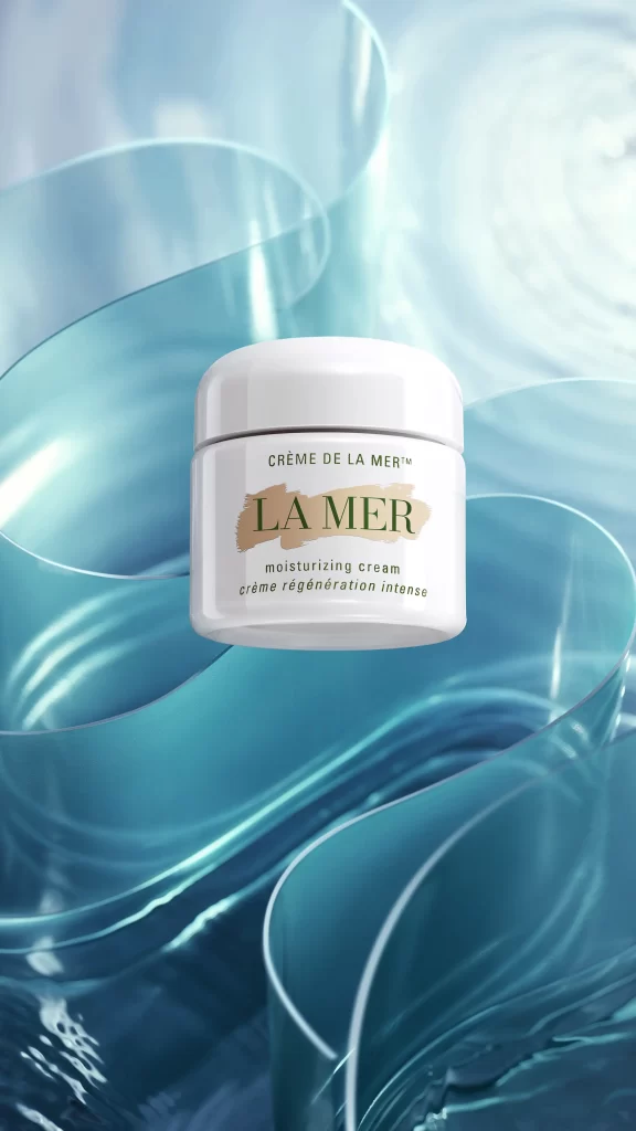
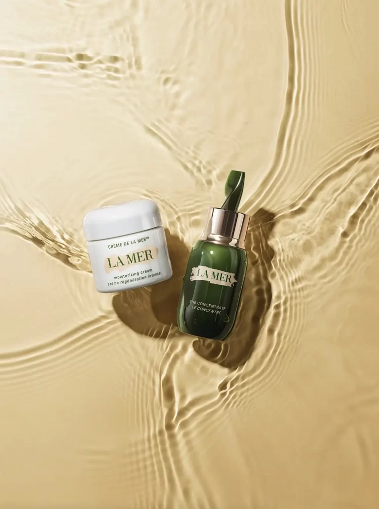
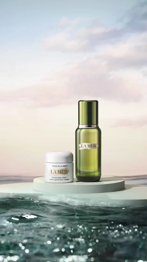
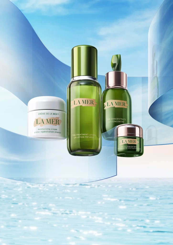
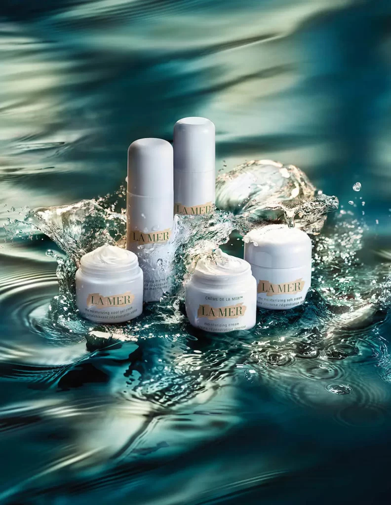
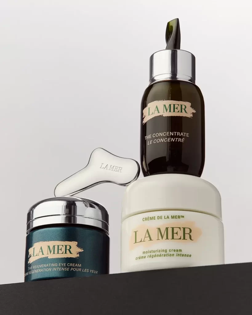
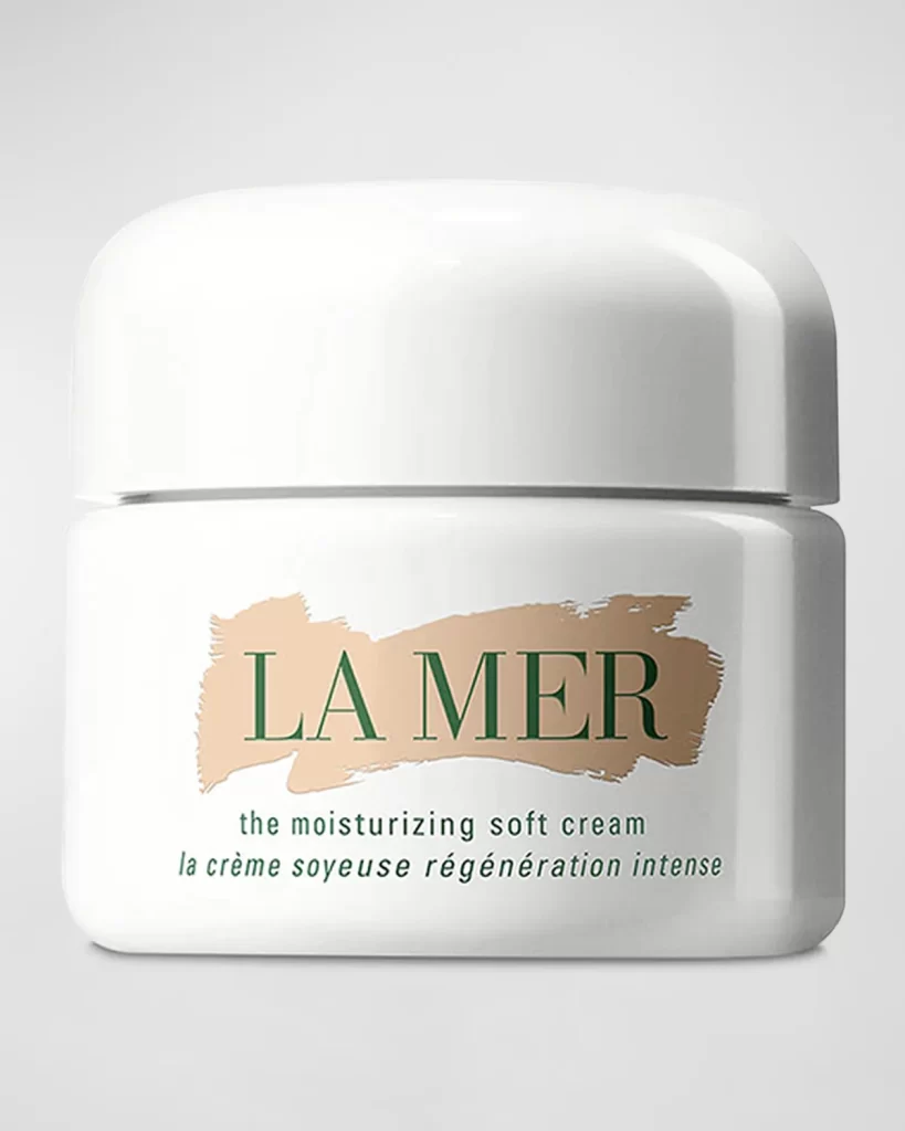
A cylindrical white jar of La Mer Moisturizing Soft Cream dominates the frame in a direct, frontal view, its smooth opaque body topped with a matching domed lid that catches soft highlights along the curved edge. A horizontal brushstroke of pale beige pigment anchors the brand name 'LA MER' in dark green serif lettering, with smaller text beneath identifying the product as 'the moisturizing soft cream' and 'la crème soyeuse régénération intense'. The vessel sits on a light gray surface that recedes into a neutral backdrop.
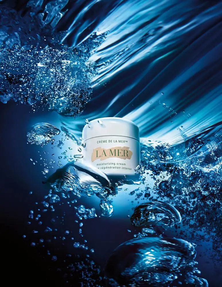
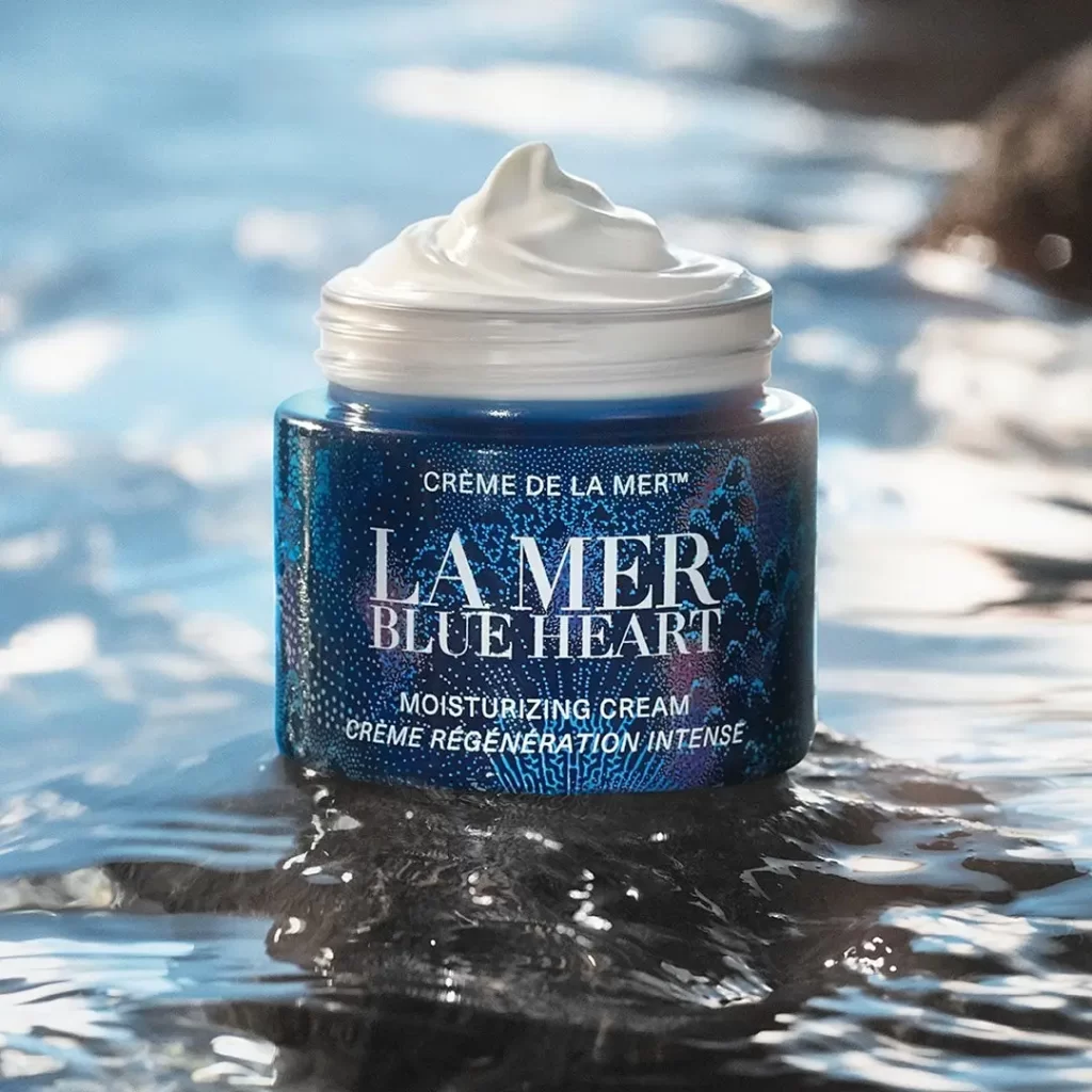
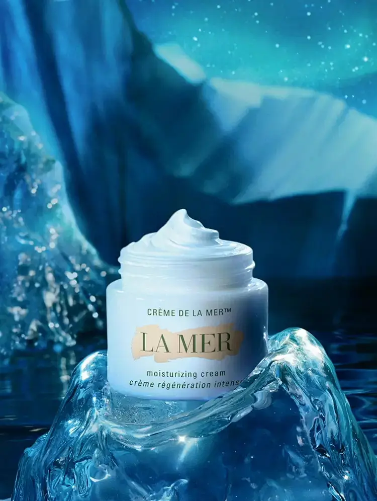
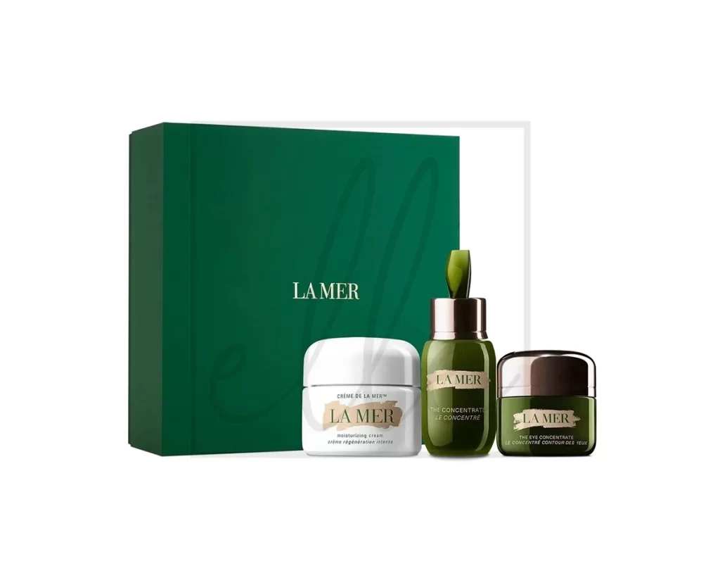
Visual distinction arises from the deliberate contrast between the container’s clinical porcelain finish and the organic, textured quality of the central label. The irregular tan stroke introduces an artisanal element that disrupts the otherwise minimalist geometry of the packaging. This specific iteration emphasizes legibility through restrained color palette choices, where the earthy accent anchors the typographic hierarchy without overwhelming the clean aesthetic.
Industrial designers analyzing luxury cosmetic branding will find value in studying the balance between rigid industrial forms and hand-painted graphic elements. Packaging specialists can examine how subtle material finishes interact with studio lighting to convey premium positioning. Researchers documenting contemporary skincare marketing strategies may utilize this as a case study in bilingual labeling and minimalist visual communication.