La Mer Lotion Green Bottles Water
Topics
Details
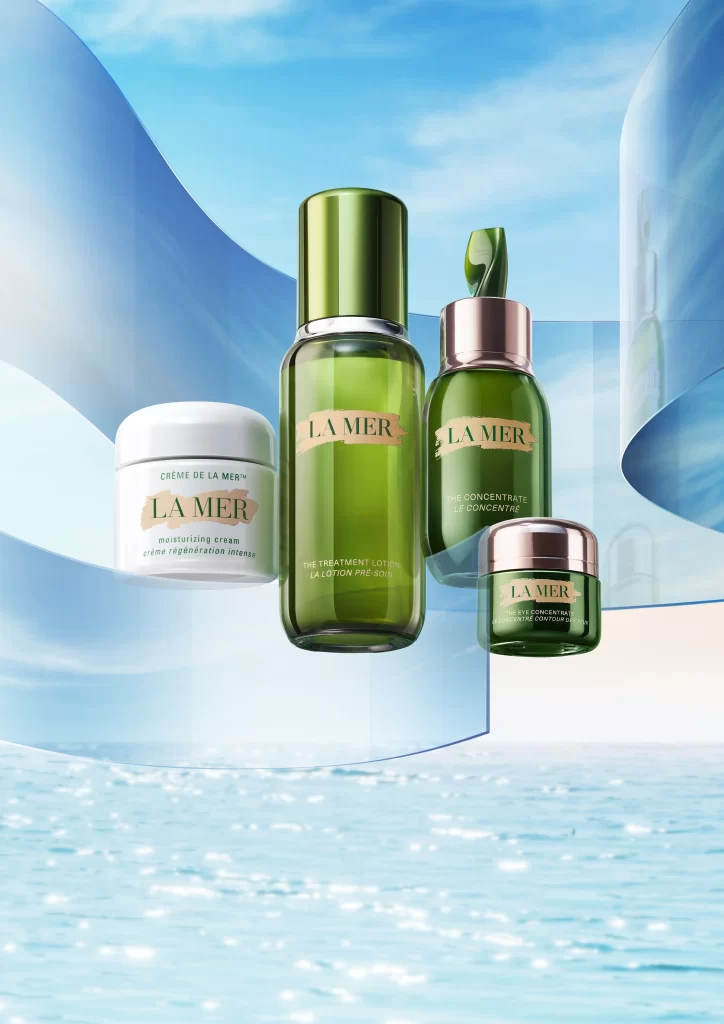
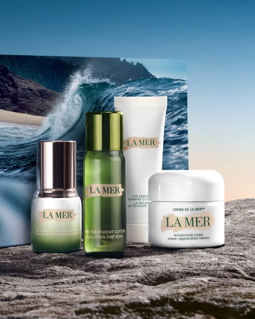
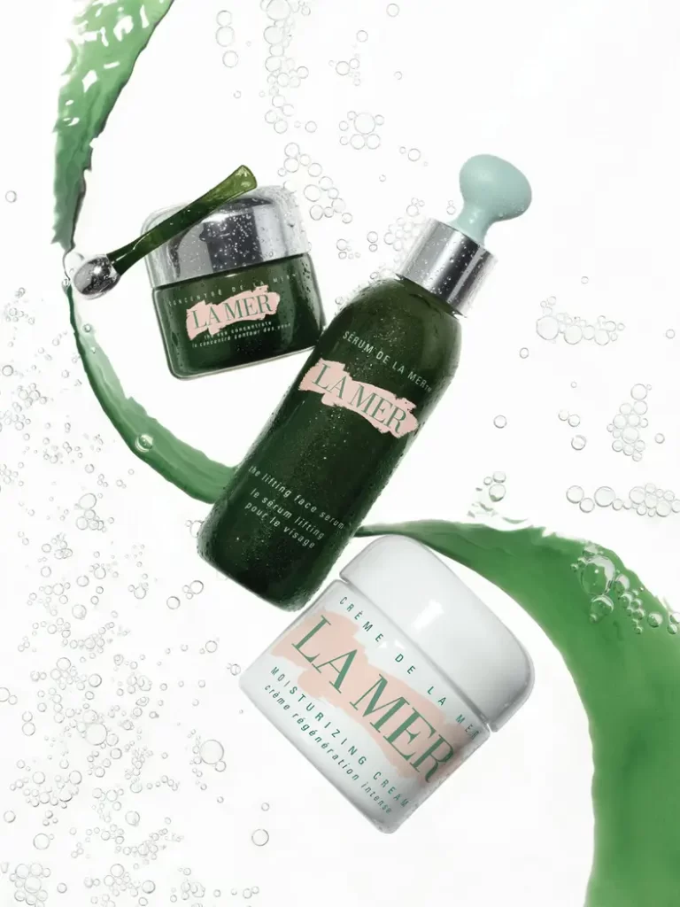
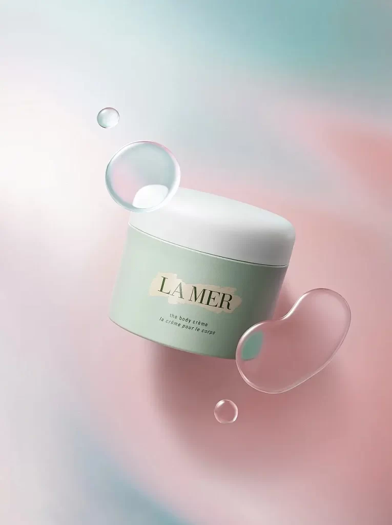
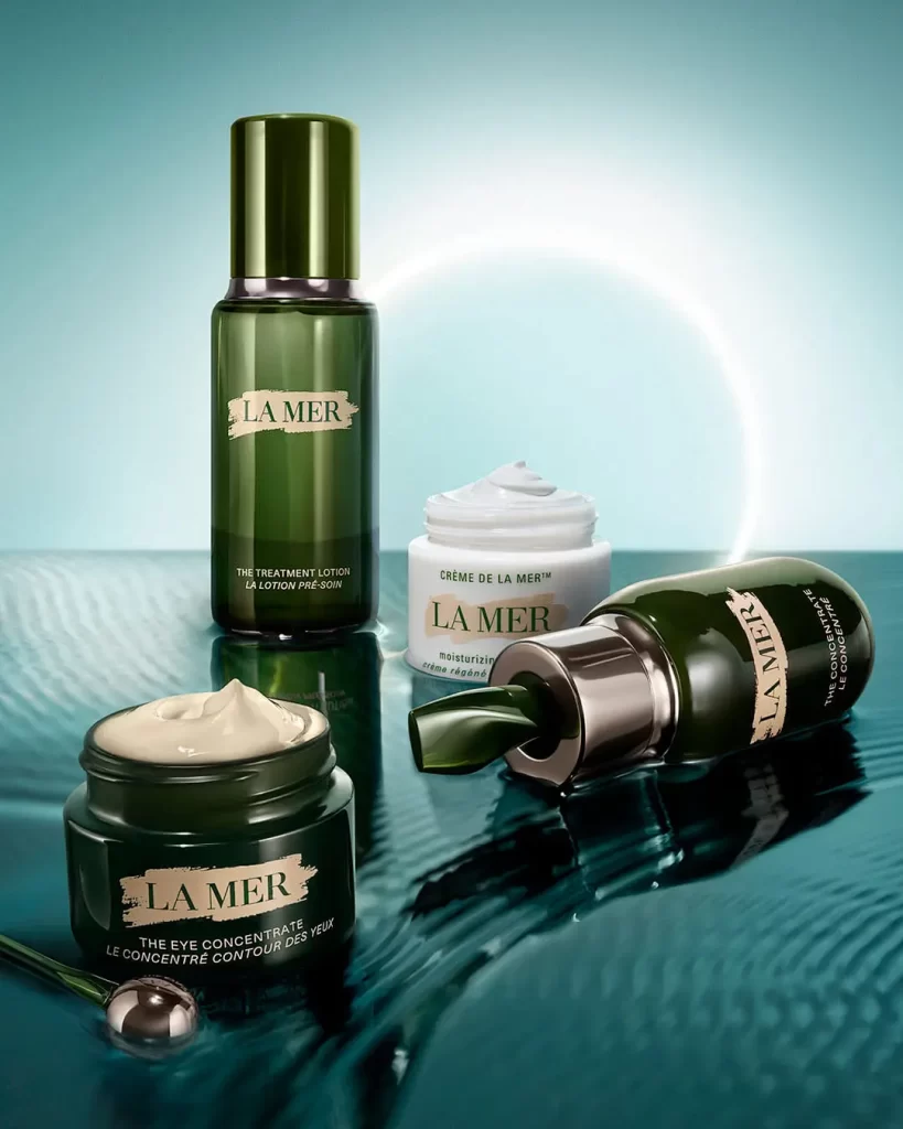
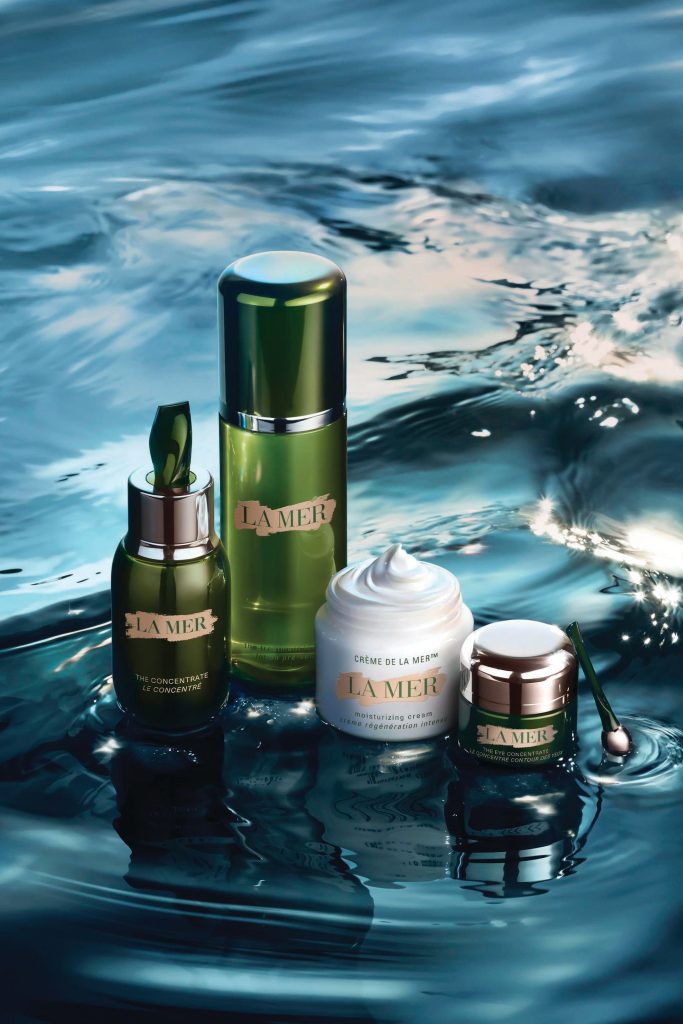
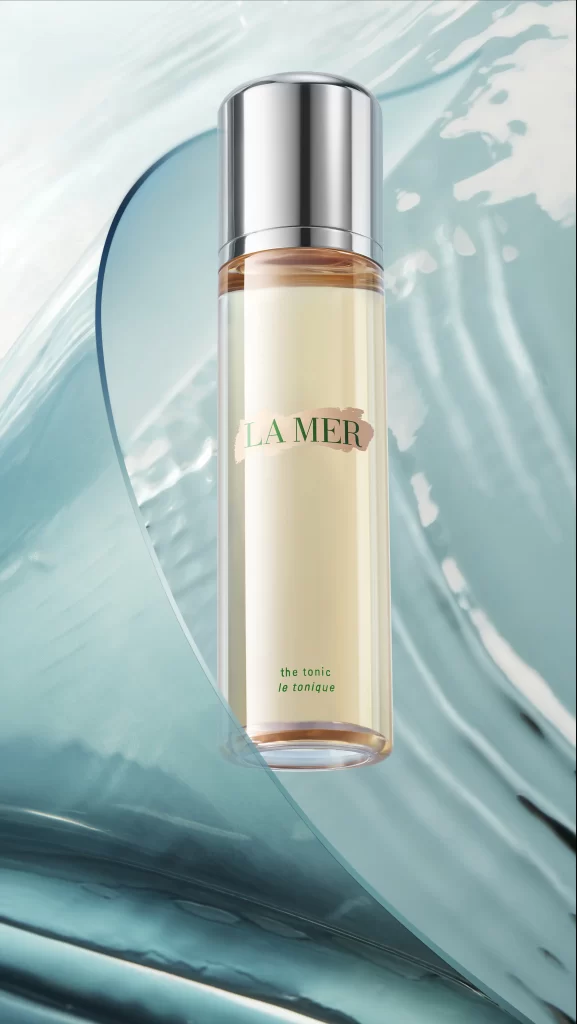
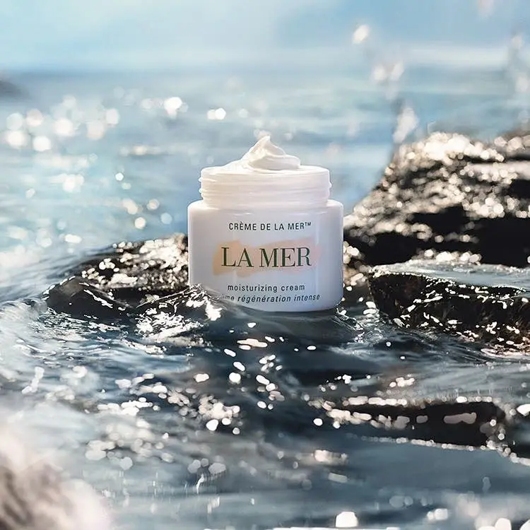
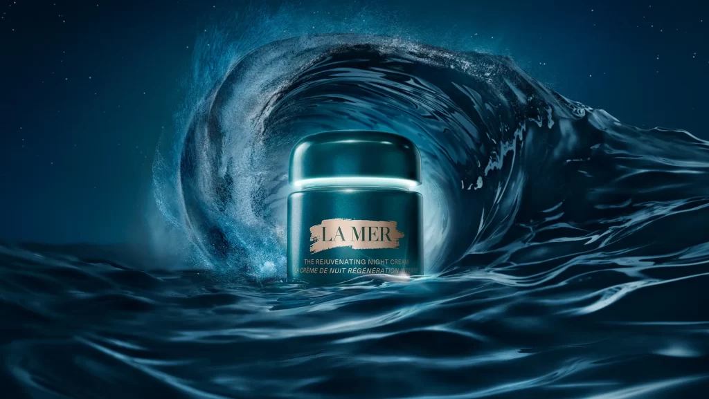
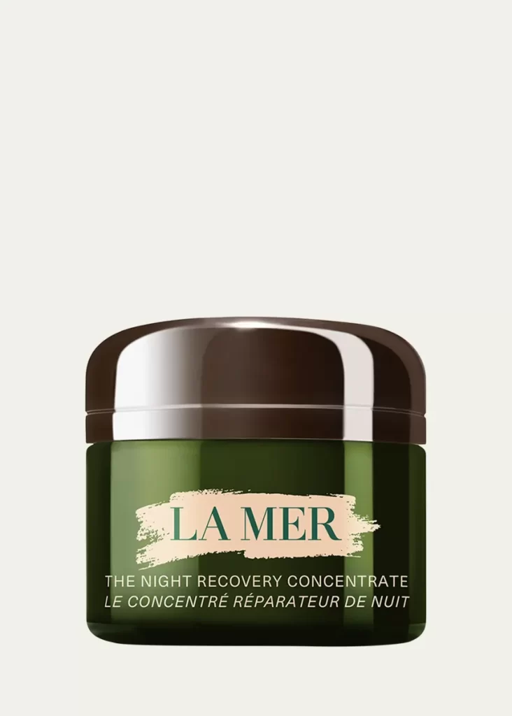
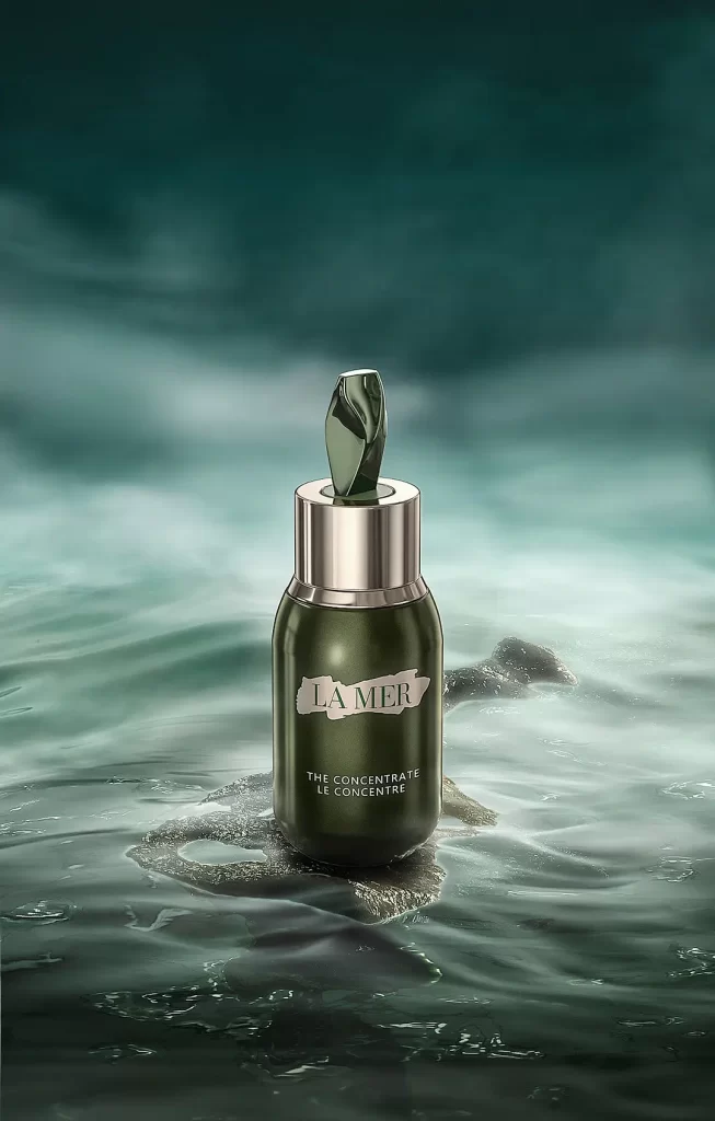
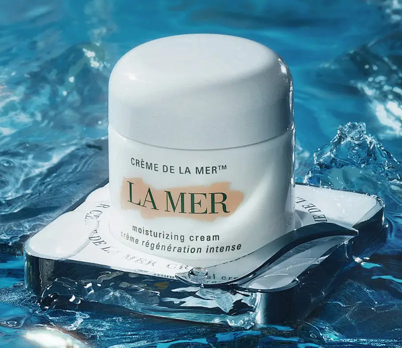
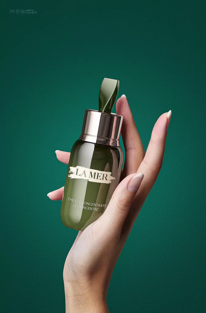
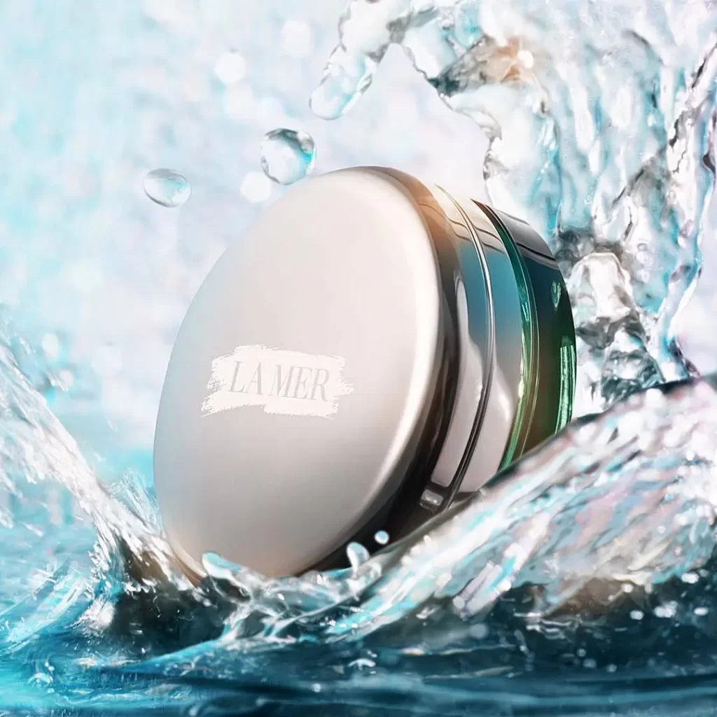
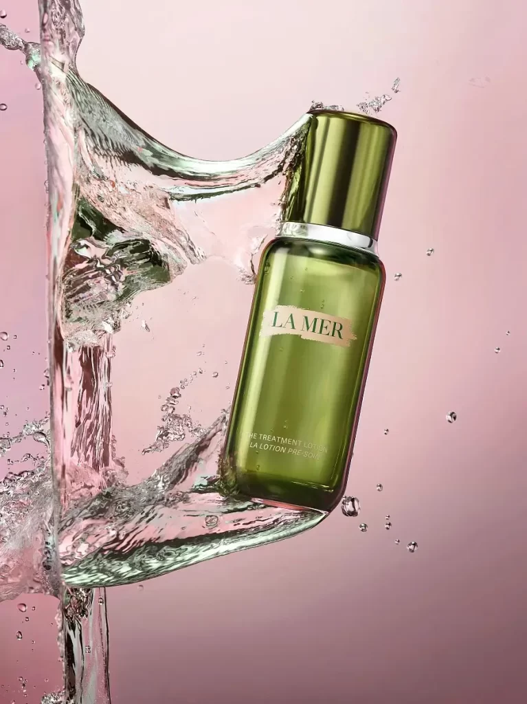
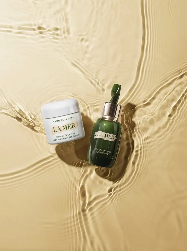
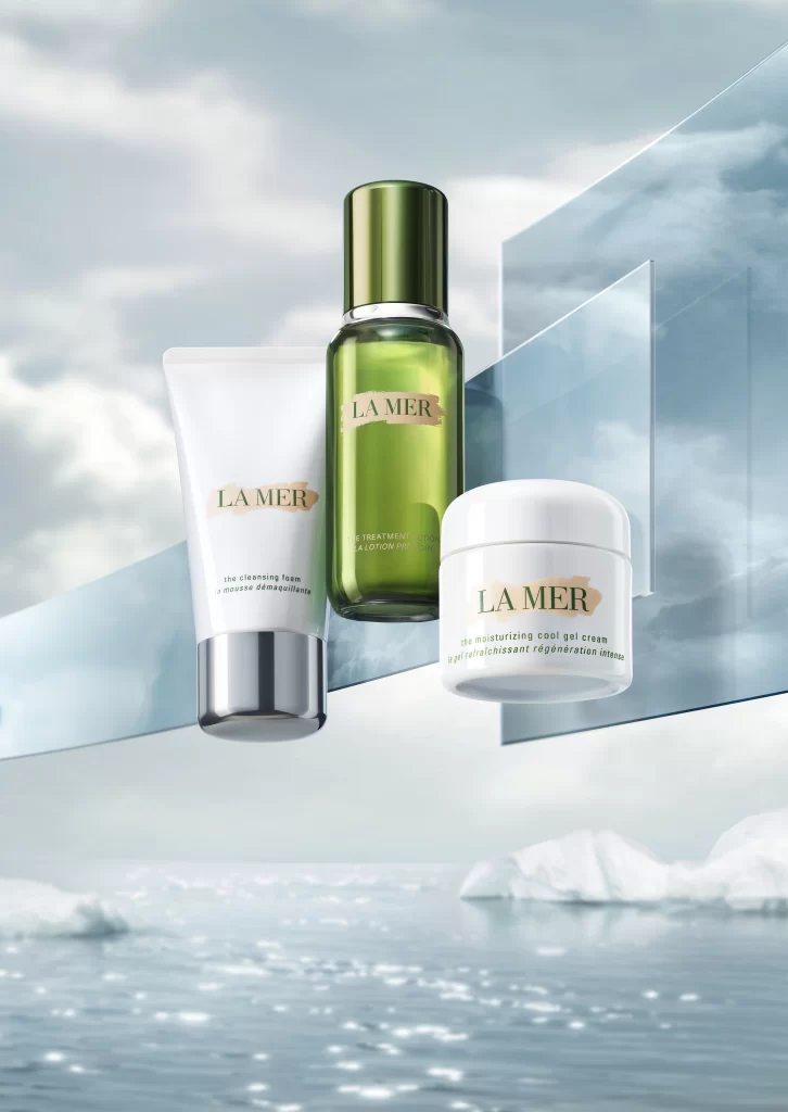
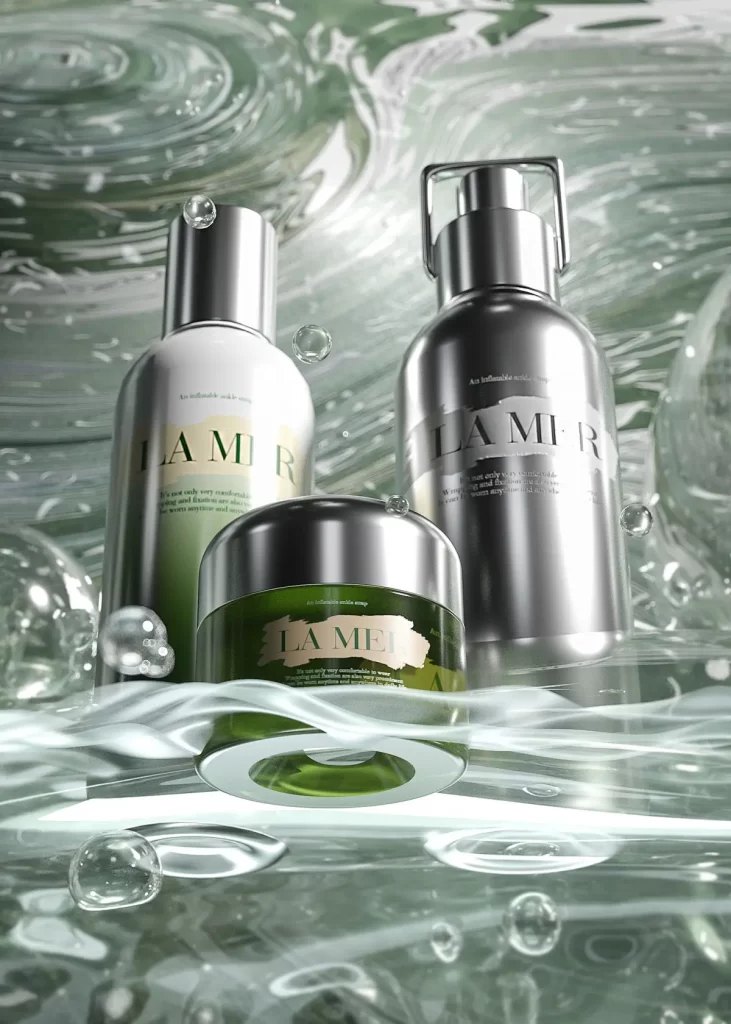
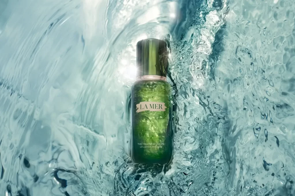
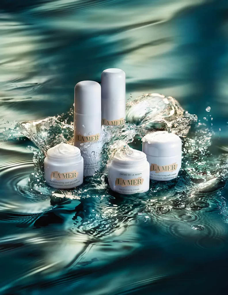
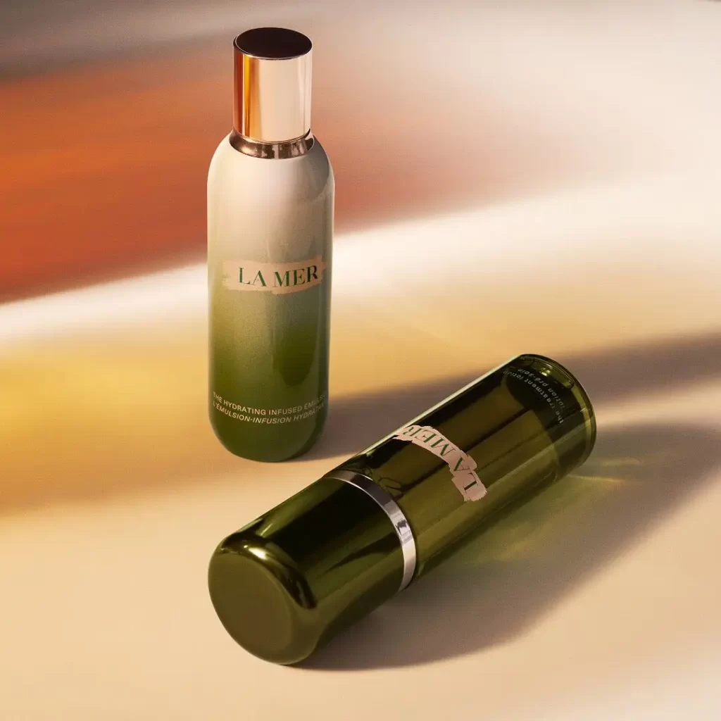
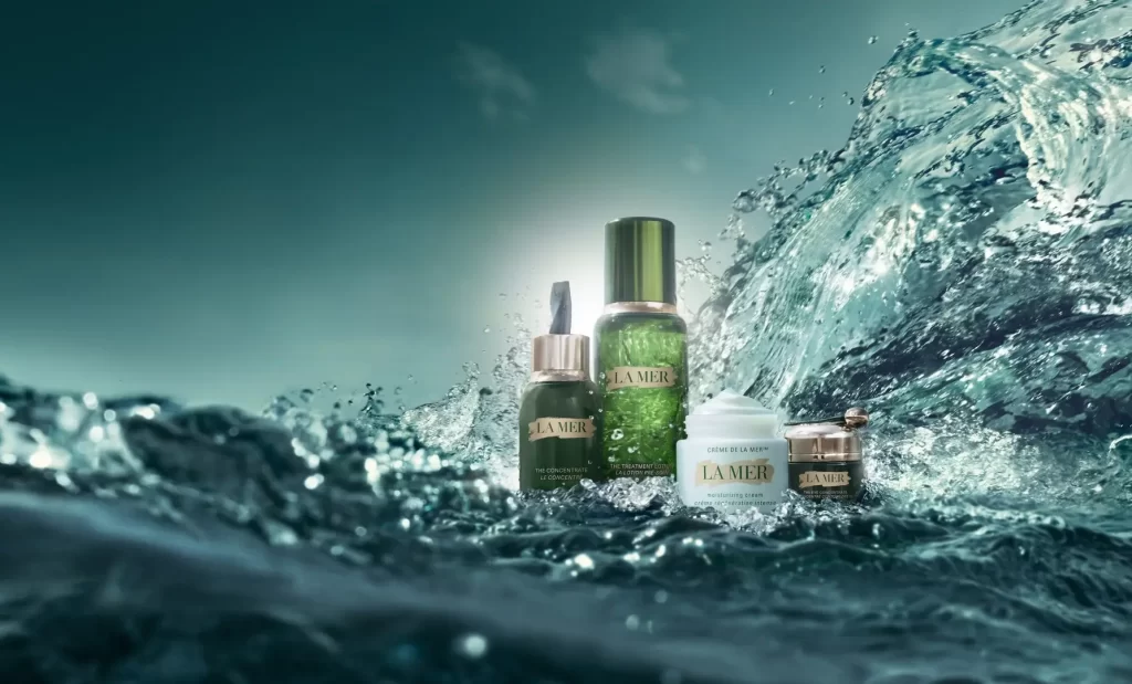
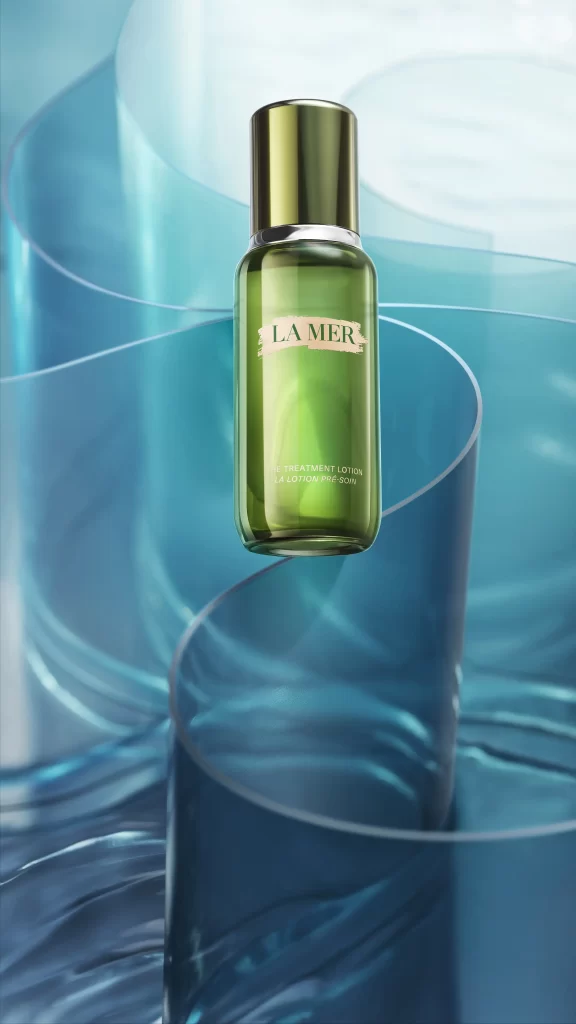
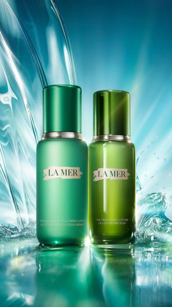
Emerald glass cylinders stand side by side against a backdrop of cascading liquid, their metallic silver collars catching the light. The left bottle presents a matte forest finish while its companion gleams with a translucent olive sheen, both bearing the cream-colored LA MER label above smaller text identifying them as The Treatment Lotion variants. Cool blue tones dominate the scene as water splashes dynamically around the base, creating sharp reflections on the glossy surface below.
Visual tension arises from the deliberate contrast between the two finishes—one absorbing light completely while the other refracts it through the green glass. The composition balances rigid vertical geometry with fluid organic motion, where frozen water droplets and flowing streams provide textural counterpoint to the smooth cylindrical forms. This duality in material treatment creates a sophisticated study of how identical packaging can communicate different product experiences through surface manipulation alone.
Product photographers might analyze this setup to understand how to achieve similar liquid dynamics without compromising product legibility. Brand strategists could reference the color psychology at play when positioning luxury skincare within aquatic visual contexts. 3D artists studying material shaders would find value in observing how the matte versus glossy surfaces interact with the same cool-toned lighting environment.