Title

La Roche-Posay Anthelios SPF 60 Skincare Packaging


Topics

La Roche-PosaySkincare

Details

Uploaded user: Leo

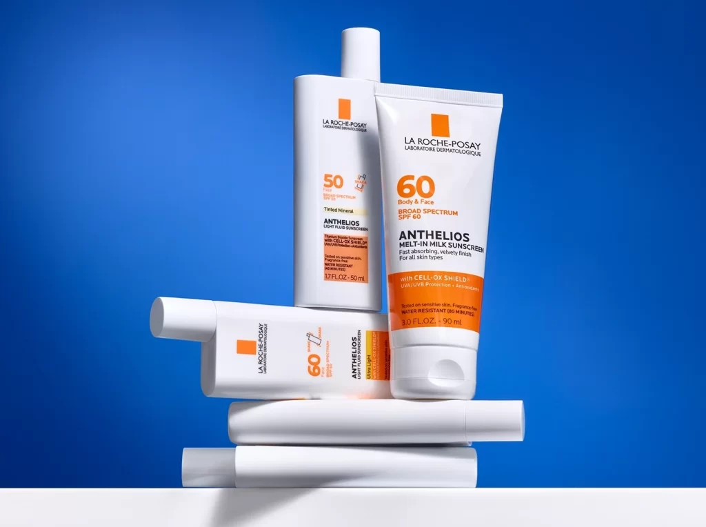
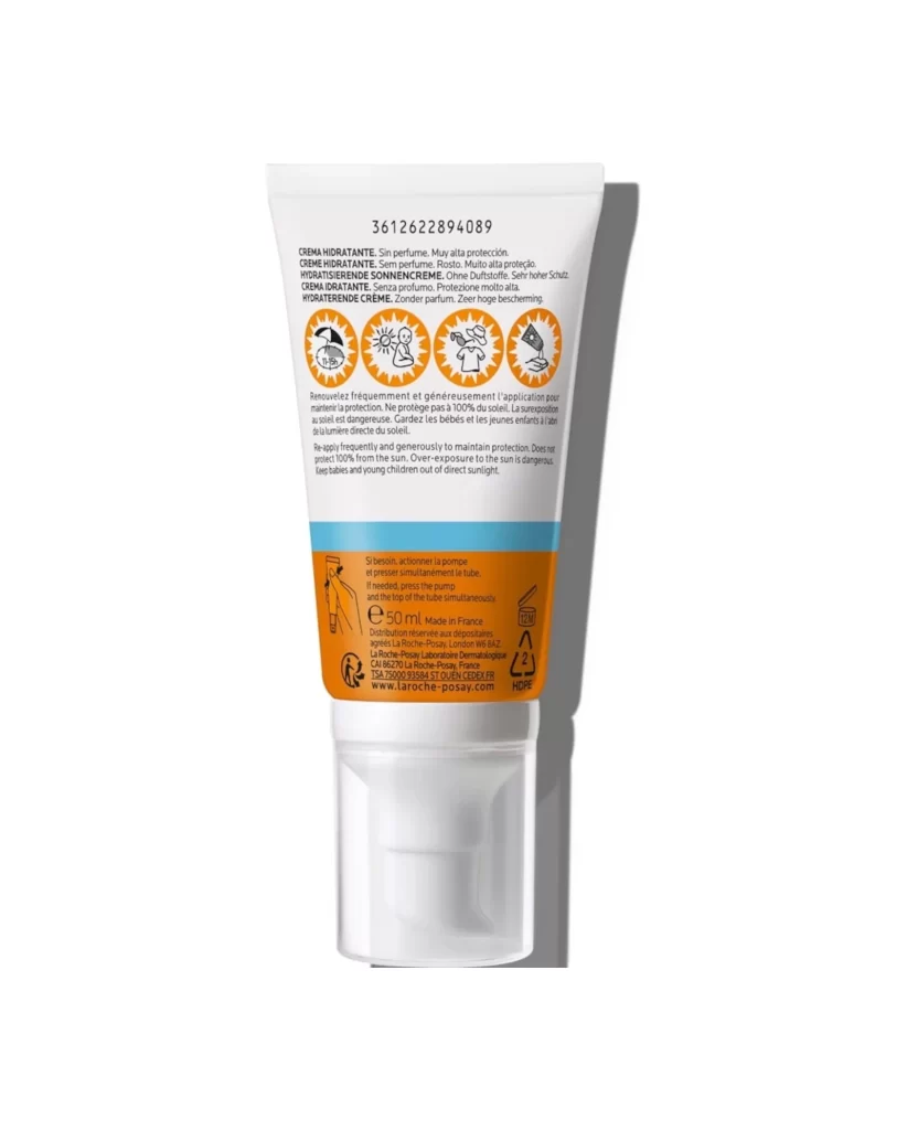
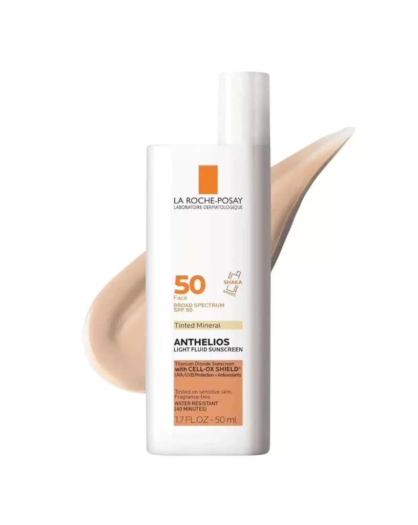
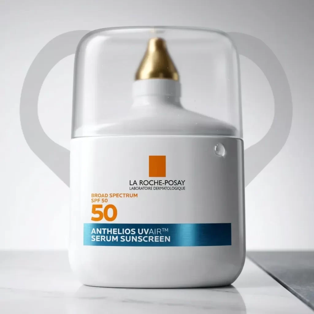
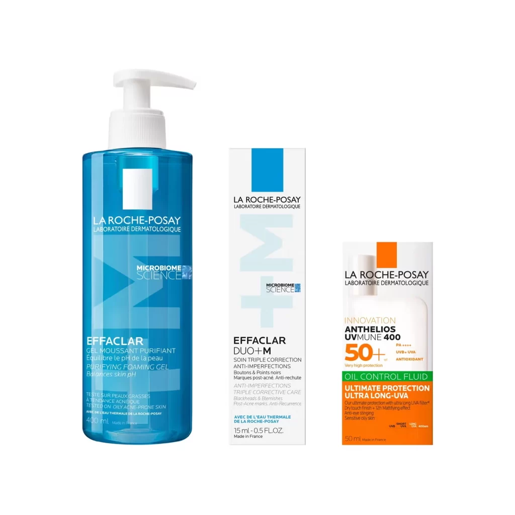
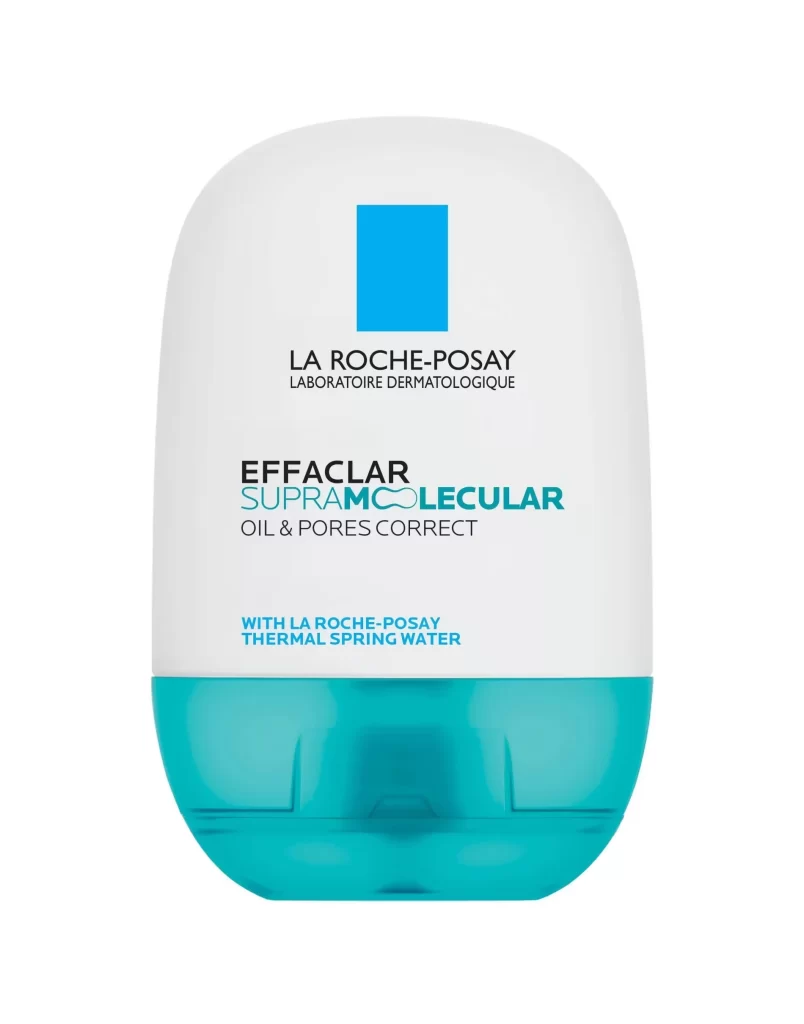
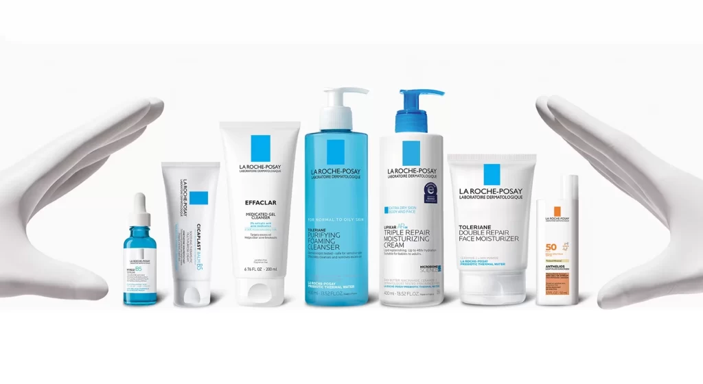
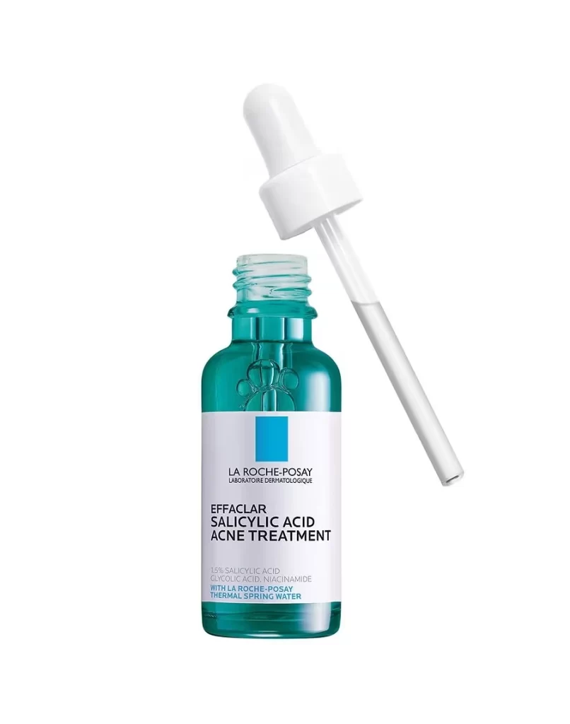
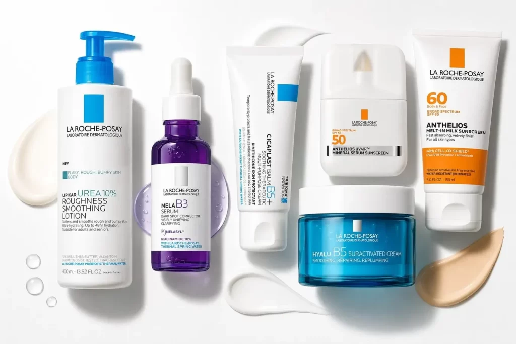
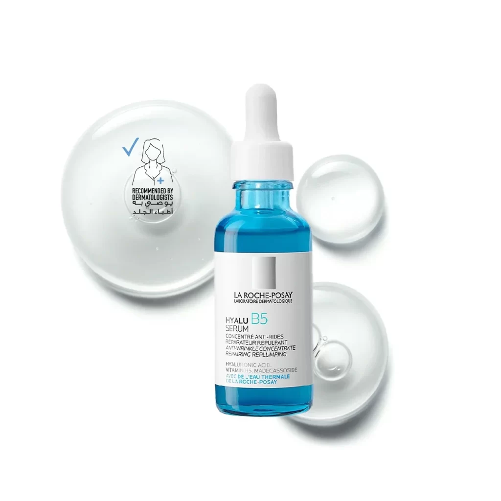
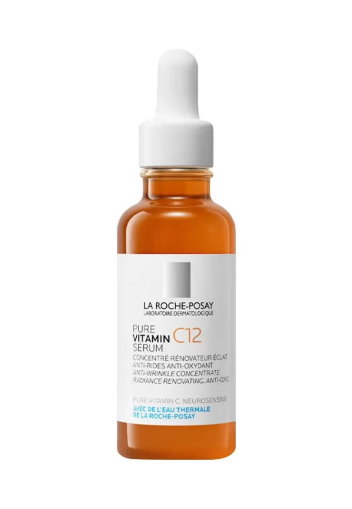
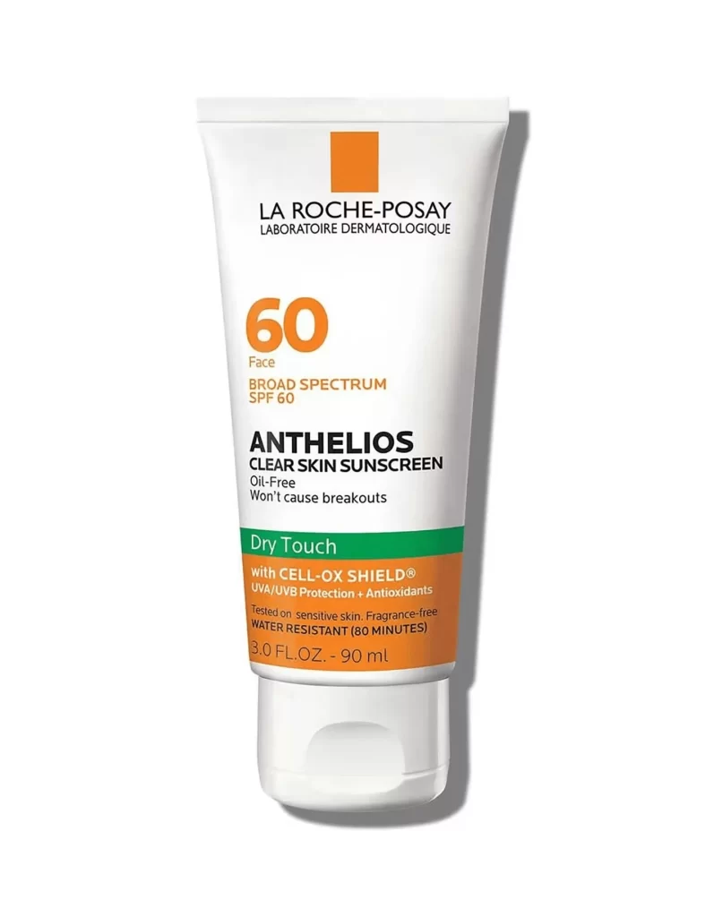
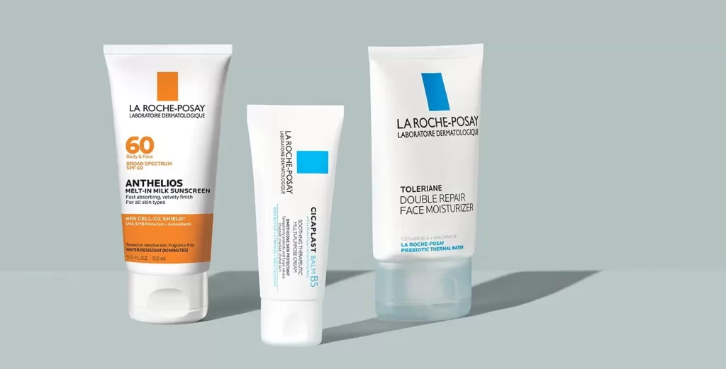
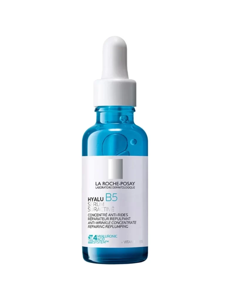
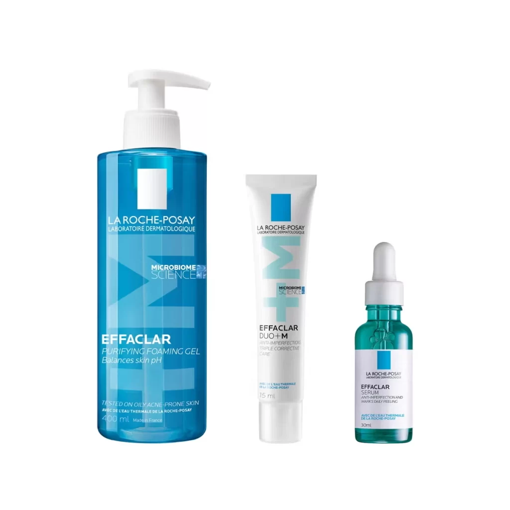
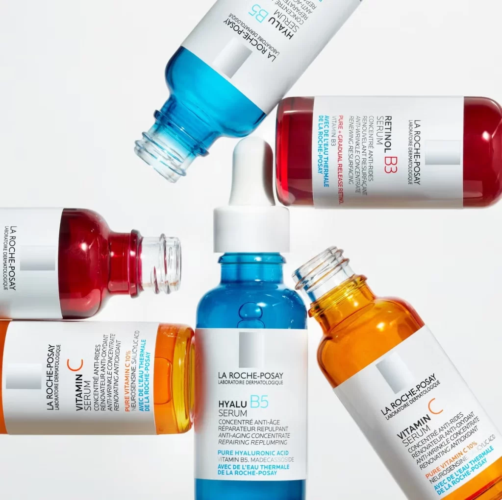
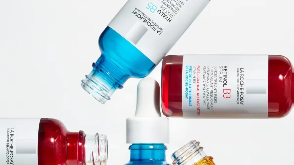
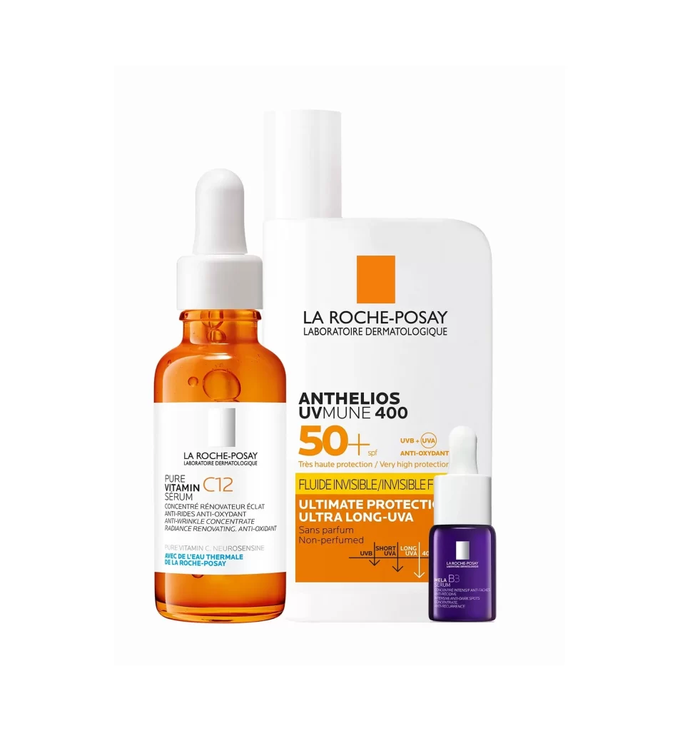
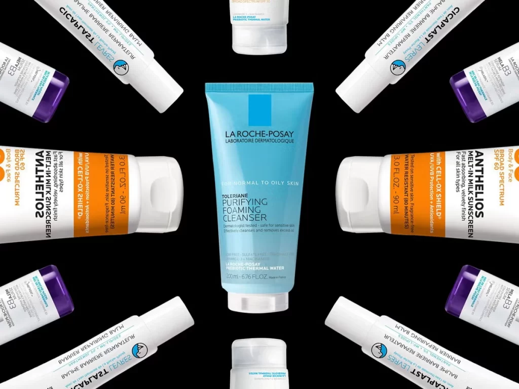
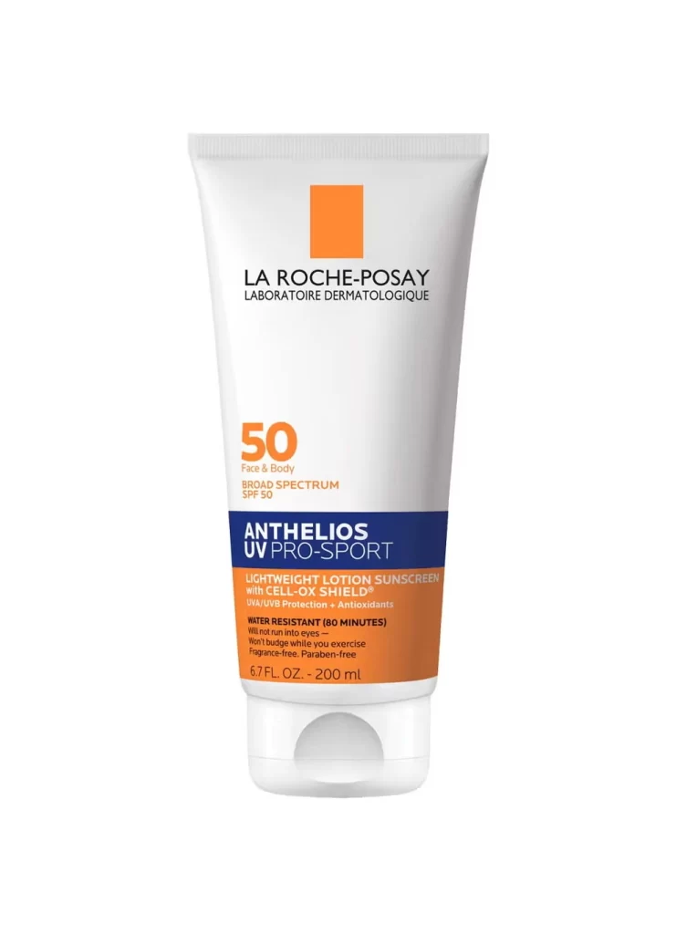
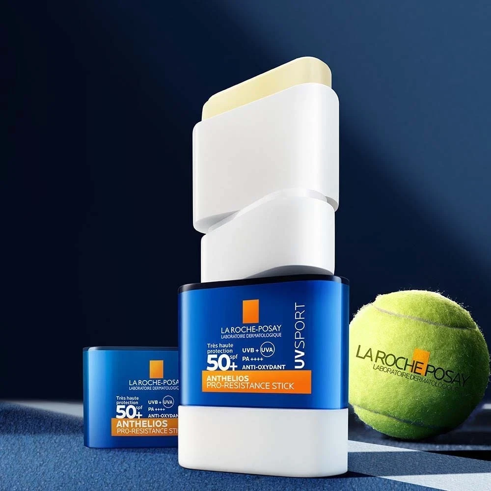
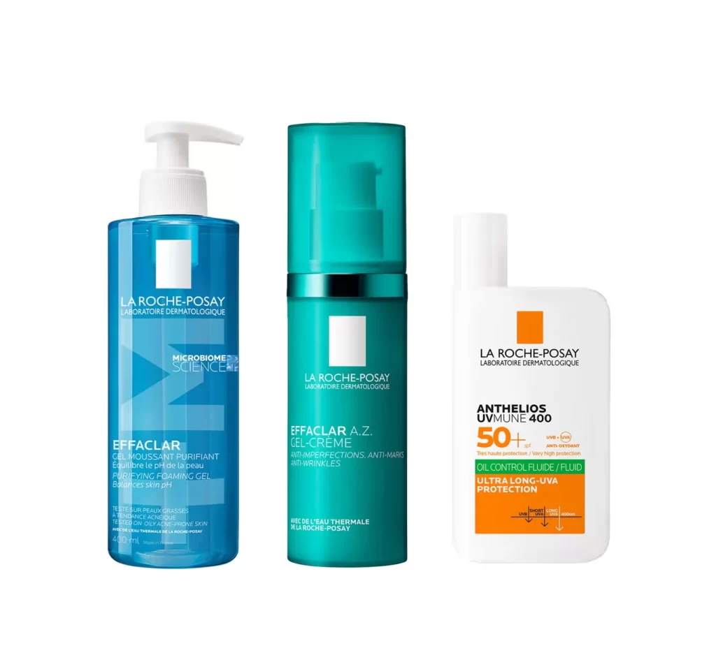
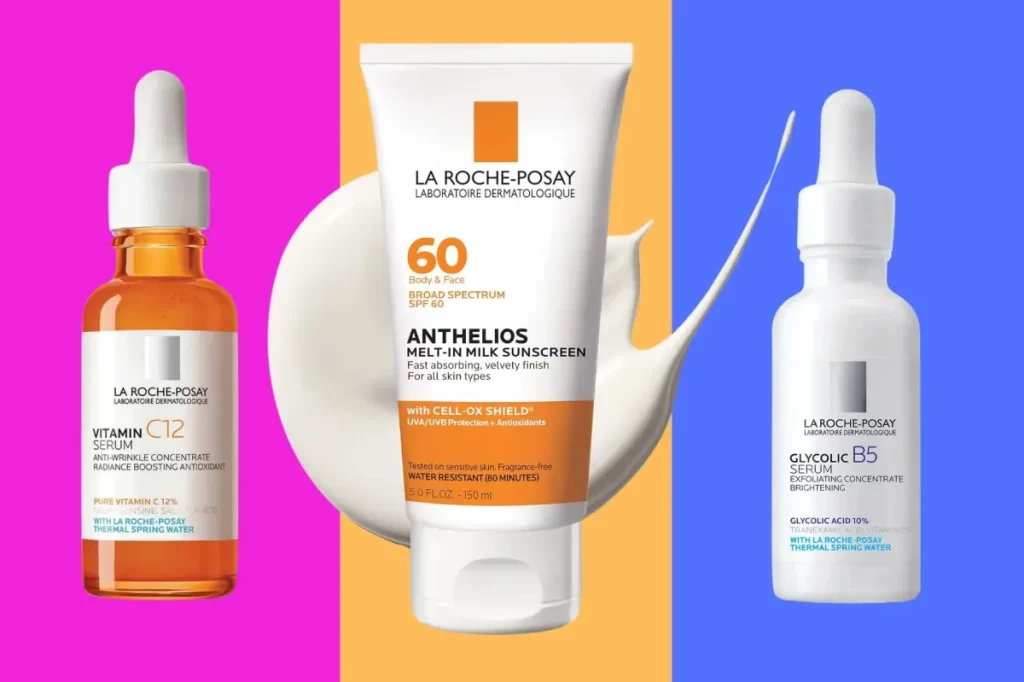
A white tube of Anthelios Melt-In Milk Sunscreen commands the center of the composition, its surface displaying the La Roche-Posay brand name, a bold orange square logo, and prominent '60' SPF typography above the product title. Two dropper bottles flank the central sunscreen: an amber glass vessel containing Vitamin C12 Serum on the left and a white bottle holding Glycolic Acid B5 Serum on the right. The trio sits atop a tripartite background divided into magenta, amber, and cobalt blue vertical panels.
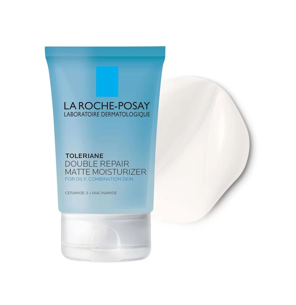
Visual hierarchy is established through the strategic use of the brand’s signature orange accent color against clinical white surfaces, creating immediate recognition across different container formats. The juxtaposition of translucent amber glass with opaque frosted plastic demonstrates material variety within a unified design system, while the sans-serif typeface maintains legibility at various scales. This particular arrangement highlights how secondary packaging elements—such as the color-coded SPF rating and ingredient callouts—function as navigational aids for consumers scanning retail shelves or digital catalogs.

Brand managers analyzing competitive positioning in the dermatological skincare sector would examine this composition to evaluate color psychology and shelf presence. Packaging engineers might reference the tube’s structural proportions and cap integration when developing new sunscreen formulations requiring similar dispensing mechanisms. Marketing teams could utilize this visual arrangement to plan e-commerce photography layouts that emphasize product efficacy through textural demonstrations and clear ingredient communication.