Title

La Roche-Posay SPF 50 Skincare Packaging


Topics

La Roche-PosaySkincare

Details

Uploaded user: Leo

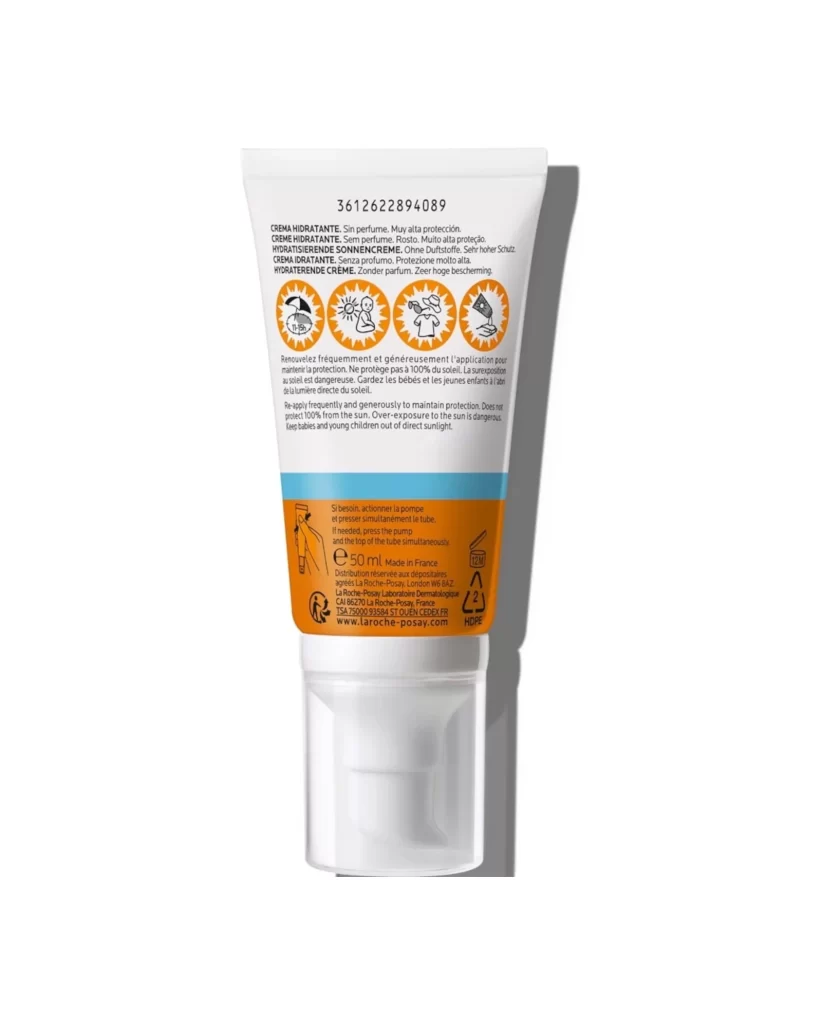
The reverse side of a La Roche-Posay tube displays a clinical yet approachable aesthetic on a white surface. A white plastic body transitions into a vibrant orange band at the base, separated by a thin cyan stripe, while soft directional lighting from the upper right casts a subtle drop shadow that emphasizes the cylindrical form and matte texture.
Visual hierarchy is established through a disciplined grid of iconography and text, where five circular orange symbols serve as immediate visual anchors for usage instructions. The stark contrast between the cool white upper section and the warm orange footer creates a distinct zoning effect, separating general product information from safety warnings. This specific layout demonstrates how pharmaceutical brands utilize color blocking to guide the consumer’s eye through complex regulatory information without sacrificing brand identity.

Packaging designers studying international compliance will find this layout particularly useful for understanding how to balance dense multilingual text with breathable negative space. Industrial photographers can analyze the lighting setup to replicate similar product shots that highlight material finishes without creating harsh glare. Furthermore, user experience researchers might examine the placement of instructional icons to evaluate their effectiveness in communicating application methods across different markets.