La Roche-Posay Toleriane Double Repair Skincare Packaging
Topics
Details
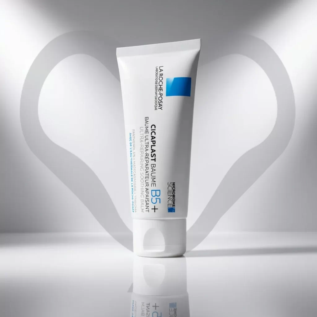
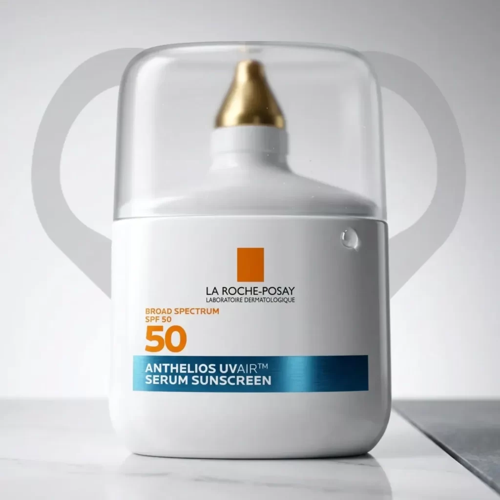
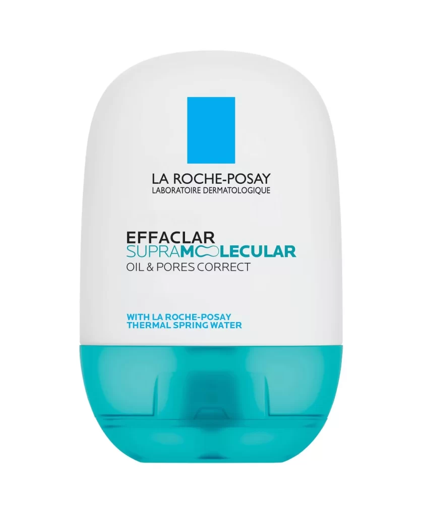
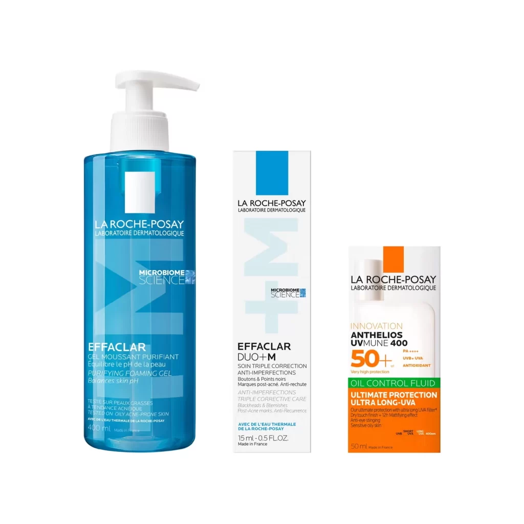
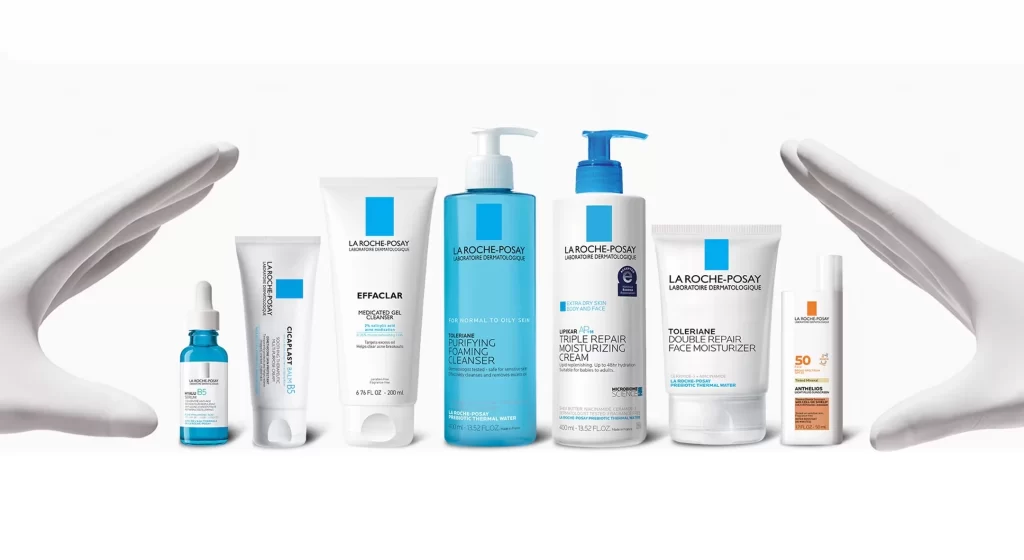
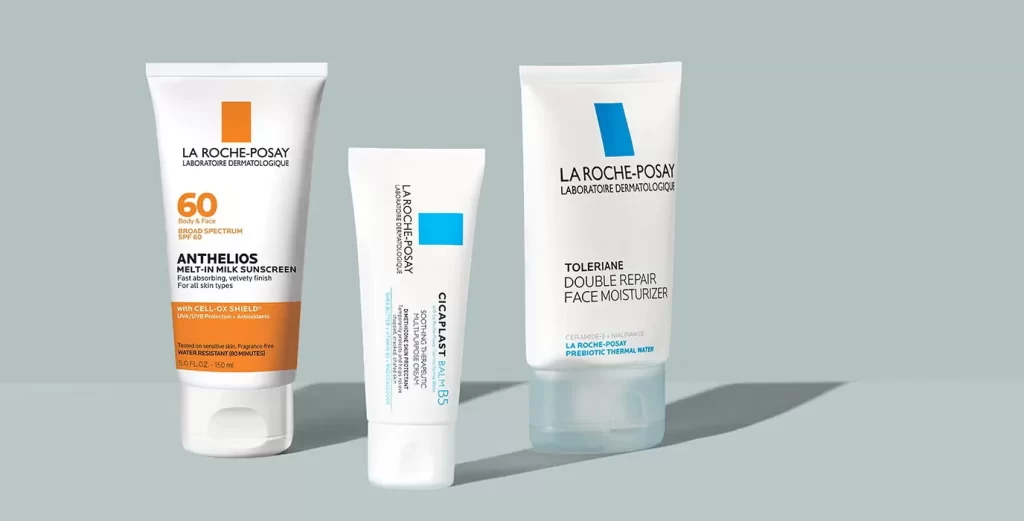
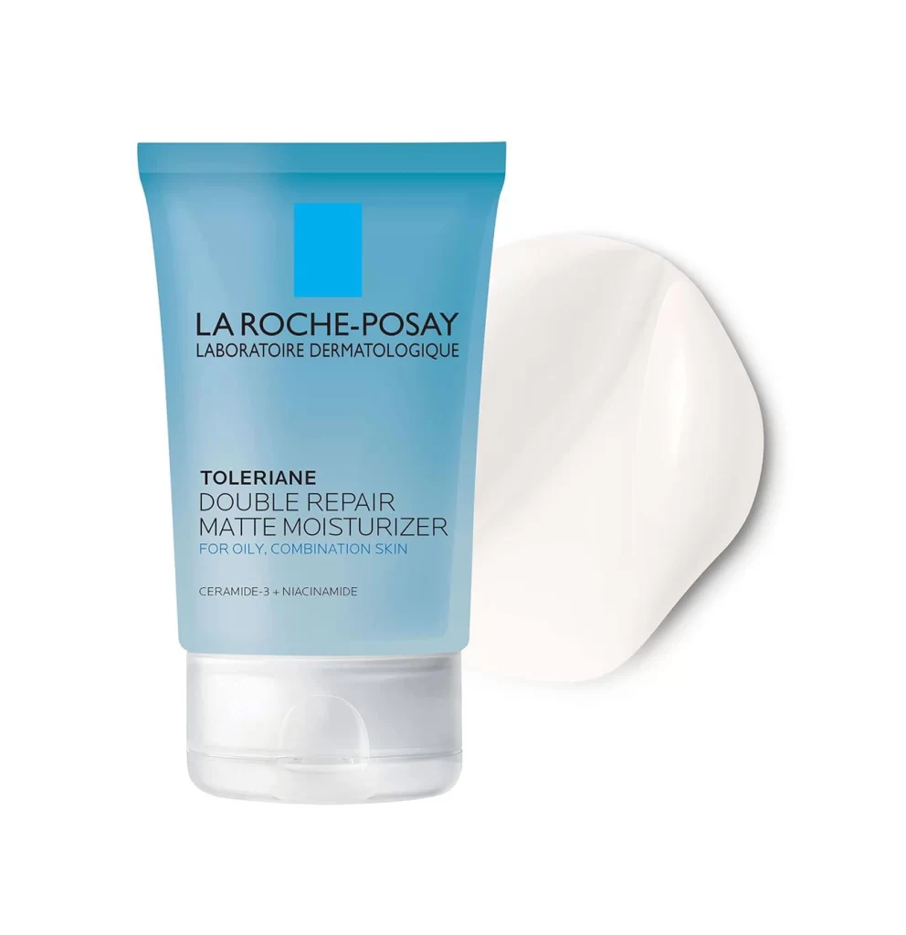
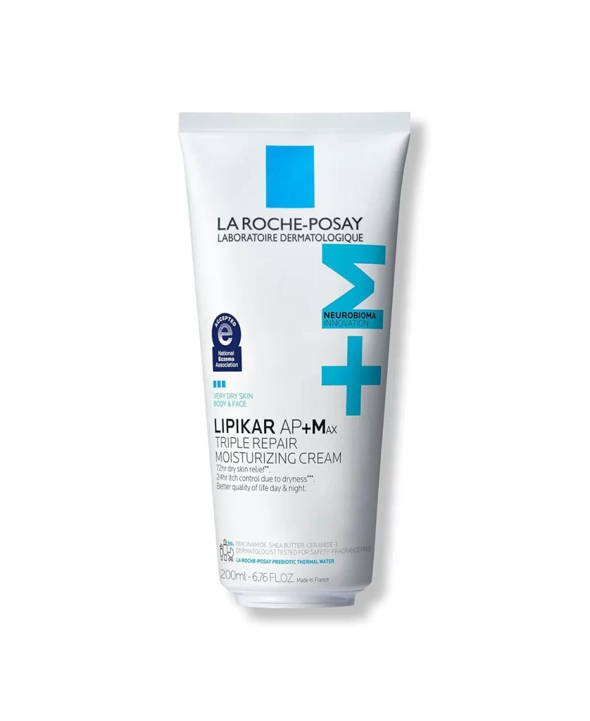
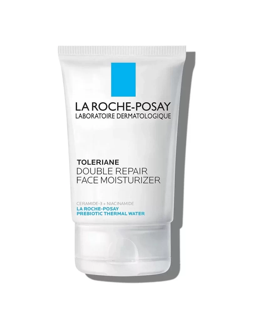
A white plastic tube of La Roche-Posay Toleriane Double Repair Face Moisturizer stands at a slight three-quarter angle, casting a soft shadow to its right on a white surface. The packaging features the brand's signature cyan-blue rectangular logo positioned prominently above the bold, black sans-serif typography of 'LA ROCHE-POSAY' and its French sub-branding 'LABORATOIRE DERMATOLOGIQUE'. Below this, the product name 'TOLERIANE DOUBLE REPAIR FACE MOISTURIZER' appears in clean black lettering, with key ingredients 'CERAMIDE-3 + NIACINAMIDE' and 'LA ROCHE-POSAY PREBIOTIC THERMAL WATER' noted in smaller text near the base.
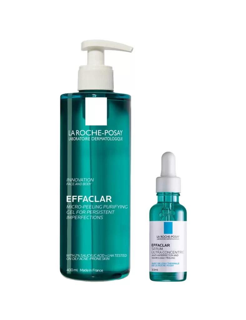
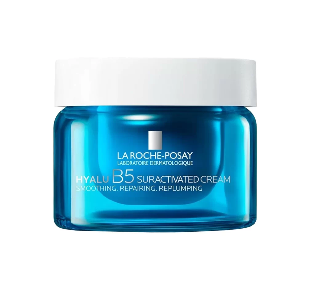
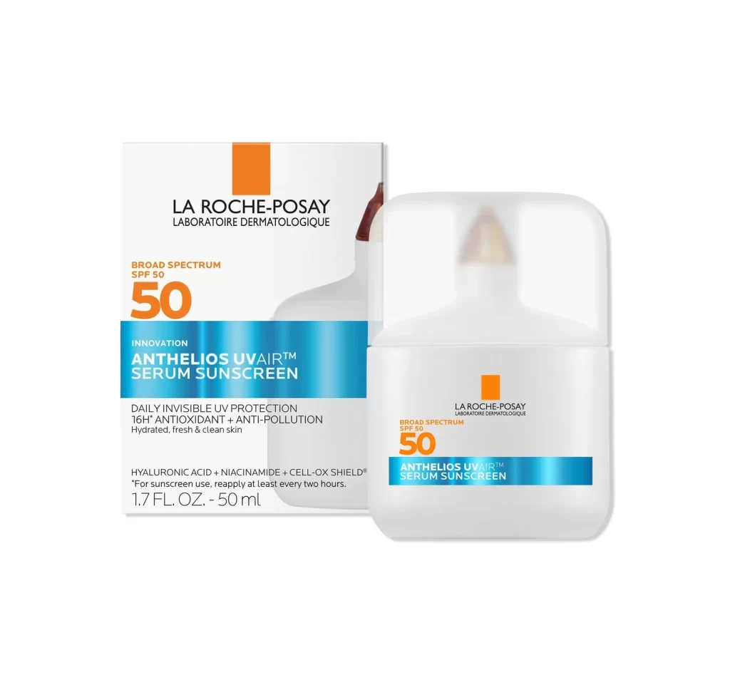
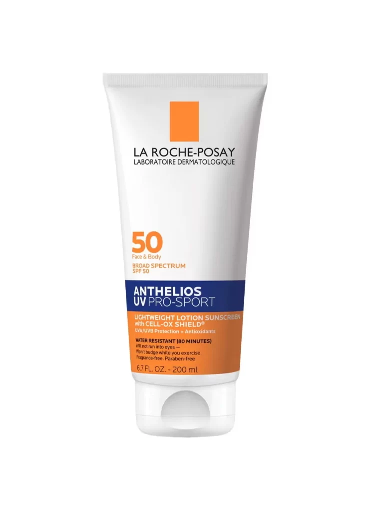
Visual hierarchy is strictly maintained through the strategic use of weight and color, ensuring that the medical-grade aesthetic remains uncluttered yet informative. The stark contrast between the clinical white substrate and the vibrant blue accent creates an immediate association with dermatological trust and soothing relief. Such minimalist execution allows the functional details to breathe, making the complex ingredient list feel accessible rather than overwhelming to the consumer.
Brand strategists might analyze this composition to understand how pharmaceutical companies balance scientific authority with consumer-friendly aesthetics. Packaging engineers could study the tube’s structural proportions and cap placement for ergonomic improvements in future skincare lines. Additionally, art directors working on beauty campaigns often utilize such straightforward product shots to establish a baseline of purity before introducing more stylized environmental elements.