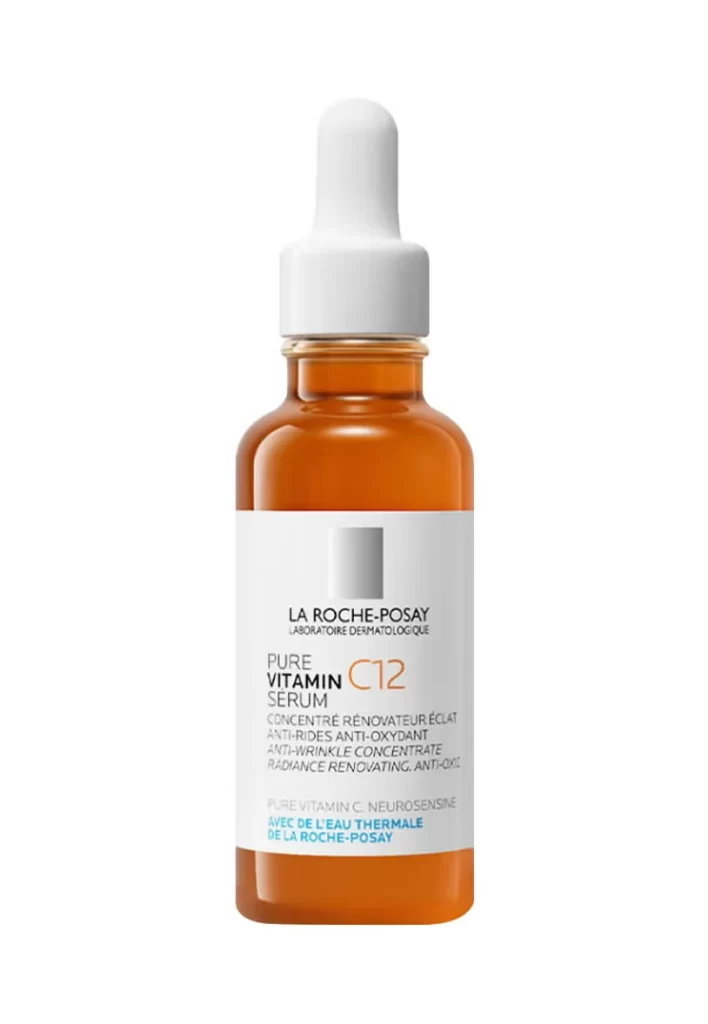
La Roche-Posay Pure Vitamin C12 Serum Skincare Packaging
Topics
Details
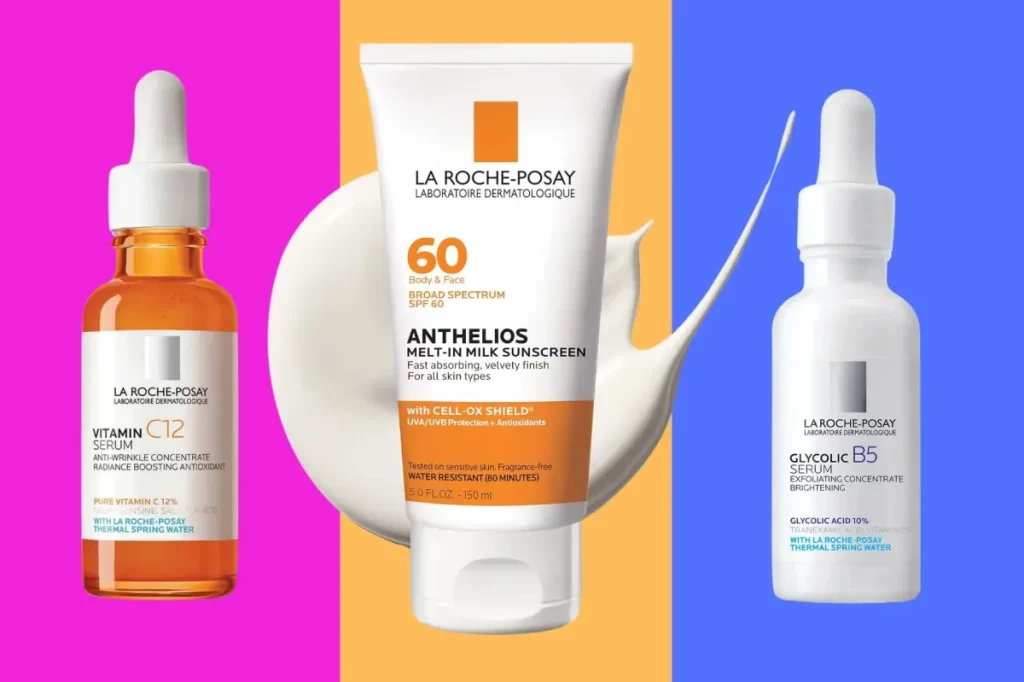
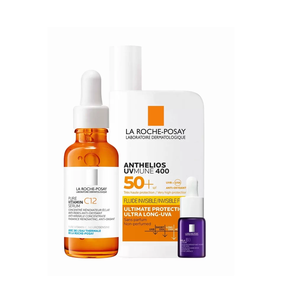
Amber glass glows beneath a clinical white label, holding thirty milliliters of potent skincare within a cylindrical silhouette. A matte white dropper cap crowns the bottle, its bulbous top suggesting precise dispensing of the golden liquid visible through the transparent container. Centered against a void-like pure white background, the product stands in sharp focus with even studio lighting that eliminates shadows and emphasizes the clean, pharmaceutical aesthetic of the packaging.
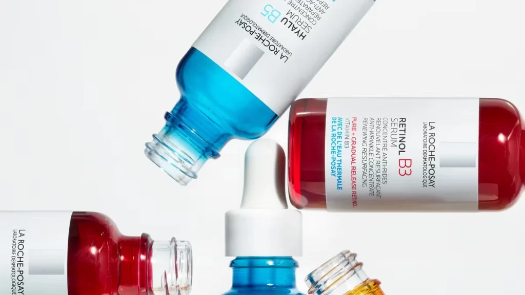
Visual hierarchy dominates the label design through strategic typography, where 'PURE VITAMIN C12' commands attention in bold black lettering against the minimalist white field. The distinctive orange hue of the numeral '12' creates a singular chromatic accent that echoes the serum's natural coloration while signaling the high-concentration formula within. Subtle gray branding at the top anchors the composition, balancing the dense informational text below that details the product's anti-oxidant and radiance-renewing properties in three languages.
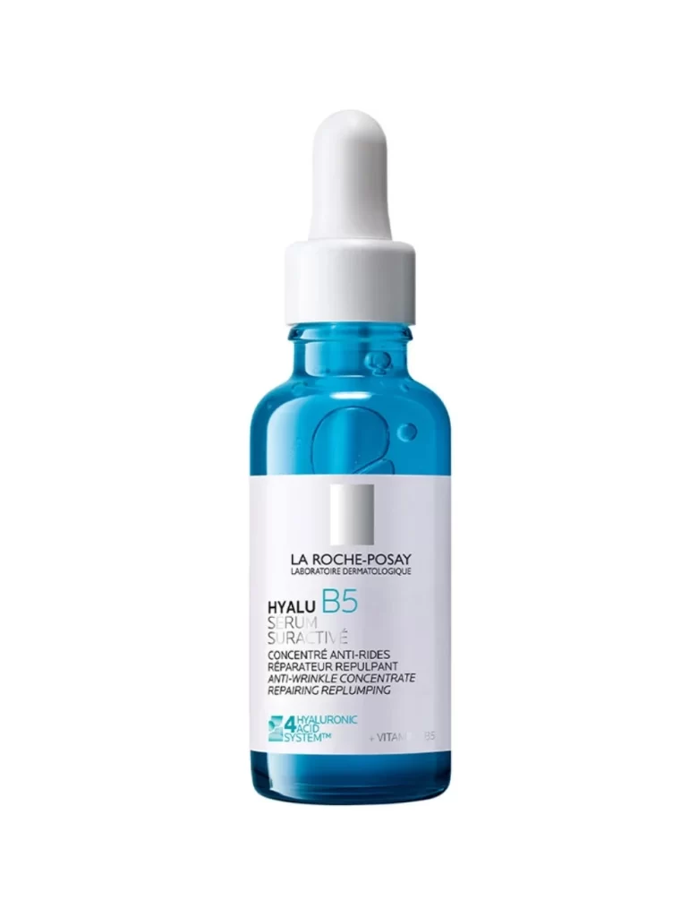
Packaging designers studying pharmaceutical beauty aesthetics will find this composition valuable for analyzing how color psychology and typographic weight convey efficacy and scientific credibility. Marketing teams developing positioning for active-ingredient skincare can reference the specific layout choices that communicate both gentleness and potency simultaneously. 3D artists creating cosmetic product visualizations might study the material interplay between the glossy amber glass, matte plastic components, and paper label to achieve realistic rendering results.