Most Italian Chocolate Box
Topics
Details
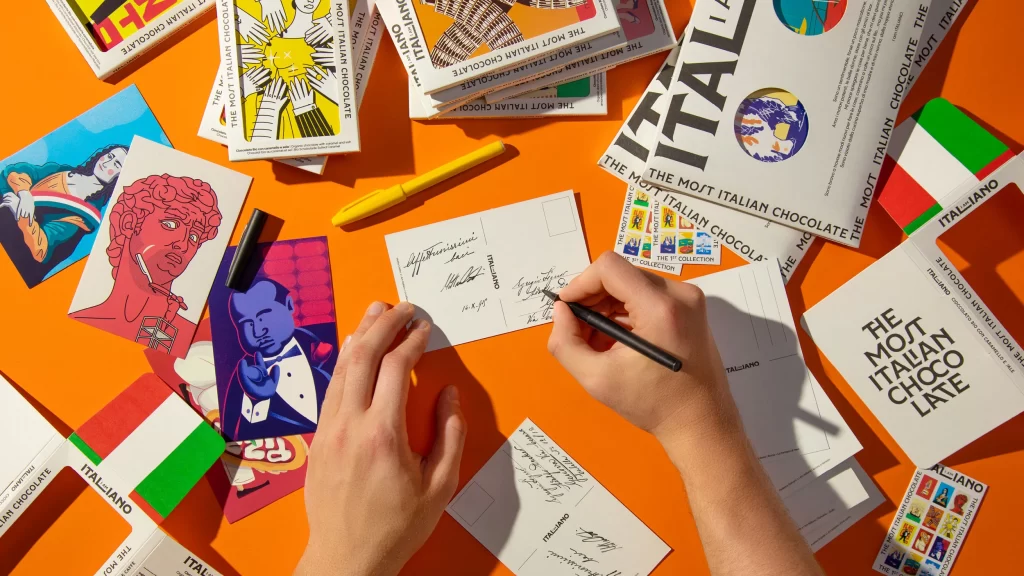
Against a saturated tangerine backdrop, a pair of hands interacts with an array of printed materials centered around the branding 'THE MOJT ITALIAN CHOCOLATE.' The composition features multiple white postcards and brochures scattered across the surface, some bearing the word 'ITALIANO' in bold black typography alongside small Italian flag motifs. A right hand grips a sleek black pen, actively signing or writing on a postcard, while the left hand steadies the paper nearby. Visible among the clutter are vibrant illustrations—including a pink-hued classical bust, a blue-toned figure in a tuxedo, and a yellow graphic of hands reaching for a sun—alongside a solitary yellow pen and a black marker cap resting near the edge.
Visual interest stems from the deliberate juxtaposition of high-contrast graphic elements against the warm monochromatic background, creating a workspace that feels both curated and spontaneously active. The typography varies between clean sans-serif statements and elegant cursive handwriting, suggesting a blend of mass-produced branding and personal touch. Each component, from the circular emblem containing a miniature globe to the colorful stamp sheets, contributes to a cohesive yet eclectic aesthetic that celebrates Italian cultural signifiers through a modern, playful lens.
Art directors examining packaging systems for luxury confectionery brands might study this arrangement to understand how collateral materials can extend a product's identity beyond the primary box. Print designers could analyze the interplay between illustration styles and typographic hierarchies when developing promotional kits for food and beverage launches. Additionally, photographers planning flat-lay compositions for editorial spreads might reference the spatial distribution and color balancing techniques evident here to achieve similar dynamic energy in their own work.