Nongshim Korean Clay Pot Ramyun Ramen Packaging
Topics
Details
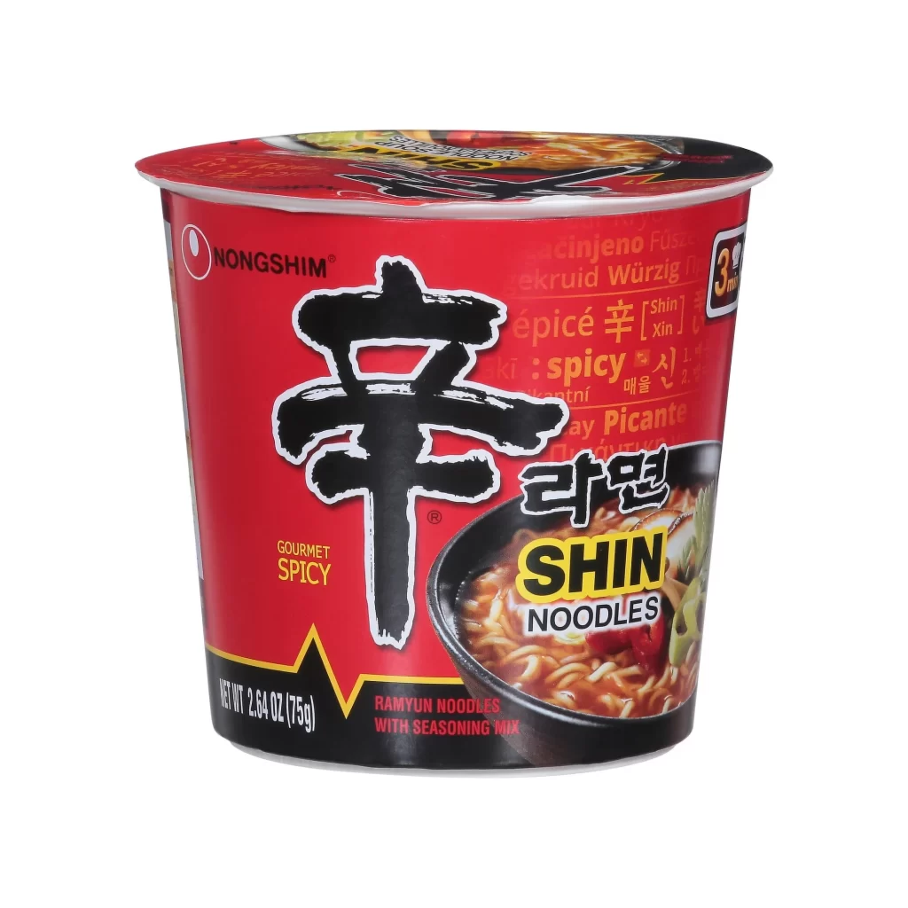
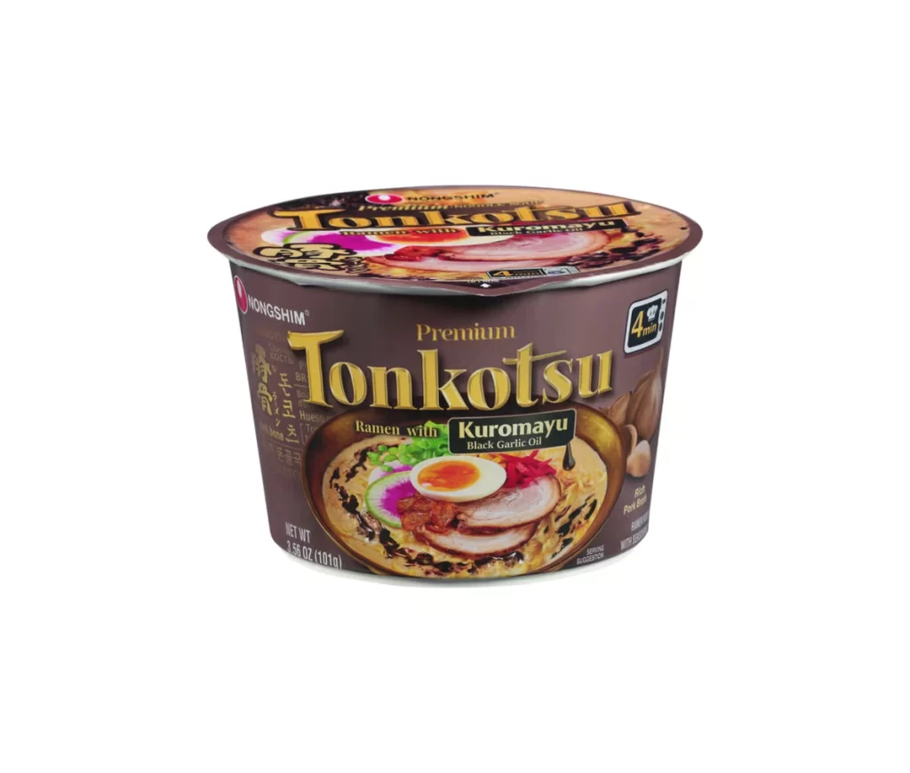
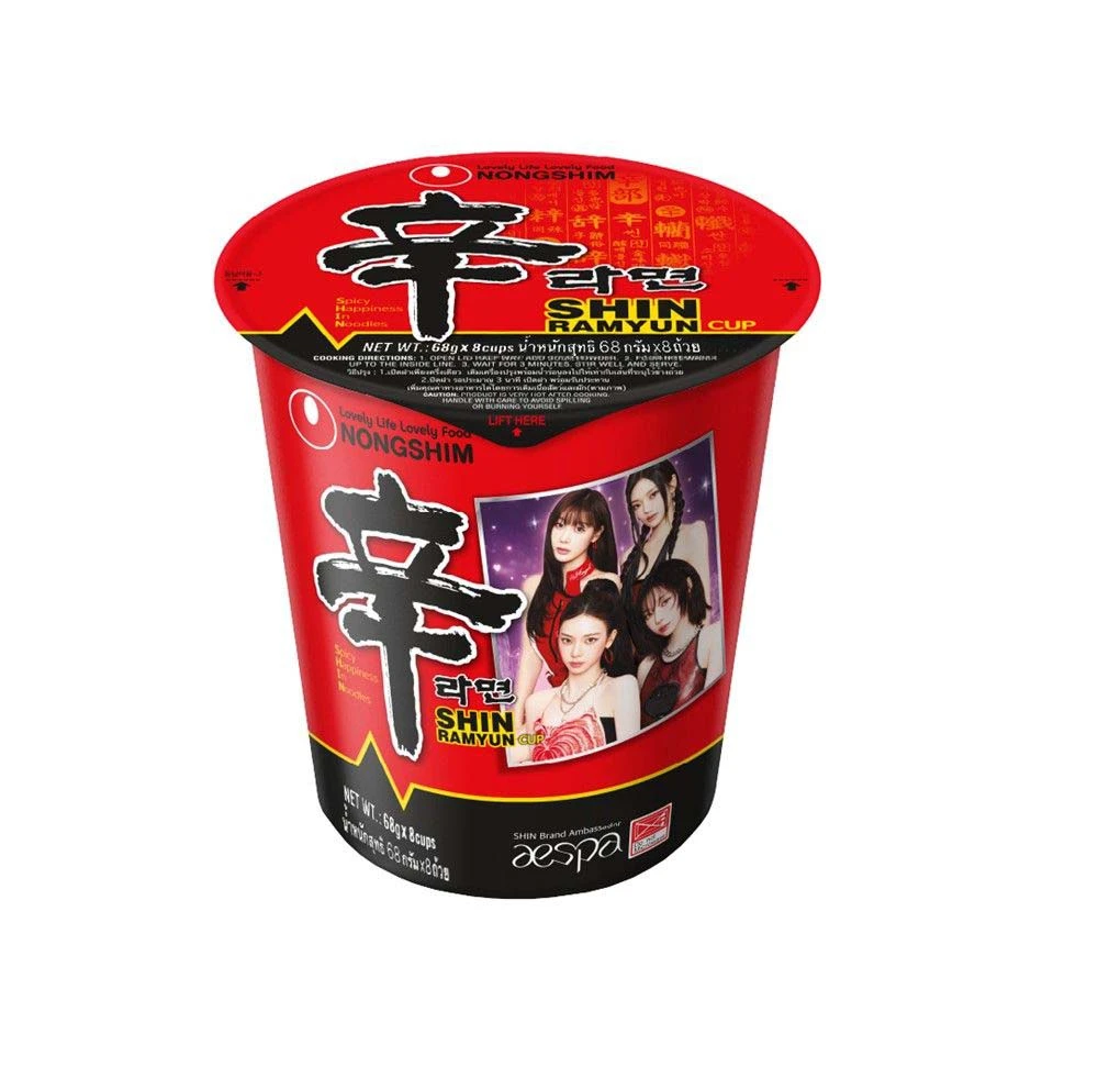
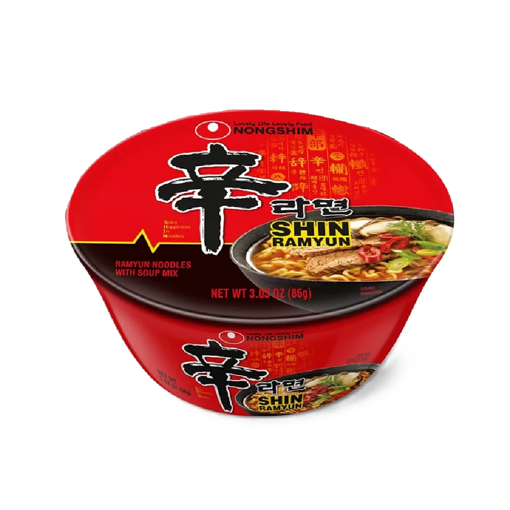
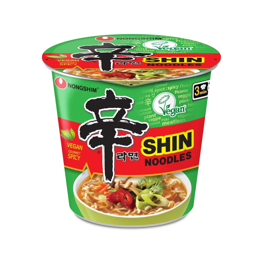
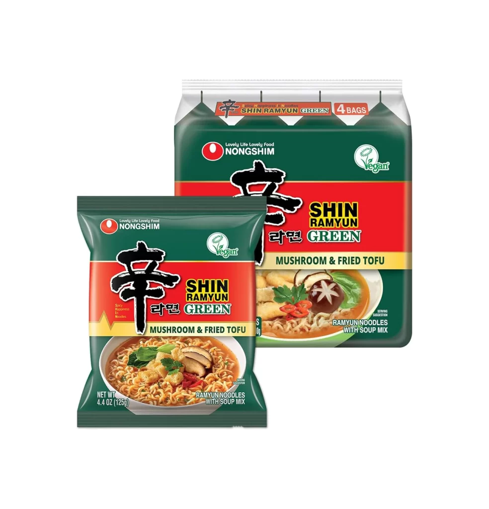
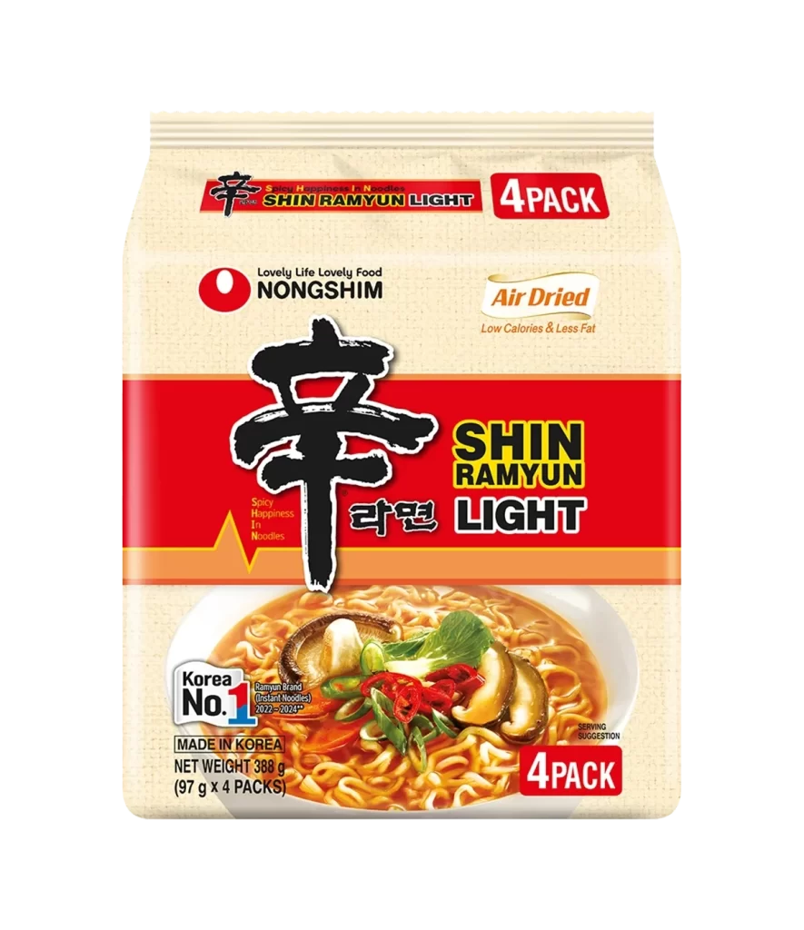
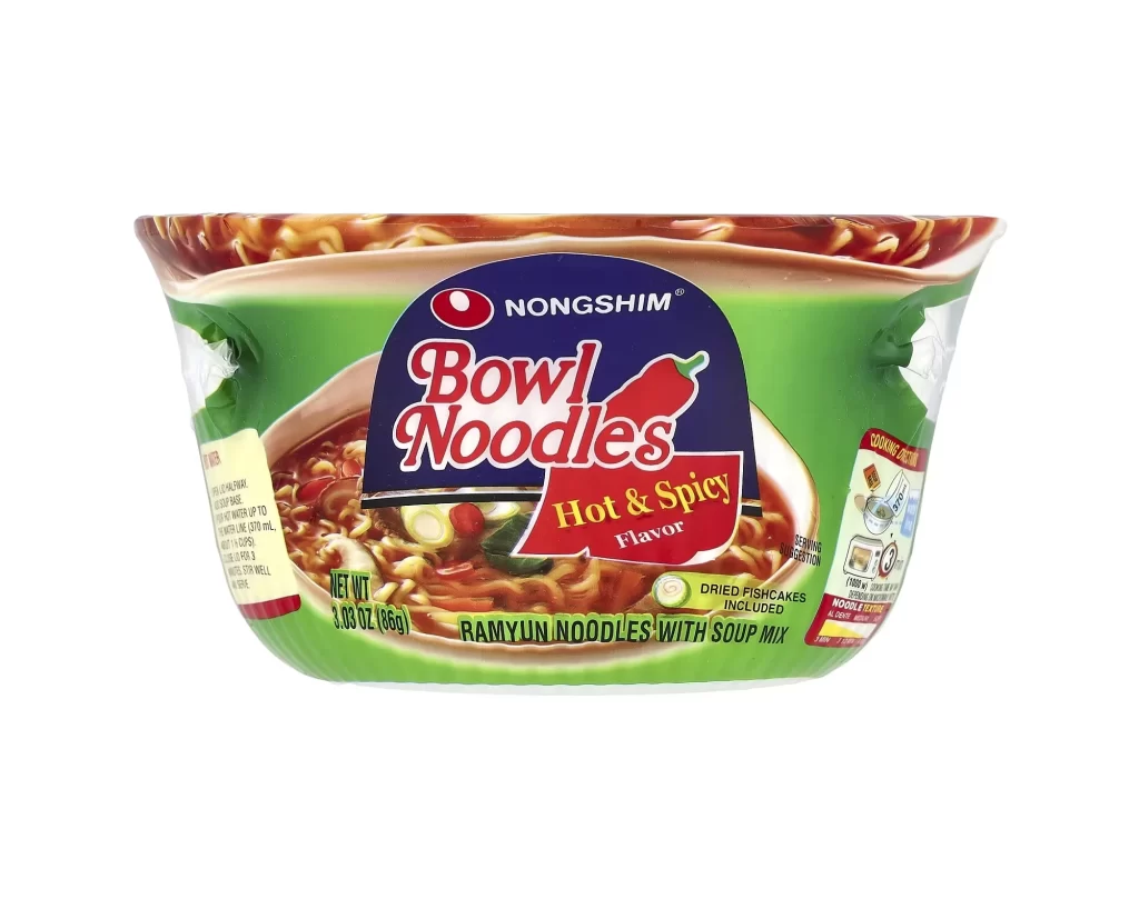
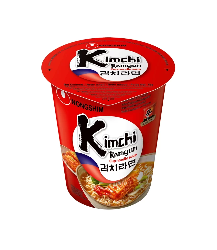
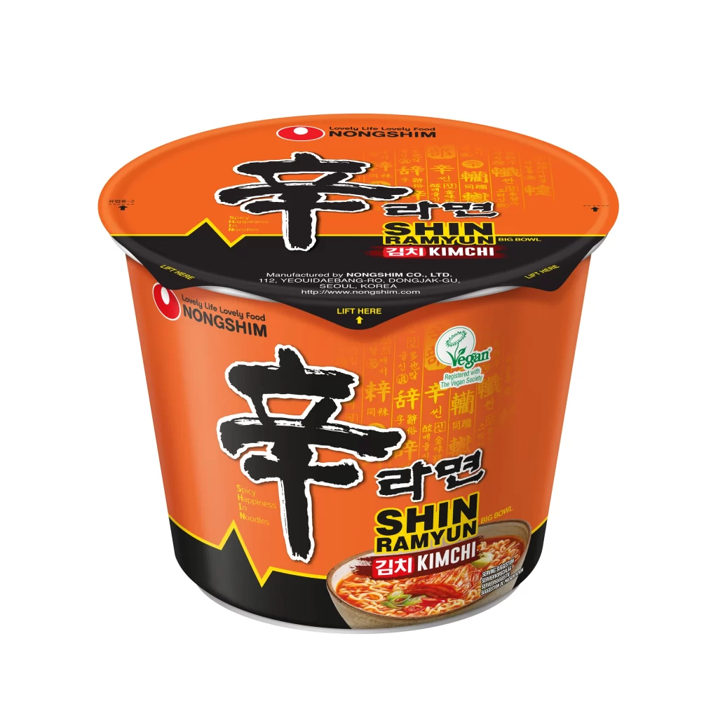
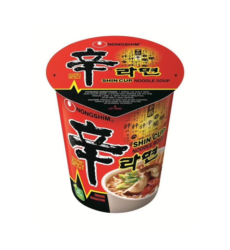
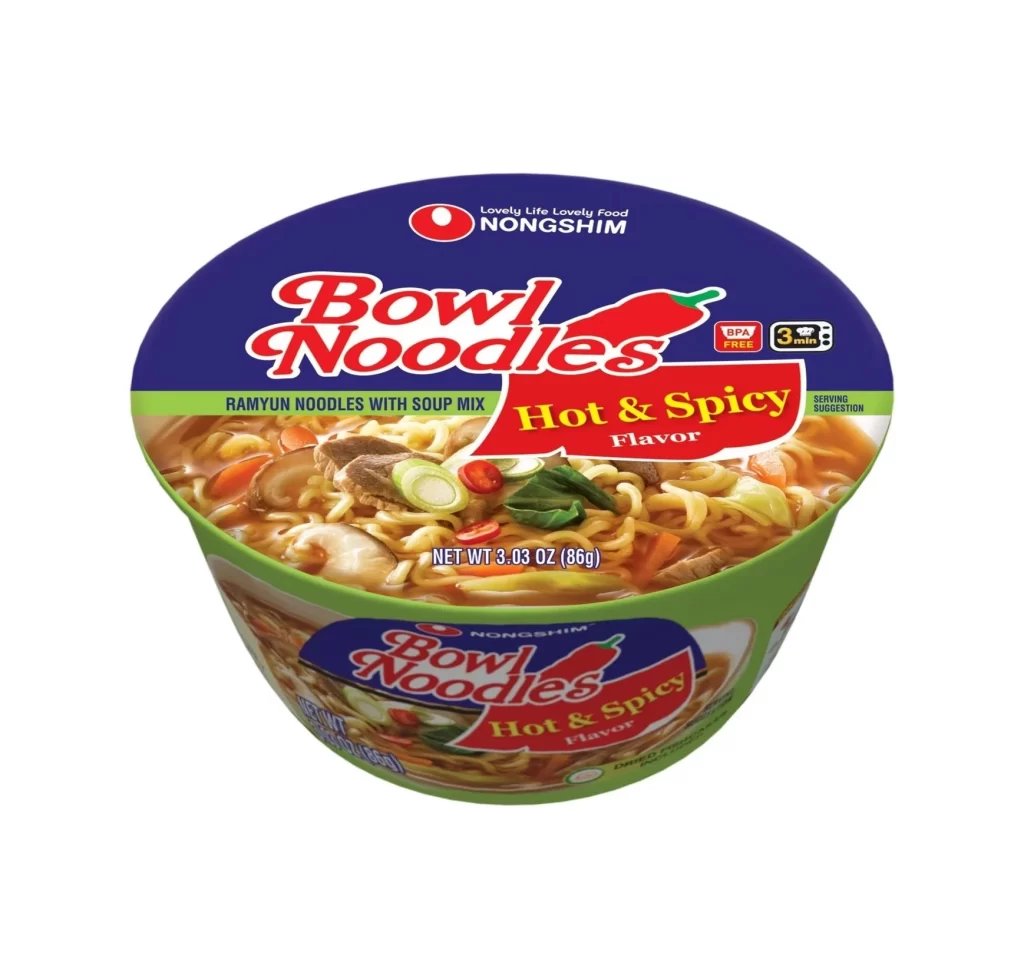
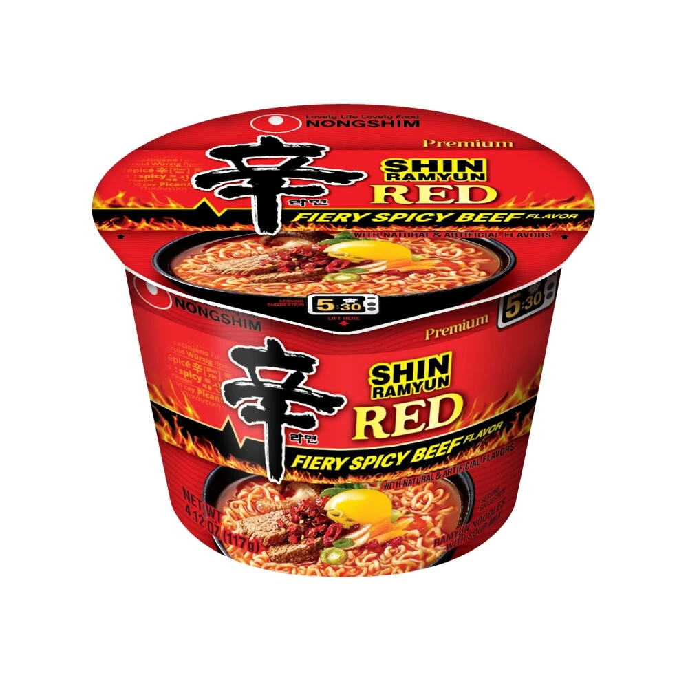
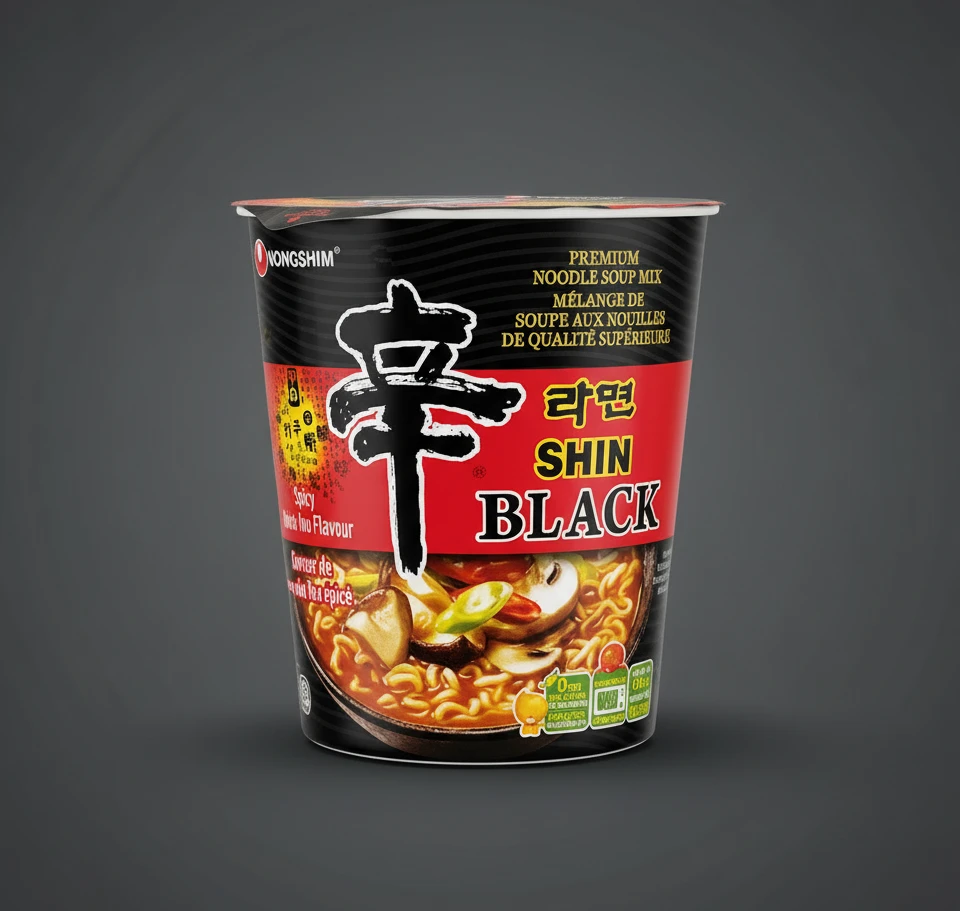
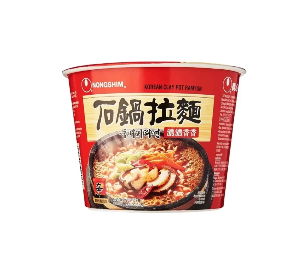
A cylindrical Nongshim cup dominates the frame with its aggressive red palette and bold typographic hierarchy. The packaging features the brand's signature red logo in the upper left, while the central cream-colored banner displays large, black calligraphic characters for 'Stone Pot Ramen' above smaller Korean and Chinese text. Below this text block, a photographic image showcases the ramen served in a dark clay pot with visible toppings including sliced mushrooms, green onions, and red chili peppers.
Visual tension arises from the juxtaposition of modern industrial cup geometry with the organic, rustic imagery of the clay pot serving suggestion printed on the front. The design leverages high-contrast color blocking, where the saturated crimson background makes the cream label and black typography pop with immediate legibility. Subtle details like the net weight indicator in the lower corner and the vertical nutritional text on the sides add layers of authentic commercial complexity to the composition.
Food photographers might study the lighting techniques used to make the broth appear glossy and appetizing within the circular frame of the pot illustration. Brand strategists could analyze how the specific arrangement of multilingual text caters to diverse Asian markets while maintaining a cohesive visual identity. Packaging engineers may reference the structural proportions of the cup’s curvature and the placement of informational panels for their own product development projects.