Paleo Toppers Breakfast Snacking Mix Hubards Green White
DownloadTopics
Details
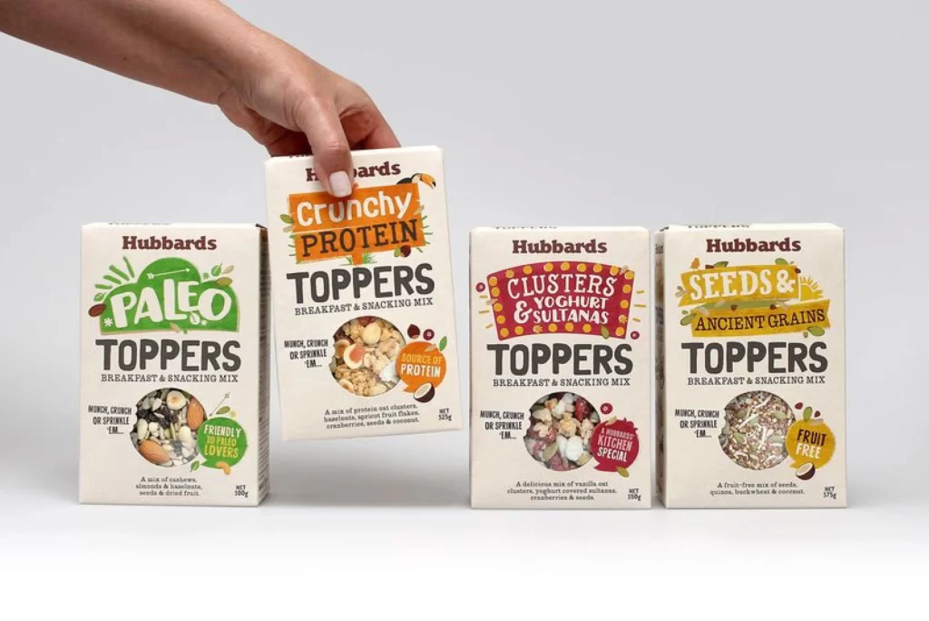
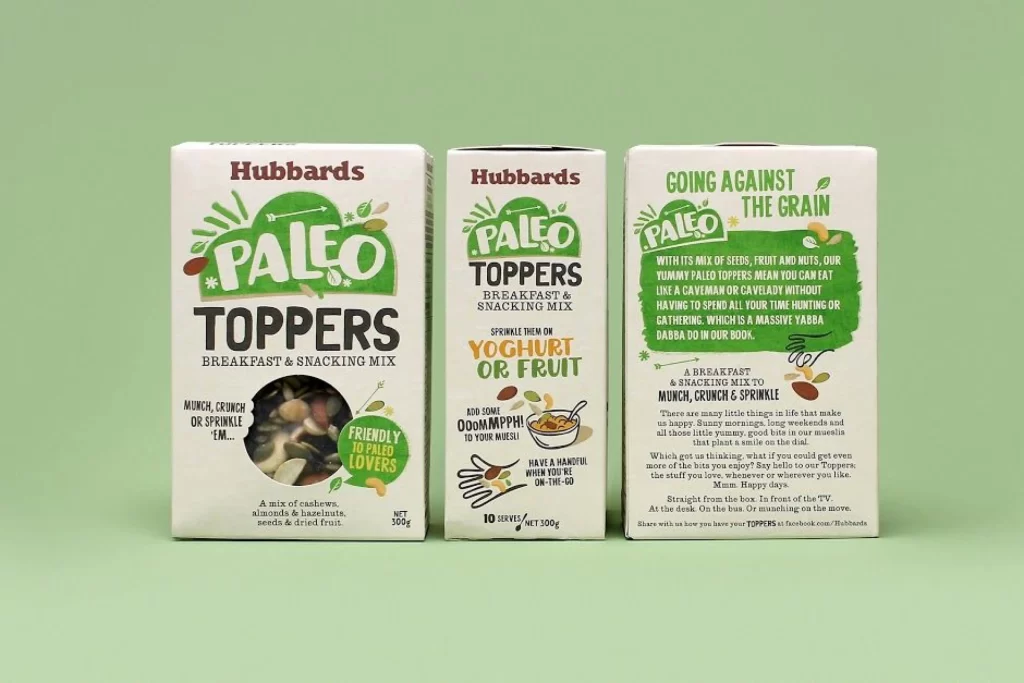
Three rectangular cardboard cartons of Hubbards Paleo Toppers stand in a row, each displaying a different face of the packaging. The boxes feature a cream-white base with vibrant forest-green organic shapes and bold black typography spelling out 'PALEO TOPPERS' and 'BREAKFAST & SNACKING MIX'. A circular die-cut window on the leftmost box reveals the actual mix of cashews, almonds, hazelnuts, seeds, and dried fruit inside, while the center panel illustrates serving suggestions for yoghurt or muesli bowls. The right side presents a dense green text block headlined 'GOING AGAINST THE GRAIN' with playful copy about caveman snacking habits. Soft even lighting illuminates the scene from the front against a muted sage-green backdrop, captured from a straight-on eye-level camera angle.
The packaging design distinguishes itself through its hand-drawn botanical illustrations and irregular green blobs that frame the brand name, creating an artisanal feel that contrasts with typical rigid grid-based cereal packaging. Typography varies dramatically across the three visible faces, shifting from heavy slab-serif headlines to casual script accents and condensed sans-serif body copy, demonstrating how a single product can maintain brand cohesion while presenting different information hierarchies on each panel. Designers studying this reference will notice how the limited palette of cream, forest green, and dark brown creates strong visual impact without relying on photographic food imagery except for that strategic transparent window showing the actual contents.
Packaging designers developing natural-food brands could analyze the typographic hierarchy and color blocking choices shown here when planning their own multi-panel box layouts. Art directors working on paleo or health-focused product lines might reference the specific illustration style and badge placement—particularly the circular 'FRIENDLY TO PALEO LOVERS' seal—to understand how certification-style graphics integrate with playful branding elements. Anyone needing to study the exact material textures, print finishes, or spatial relationships between text blocks can access the full-resolution source file at no cost directly from the resource library.