Toppers Breakfast Snacking Mix Colorful Illustration Typography
DownloadTopics
Details
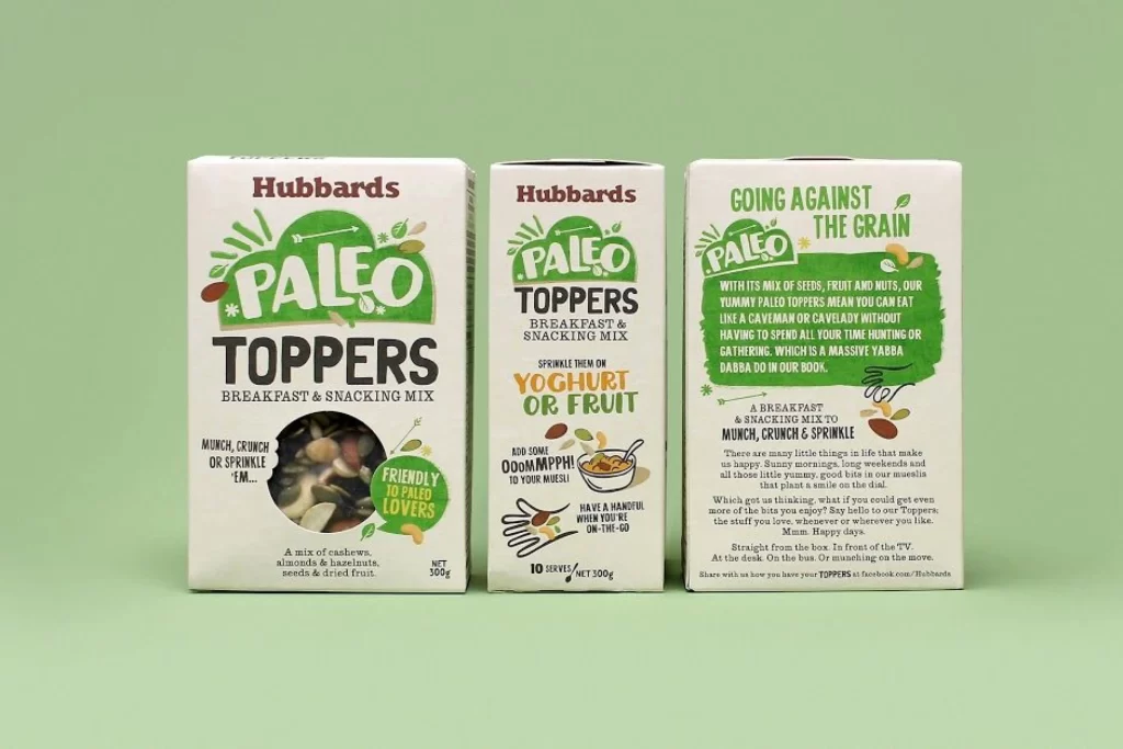
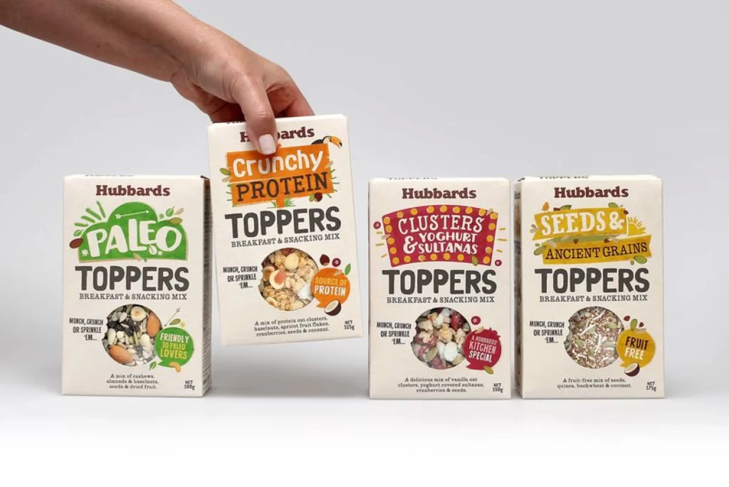
Four rectangular cardboard boxes for Hubbards Toppers breakfast mixes sit in a row, with a human hand lifting the second package from the left. The packaging features a cream-colored base with bold, colorful typography—green for the Paleo variant, orange for Crunchy Protein, red for Clusters Yoghurt & Sulianas, and yellow for Seeds & Ancient Grains. Each box displays circular product photography showing the actual granola contents, along with descriptive badges like 'Friendly Loved' or 'Fruit Free'. Soft studio lighting illuminates the scene from above against a neutral gray backdrop, creating gentle shadows beneath the cartons.
What makes this packaging stand out is its playful, hand-drawn illustration style combined with chunky, retro-inspired typefaces that give each flavor a distinct personality. The color-coded system allows for instant shelf recognition while maintaining brand cohesion through consistent layout elements like the 'Munch, crunch or sprinkle' tagline and the prominent 'TOPPERS' wordmark. Designers will appreciate how the organic shapes and varied font weights create visual hierarchy without feeling cluttered or corporate.
Food packaging designers and branding agencies could study this reference to understand how to balance nutritional messaging with appetizing visual appeal in the health-food sector. Marketing teams developing cereal or snack product lines might use these layouts as templates for organizing ingredient claims, dietary certifications, and serving suggestions on limited real estate. Anyone researching contemporary packaging trends can grab the full-resolution file at no cost to examine the texture details and color values up close.